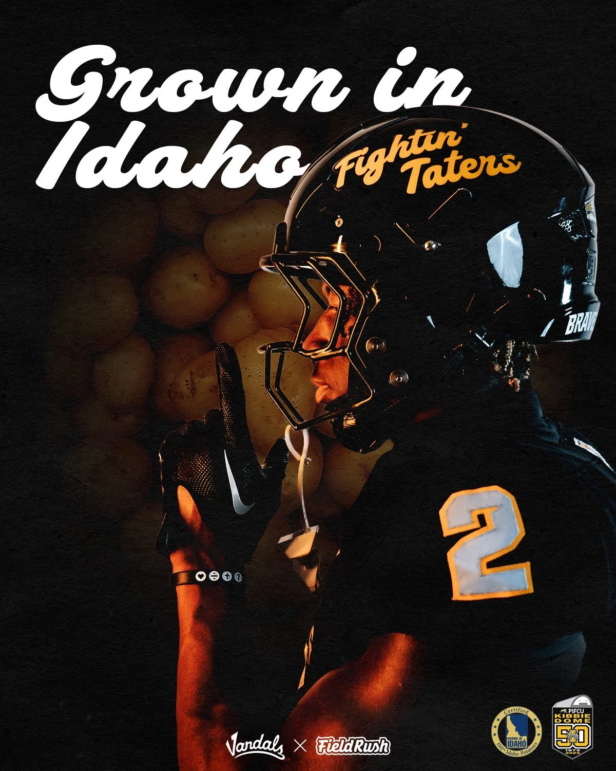
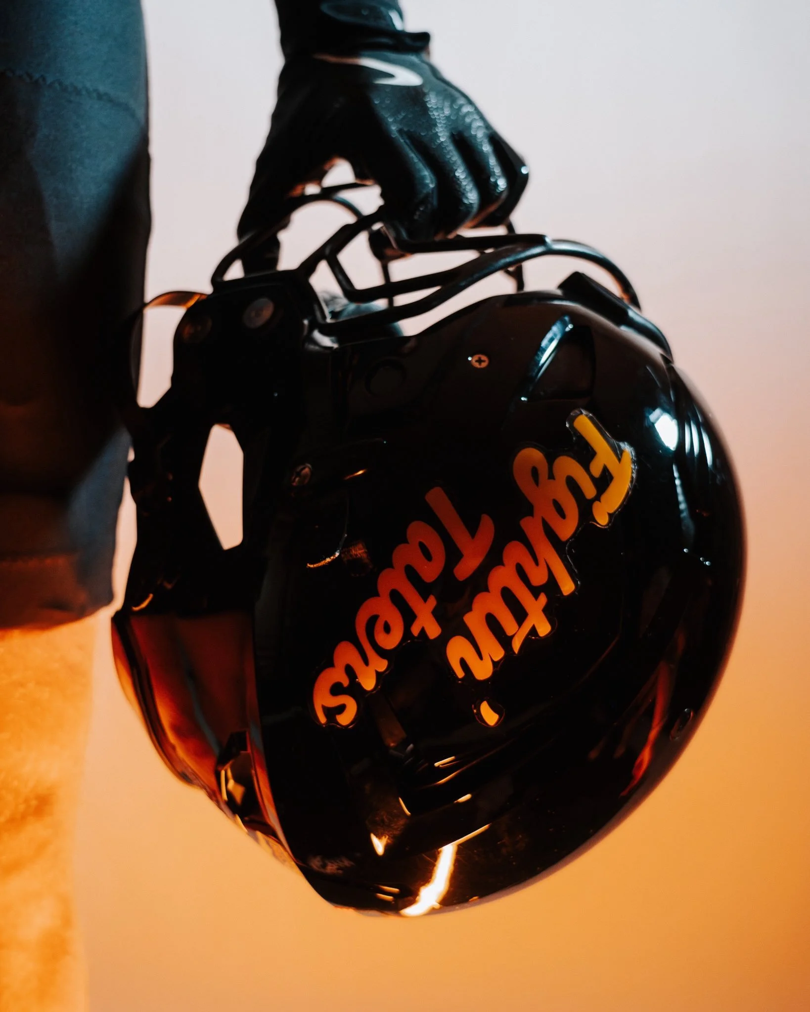
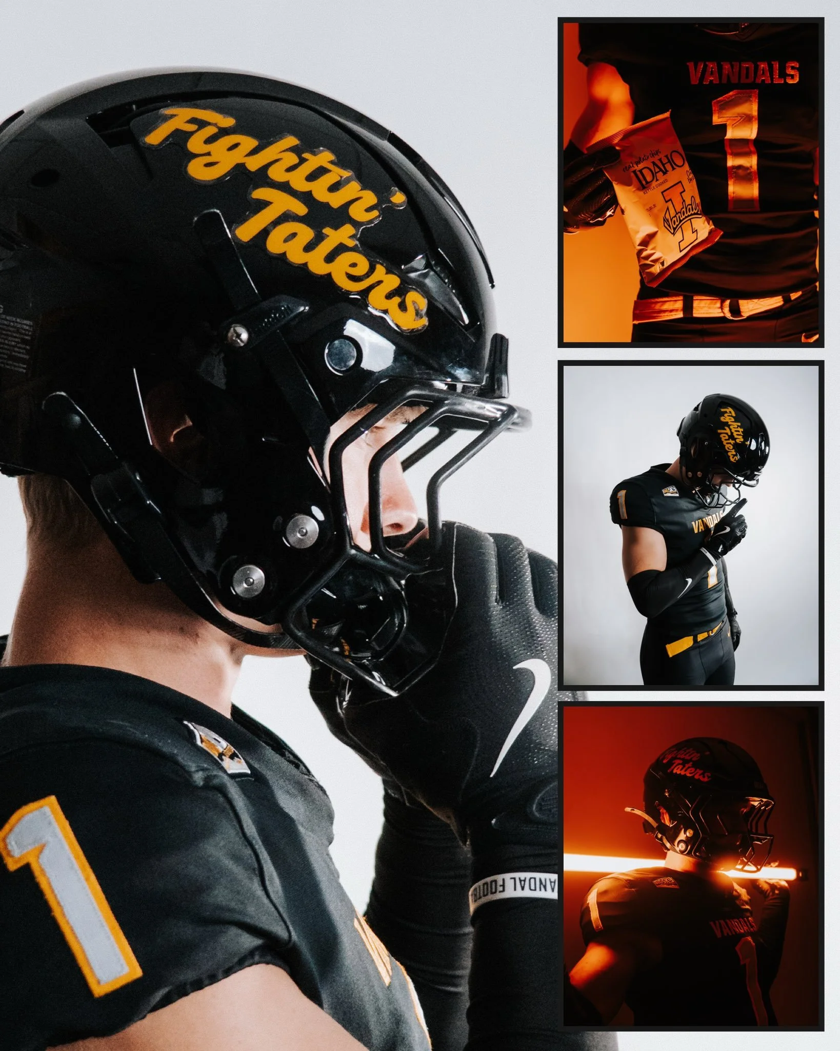
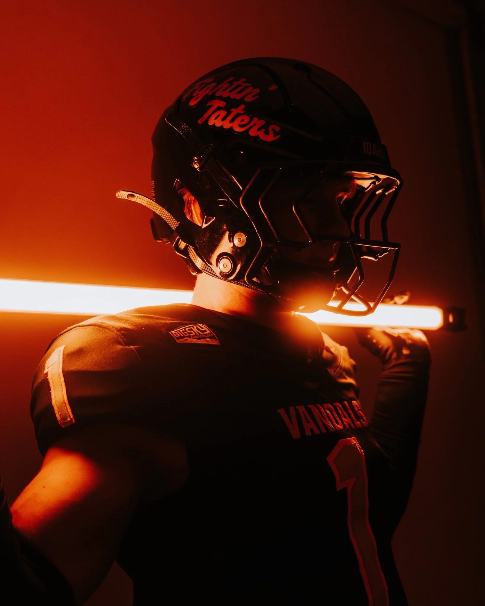
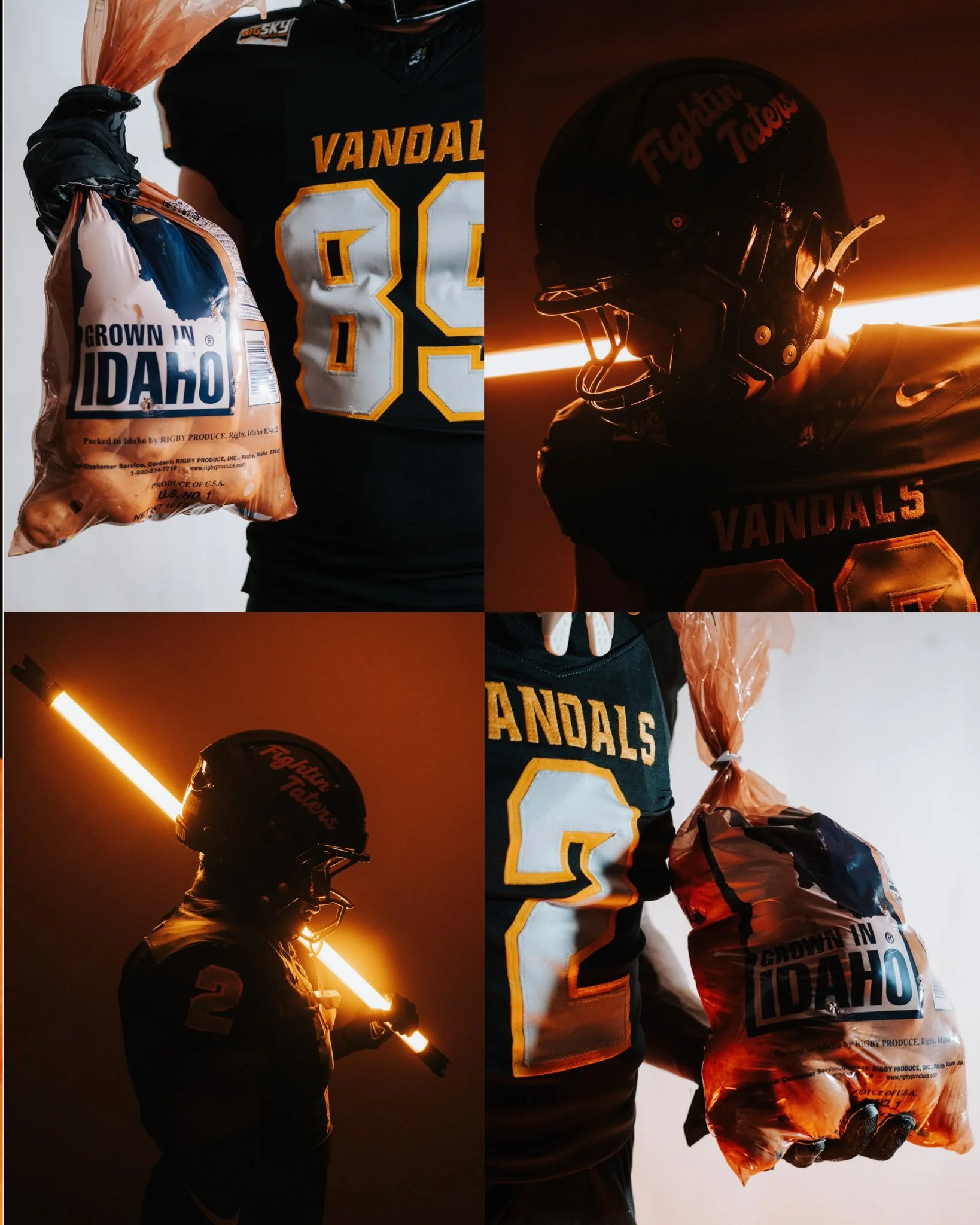
The University of Idaho is bringing a truly one-of-a-kind look to the field this weekend. When the Vandals open their 2025 home slate against St. Thomas, they’ll debut special “Fightin’ Taters” helmets, a bold nod to the Gem State’s proud agricultural roots.
The timing couldn’t be more perfect. Saturday’s game is presented by the Idaho Potato Commission, making the themed alternate look a fitting tribute to one of the state’s most iconic exports.
“The University of Idaho already has one of the most unique mascots and brands in all of college athletics,” said Assistant Athletic Director for Brand Engagement and Digital Strategy Jerek Wolcott. “This was an opportunity to celebrate our state and our tremendous agricultural history while partnering with the creative minds at Field Rush for a game sponsored by the Idaho Potato Commission. Everything came together for this week for something truly unique, and we couldn't be more excited to see this alternate brand on the field.”
The celebration won’t stop with the helmets. Fans attending the game can expect a full potato-themed experience: the Idaho Potato Commission’s 70-foot-long Big Potato Truck will be on-site, and the beloved mascot Spuddy Buddy will be in attendance to bring the energy.
The “Fightin’ Taters” identity is more than just a clever alternate; it’s a celebration of Idaho’s culture, history, and community pride. By leaning into their roots, the Vandals continue to prove they aren’t afraid to stand out in the college football landscape.
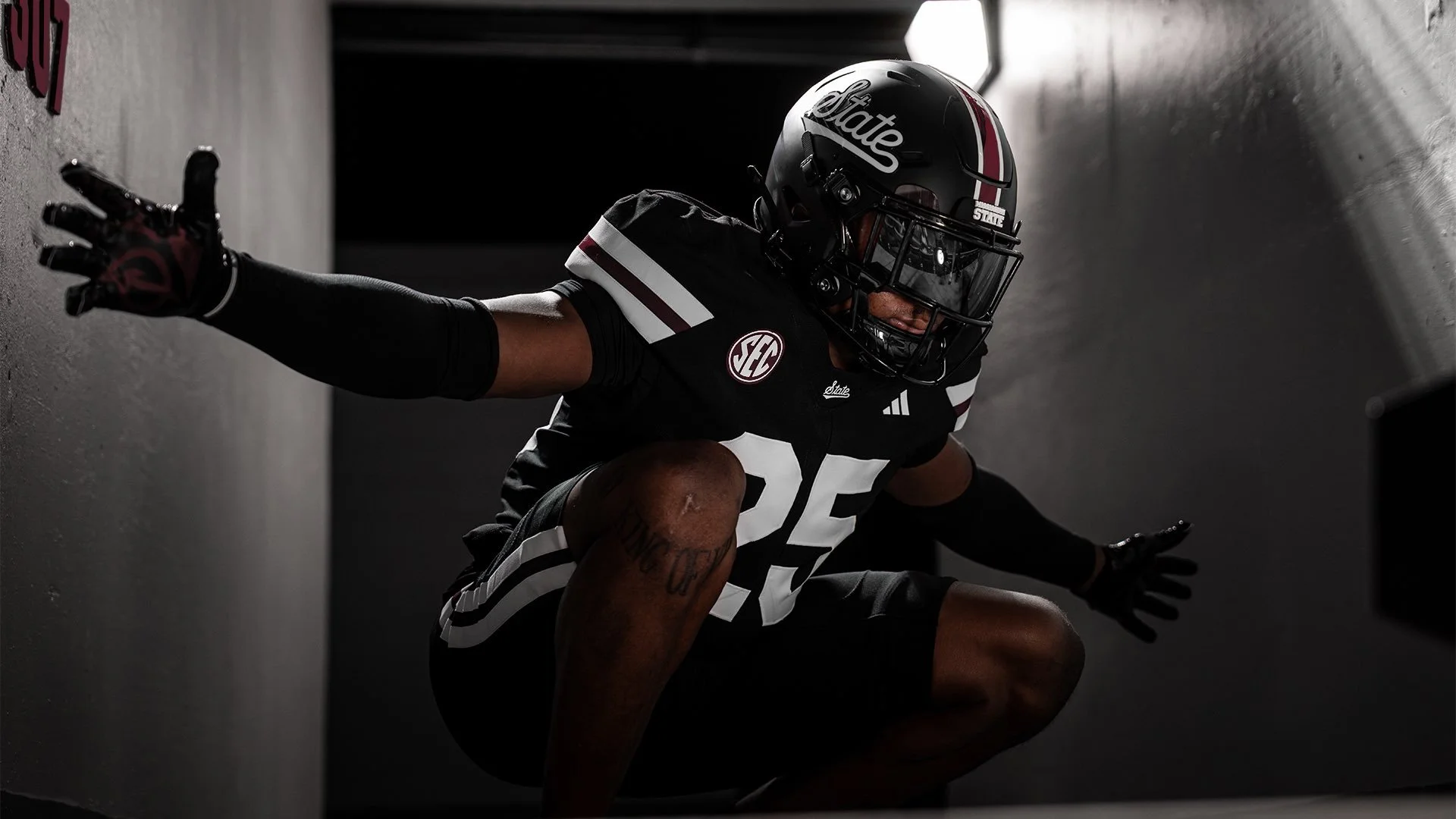
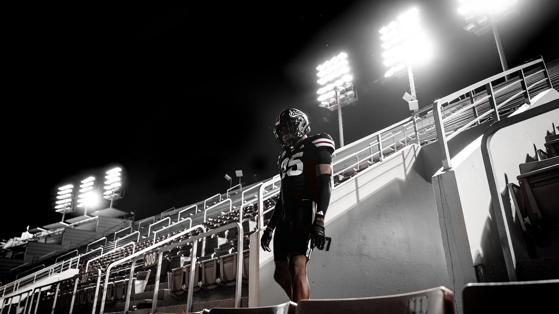
The Mississippi State Bulldogs are going black for Week 2, unveiling an all-new all-black look nicknamed “Dark Mode.” The Bulldogs dropped the uniform reveal on social media with phrases like “Out of the Darkness” and “From the Shadows to the Spotlight,” setting the tone for their September 6th showdown against Arizona State in Starkville.
The jerseys are A simple black base with bold white block numbers. Across the collar sits “State” in script, paired with conference and maker’s marks. The sleeves feature two thick white stripes split by a thin maroon stripe, adding some balance.
The Helmets are Matte black with a stripe running down the middle in white–maroon–white. “State” appears in script on both sides, tying back to the jersey collar design.
The Pants are Black with a matching stripe pattern, thick white, thin maroon, thick white, mirroring the sleeve design.
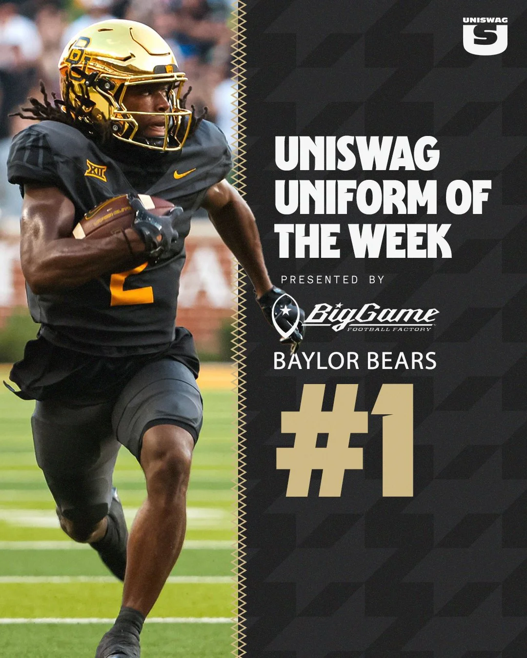
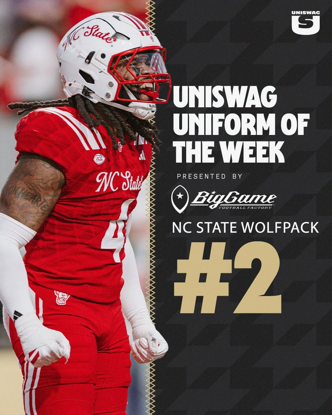
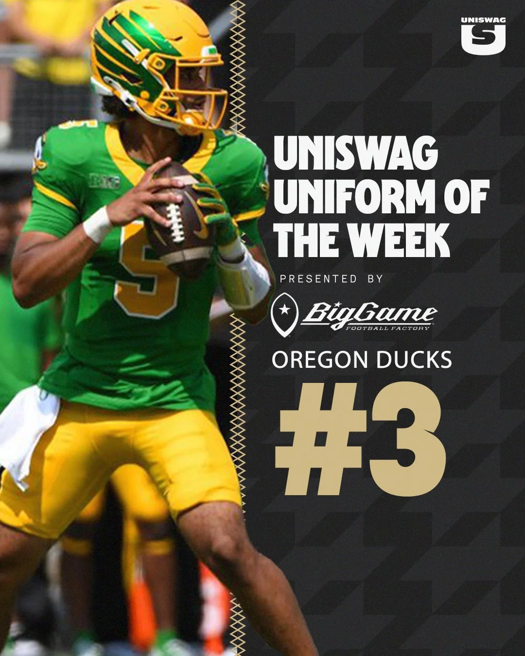
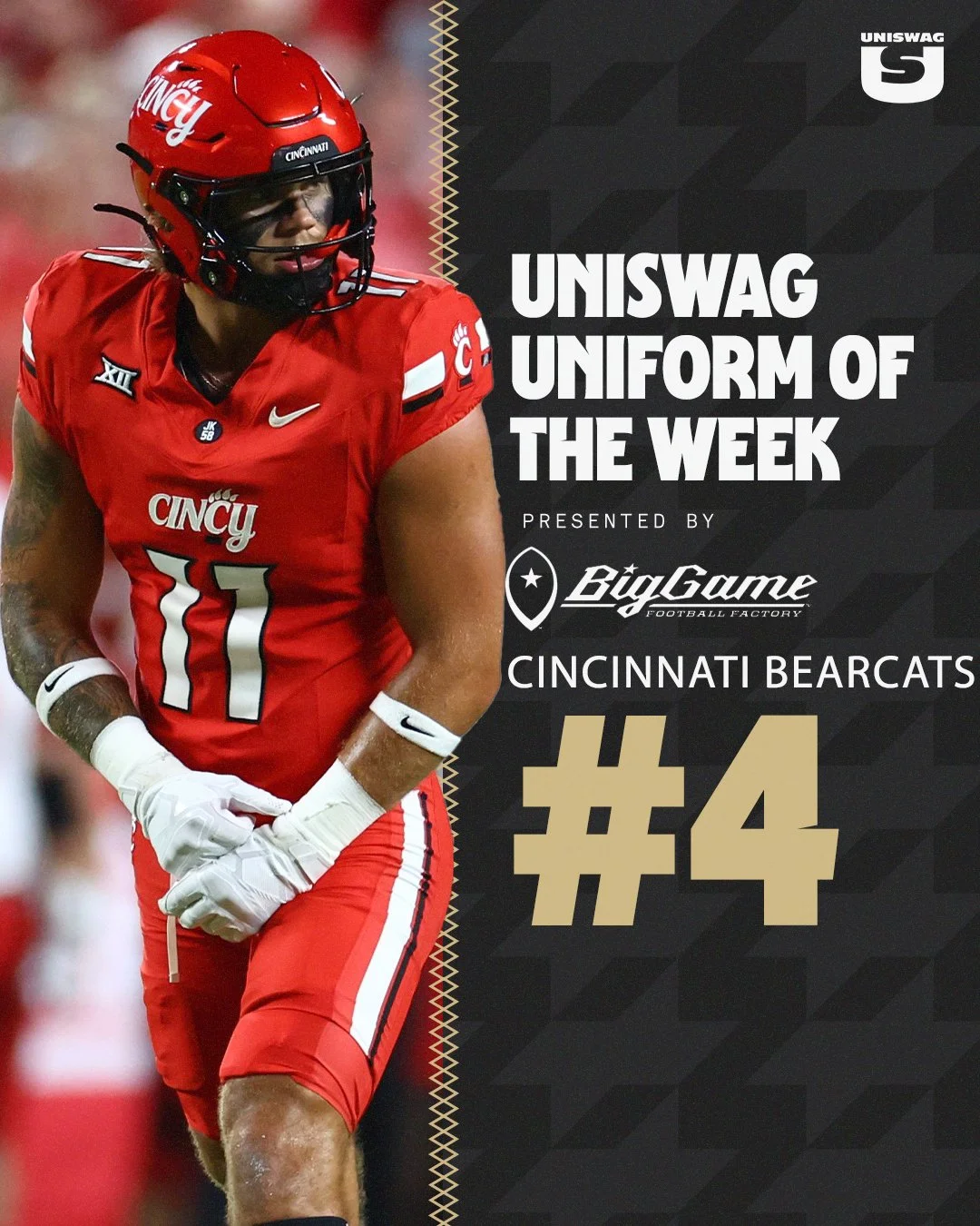
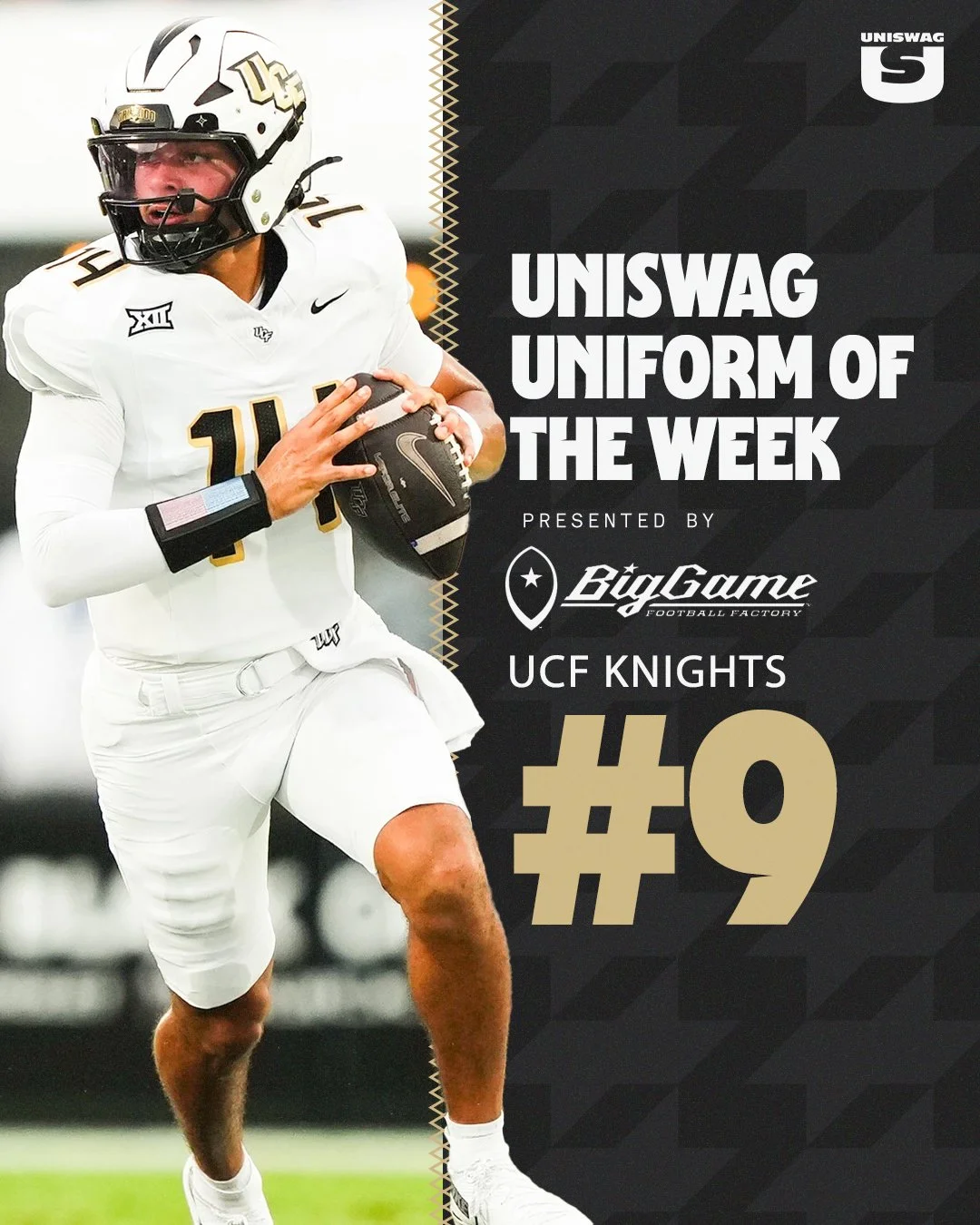
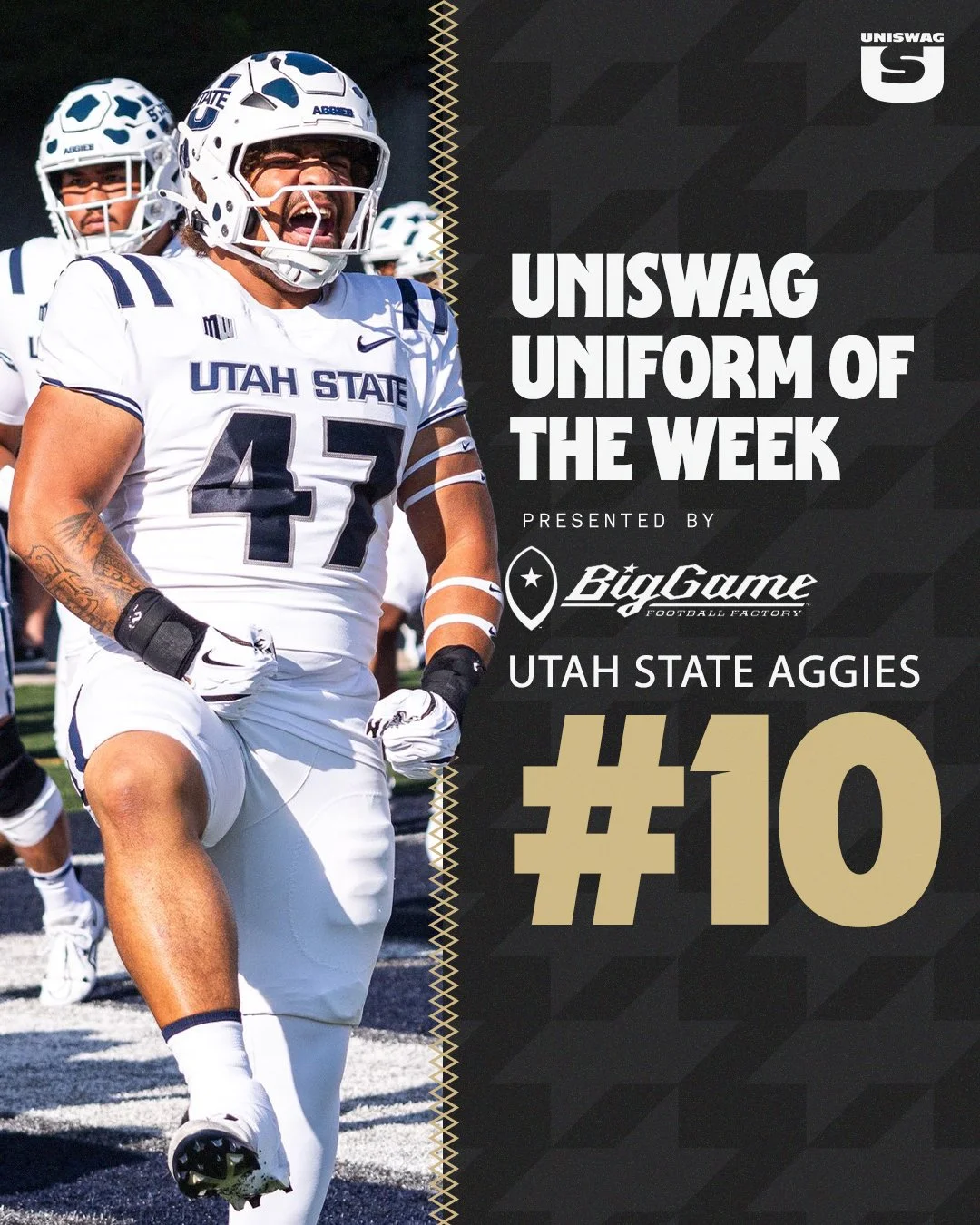
It’s time for the UNISWAG Weekly Countdown for the 2025 College Football Season, Presented by Big Game USA!
Each week, we highlight the cleanest, boldest, and most innovative uniforms across the college football landscape, all building toward that coveted No. 1 spot.
Check out the Week 1 Uniform of the Week Countdown as we celebrate the designs that made the biggest impact on the field!
The UNISWAG Uniform of the Week Countdown is back for Week 1 of college football!
Check out which teams are turning heads with their uniform combos this weekend. The official Top 10 drops Tuesday, leading up to the reveal of the Week 1 Uniform of the Week winner.
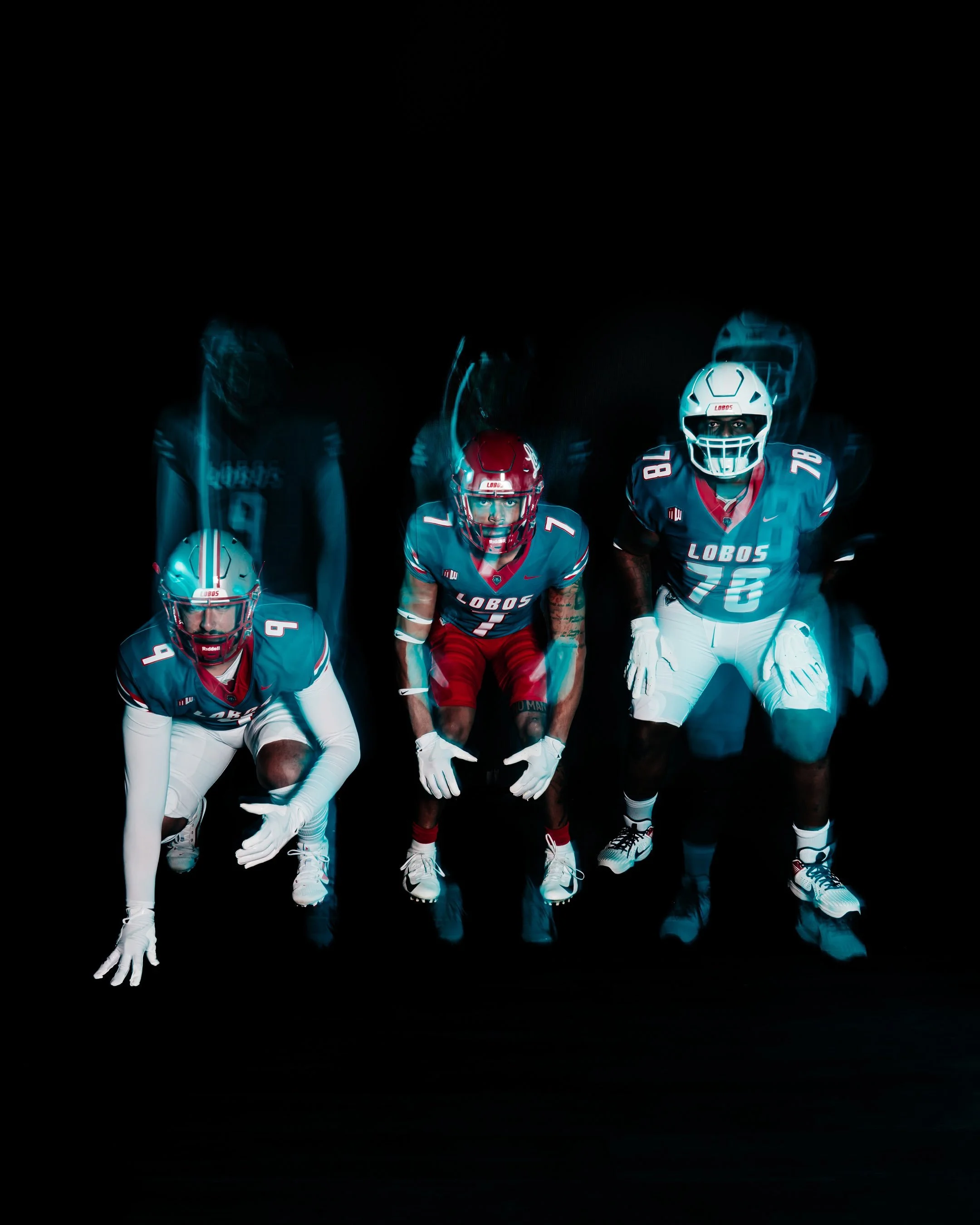
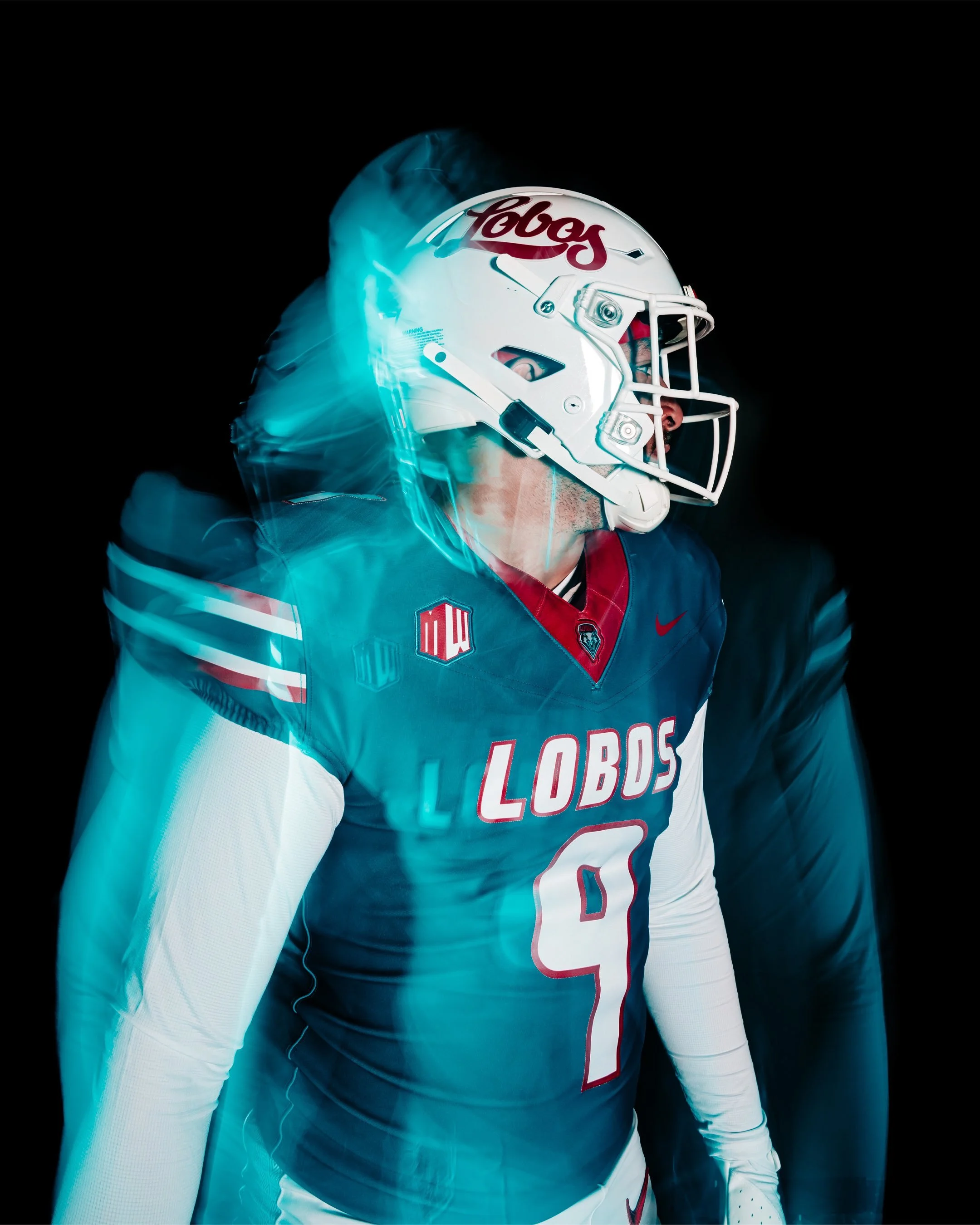
This fall, New Mexico Football is bringing back turquoise, a color with roots that run deep in the state’s culture and the Lobos’ athletic tradition. More than just a design choice, turquoise represents life, resilience, and identity. When the Lobos take the field in their United in Turquoise uniforms, they’ll be wearing a symbol of who they are — for the past they honor, for the state they live in, and for the future they represent.
The story of turquoise at UNM is rich and layered. The Lobos’ earliest colors in the 1890s were black and gold, but those never truly captured the essence of New Mexico. It was Harriet Jenness, a faculty member who taught art, drama, and music, who suggested crimson and silver to better reflect the landscape. Crimson for the evening glow of the Sandia Mountains, and silver for the Rio Grande winding like a ribbon through the valley. Her vision stuck, and cherry and silver became the official identity of the Lobos.
In 1973, turquoise was officially added to the palette of school colors, and for six seasons the football team made it their own. The Lobos wore turquoise jerseys at home, creating one of the most iconic looks in program history before returning to cherry and silver in 1980. Their last game in turquoise came in a 17-3 win over Wyoming on November 24, 1979, marking the end of an era.
The color made a return in 2013 as an alternate accent, with UNM donning white jerseys with turquoise numbers and trim against Fresno State. The Lobos continued to wear turquoise accents once a season through 2022, while experimenting with other alternates like silver and anthracite along the way. Still, fans longed for a true revival of the original 1970s turquoise look.
Now, that wait is over. For the first time in over four decades, New Mexico Football will once again wear the turquoise jerseys in their full glory, honoring the past while uniting players and fans in the vibrant identity of the state.
It’s more than a uniform. It’s a connection to heritage. A reminder of resilience. And a celebration of New Mexico itself.
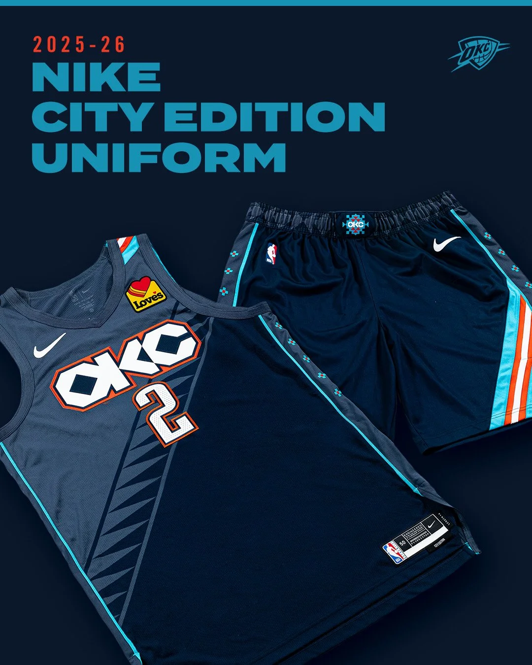
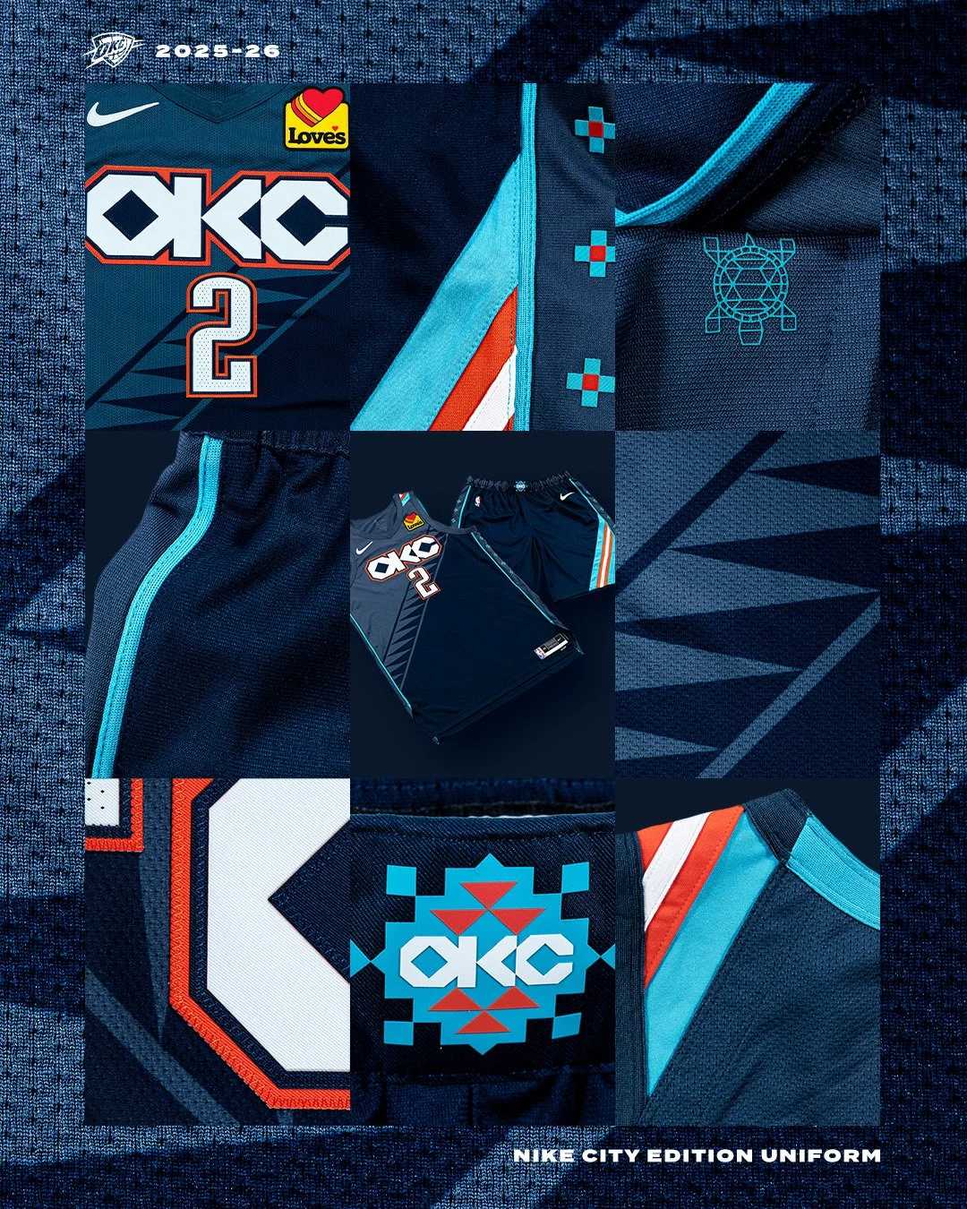
The Oklahoma City Thunder have always embraced community pride, and this season, they’re taking that commitment to a deeper level. The team revealed its 2025-26 Nike NBA City Edition Uniform, a design rooted in Native American culture and Oklahoma’s Indigenous heritage. The uniform will make its on-court debut on November 19, when the Thunder host the Sacramento Kings on Native American Heritage Night at Paycom Center.
The new look builds on elements of the Thunder’s 2018-19 City Edition uniform, but this year’s version strengthens the connection to the state’s Native identity. At its core, the design blends historical symbols with modern aesthetics, telling a story of community, resilience, and shared pride. At the center of the jersey, interlocking geometric shapes form the letters “OKC,” symbolizing unity and strength. The duotone halves of the jersey are connected by water-like teeth inspired by the Oklahoma River, which binds the north and south sides of the city. On the waistband, a pattern of expanding squares reflects the growth of Oklahoma communities, borrowing influence from ceremonial regalia.
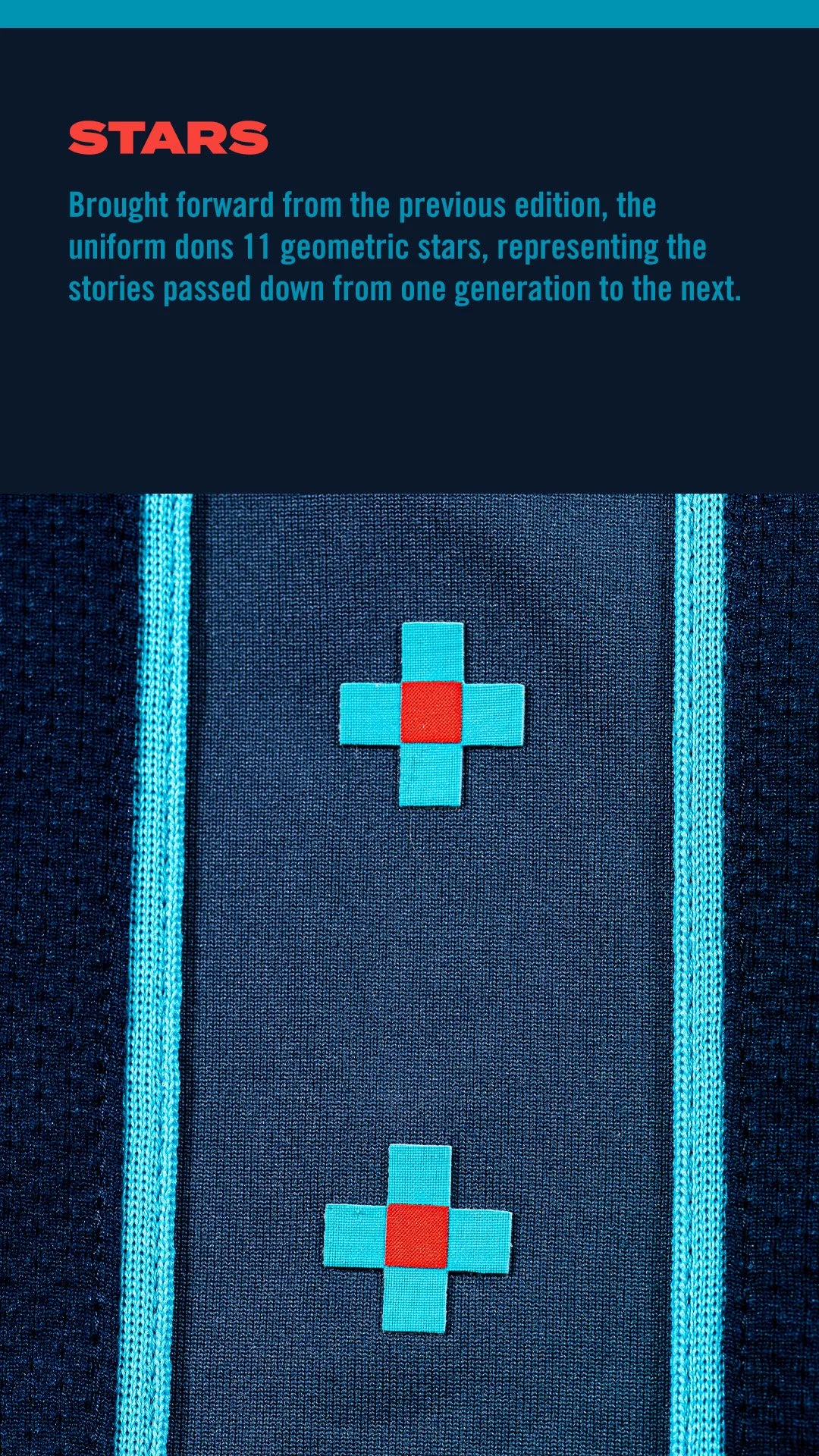
The uniform also features a hidden emblem on the right leg of the shorts: a turtle representing endurance and unity, its circular shell and arrow motifs pointing toward Oklahoma City and the four sacred directions. Sunset-toned sashes wrap across the shoulders and down the sides of the shorts, paying tribute to tribal resilience and shared identity. Meanwhile, the eleven geometric stars along the sides of the jersey and shorts carry forward stories passed through generations, weaving heritage directly into the fabric of the design.
Fans will get a chance to experience the uniform beyond the court thanks to a special showcase at the First Americans Museum. From August 21 through September 5, the museum will host a limited-time exhibit displaying the full uniform while offering fans the chance to win Thunder City Edition gear. Beginning September 6, the uniform will shift into a digital exhibit that runs through November in celebration of Native American Heritage Month.
The Thunder are also expanding the City Edition platform this season with an alternate City Edition court and designated City Nights theme games. Each Friday home game, starting December 5, will highlight the new look as the team takes the floor in the City Edition uniform on the specially designed court.
With its blend of history, symbolism, and community pride, the Thunder’s 2025-26 City Edition uniform isn’t just another alternate. It is a statement piece that honors the Indigenous heritage at the heart of Oklahoma and unites fans around the stories and traditions that continue to shape both the city and the legacy of Thunder Basketball.
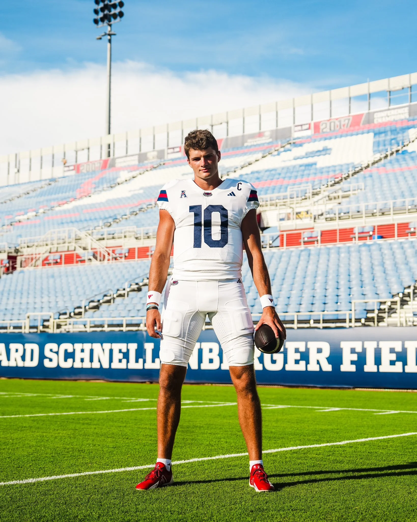
Florida Atlantic Football is turning 25 years old this season, and the Owls are marking their Silver Anniversary with a brand-new look. On August 21, just nine days before their season opener, FAU revealed their updated uniforms. The redesign also signals the start of the Zach Kittley era, ushering in a streamlined aesthetic that leans heavily into tradition and simplicity. The new set features: Two helmets: blue and white, Two jerseys: blue and white, and Two pants: blue and white.
Noticeably missing from the lineup is red, which has been reduced to an accent color rather than a primary element. This marks a significant shift from FAU’s recent uniform history, where red, along with black and even sand-colored alternates, made appearances throughout the last decade. For now, the Owls are keeping it clean and consistent, with blue and white as the foundation of the program’s identity.
While FAU may eventually reintroduce red helmets, jerseys, or pants down the line, the initial reveal focuses on four core combinations that balance tradition with a modern edge. The stripped-down look is designed to give the program a strong, cohesive brand presence as they enter their 25th season on the gridiron.
For a team looking to make a statement in the American Conference, these new uniforms represent more than just a change of wardrobe — they’re a symbol of a new era for FAU Football.
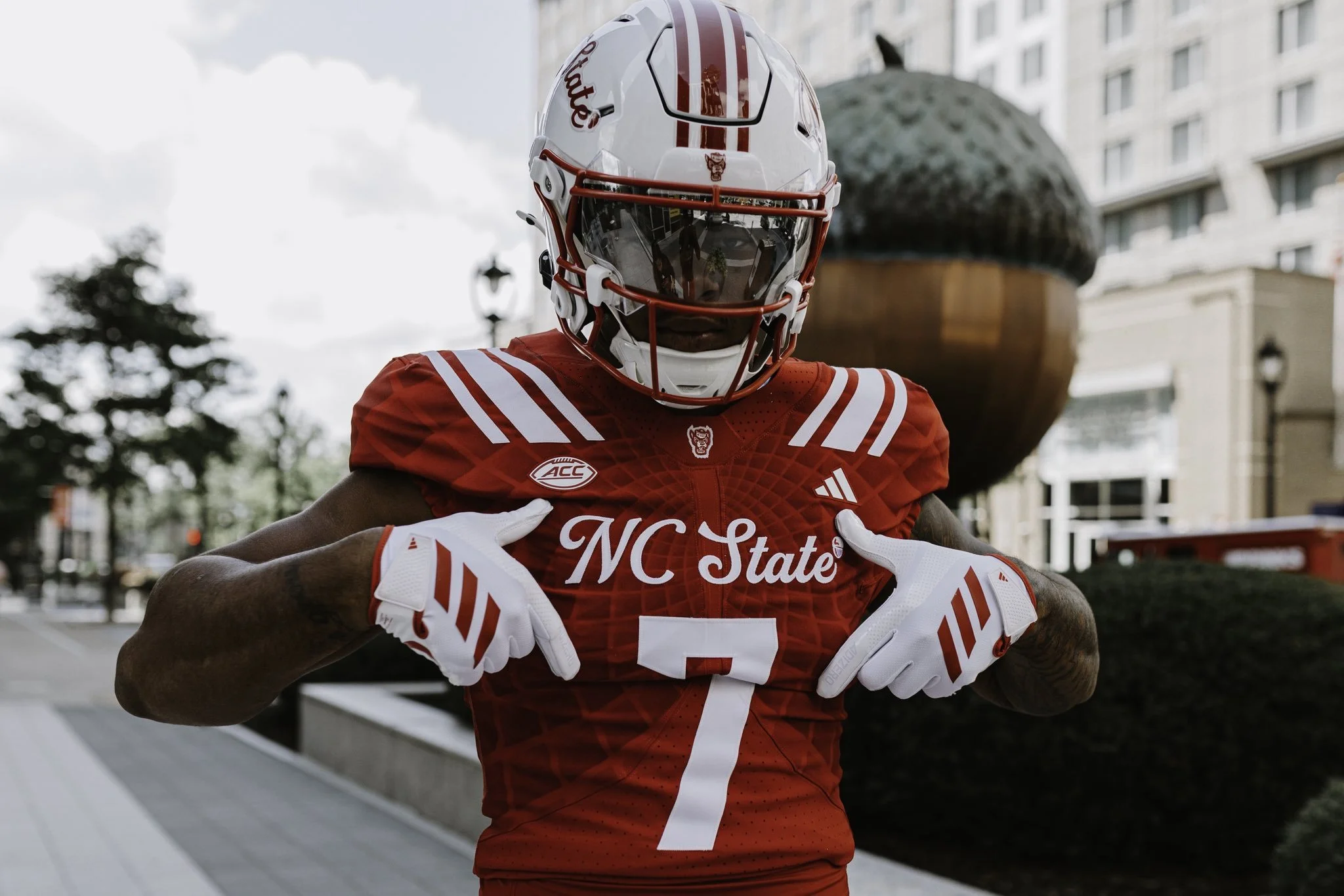
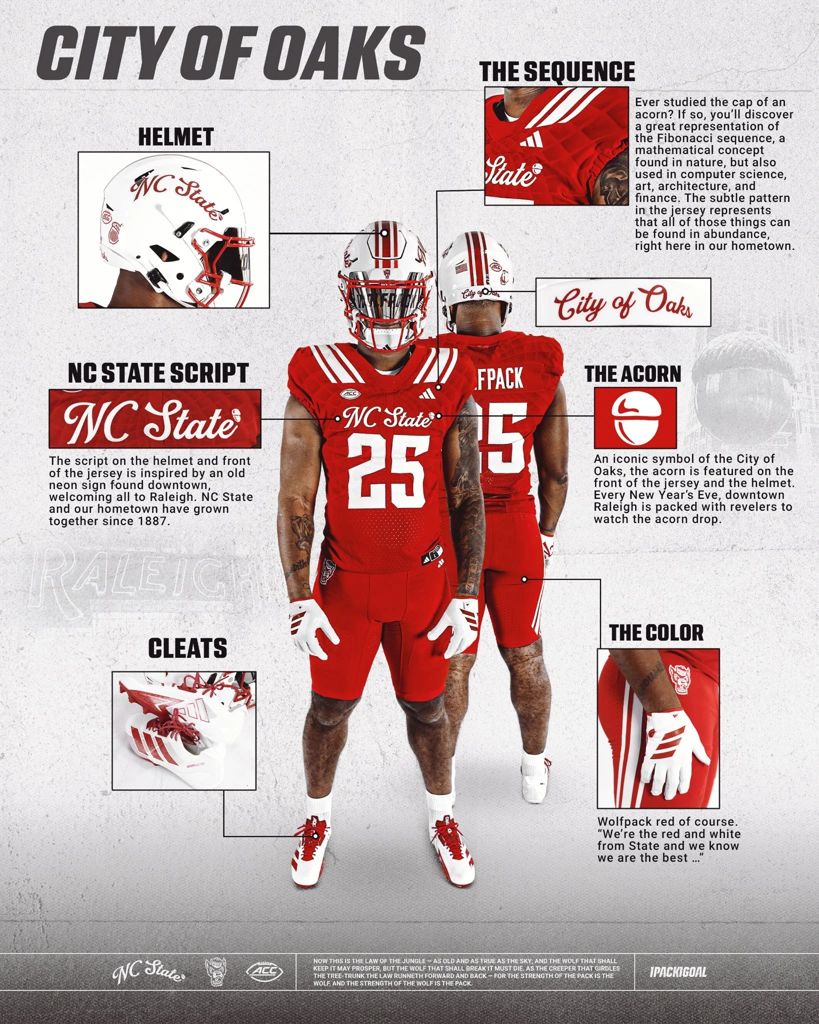
NC State has revealed a new uniform that blends tradition, local pride, and modern design in a way that perfectly represents the Wolfpack and their hometown of Raleigh, the City of Oaks.
The defining feature of the uniform is the script "NC State" showcased on both the helmet and the front of the jersey. The inspiration comes from an old neon sign once found downtown, welcoming all to Raleigh. Just as NC State and the city have grown together since 1887, this script pays homage to that shared history.
Look closely at the jersey fabric and you’ll find a subtle pattern inspired by the Fibonacci sequence, a mathematical design rooted in nature. Much like the acorn’s cap, where this sequence is famously visible, the detail reflects how art, science, architecture, and innovation thrive throughout Raleigh, making the city a true hub of culture and progress.
No symbol is more closely tied to Raleigh than the acorn. Known as the City of Oaks, the acorn is featured proudly on the front of the jersey and helmet. It’s a nod to a beloved local tradition, where every New Year’s Eve thousands gather downtown to watch the giant acorn drop at midnight.
And of course, no NC State uniform is complete without Wolfpack Red — bold, fierce, and instantly recognizable. As the school fight song reminds us: “We’re the red and white from State, and we know we are the best…”
With these thoughtful design touches, the “Script Pack” uniform is more than just a look; it’s a celebration of Raleigh, its history, and the Wolfpack’s connection to the city they proudly represent.
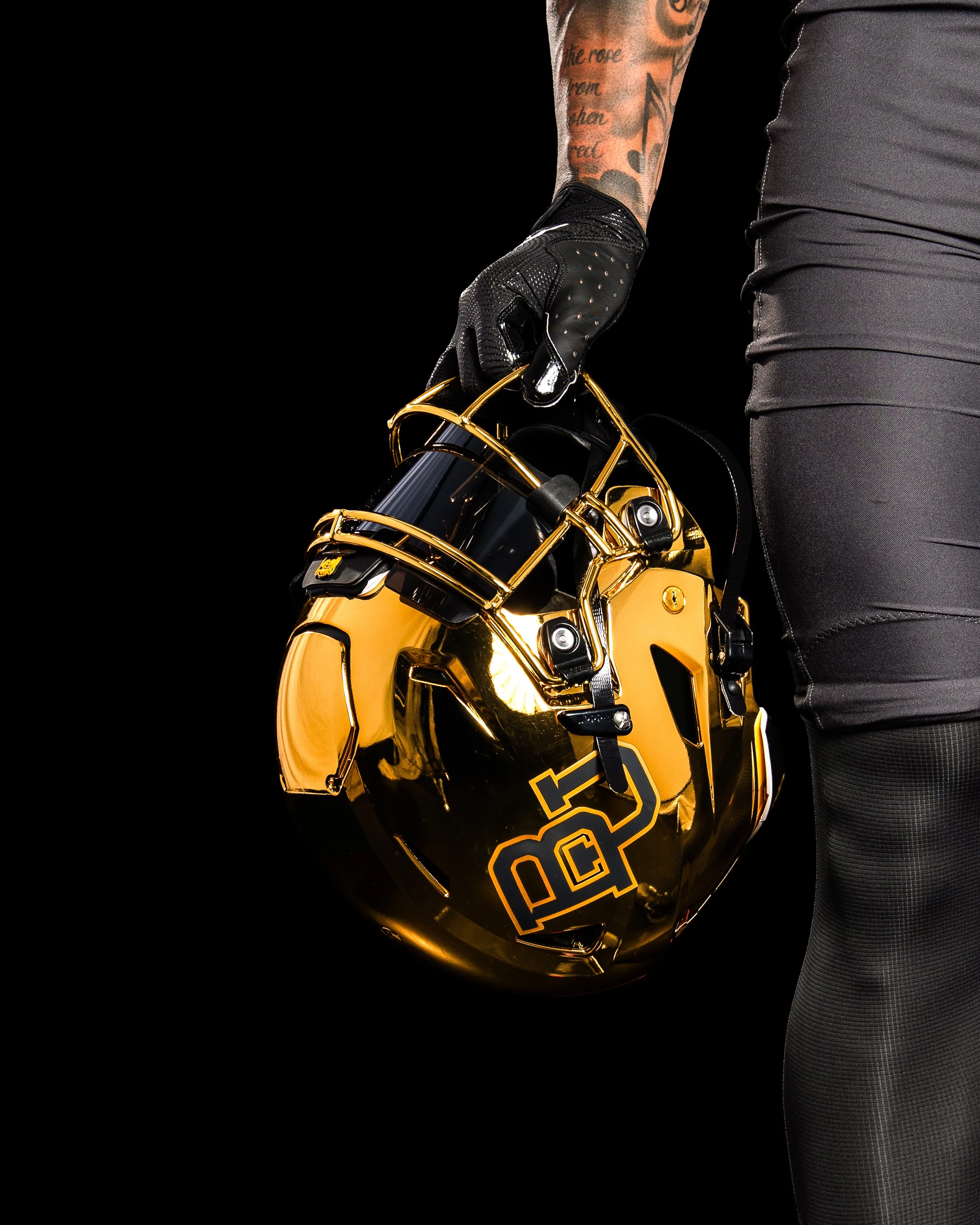
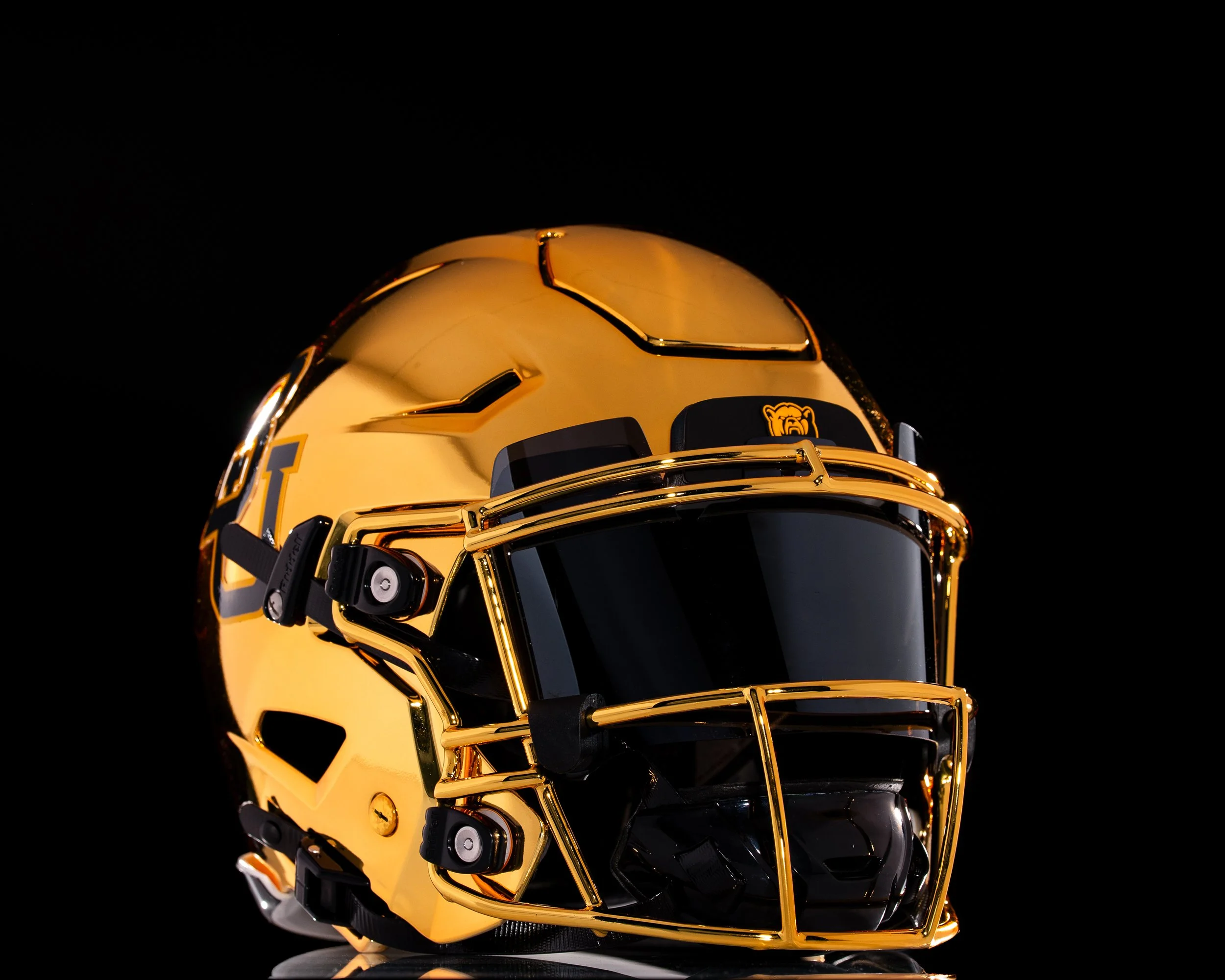
The shine is back in Waco. Baylor football is officially bringing chrome helmets back to the field for the first time since 2017, adding a bold and modern twist to its 2025 uniform lineup.
The Bears first introduced chrome lids in 2013 during one of the program’s most successful stretches in history, wearing them through the 2017 season. That era included back-to-back Big 12 championships, four straight bowl appearances, and some of the most explosive offenses college football has ever seen.
Deputy Athletics Director and COO Jovan Overshown explained that the return has been in the works for years.
“This helmet has been a secret passion project for a couple of years now. We wanted the perfect look and perfect moment — one that nods to the storied success of those who wore the chrome before us, while giving it a modern, refined edge that captures the energy and expectation of today and the future.”
The chrome helmet made its Baylor debut on October 5, 2013, in a 73–42 blowout win over West Virginia. Over the next four years, the helmet became a signature look, worn in nine games — including the unforgettable 61–58 win over TCU and the 38–27 Big 12–clinching victory against Kansas State in 2014. The final appearance of the original chrome came on November 11, 2017, against Texas Tech.
Those years are remembered not just for championships, but also for an offense that lit up the scoreboard. During Baylor’s 2013–2014 title run, the Bears wore chrome six times, piling up 167 touchdowns, 1,259 points, and more than 15,000 yards of total offense.
The 2025 reveal featured none other than Baylor legend and 2025 Athletics Hall of Fame inductee Bryce Petty.
“Look good, feel good, play good,” Petty said. “If you can’t feel good in that thing, then I don’t know what you can feel good in. We’re going to play fast, and we’re going to win a lot in these things.
For Petty, who quarterbacked those high-flying Baylor offenses, the helmet represents more than just style — it’s a symbol of Baylor football’s energy and swagger returning to the spotlight.
Head coach Dave Aranda echoed the sentiment:
“It’s really cool to be part of bringing something back that carries so much meaning and reflects such an energized period in Baylor football. Seeing our student-athletes’ excitement, former players and our fans, it further fuels everything we’re about.”
After nearly eight seasons away, Baylor’s chrome helmets are back brighter, bolder, and ready to bring a new shine to the Bears’ future.
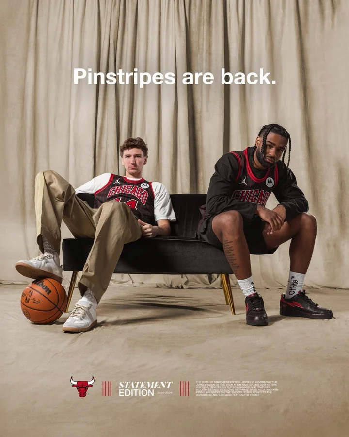
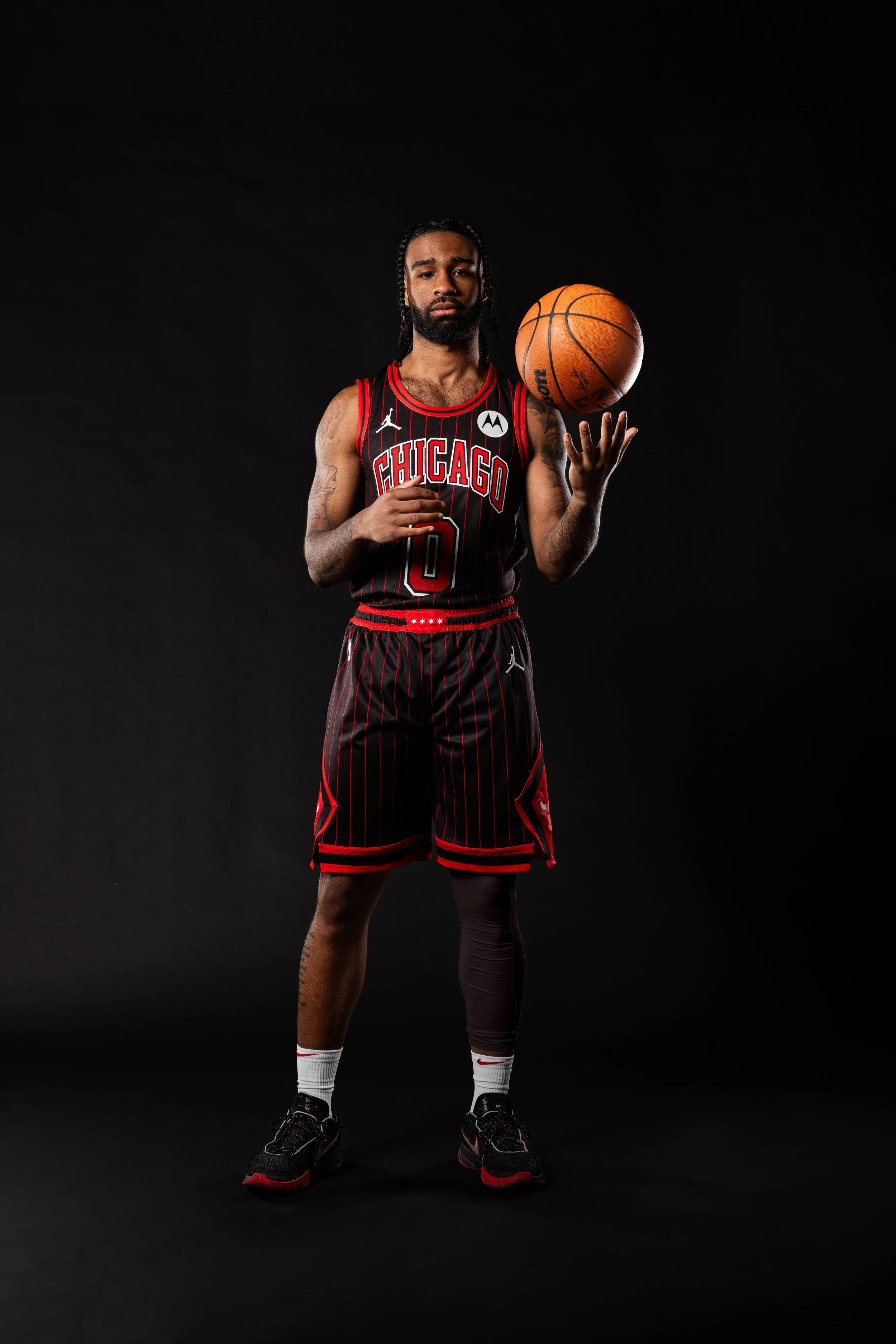
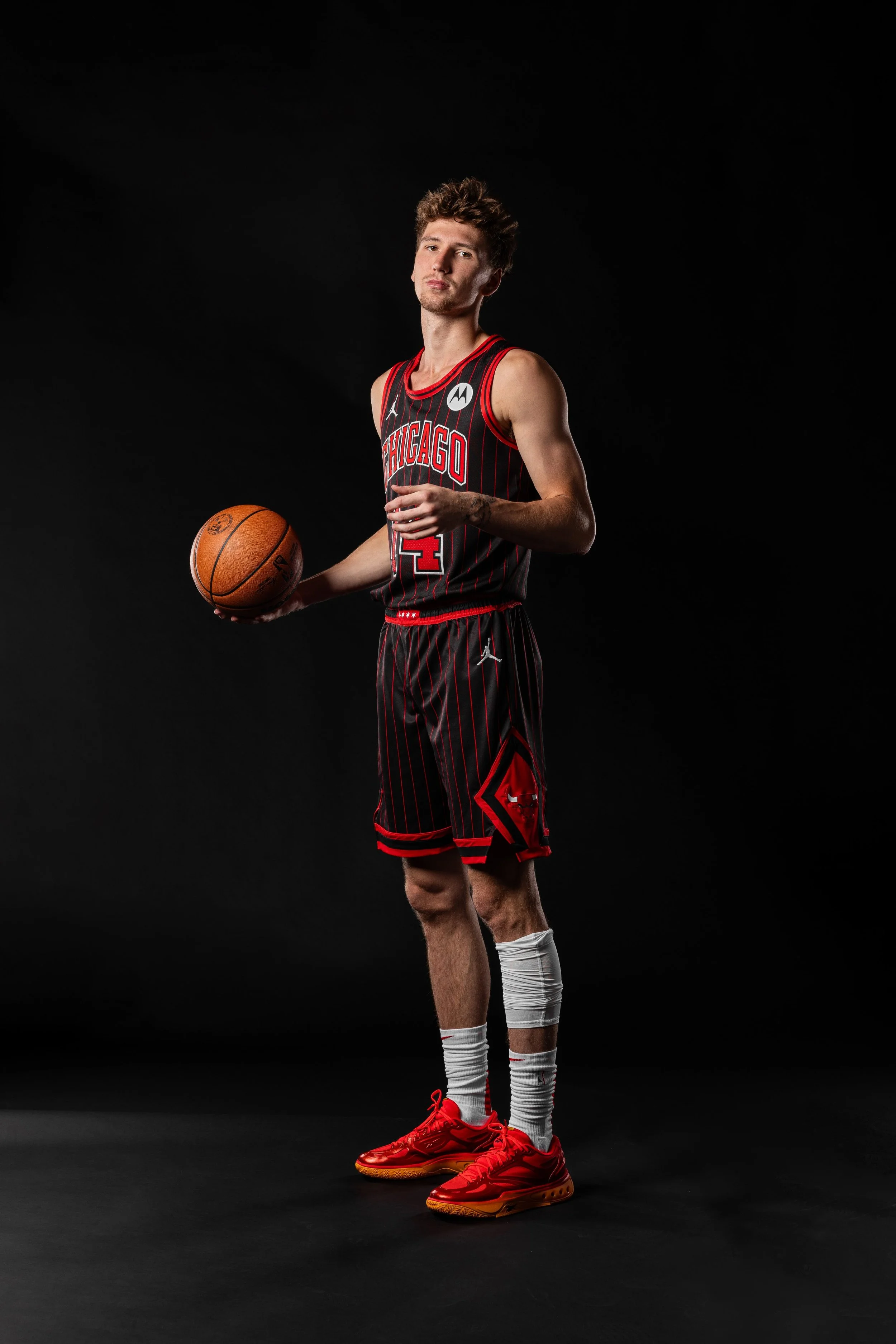
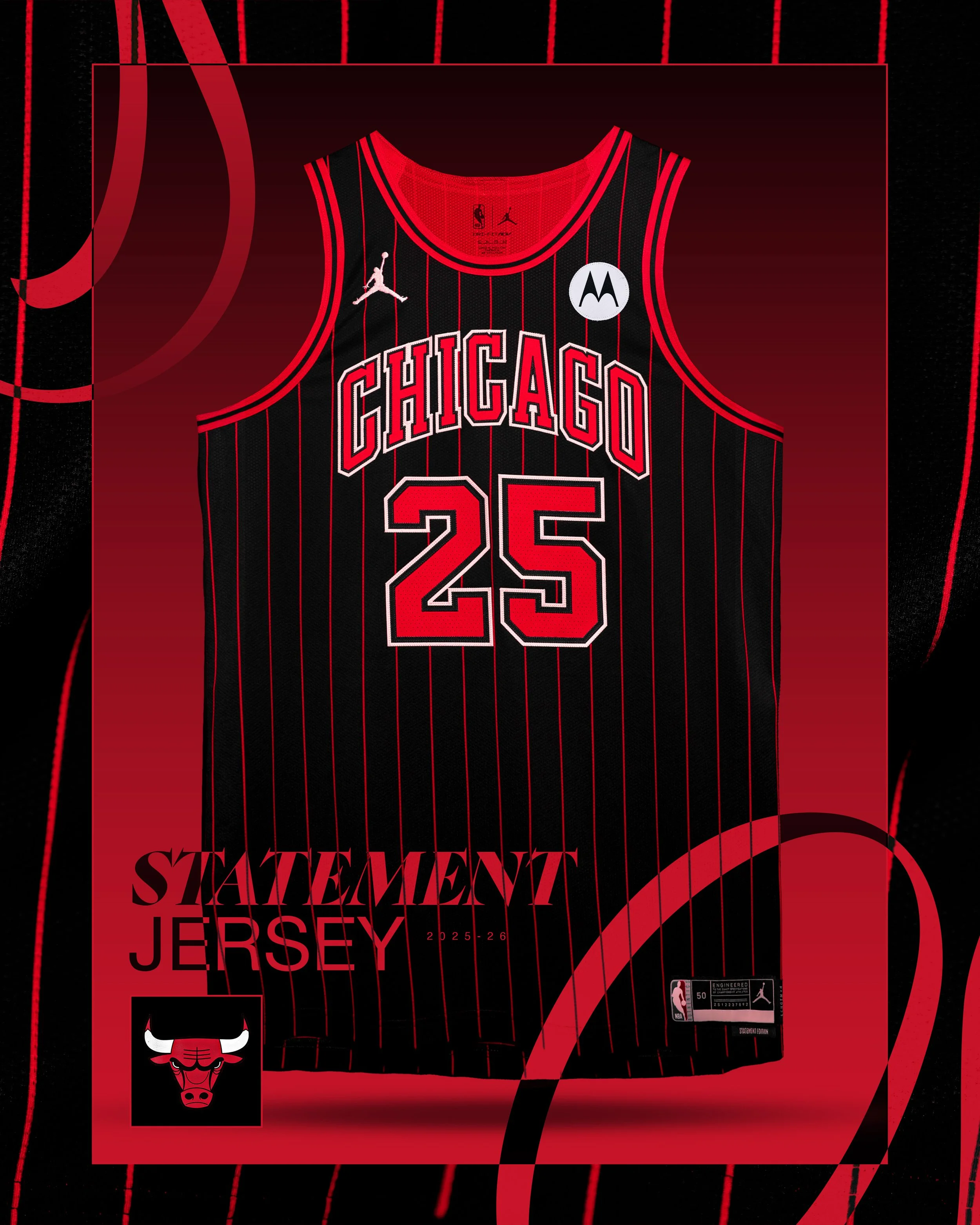
There’s never a wrong time for the Chicago Bulls to dip into the Michael Jordan era, and they just did it again, big time.
The Bulls officially revealed their 2025-26 Statement Edition uniforms, a black-and-red pinstriped look that instantly calls back to their legendary dominance in the '90s. First introduced during the 1995-96 season, a year the Bulls went 72-10 and won it all, this iconic uniform design hasn’t hit the court since the 2012-13 season. Now, it’s back and reimagined for a new generation.
Chicago turned to a fitting face for the reveal: Dennis Rodman, who rocked the pinstripes alongside MJ during back-to-back championship runs. In a hype video with current Bulls Coby White and rookie Matas Buzelis, Rodman got his hands on the new look and summed it up perfectly:
“These are nice. I remember when we first introduced this. It was legendary, man. These jerseys right here are legendary. It's not even a throwback — it’s brand-new for the new generation. This is gonna be really cool for Chicago … this brings back memories.”
The return of the pinstripes isn’t just a visual win, it’s a statement of legacy. From Jordan’s mid-air moments to the grit of the '96 squad, this design is soaked in Bulls history. It’s also a continuation of the black-and-red pinstripe takeover in Chicago sports, the White Sox unveiled a similar City Connect look earlier this year.