Indiana Pacers Bring Back ABA-Era Royal Blue With Classic Edition Uniform

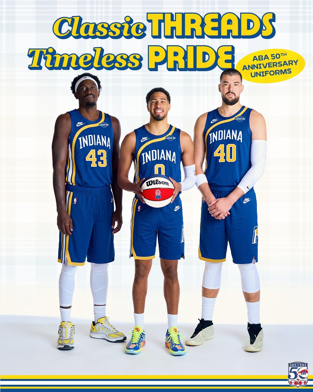
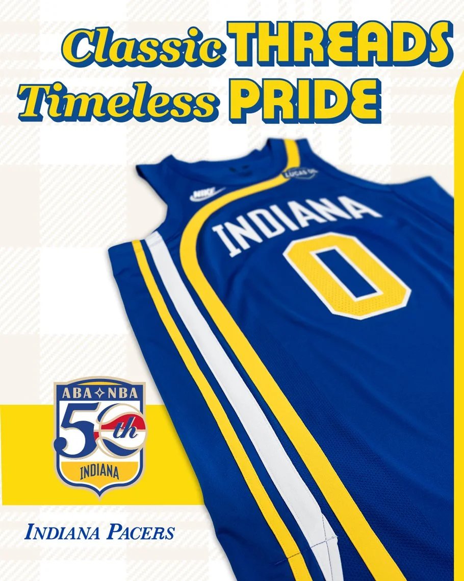
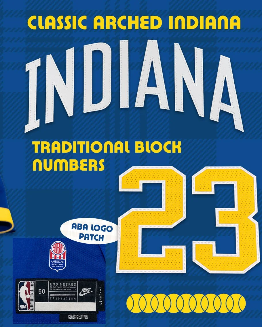
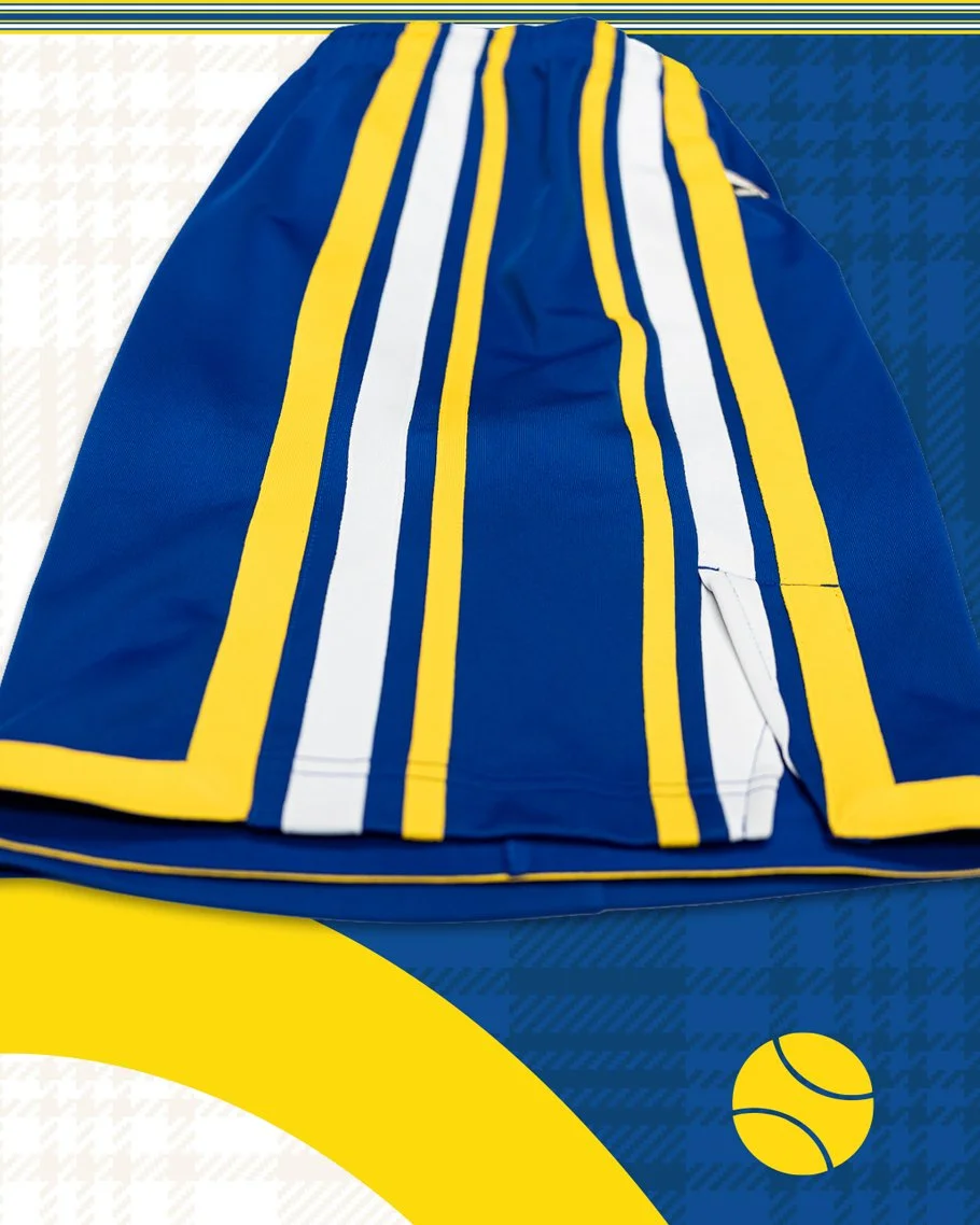
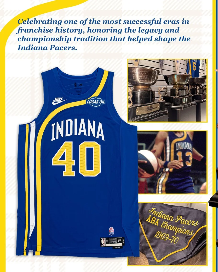
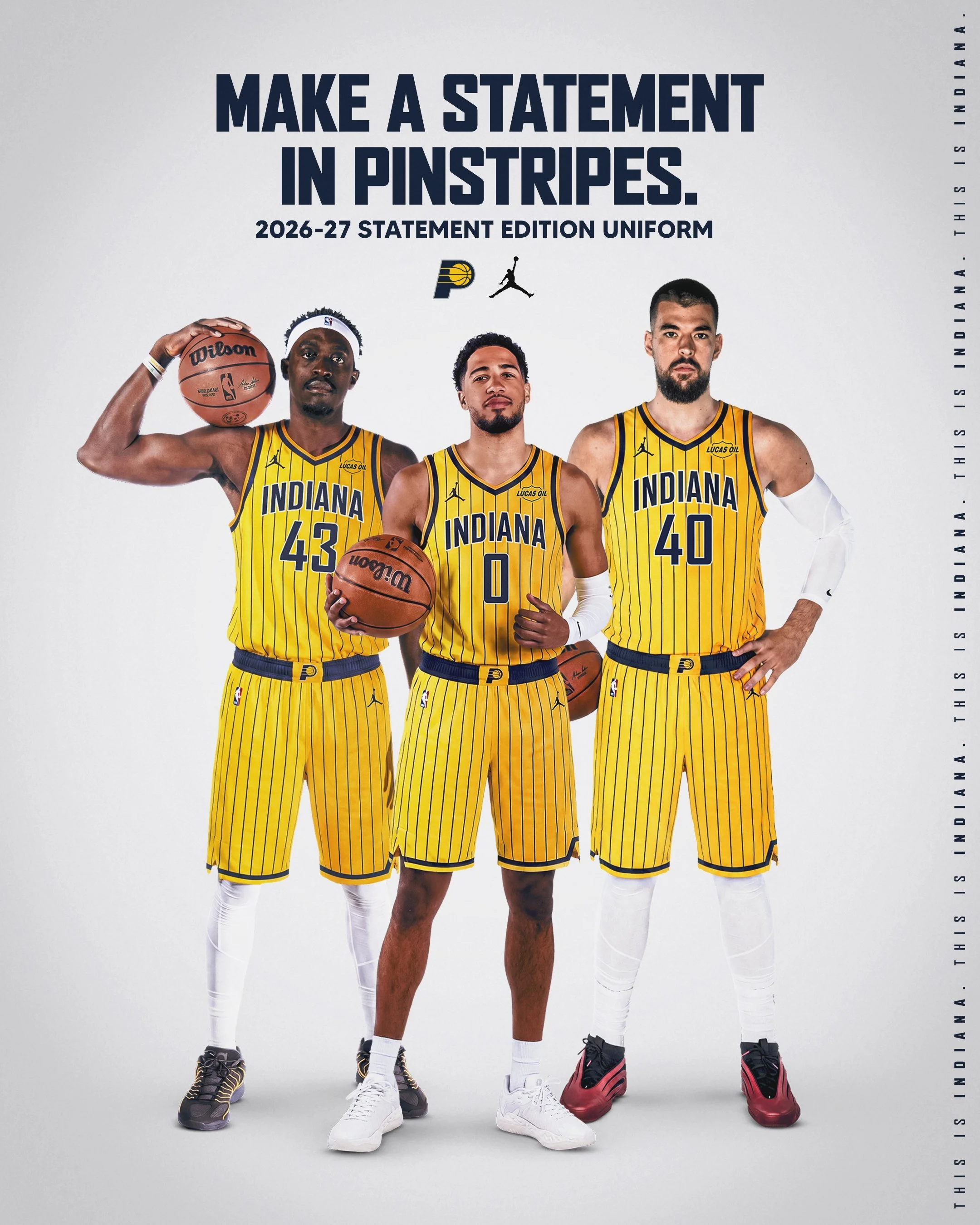
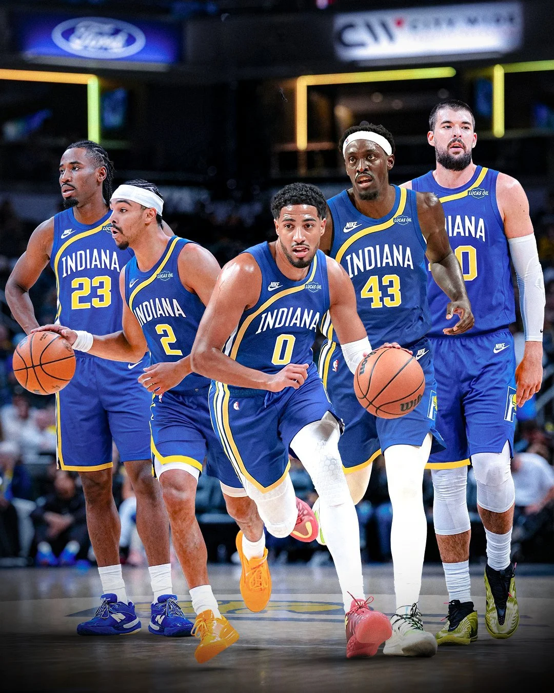
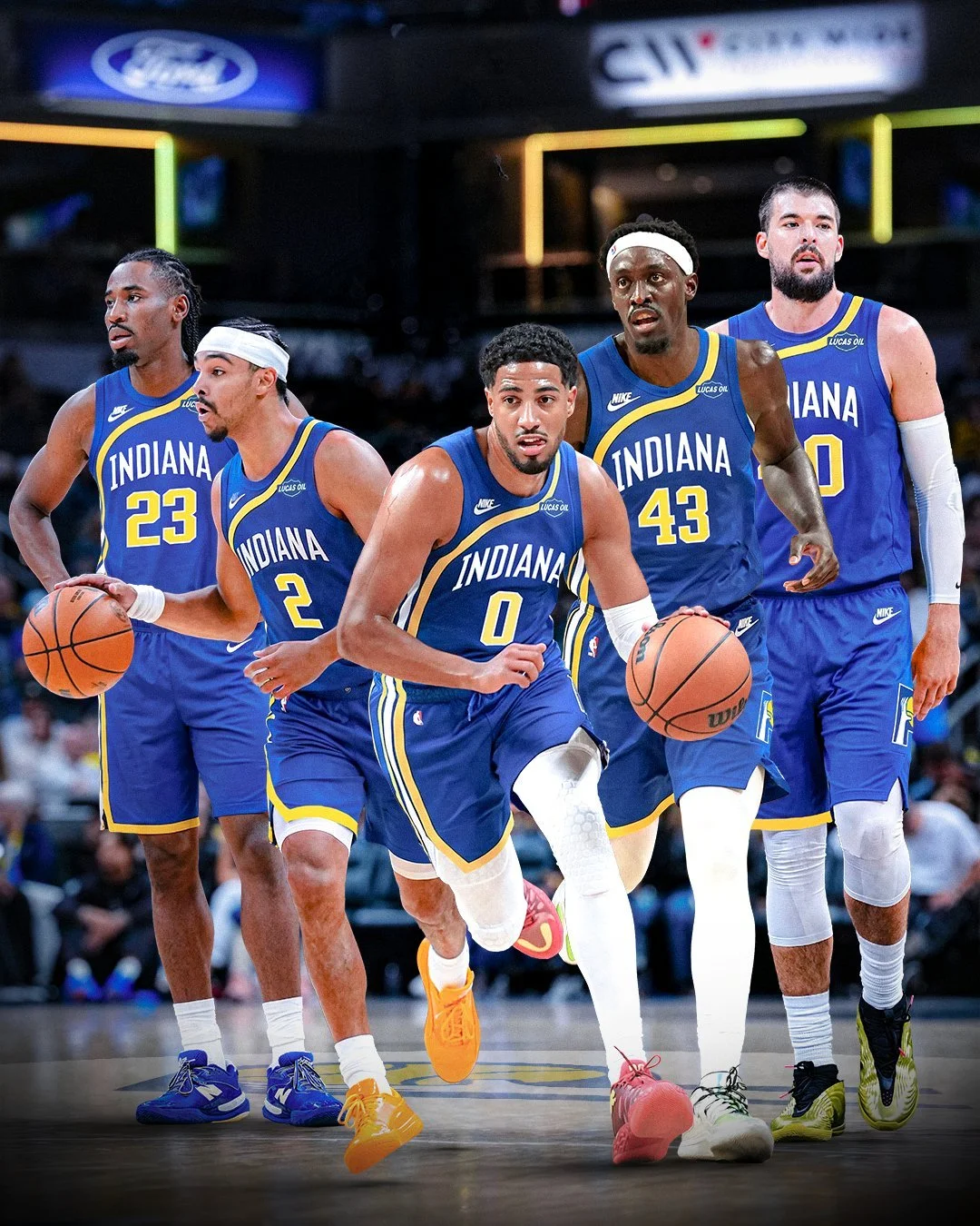
The Indiana Pacers are revisiting one of the defining eras in franchise history with their ABA 50th Anniversary Classic Edition uniform. Inspired by the team’s 1971–74 uniforms, the look brings the royal blue of Indiana’s ABA years back into the spotlight for a season celebrating 50 years since the ABA-NBA merger.

Unveiled at Gainbridge Fieldhouse, the Classic Edition connects today’s Pacers to the team that helped establish Indiana’s place in professional basketball.

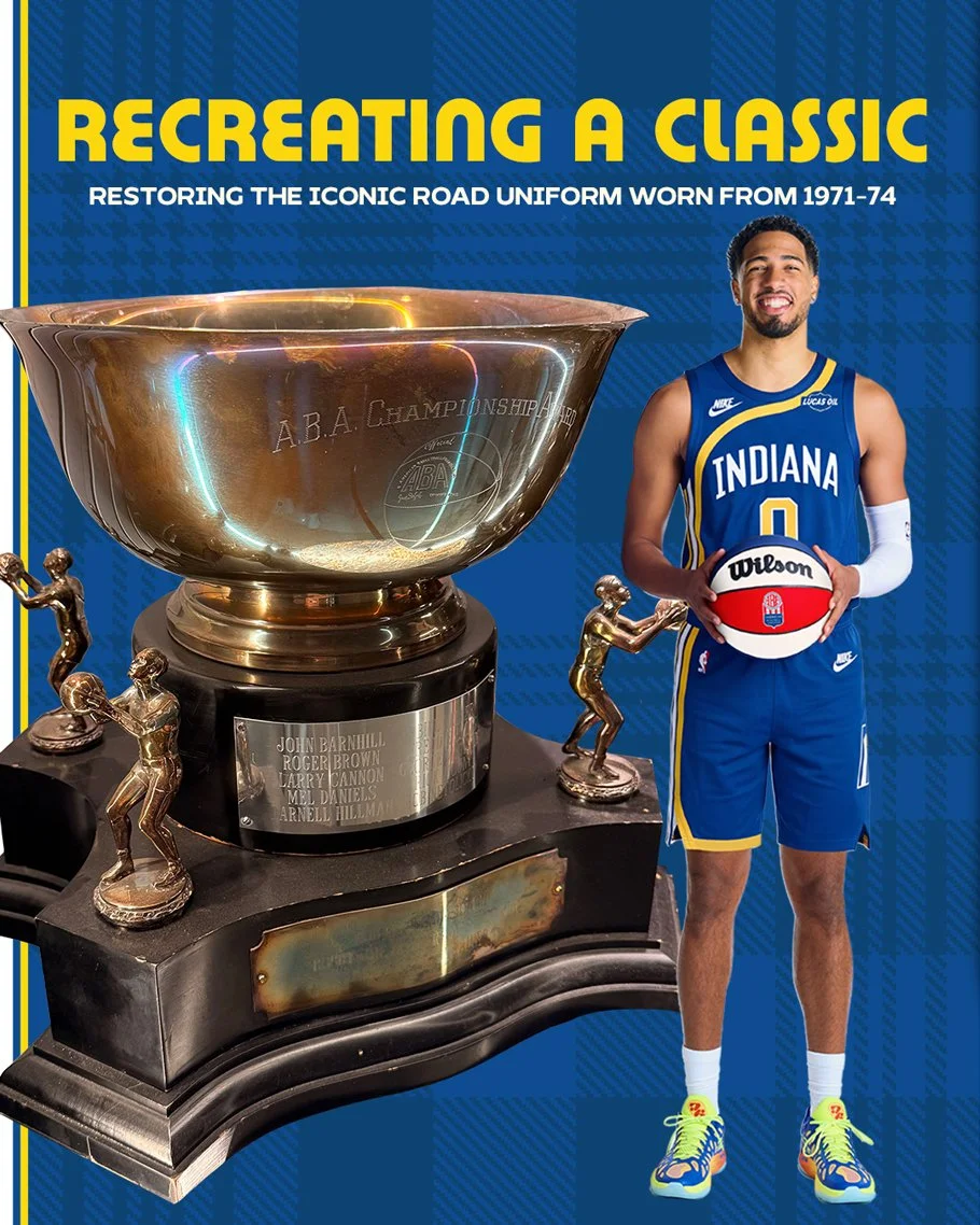
Royal blue anchors the uniform, drawing directly from the Pacers’ identity during their ABA run. By revisiting the 1971–74 design, Indiana is celebrating a period that remains central to the franchise’s history.

That inspiration carries championship significance. Under Bobby “Slick” Leonard, the Pacers won three ABA championships and three ABA division titles, building a legacy that preceded their move to the NBA in 1976.

The Classic Edition gives that history a visible place in the current season, allowing a new generation of players to wear a look connected to the franchise’s early success.

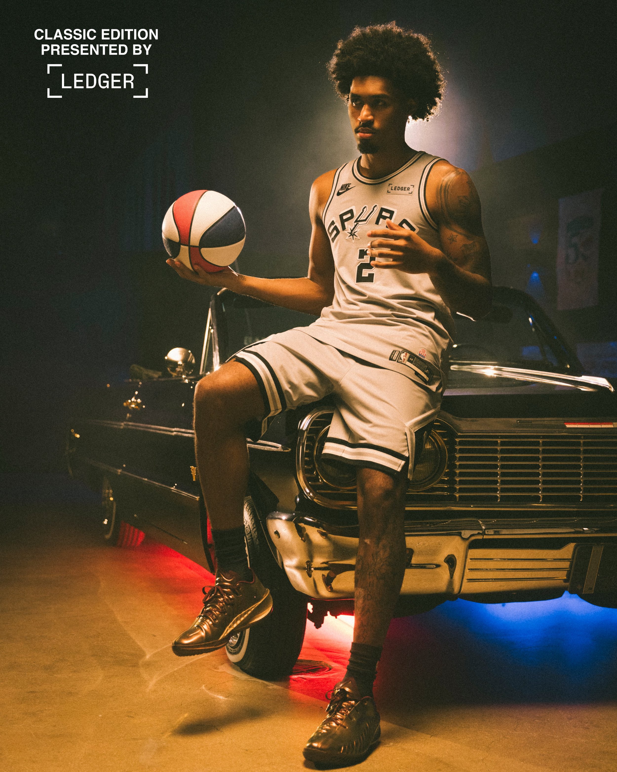
Indiana joins the Denver Nuggets, Brooklyn Nets and San Antonio Spurs in wearing ABA-inspired Classic Edition uniforms this season. The four franchises entered the NBA through the 1976 merger, and their anniversary uniforms recognize the identities they built before making that transition.

For the Pacers, returning to ABA-era royal blue offers a direct connection to their beginnings and the championship teams that helped define the organization.

Shop Pacers Gear Here

See What Else Is New

Related Articles


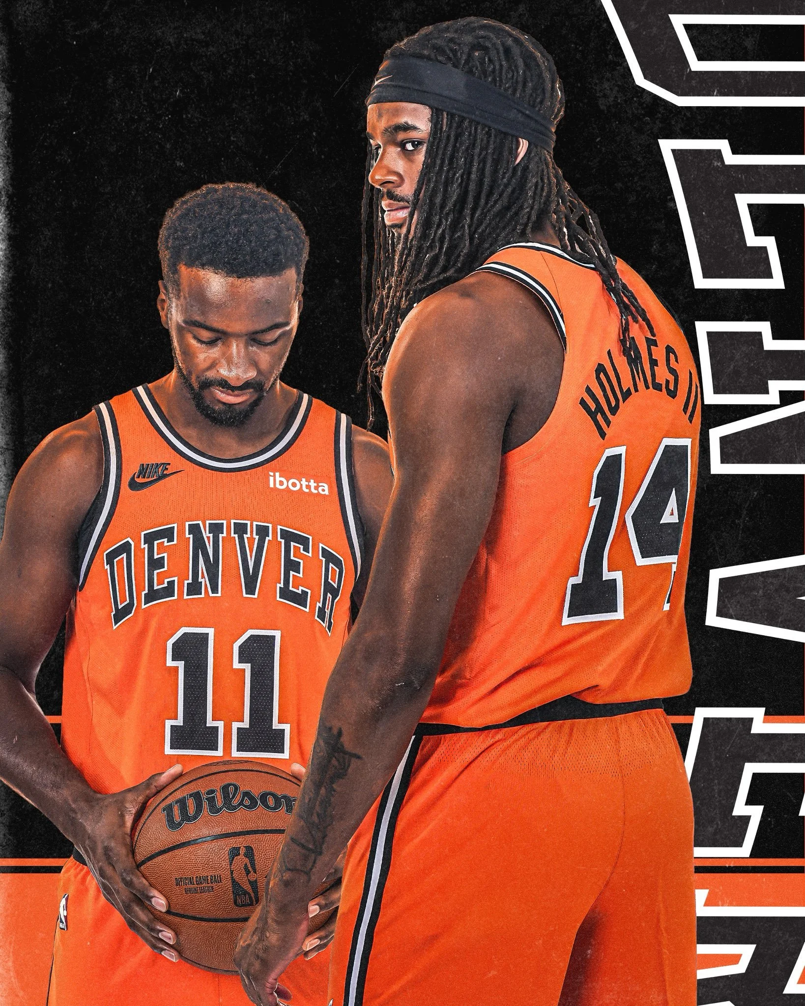
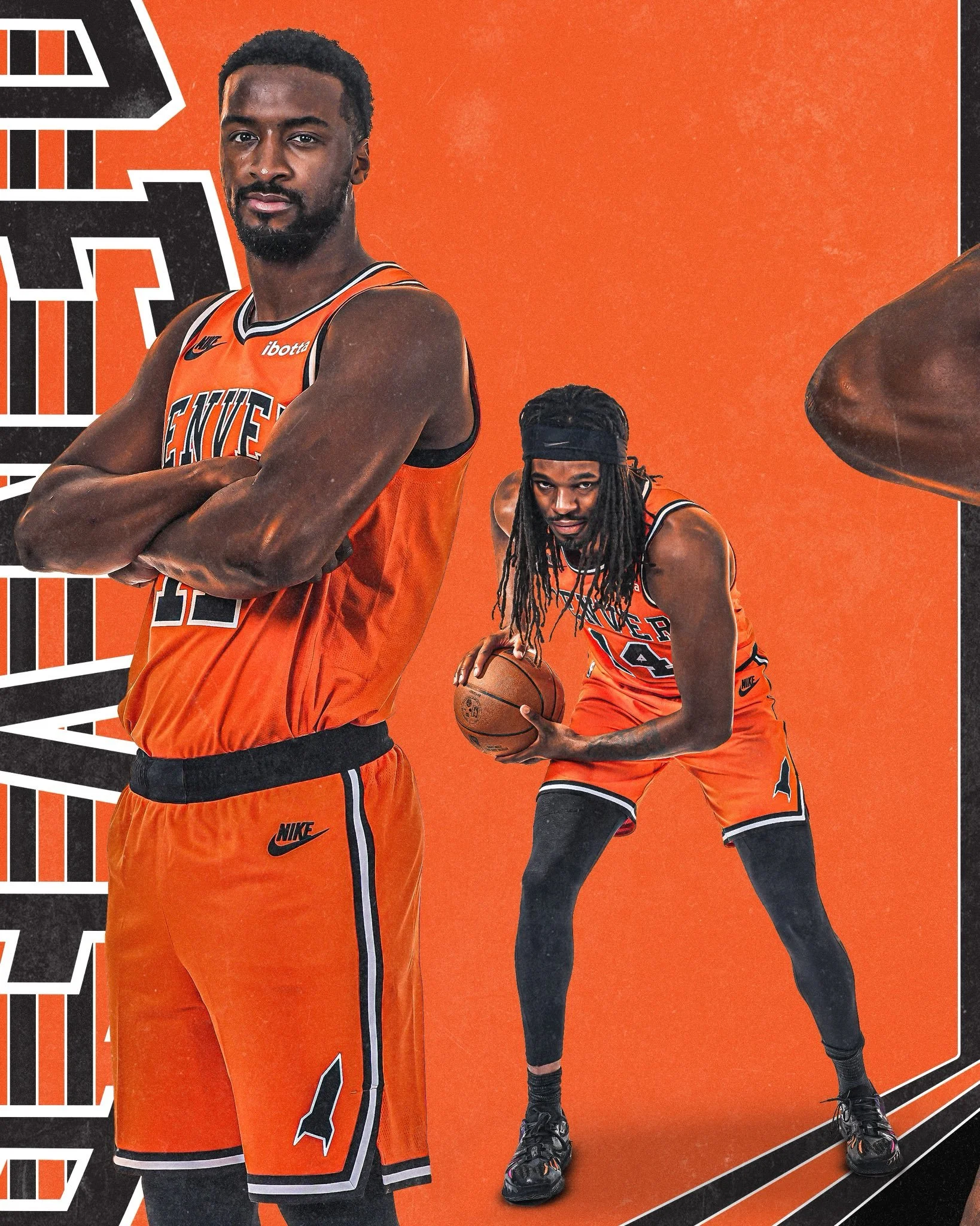
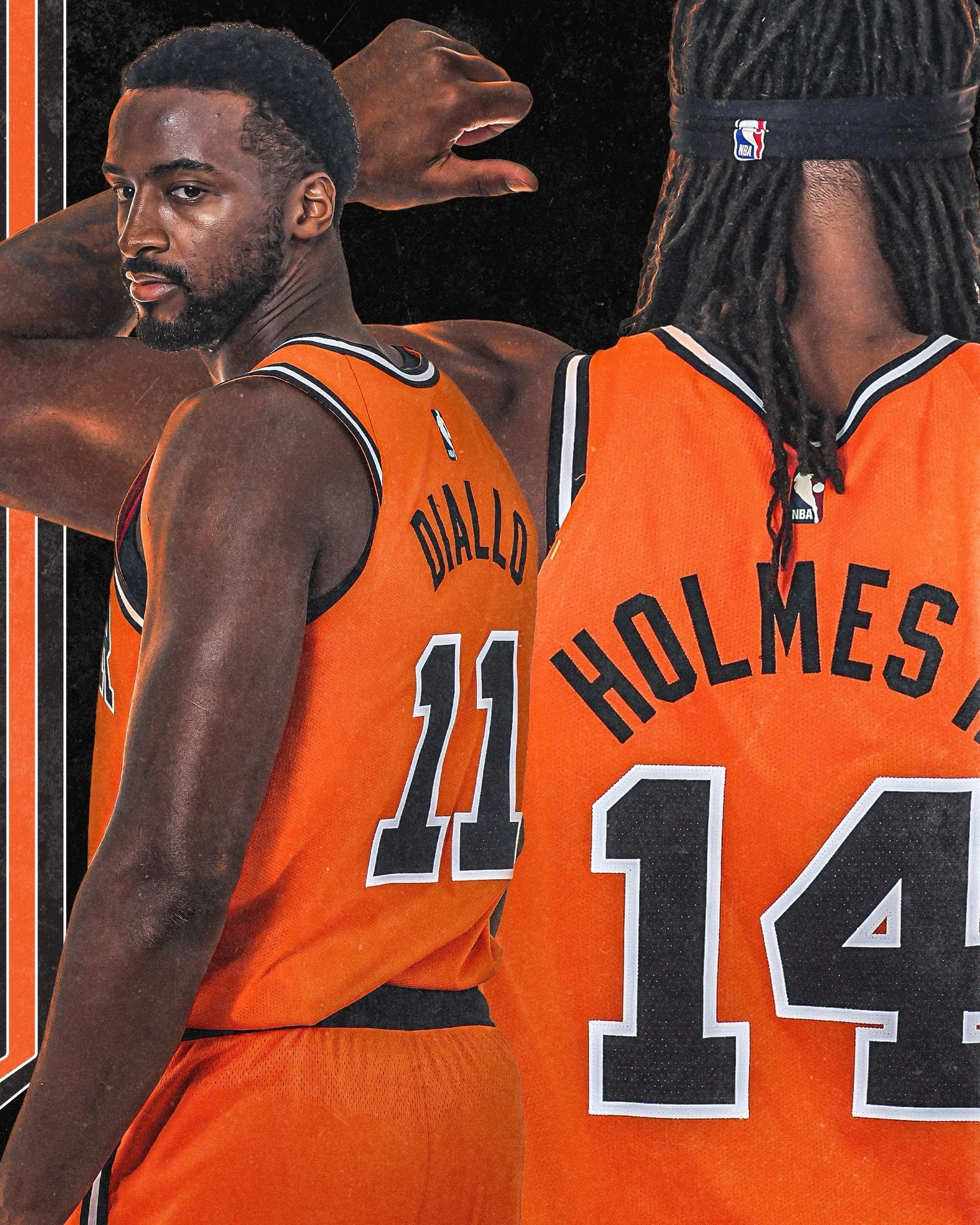
Denver Nuggets Bring Back Rockets Orange With ABA Classic Edition Uniform

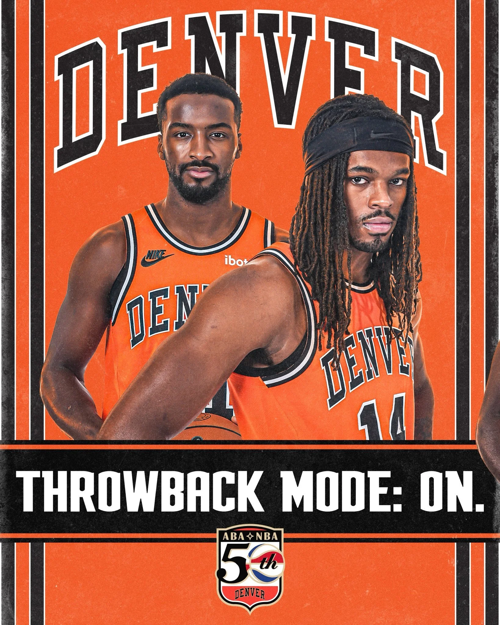
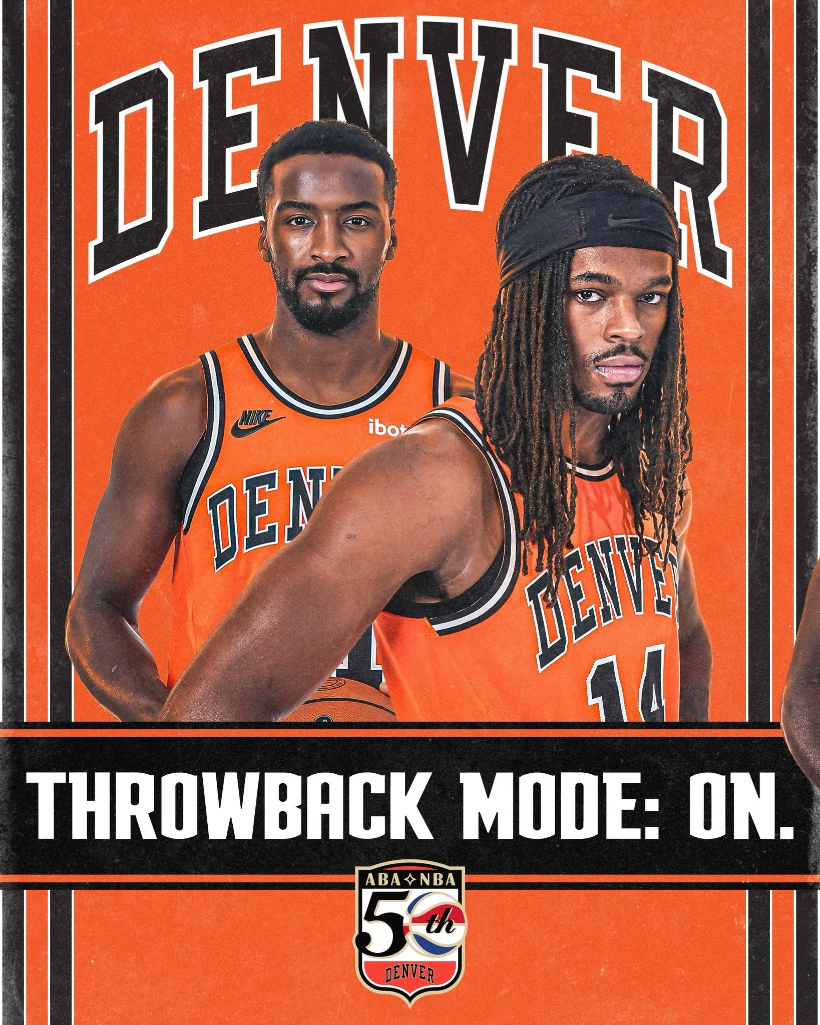
The Denver Nuggets are reaching back to their Denver Rockets roots for their ABA 50th Anniversary Classic Edition uniform. Inspired by the franchise’s orange road uniforms from its ABA days, the throwback brings an early chapter of Denver basketball back to the floor.
The look is part of a league-wide tribute involving all four franchises that joined the NBA through the 1976 ABA-NBA merger. Denver, the Indiana Pacers, Brooklyn Nets and San Antonio Spurs will each wear ABA-inspired Classic Edition uniforms this season.
Denver’s Classic Edition takes its inspiration from the Rockets’ orange road look, giving the anniversary uniform a bold foundation tied directly to the franchise’s past.

Across the chest, arched “DENVER” lettering outlined in white stays true to the team’s 1970s ABA uniform. The design also features the original Rockets logo, bringing back a piece of the franchise’s identity from before it became the Nuggets.

The choice to revisit the orange road uniform gives this throwback a distinct place in Denver’s uniform lineup. From the color to the lettering and vintage logo, the design puts the Rockets era at the center of the celebration.

Before Denver became known as the Nuggets, the franchise competed in the ABA as the Rockets. In 1974, ahead of a potential move into the NBA, the team changed its name to avoid a conflict with the Houston Rockets.

Denver went on to reach the ABA Finals in the league’s final season before joining the NBA in 1976. This Classic Edition connects today’s Nuggets to that earlier era, recognizing the identity and history that helped lay the foundation for the franchise.

The Nuggets will wear their ABA 50th Anniversary Classic Edition uniforms nine times this season, including seven games at home.

Shop Nuggets Gear Here


See What Else Is New

Related Articles


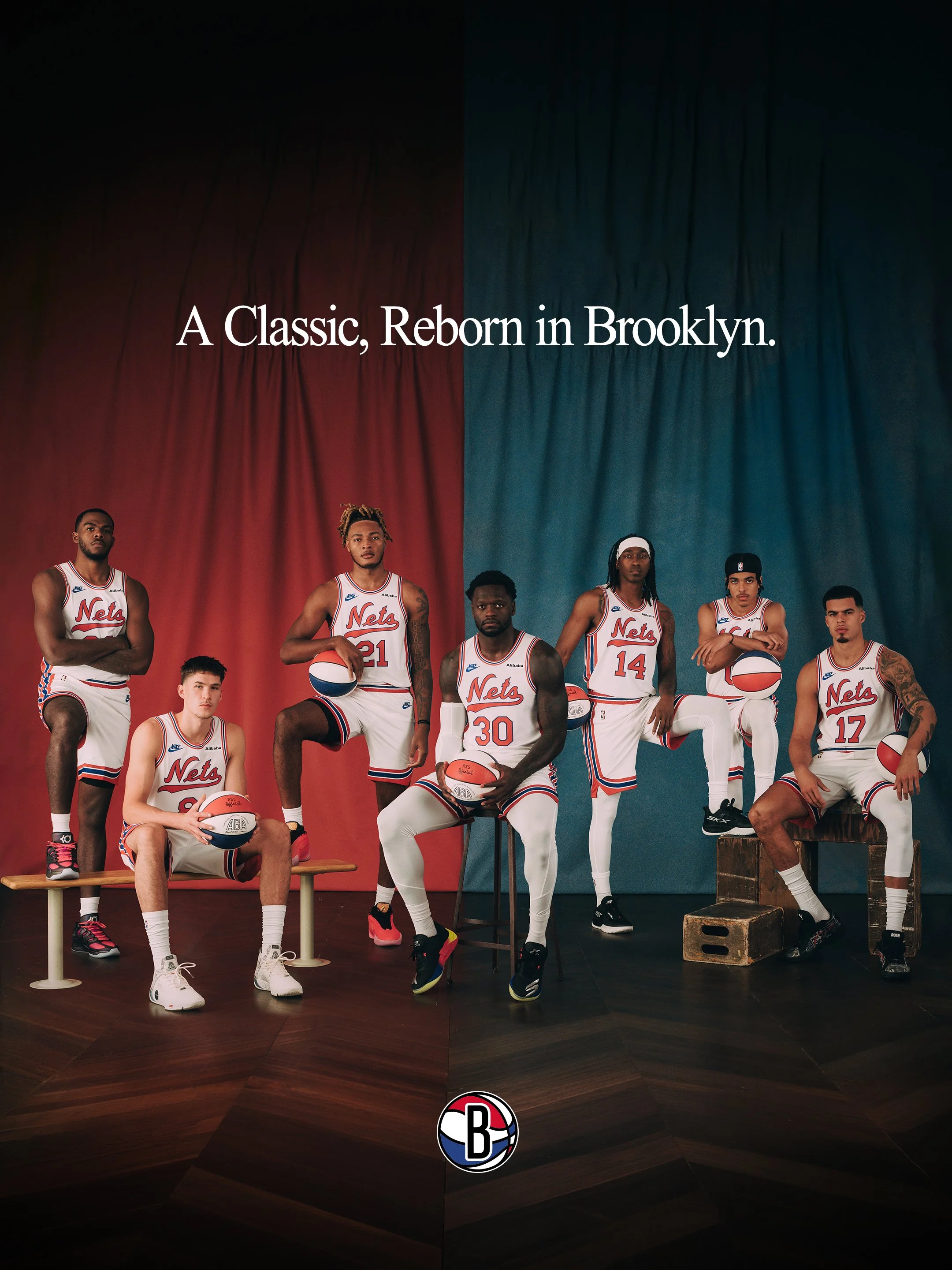
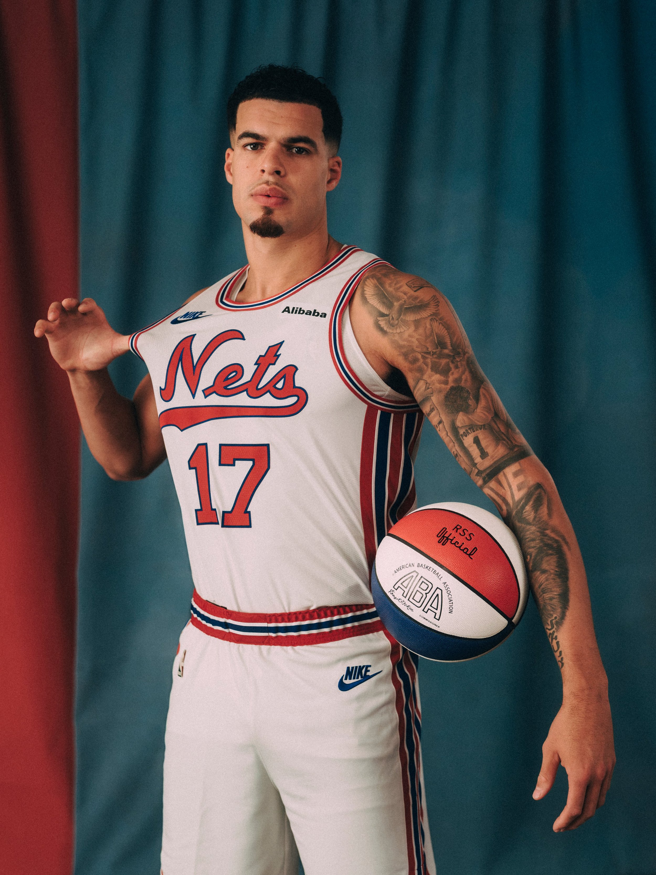
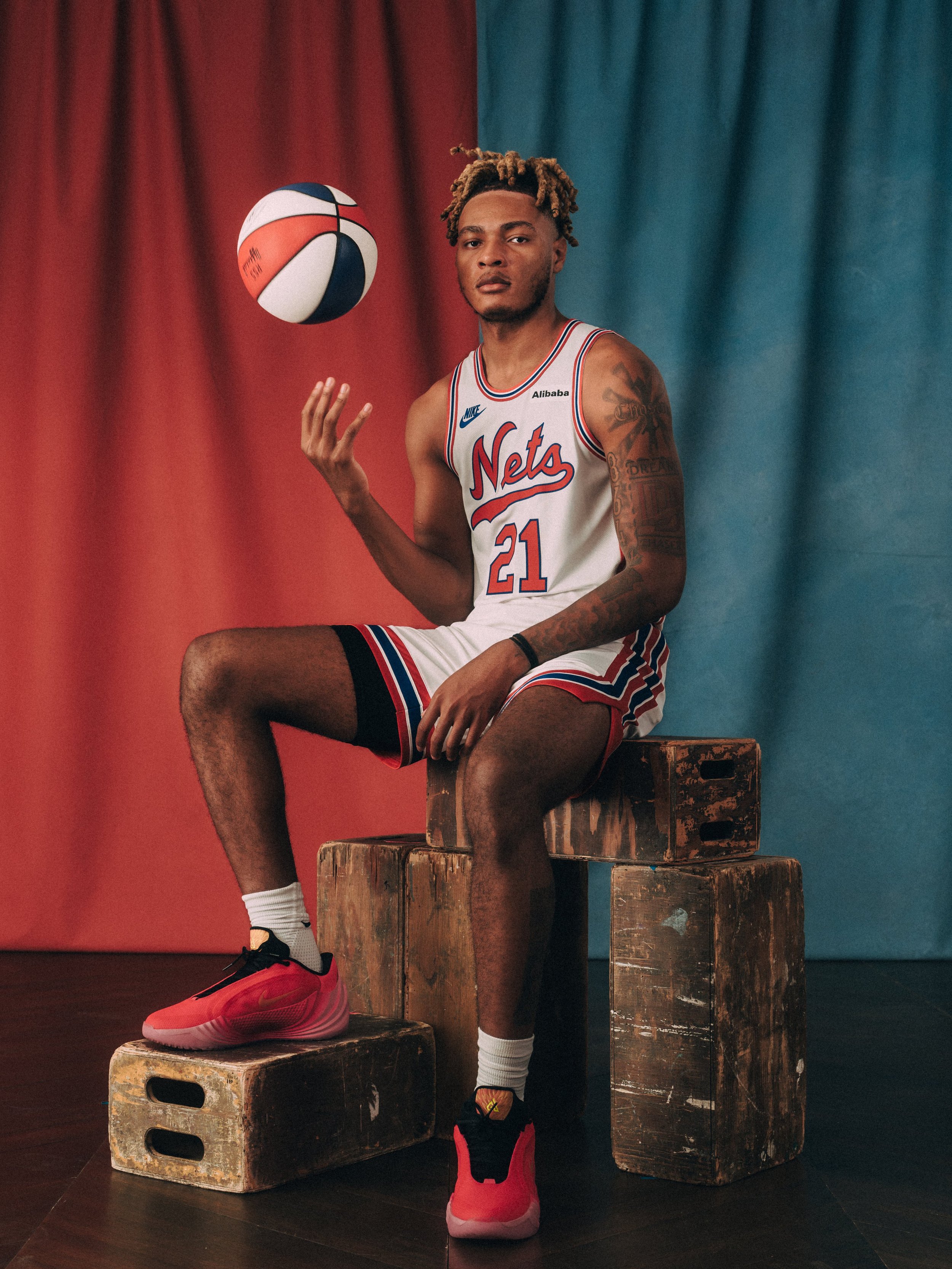
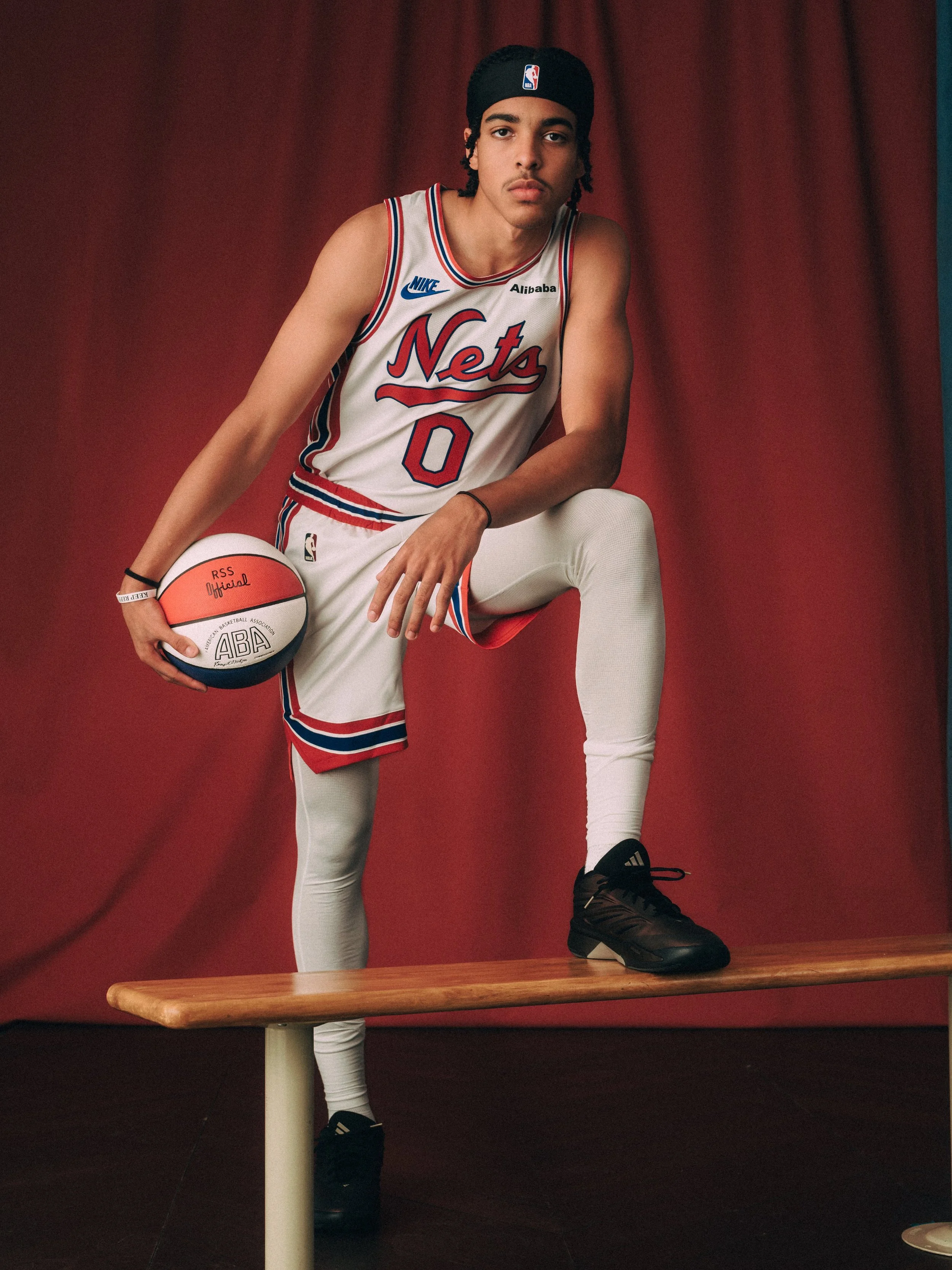
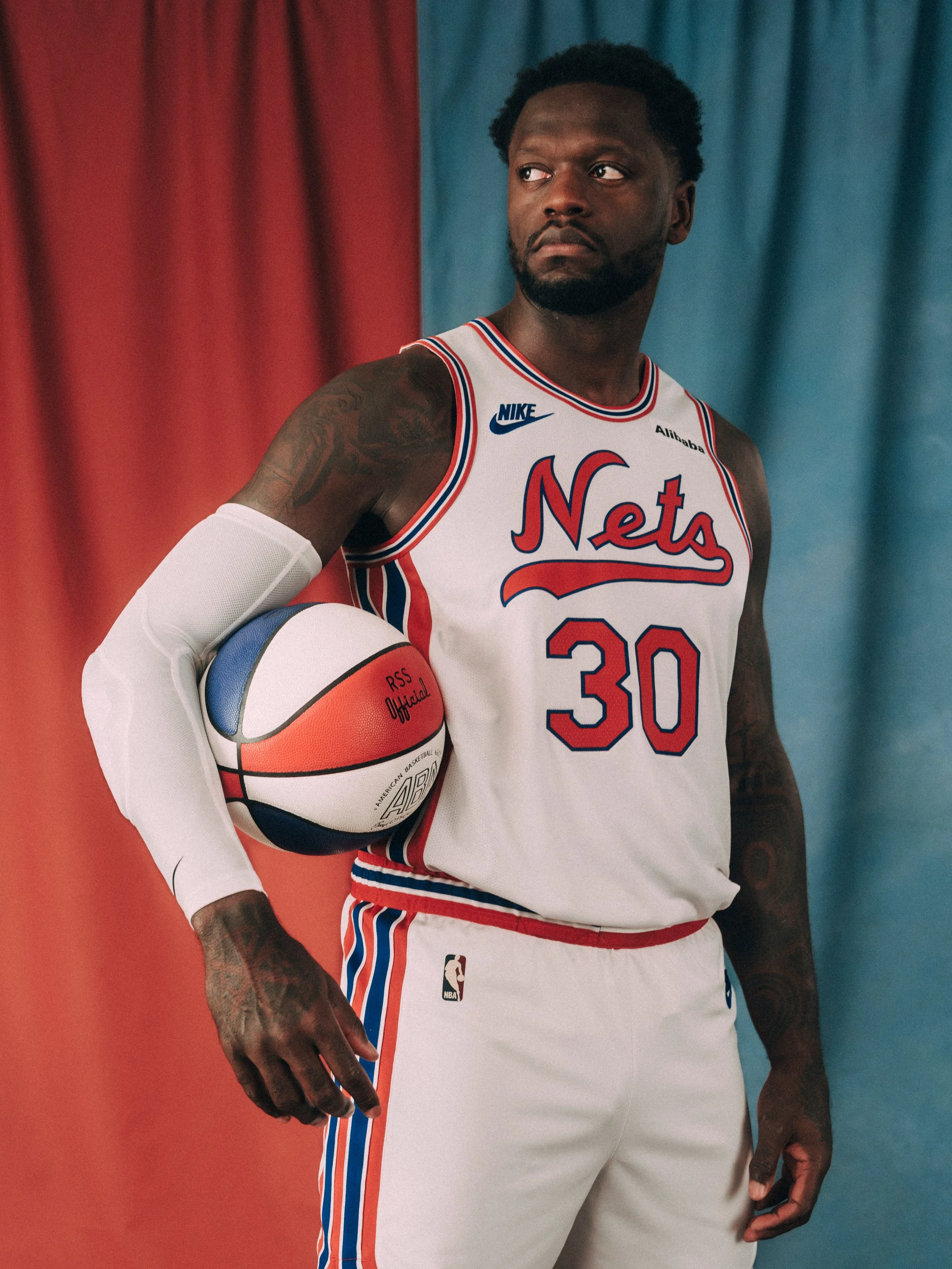
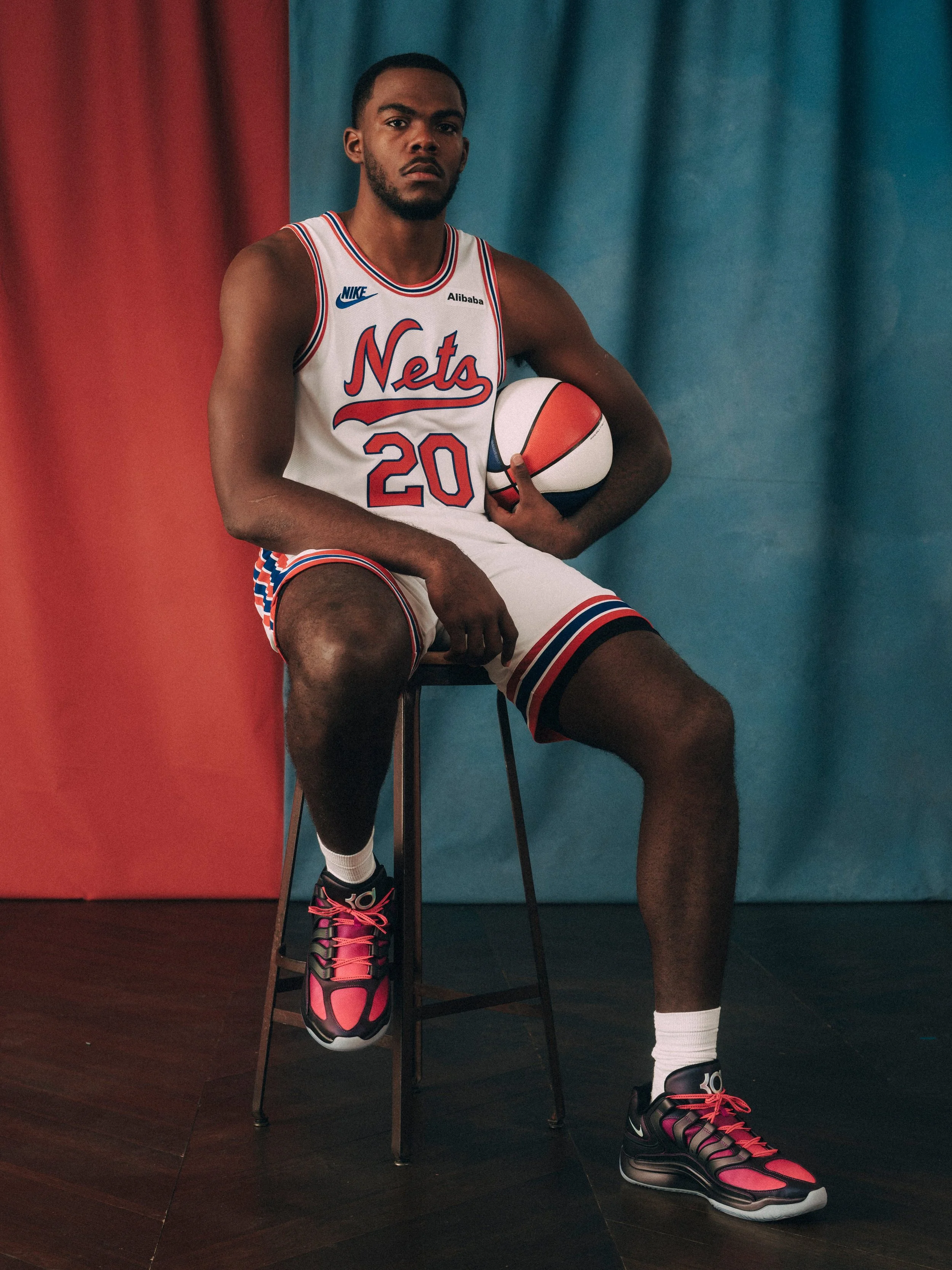
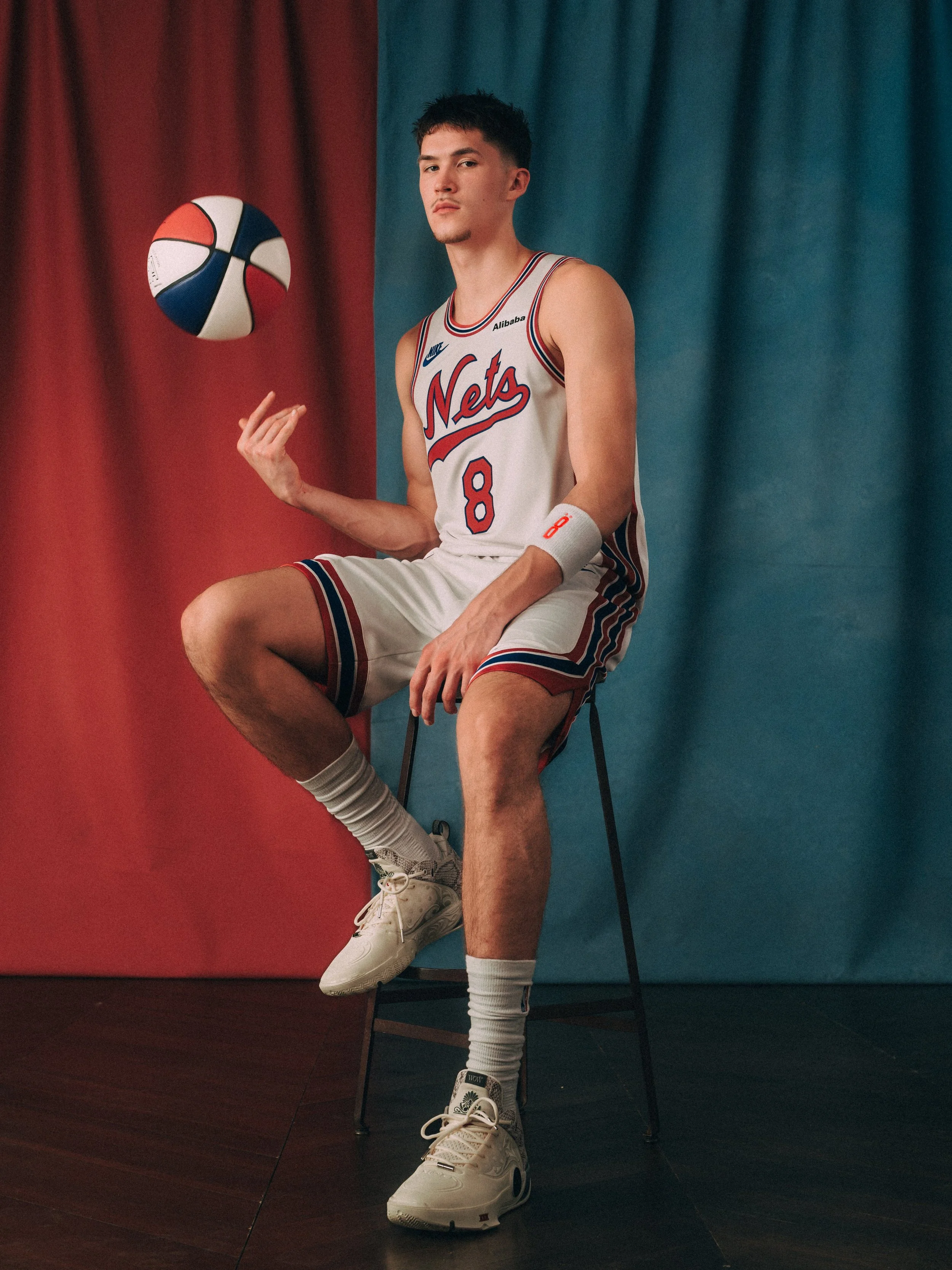
Brooklyn Nets Honor ABA Roots With 60th Season Classic Edition Uniform

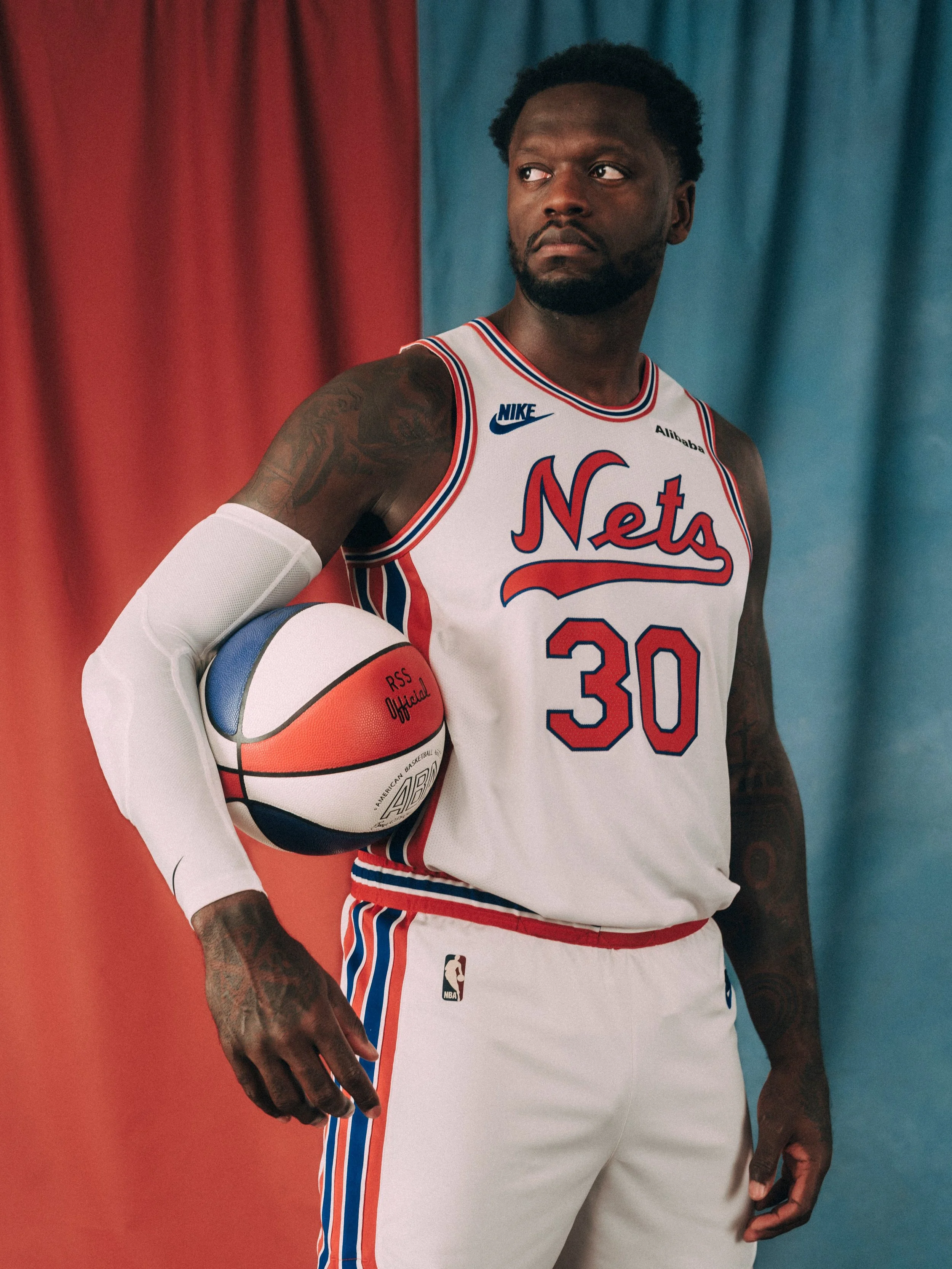
The Brooklyn Nets are bringing six decades of franchise history to the floor with their 2026–27 Classic Edition uniform. Connecting the team’s ABA beginnings with its identity in Brooklyn, the pairing celebrates the Nets’ 60th season and the 50th anniversary of the ABA-NBA merger.

The threads will debut at Barclays Center on October 21, when Brooklyn hosts the Charlotte Hornets for its home opener.

The Classic Edition uniform revisits the red, white and blue palette of the Nets’ early years, drawing its colors and design from the franchise’s original uniforms. The look brings that identity into a new era while honoring a chapter that helped establish the Nets’ place in professional basketball.

As one of four franchises that joined the NBA through the 1976 ABA-NBA merger, the Nets have a history that stretches across both leagues. This season’s Classic Edition gives that connection a visible presence on the court, bringing the franchise’s earliest visual identity back into the spotlight for its milestone anniversary.

The anniversary celebration will continue throughout the season with six Eras Nights, featuring entertainment, alumni appearances, activations and giveaways inspired by defining chapters of Nets basketball.

With an ABA-inspired uniform that recognizes the players and identities of every era, Brooklyn’s anniversary look gives the franchise’s history a place in the game itself. The 60th season begins with a visual connection between where the Nets started and the next chapter taking shape in Brooklyn.

Shop Nets Gear Here


See What Else Is New

Related Articles


2026 WEEK 6 UNISWAG COUNTDOWN

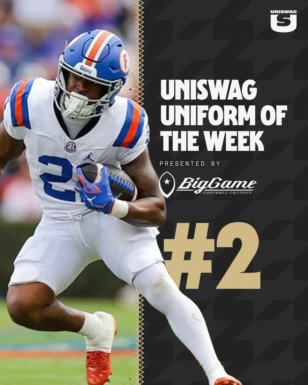
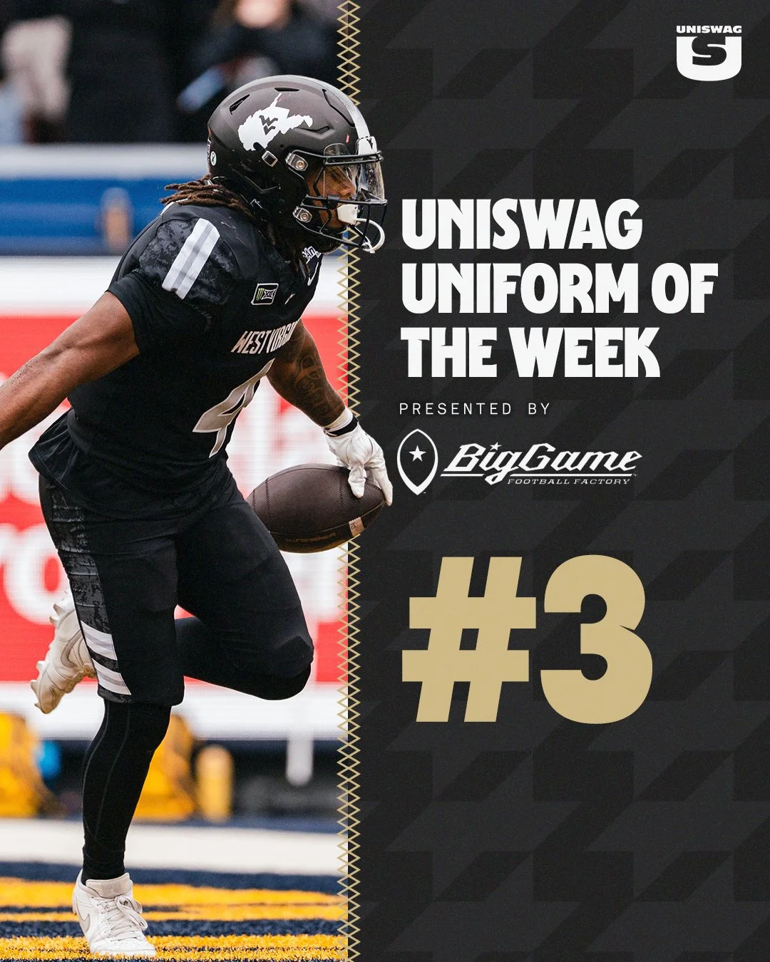
From Utah’s icy hand-painted helmets to Florida’s Spurrier-era throwbacks and West Virginia’s Coal Rush uniforms, Week 6 brought craftsmanship, history and hometown pride to the field. Frosted script, vintage details and coal-inspired textures gave each look a story worth exploring.

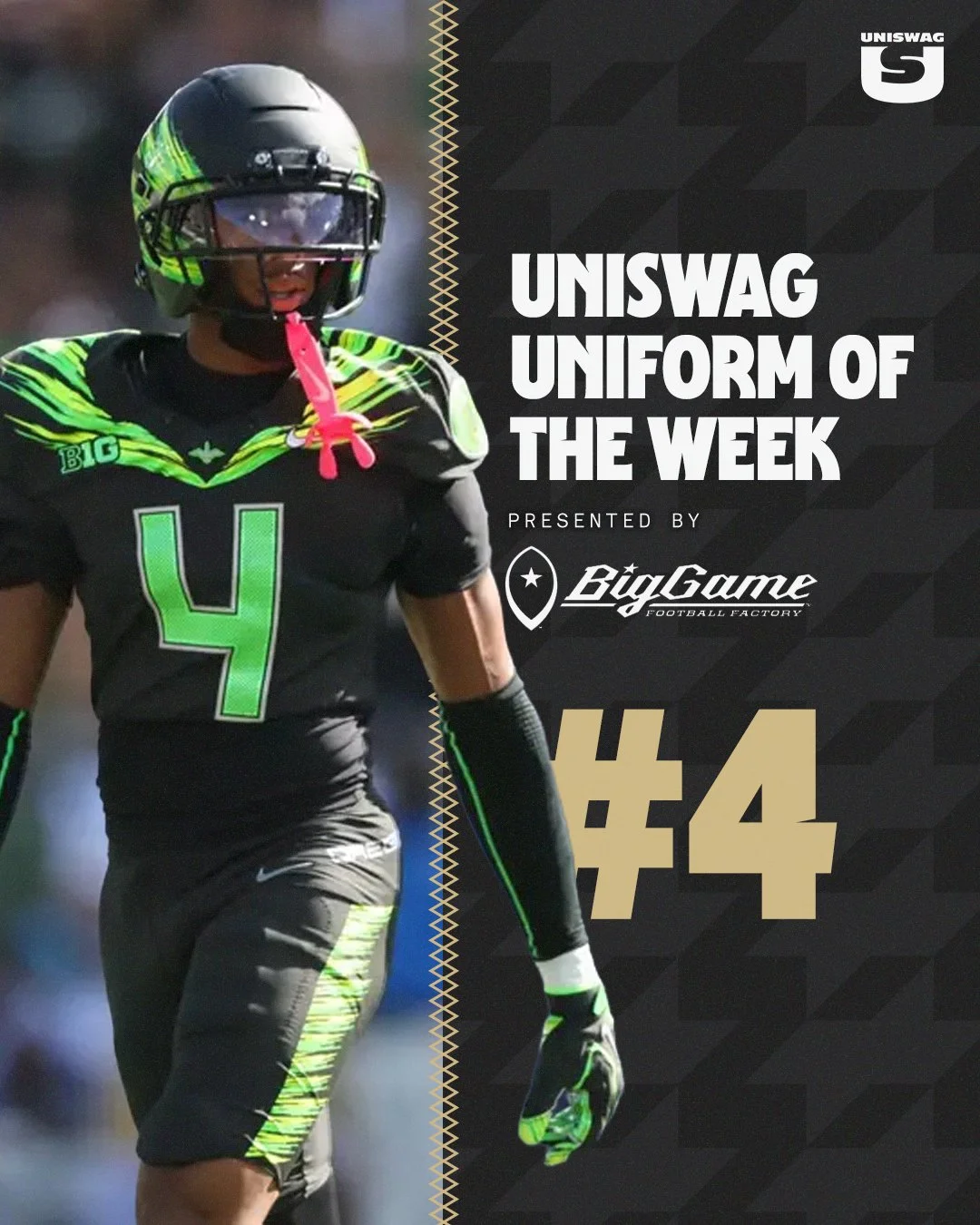
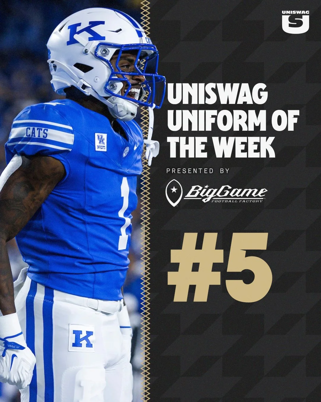
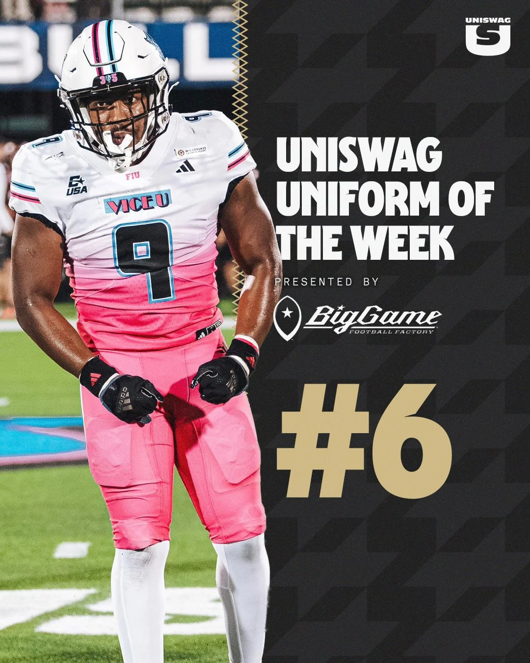
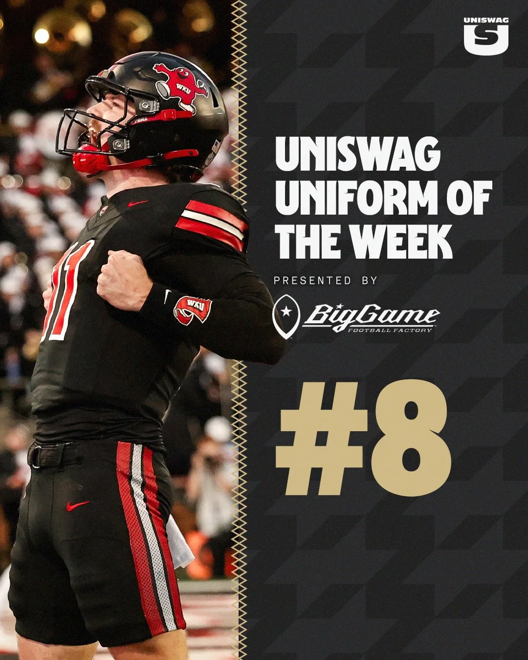
Oregon’s Origin of Speed uniform celebrated the foundations of the Ducks’ identity, while Kentucky brought back the Power K for a classic throwback look. FIU added Miami-inspired VICE style, and WKU gave each position group its own version of Big Red.

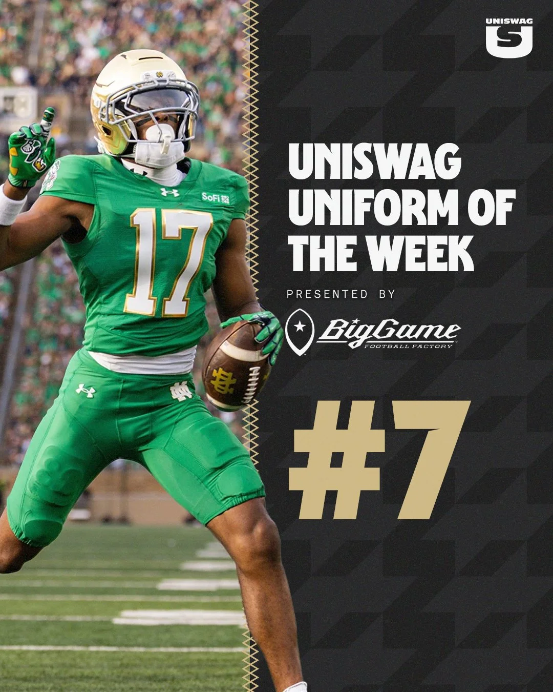
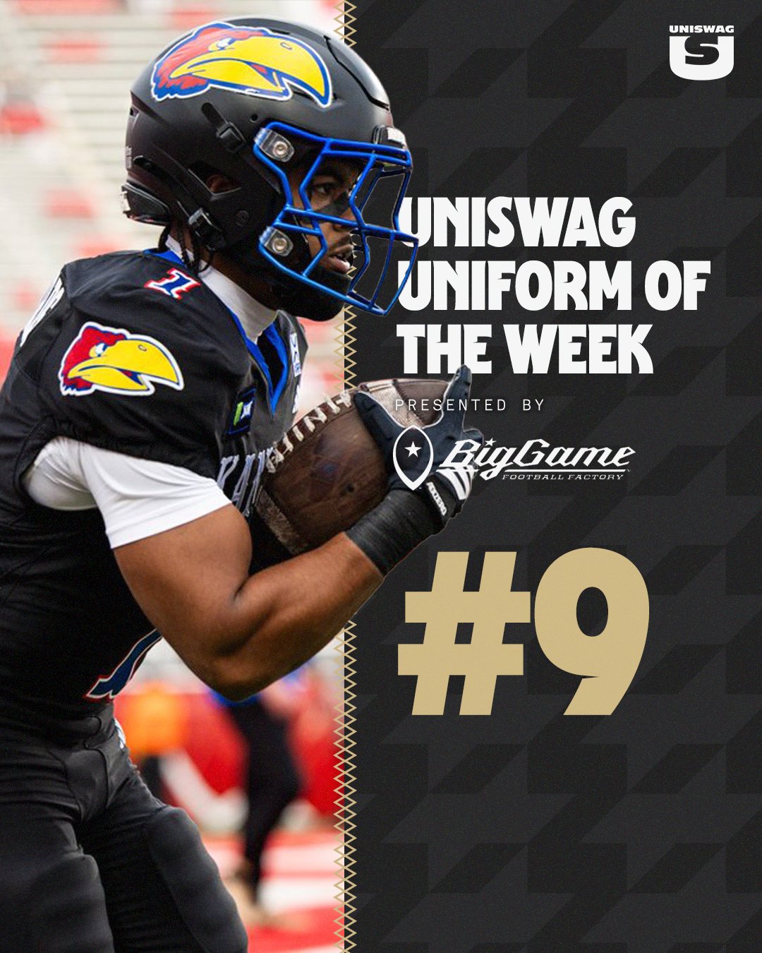
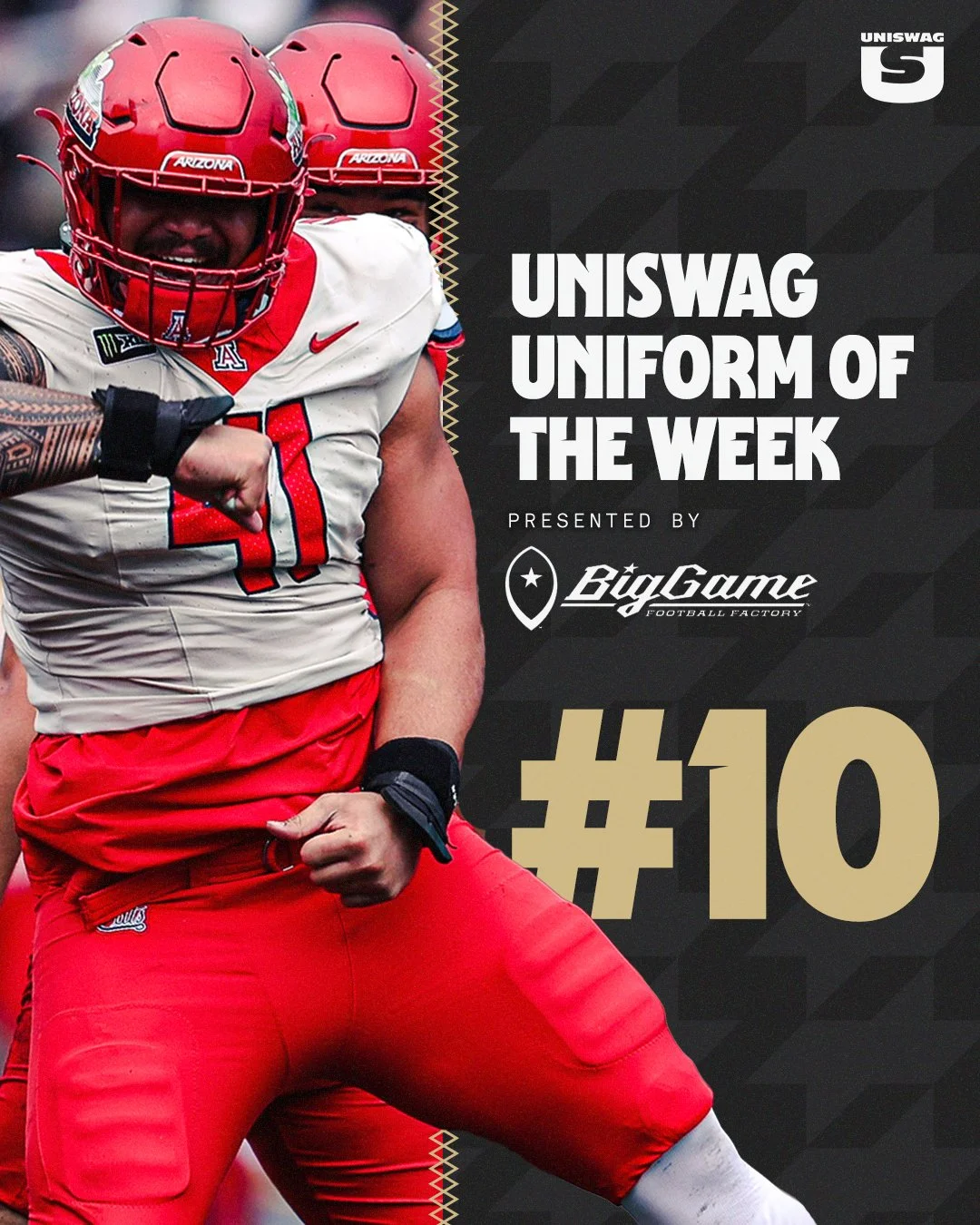
Notre Dame, Kansas and Arizona complete a Top 10 that shows how many different ways a team can make an impression on game day. From bold alternates to familiar colors brought together with care, the complete look matters.

We’ve examined the helmets, jerseys, pants and finishing touches. Now it’s time to see where your favorites landed—and which team earned the top spot.

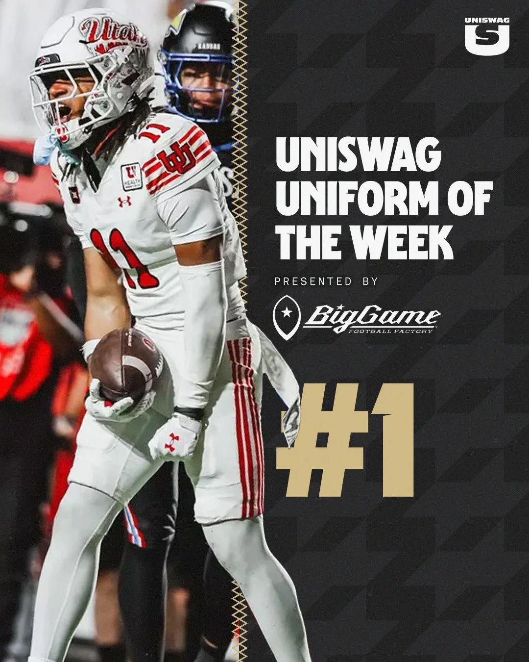
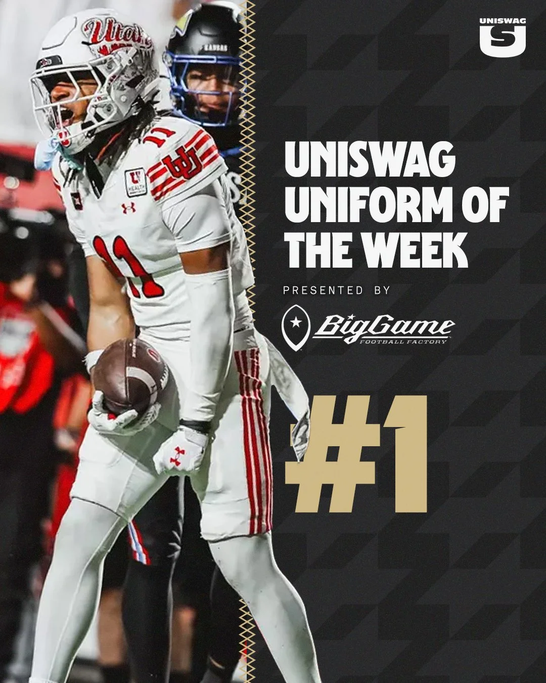
Let’s count down the Week 6 UNISWAG Uniform of the Week Top 10, presented by Big Game USA.

Shop College Football Gear Here


See What Else Is New

Related Articles


FootballSkye TilsonComment
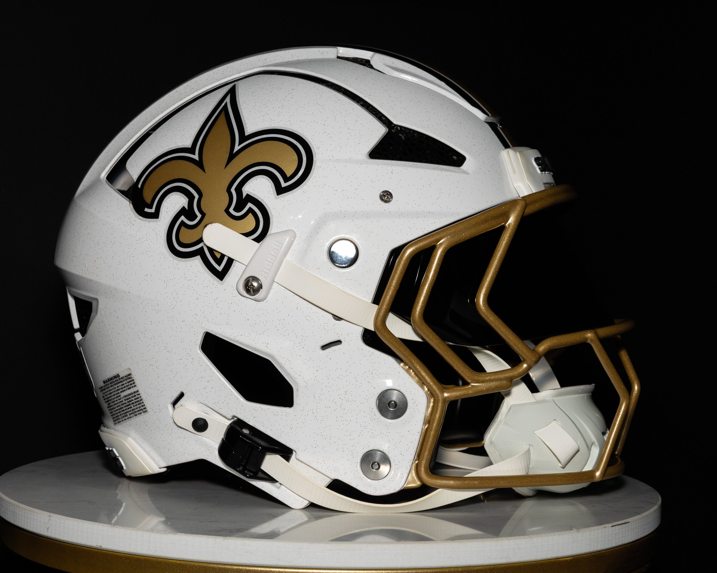
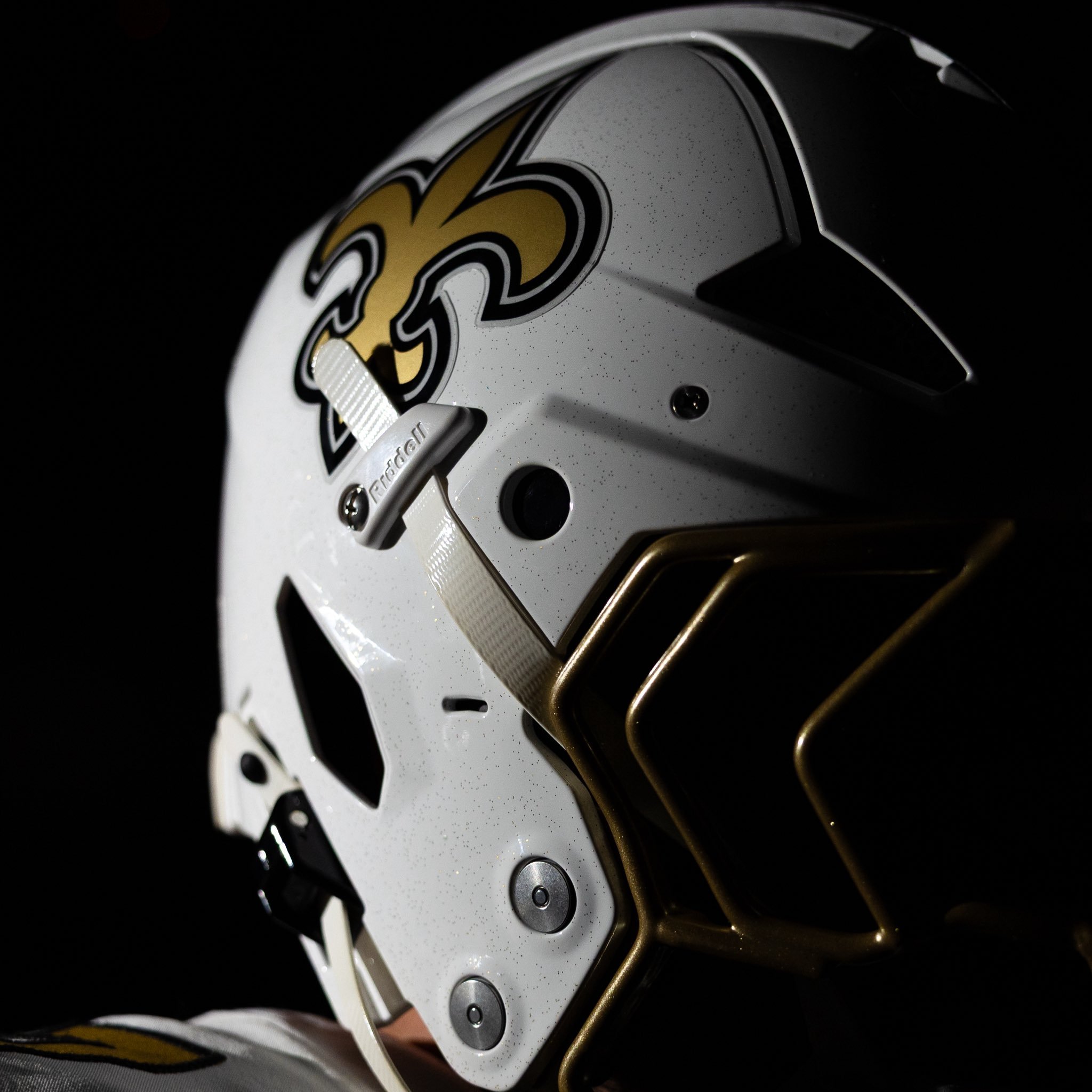
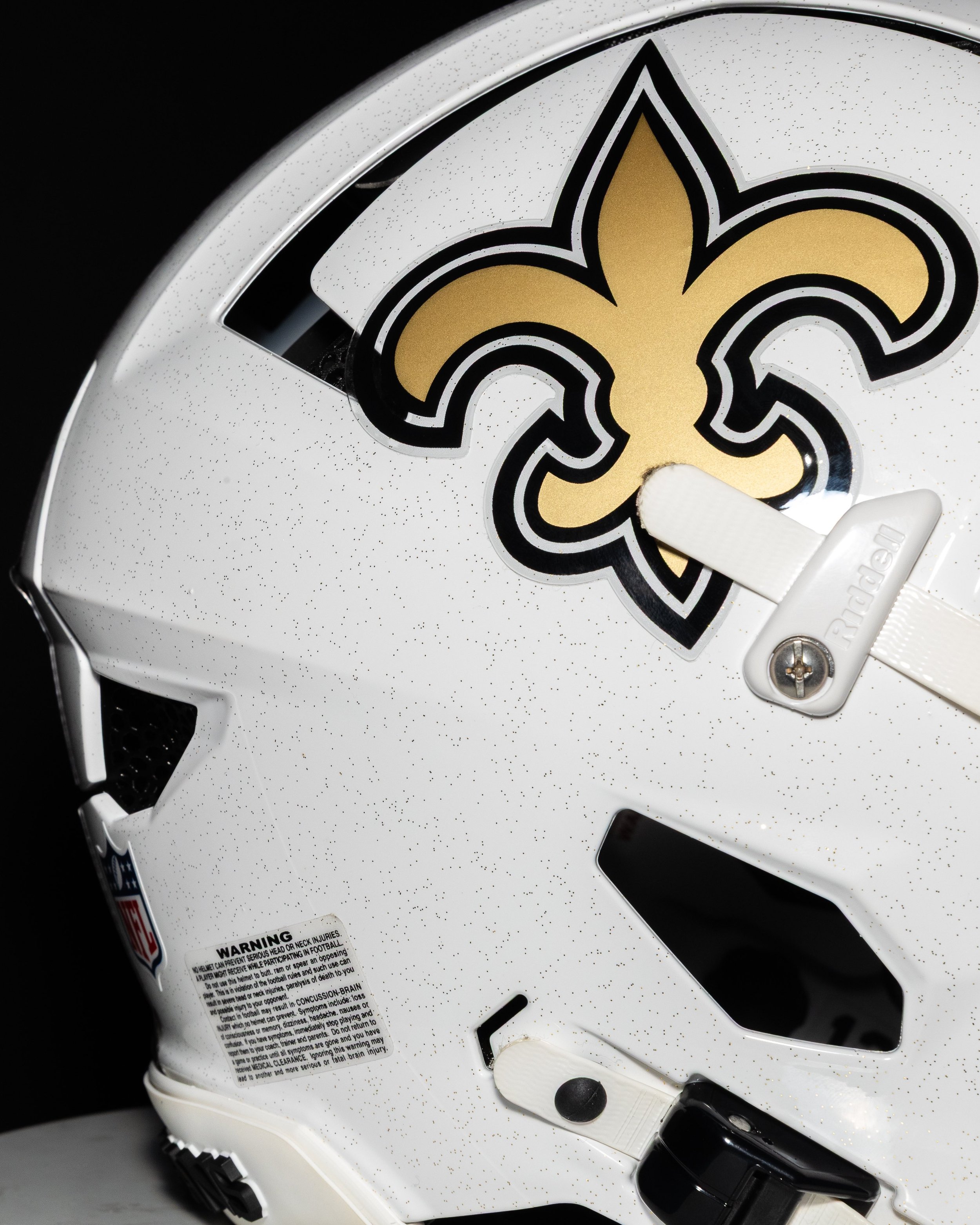
SAINTS UNVEIL NEW ALTERNATE WHITE HELMET

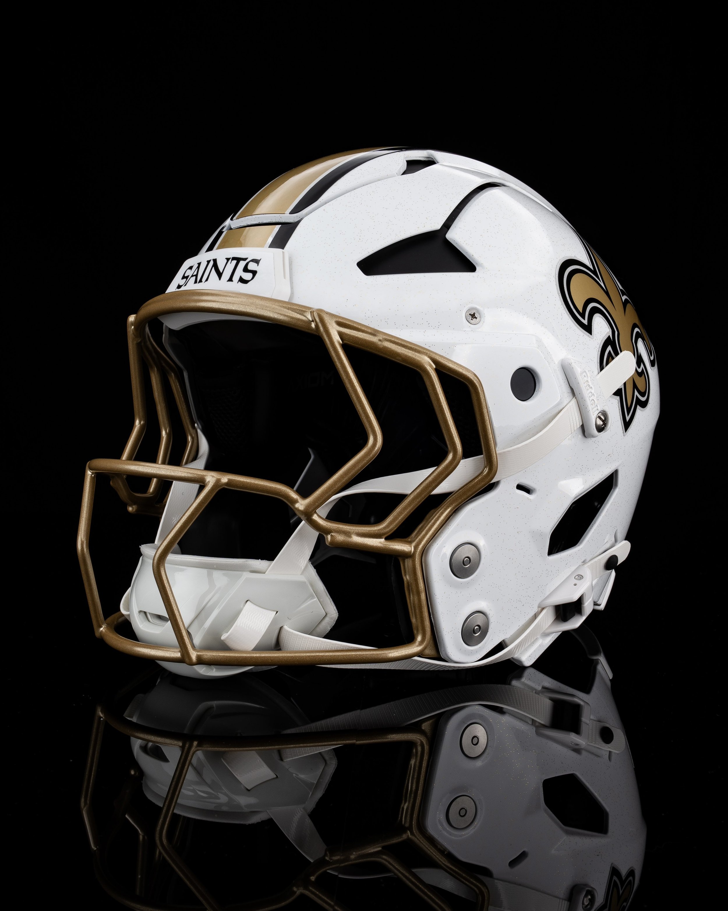
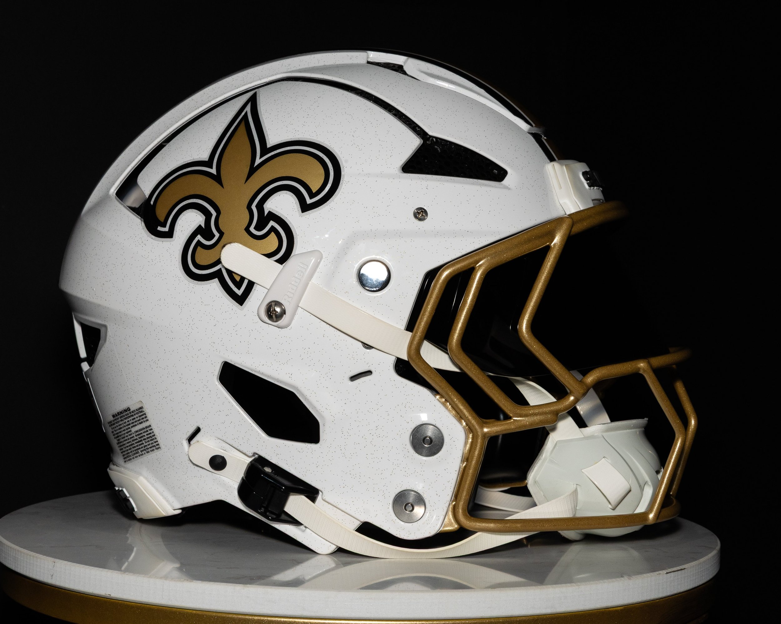
The New Orleans Saints are stepping into the 2025 season with a fresh look up top. The team revealed a brand-new white alternate helmet, joining the growing list of NFL squads expanding their lid lineup under the league’s relaxed alternate helmet rules.

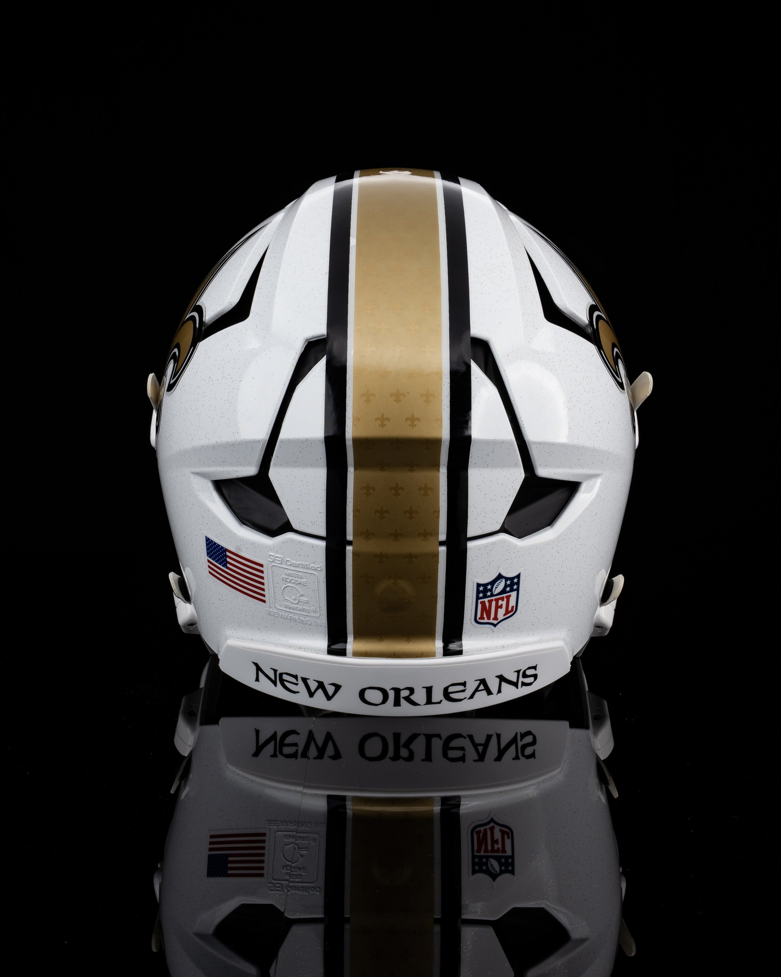
The new shell stays true to the Saints’ identity while introducing a fresh, modern twist. It features a crisp white base adorned with subtle black flecks, giving the helmet a speckled texture that fans have already compared to vanilla ice cream, a playful nod to New Orleans’ King Cake culture. The iconic gold fleur-de-lis logo remains front and center on both sides, while a bold gold stripe runs down the middle of the helmet, embossed with repeated fleur-de-lis symbols for added depth and detail. That stripe is bordered by two thin black lines for contrast, and the look is finished off with gold facemasks that tie the whole aesthetic together.

Unlike the Saints’ black alternate helmet introduced in 2022, the white version drops the fade or taper effect and keeps things sharp and symmetrical.

The Saints confirmed that the white helmet will debut with their Color Rush uniforms — a fan-favorite combo of white jersey and white pants, accented with gold numbers and black-and-gold trim.

Previously, the black helmet was always paired with the Color Rush set. It made four appearances over the last three seasons but never in the Superdome. With the arrival of the white shell, that lid might now rotate into black-on-black combos, giving the Saints more flexibility and, hopefully, better results.

SHOP Saints gear HERE


See What Else Is New

Related Articles


FootballSkye TilsonComment
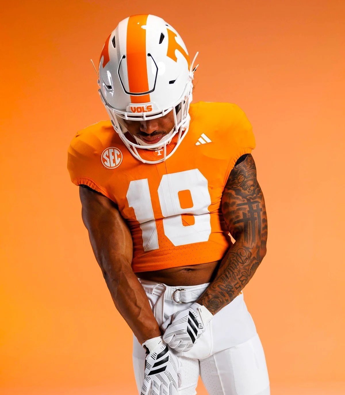
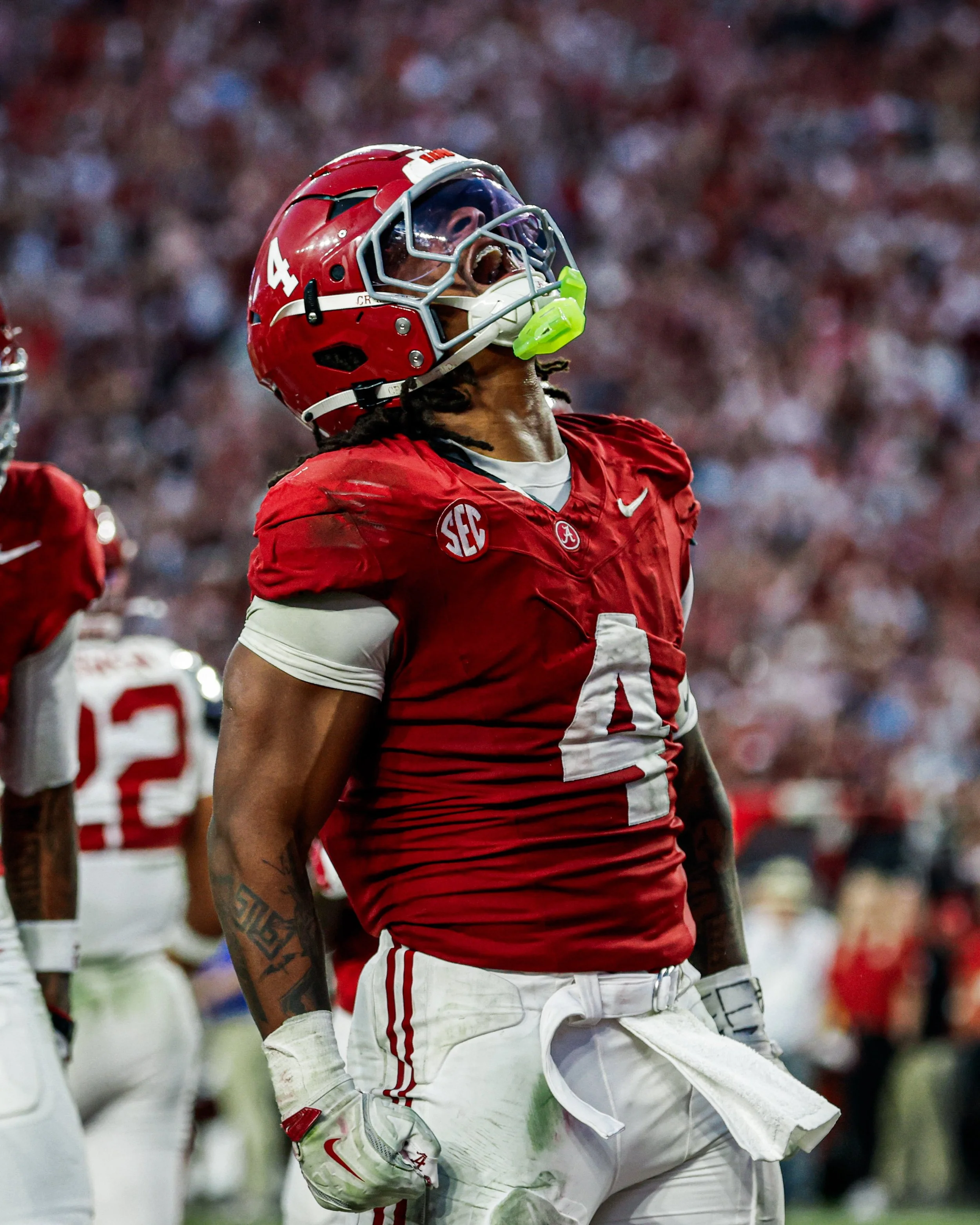
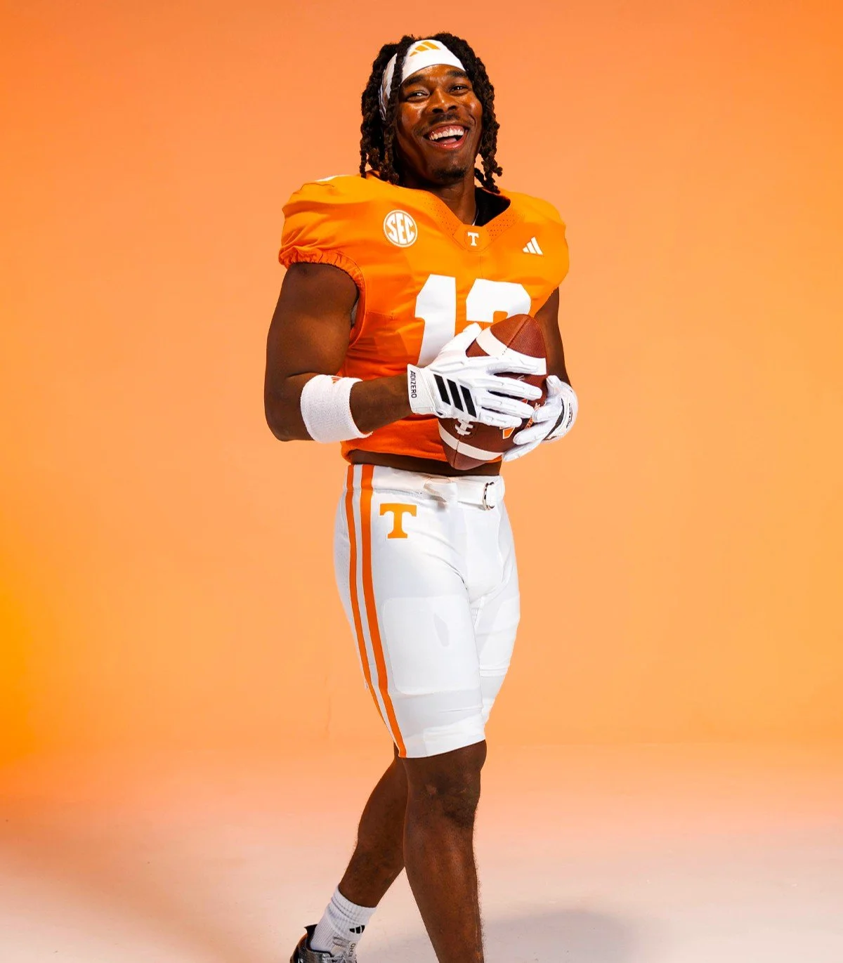
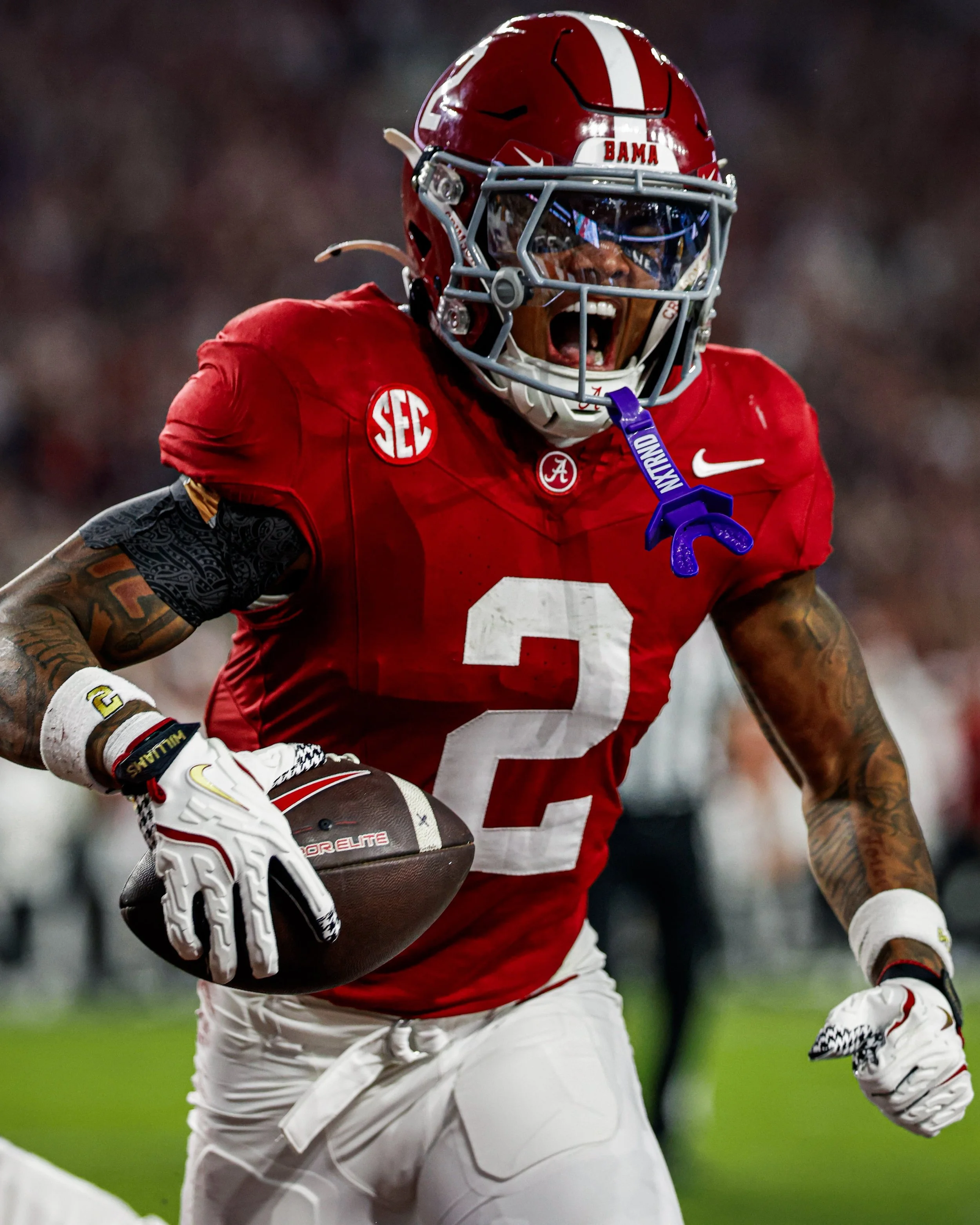
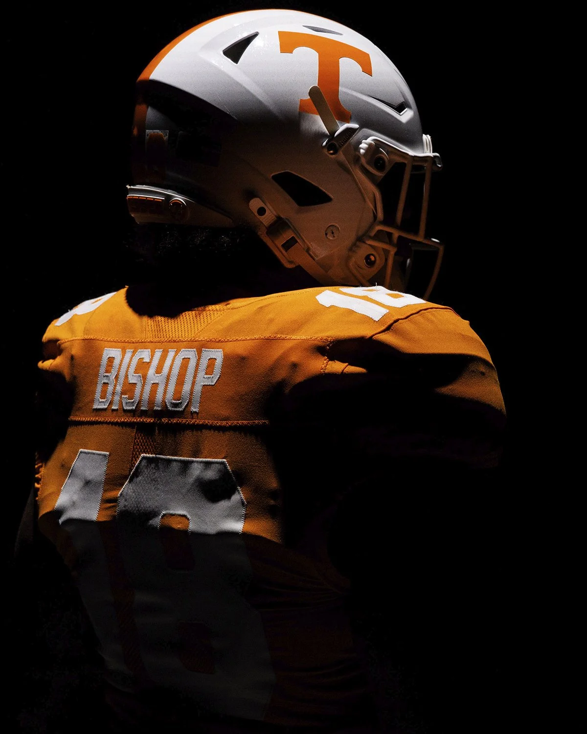
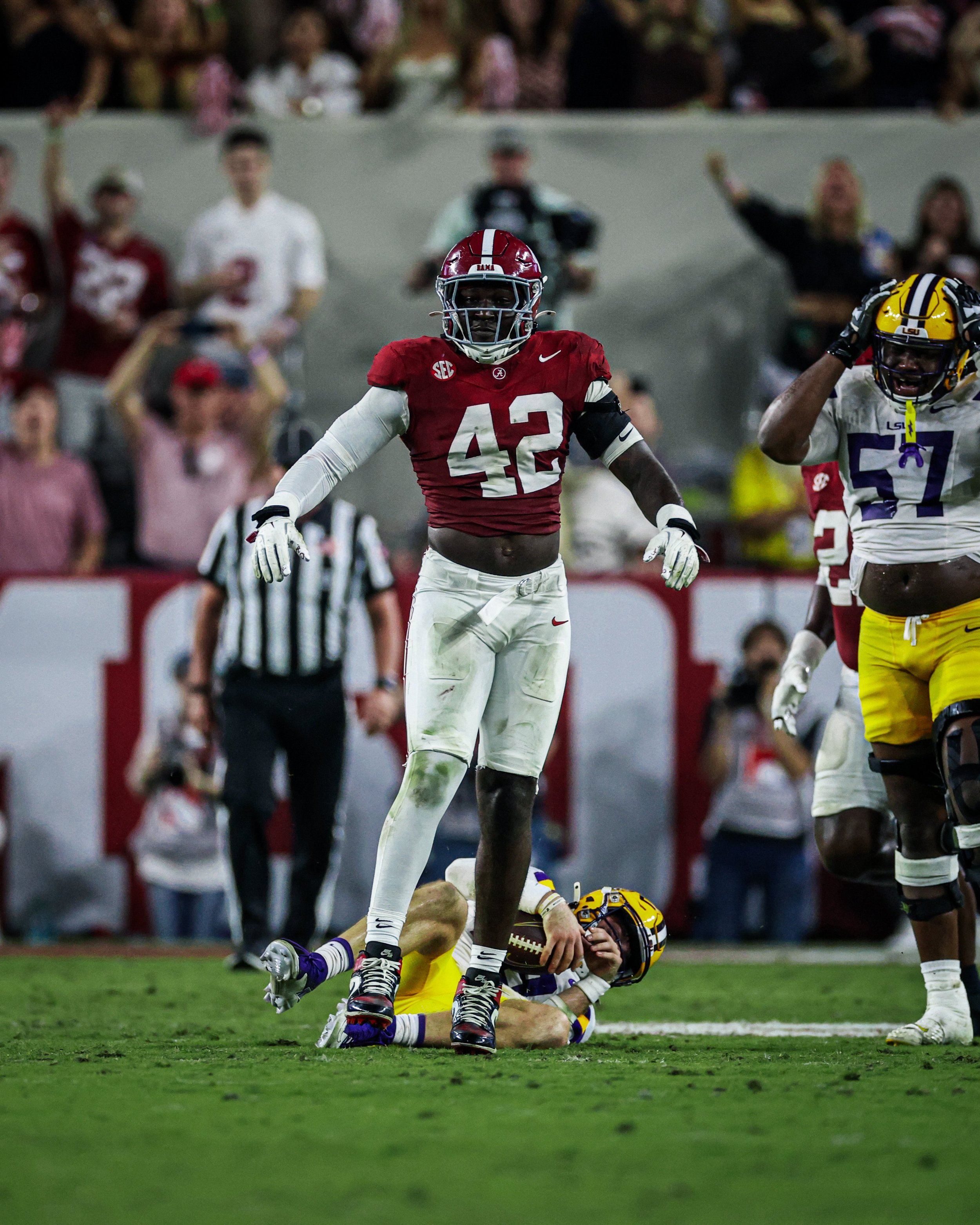
Alabama and Tennessee Are Bringing Back a Classic Uniform Tradition

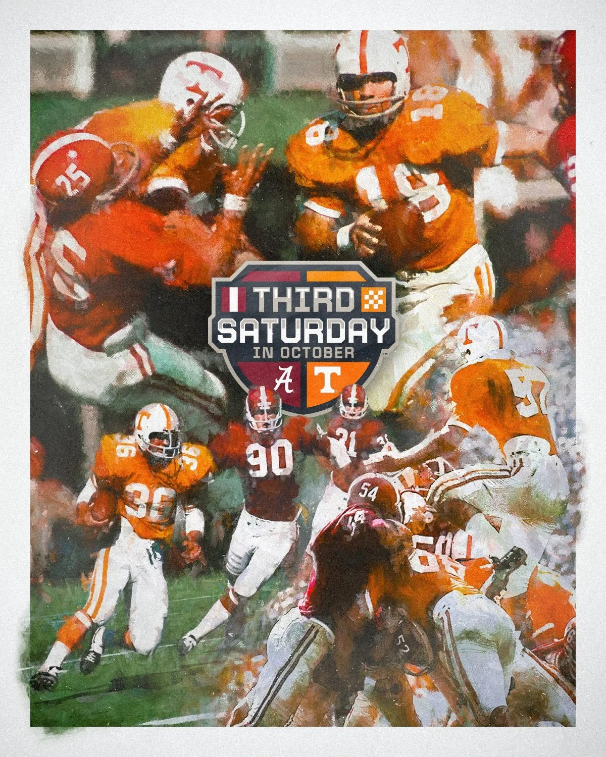
The Third Saturday in October is getting a throwback look.

Alabama and Tennessee announced that they will bring back a long-standing rivalry tradition, with both teams wearing their home jerseys when they face each other in 2026 and 2027.

That means Alabama will wear its iconic crimson jersey at Neyland Stadium on Oct. 17, 2026, while Tennessee will wear its orange jersey at Saban Field at Bryant-Denny Stadium in 2027. The two-year agreement was coordinated by both schools, their head coaches and the SEC.

The 2026 matchup will mark the first time since Oct. 17, 1970 that Alabama and Tennessee have both worn their home jerseys in Knoxville.

The 2027 meeting will make even more history. When Tennessee travels to Tuscaloosa, the Volunteers will wear their orange jerseys inside Saban Field at Bryant-Denny Stadium for the first time ever.

The uniform decision is a natural callback to the history behind the rivalry's famous nickname. Alabama and Tennessee first played on the traditional third Saturday in October in 1928, and the matchup continued on that date for 66 consecutive years through 1994. SEC scheduling changes ended the annual third-Saturday tradition in 1995, although the rivalry has continued to carry the name.

The rivalry itself dates back even further, with the programs first meeting in 1901. The teams have played every season since 1928 except 1943, when Tennessee did not field a team during World War II. The 2026 matchup will be the 109th meeting between the two programs.

Alabama currently leads the series 61-39-8 under the NCAA's historical accounting.

The Third Saturday in October, that's about as fitting as it gets.

SHOP NCAA gear HERE


See What Else Is New

Related Articles


FootballSkye TilsonComment
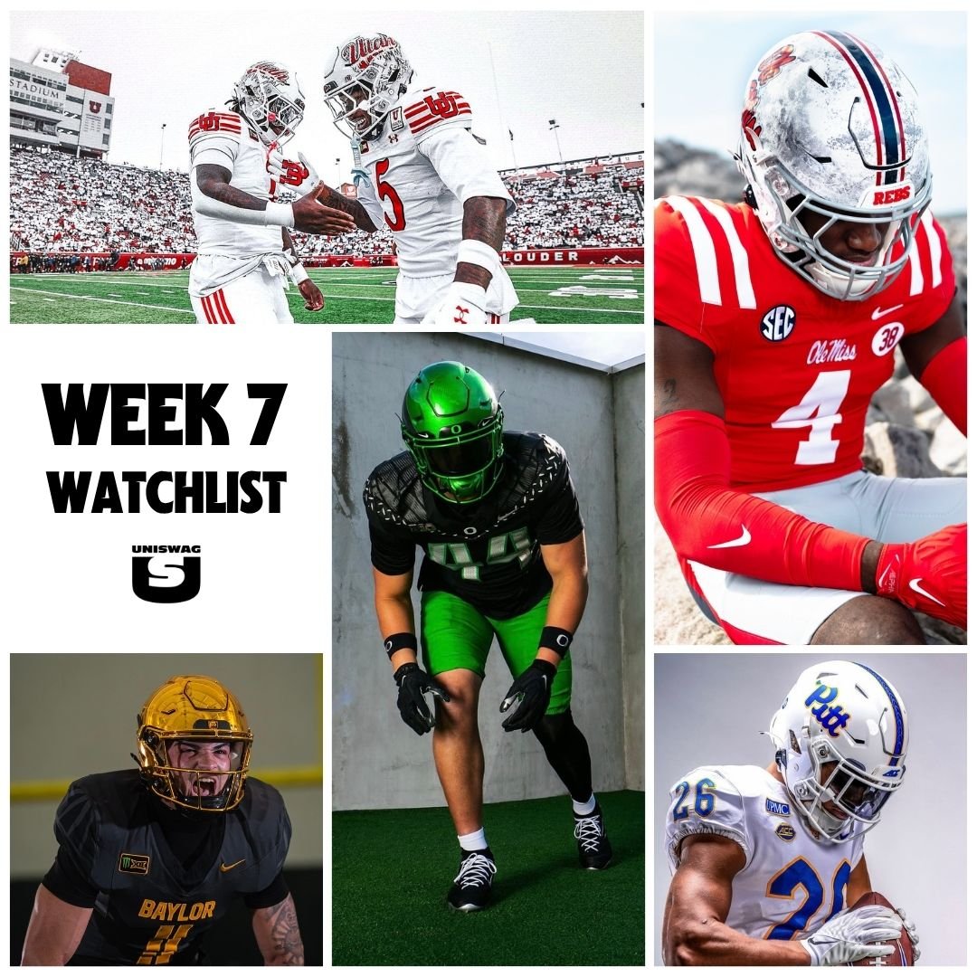
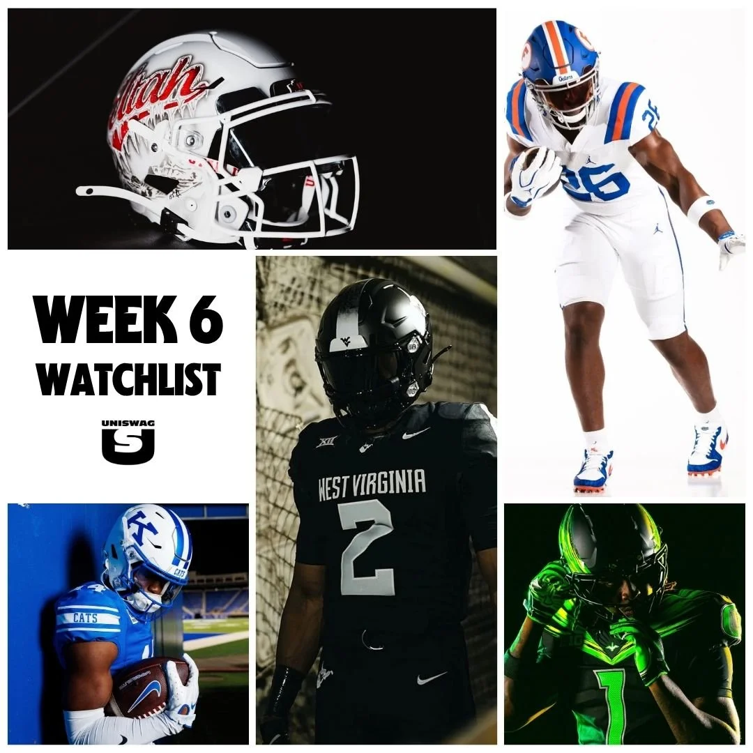
2026 Week 6 UNISWAG Watchlist

WEEK 6 IS HERE, AND ANOTHER ROUND OF GAME-DAY LOOKS IS READY FOR THE SPOTLIGHT. THE UNISWAG UNIFORM OF THE WEEK COUNTDOWN STARTS NOW.

FROM NEW DESIGNS AND THROWBACKS TO ALTERNATE UNIFORMS AND FRESH COMBINATIONS, WE’RE WATCHING THE LOOKS TAKING THE FIELD ACROSS COLLEGE FOOTBALL.

UNISWAG WILL EXAMINE THE DETAILS, BUILD OUR TOP 10 AND SELECT ONE LOOK TO EARN THE WEEK 6 UNISWAG UNIFORM OF THE WEEK AWARD.

HELMETS, JERSEYS, PANTS AND ACCESSORIES ALL PLAY A PART. WE’RE LOOKING FOR THE TEAMS THAT BRING EVERY ELEMENT TOGETHER TO CREATE A MEMORABLE GAME-DAY LOOK.

THE WEEK 6 TOP 10 WILL BE REVEALED MONDAY.

SHOP COLLEGE GEAR HERE


Utah

WKU

West Virginia

Georgia Tech

Ohio

UTSA

Liberty

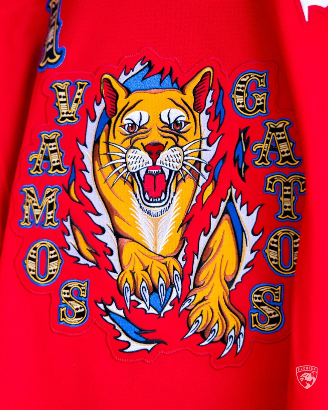
Florida

Notre Dame

Oregon

Washington

Kentucky

arkansas state

washington state

Arizona

Boise state

EMU

Toledo

pitt

Minnesota

Louisville

Wake forest

vanderbilt

north texas

northwestern

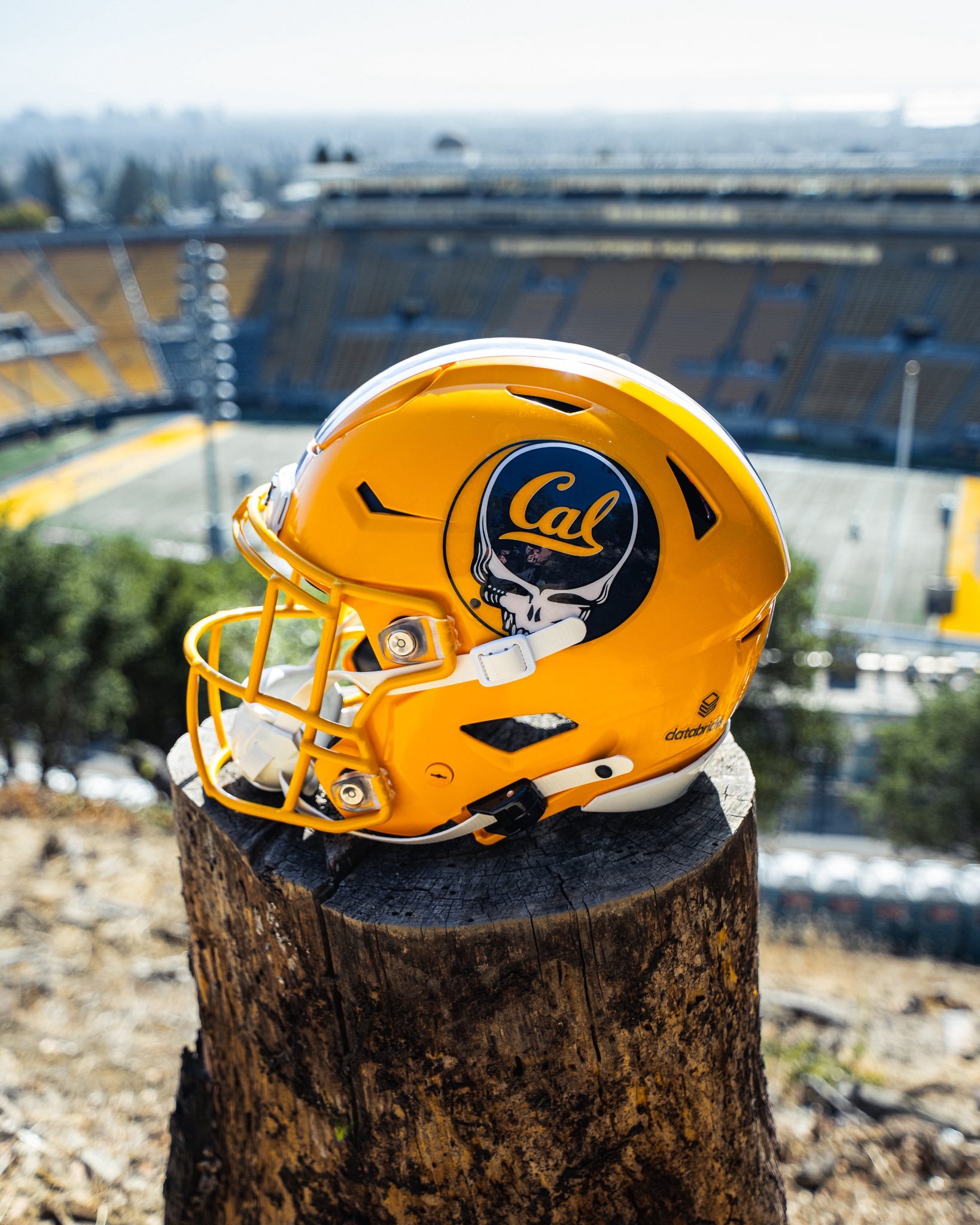
cal

jmu

memphis

oklahoma state

duke

virginia tech

Weber state

ASU

ECU

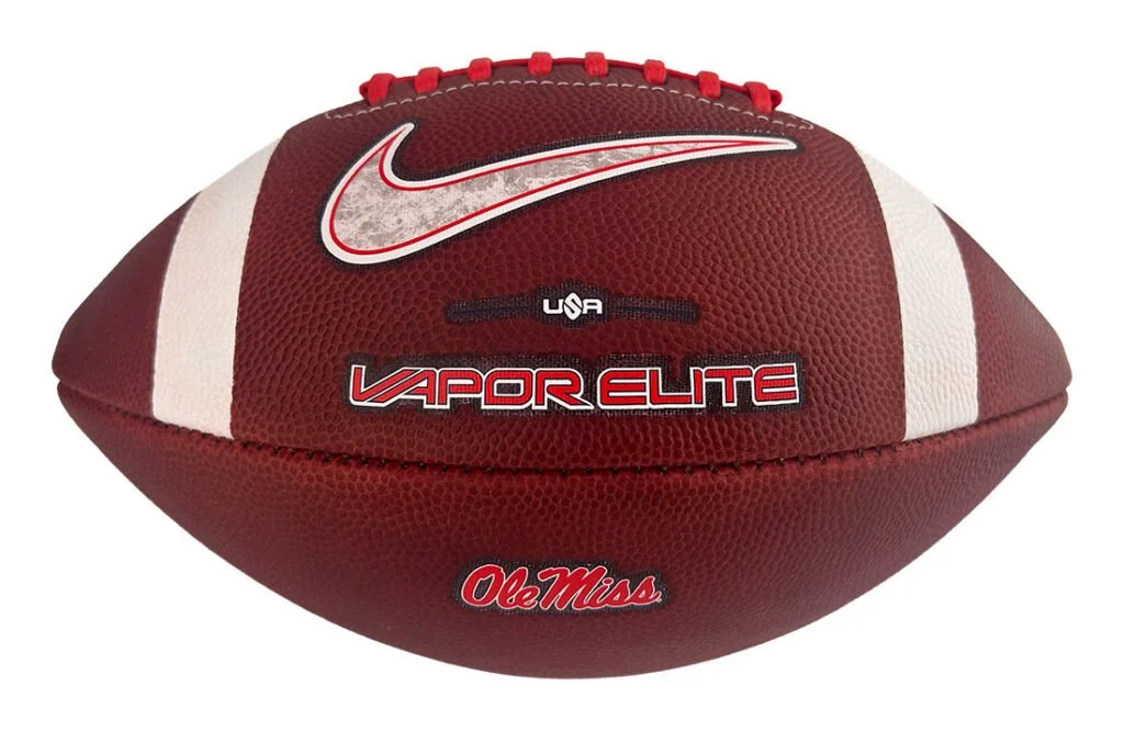
Ole Miss

oregon state

byu


See What Else Is New

Related Articles


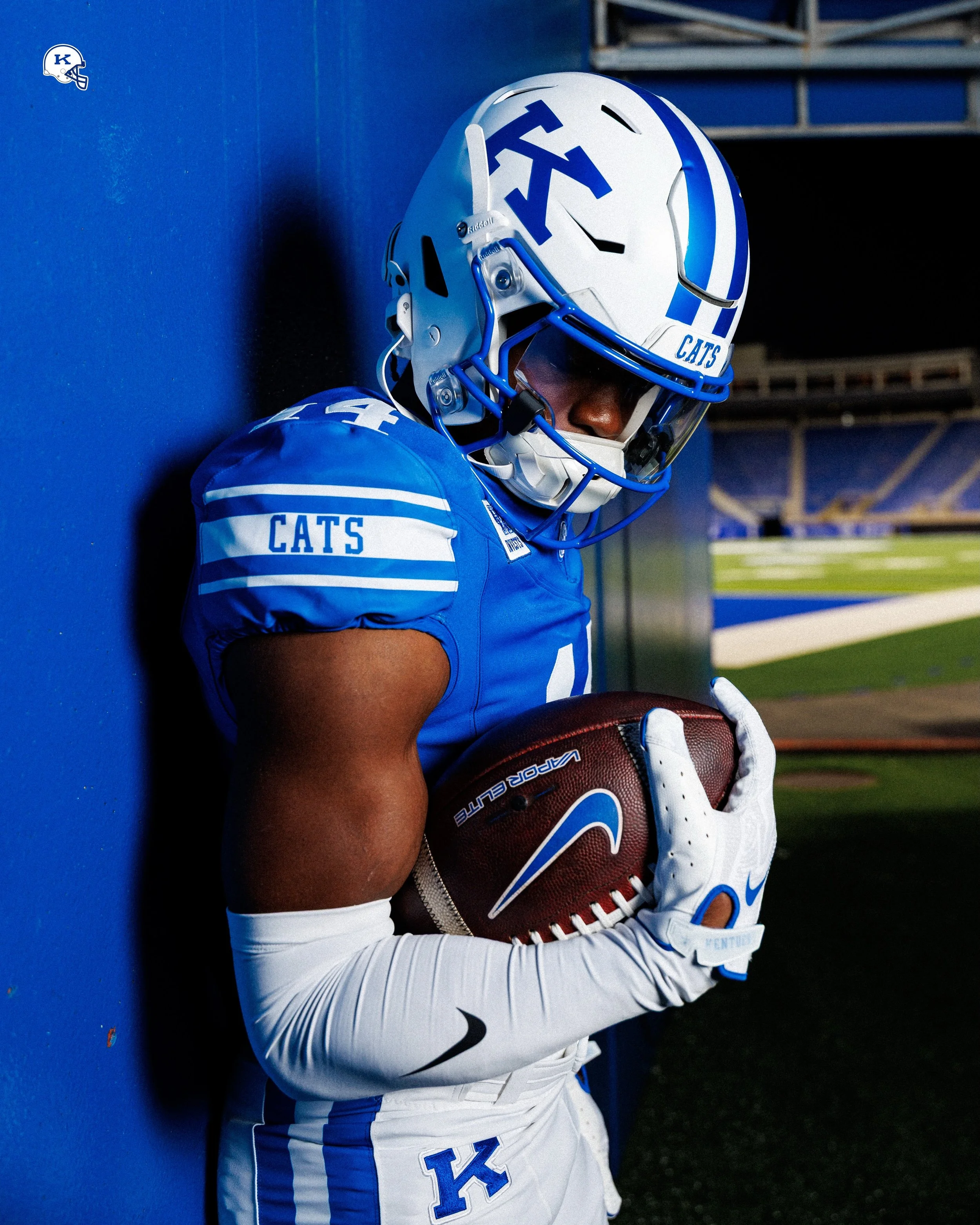
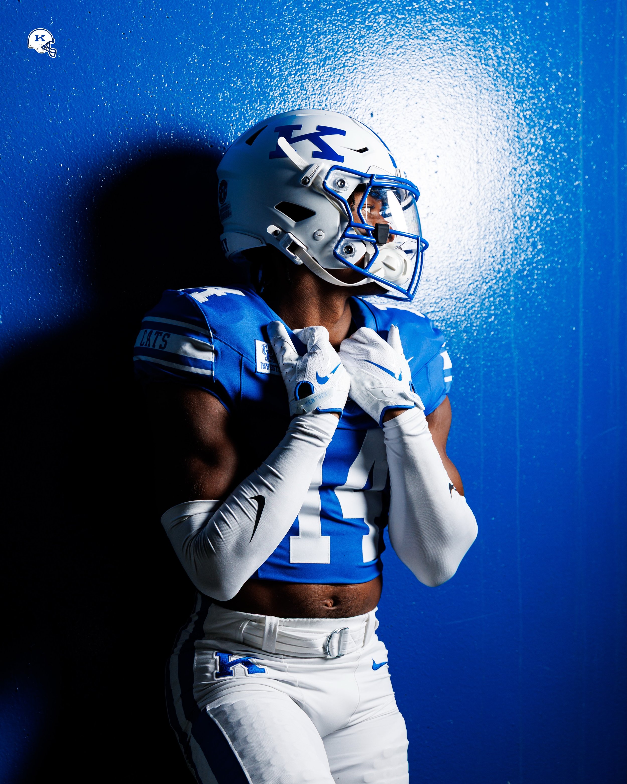
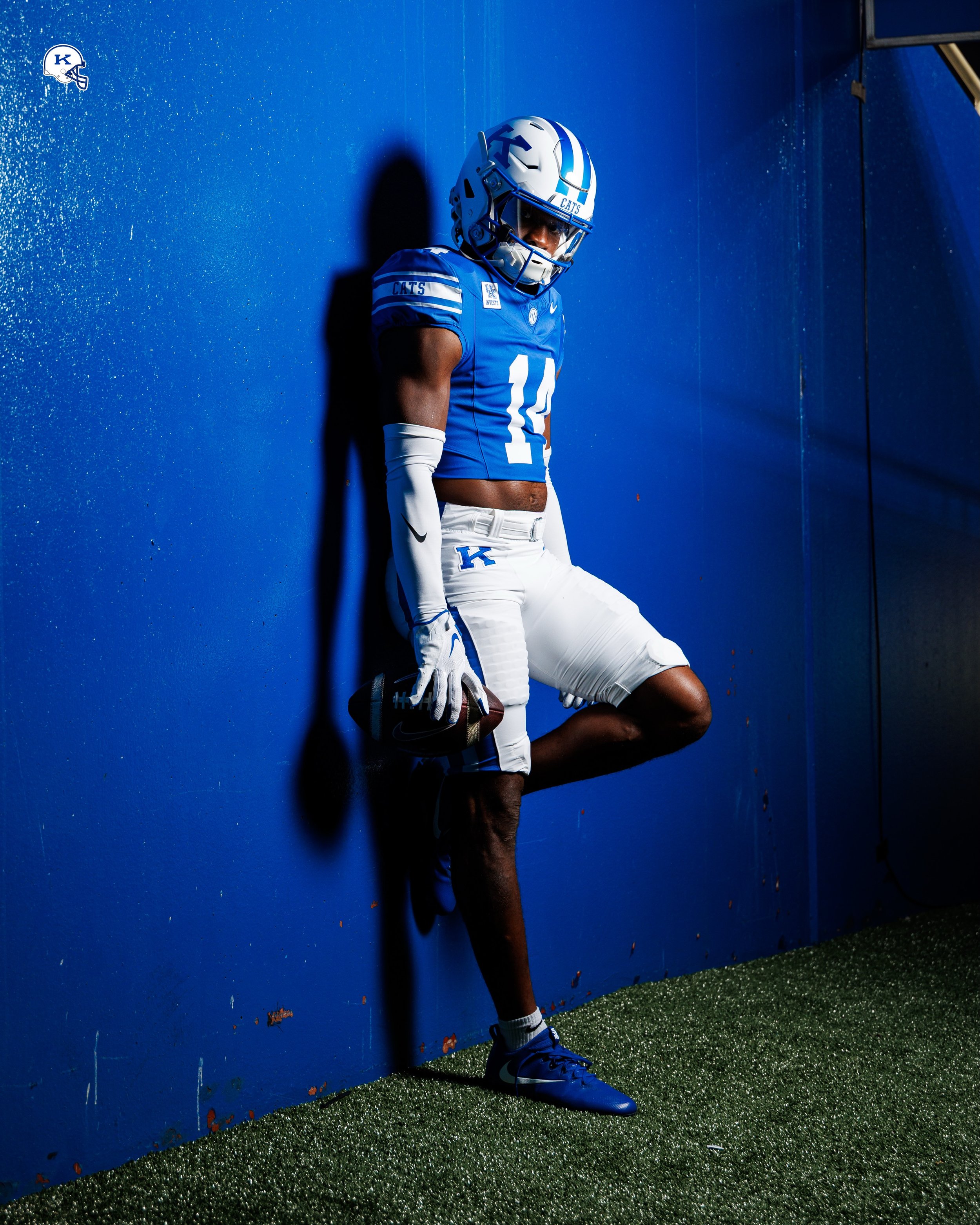
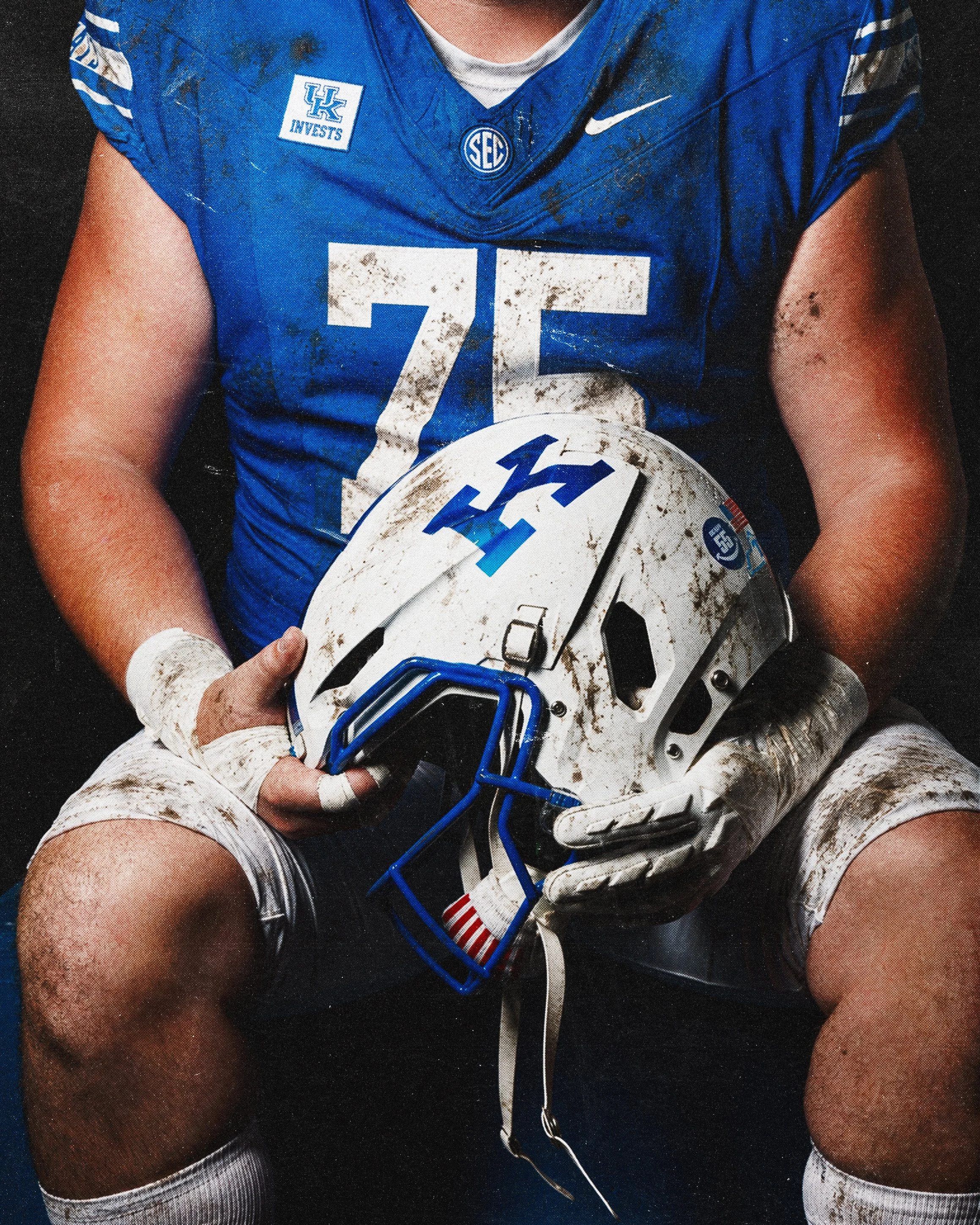
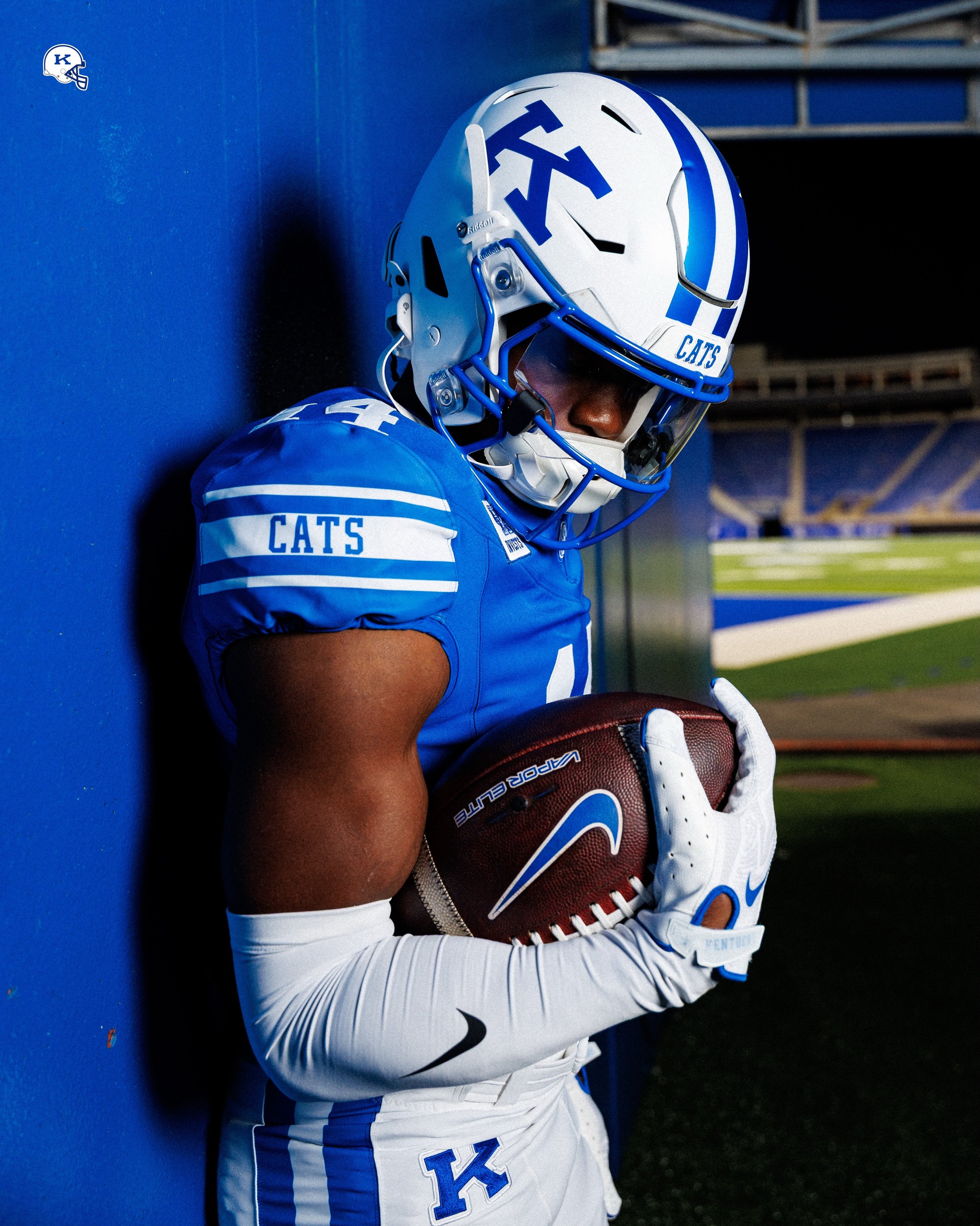
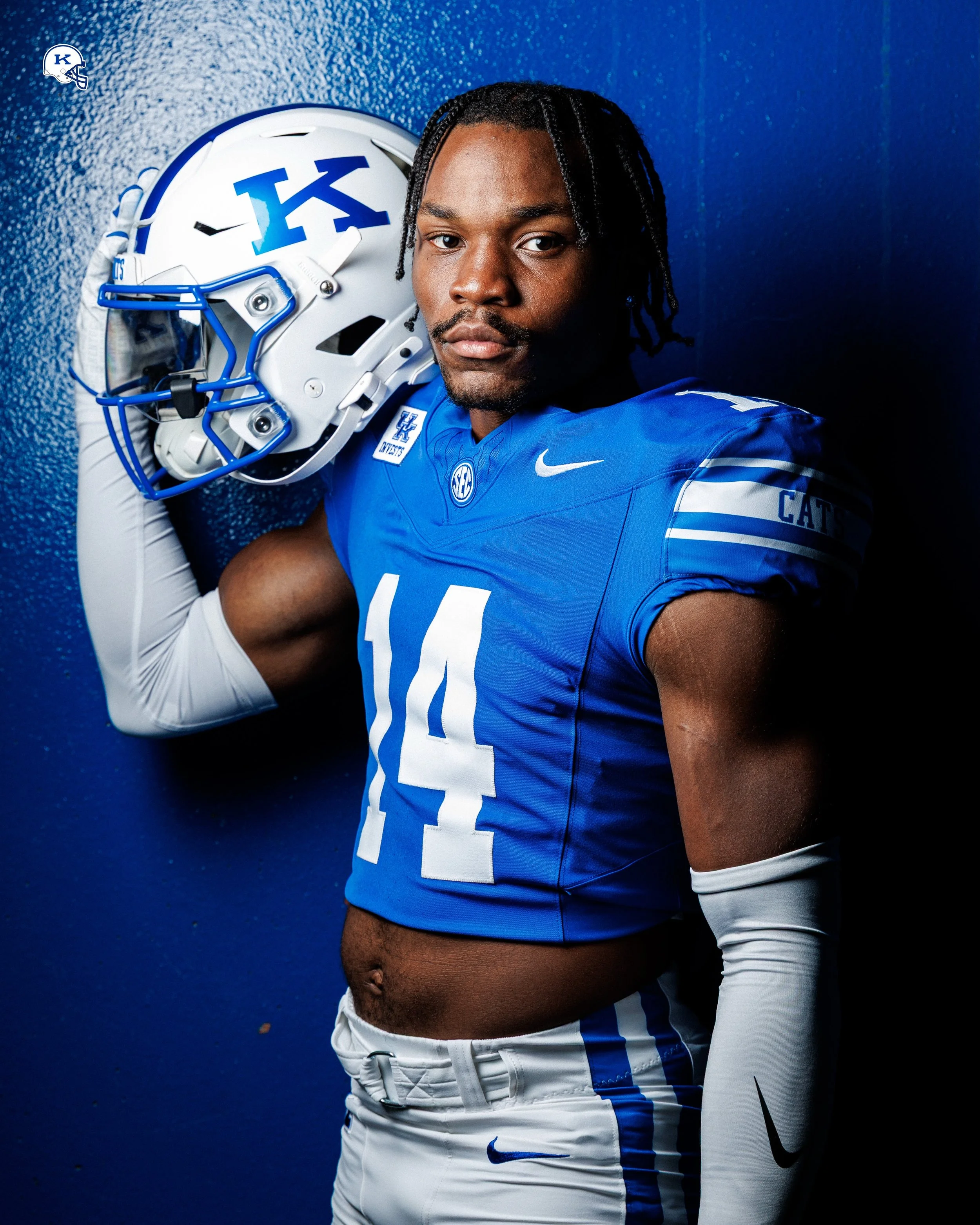
Kentucky Brings Back the Power K With a Classic Throwback Uniform

Kentucky football is turning back the clock with a throwback uniform centered on the Power K. The Wildcats’ look pairs white helmets and pants with a blue jersey, bringing a familiar mark from the program’s past into the spotlight.

The helmet is the centerpiece. A large blue Power K sits on the white shell, complemented by a blue facemask and blue center striping. The straightforward color combination gives the historic logo room to stand out, establishing the identity of the entire uniform.

The blue jersey carries that traditional approach through large white block numbers on the front and shoulders. White sleeve striping frames a blue “CATS” wordmark, adding a team-specific detail within the classic design.

The white pants feature another Power K at the hip, extending the throwback branding beyond the helmet. Blue side striping completes the combination.

What makes this uniform work is how clearly the elements connect. The helmet logo and pants mark establish the theme, while the block numbers and sleeve stripes support its traditional football appearance. Kentucky’s blue remains the dominant color, framed by white pieces that keep the complete combination crisp and recognizable.

The Power K is the defining detail. Bringing a historic logo back into the rotation gives longtime fans a connection to earlier Kentucky teams and introduces that identity to a new generation. Repeating the mark on the pants makes it feel like part of a complete uniform concept.

SHOP Kentucky gear HERE


See What Else Is New

Related Articles


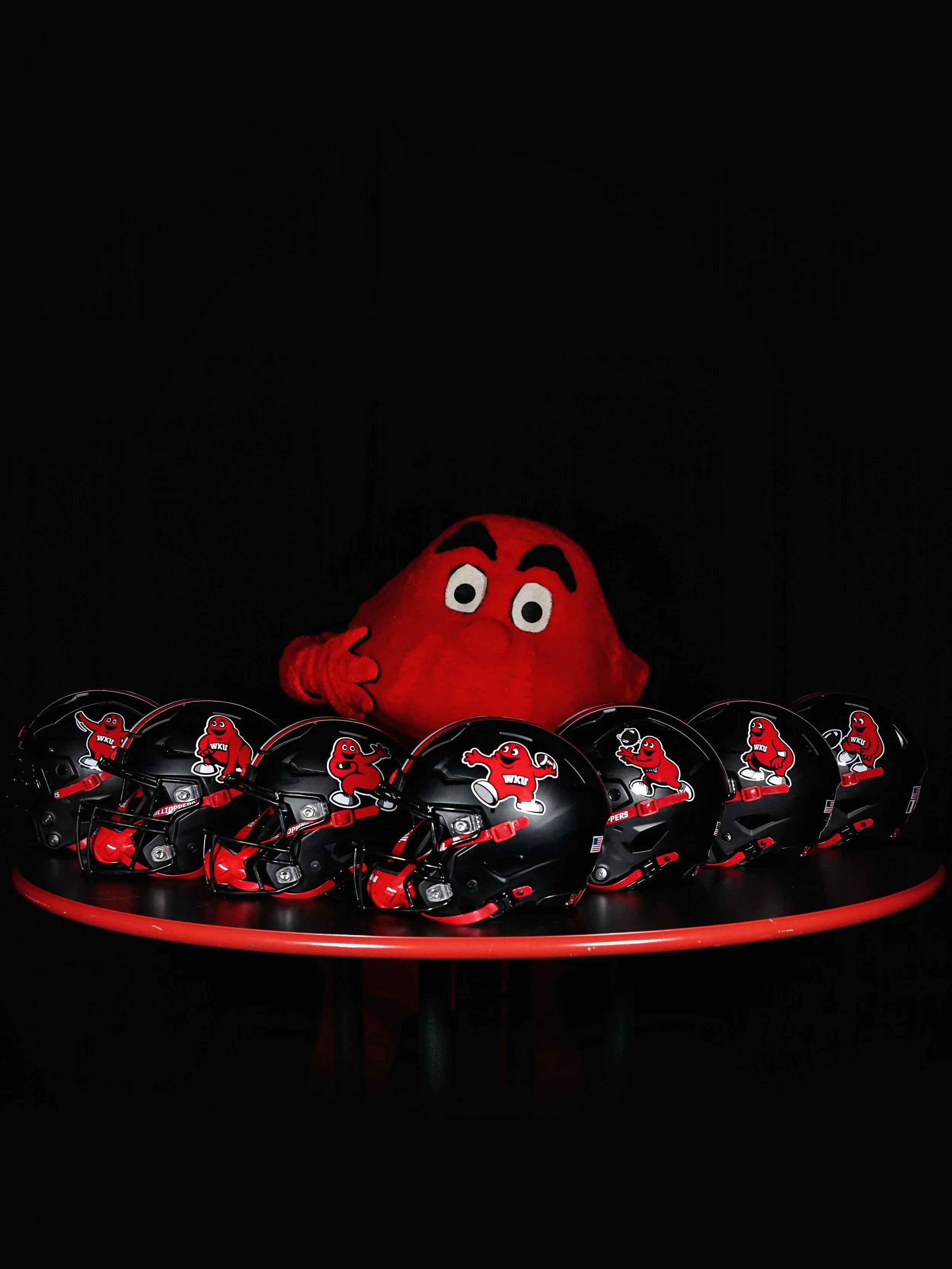
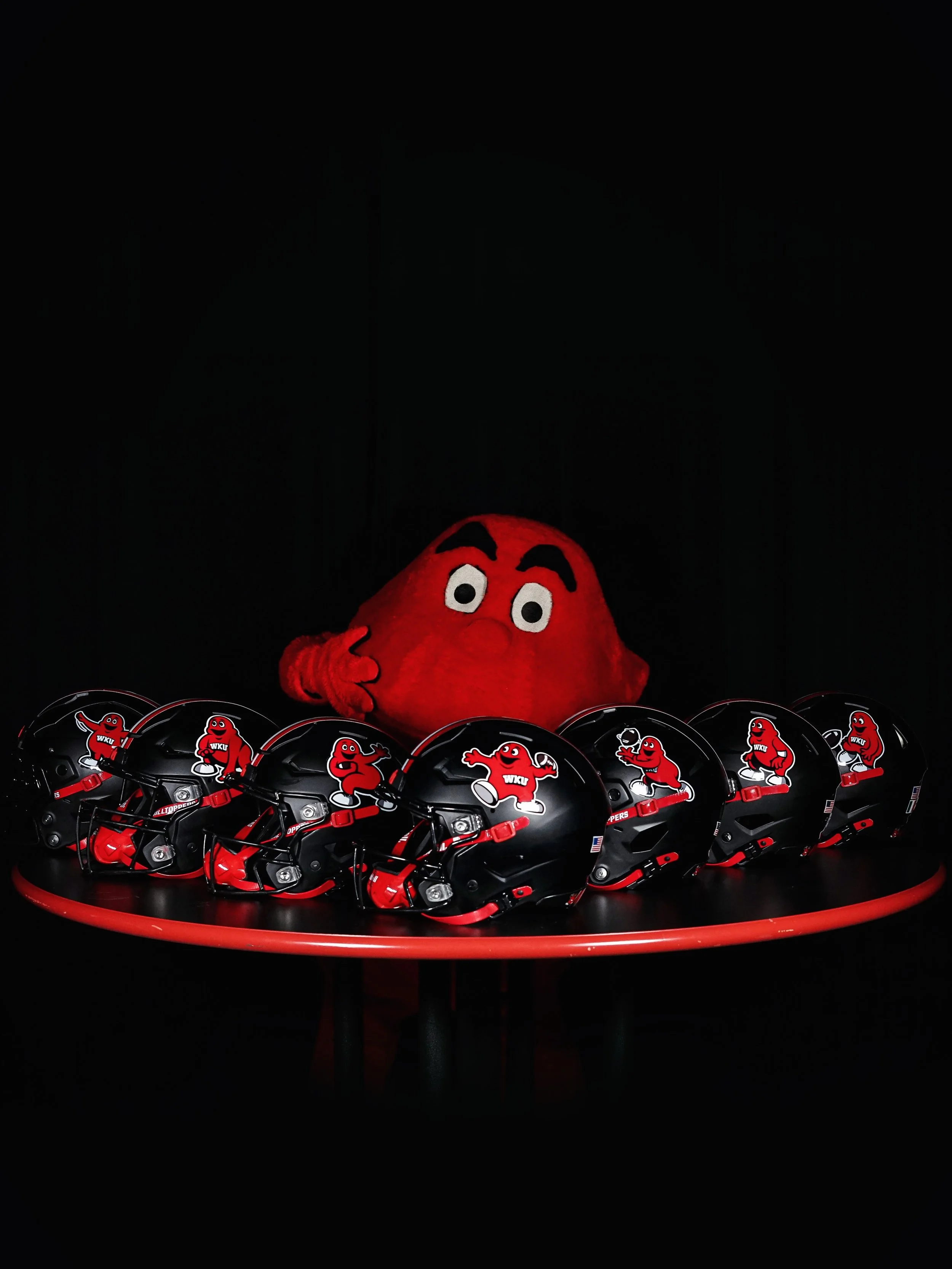
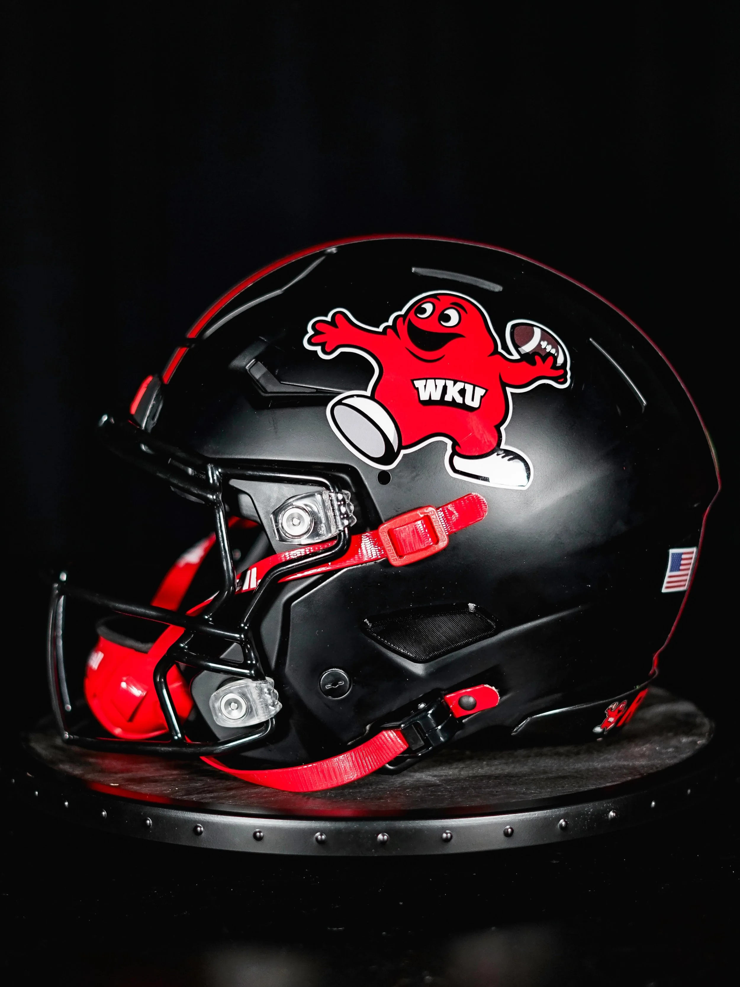
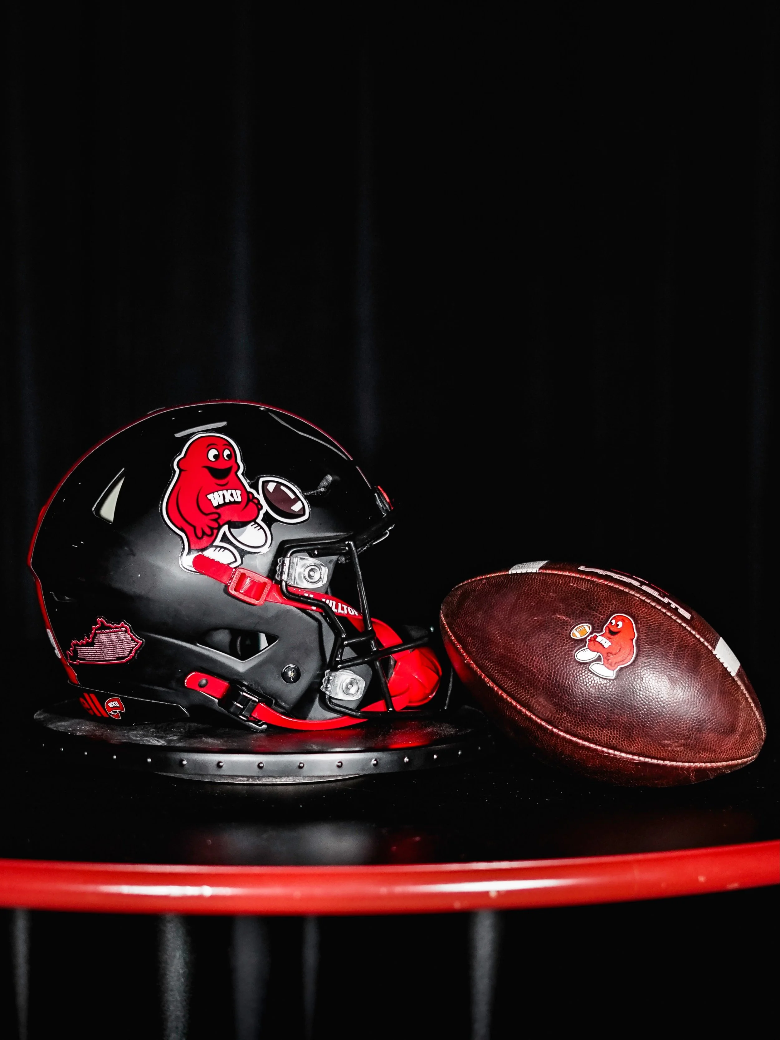
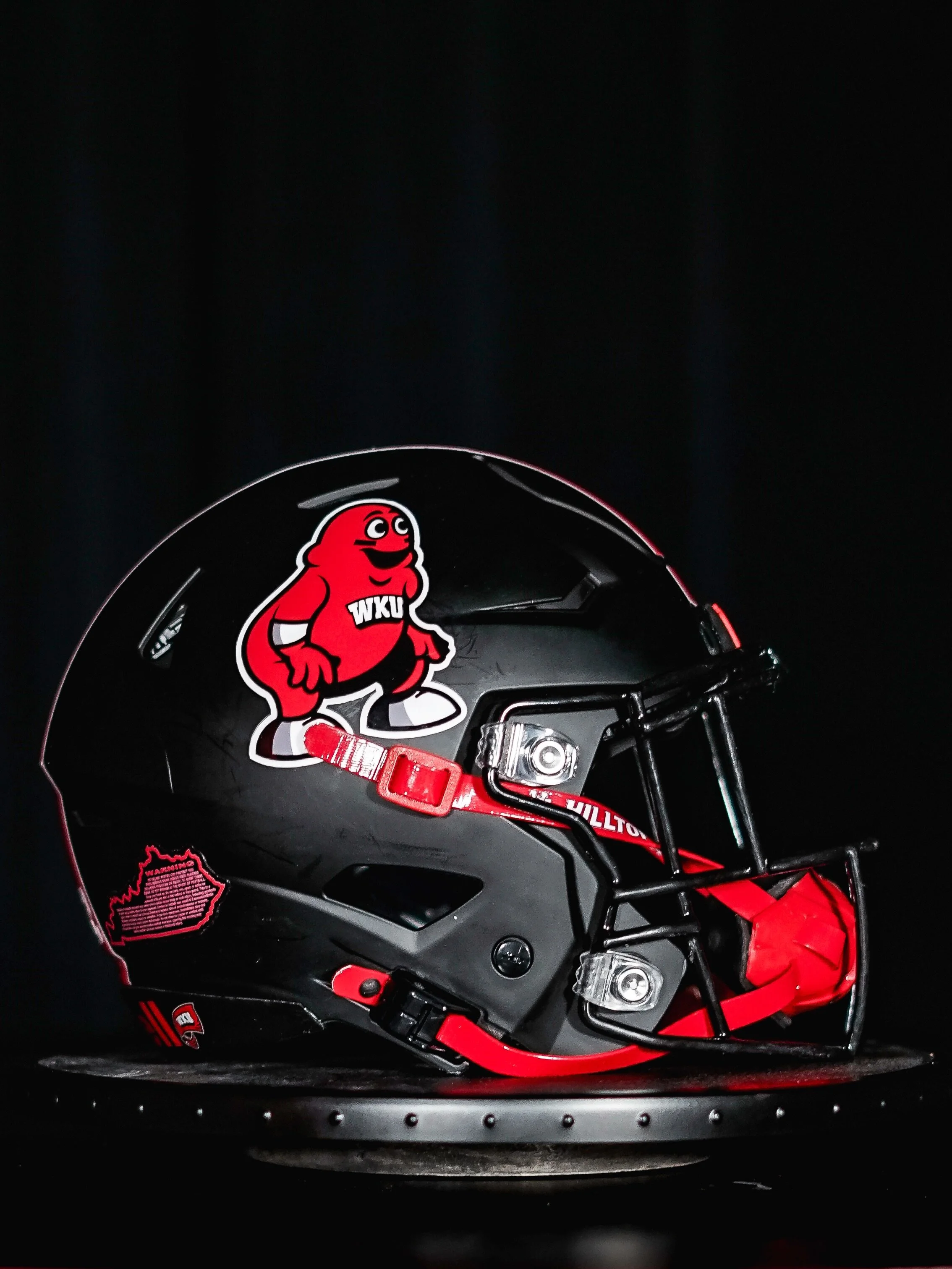
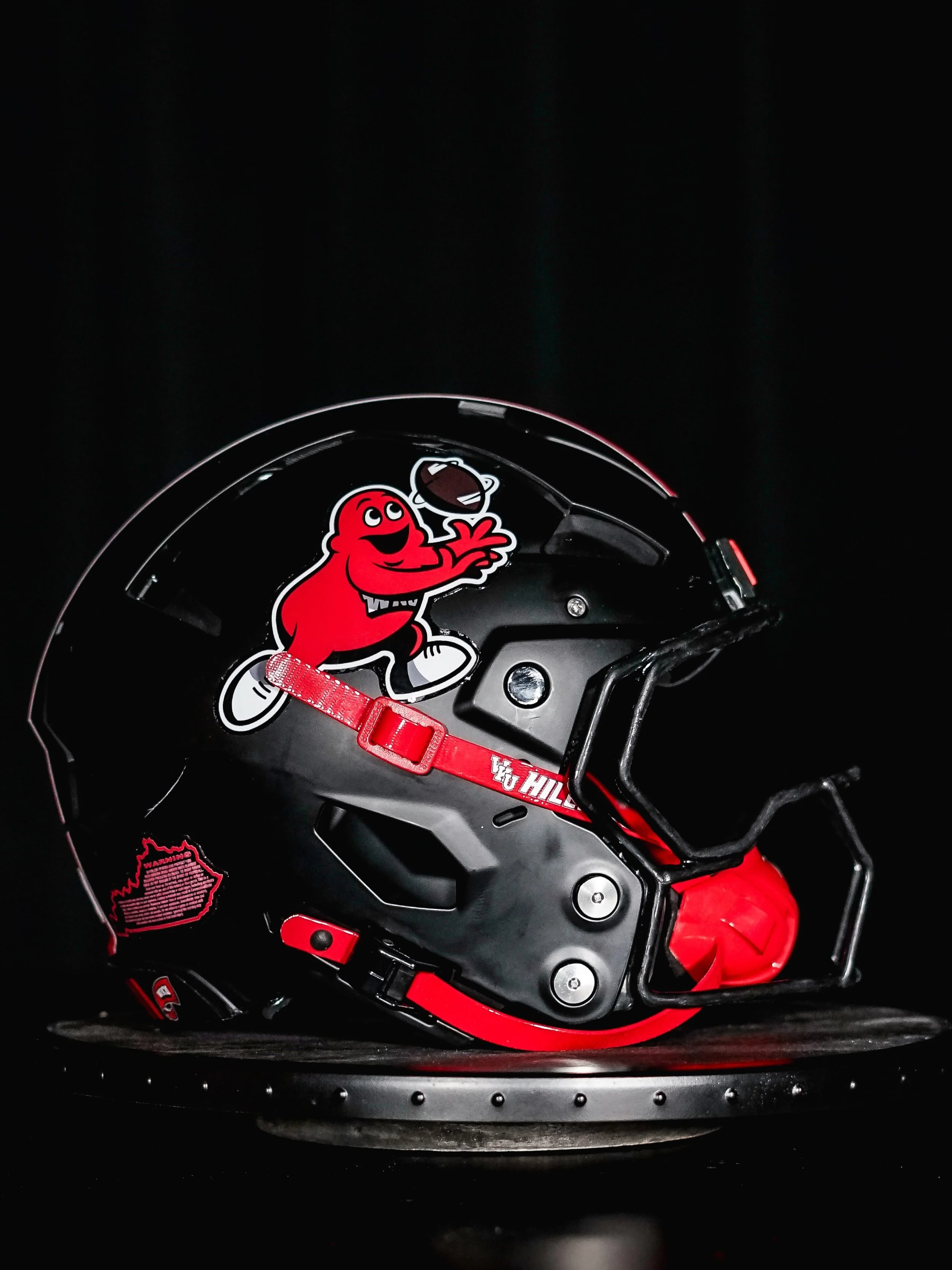
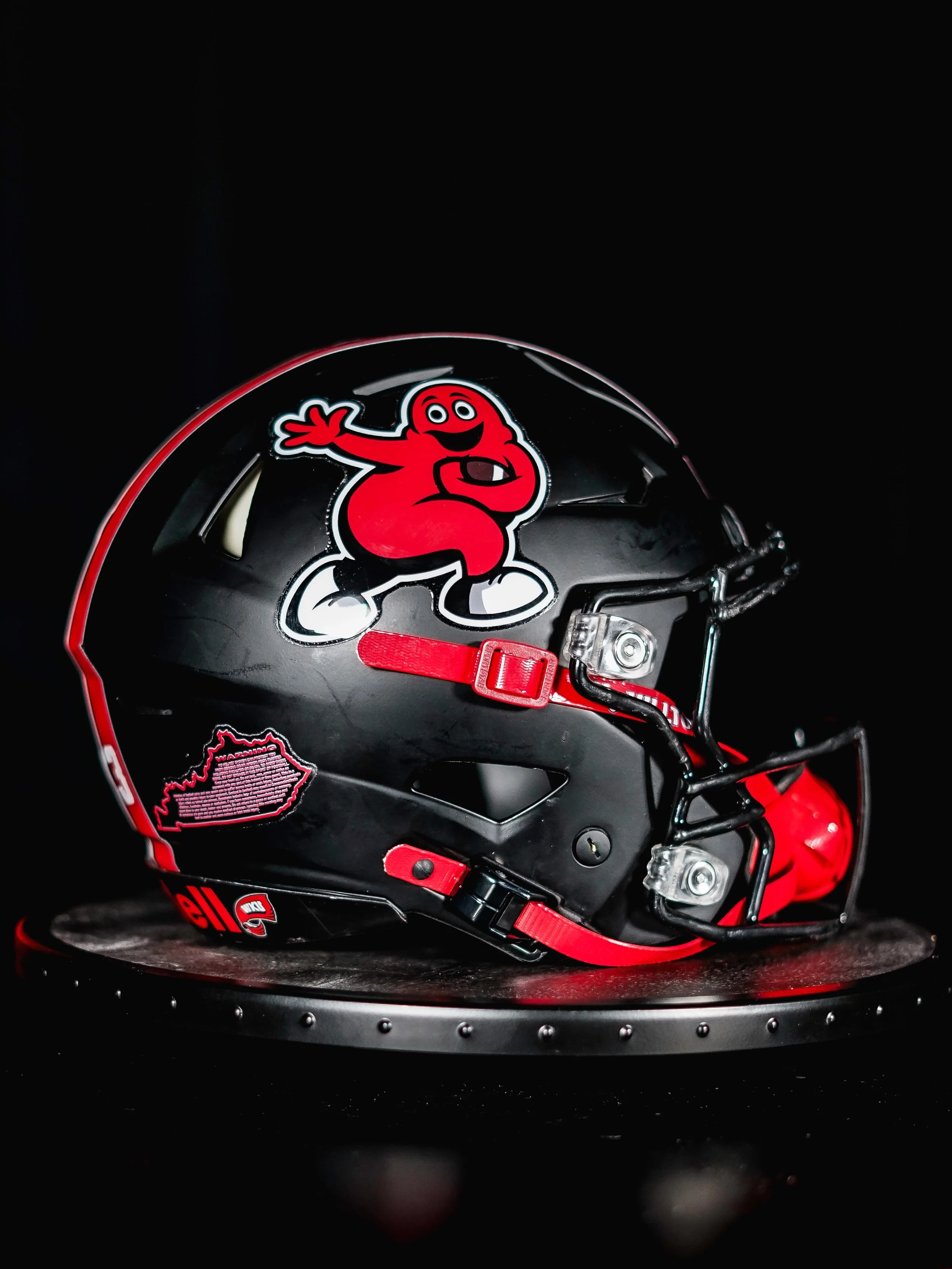
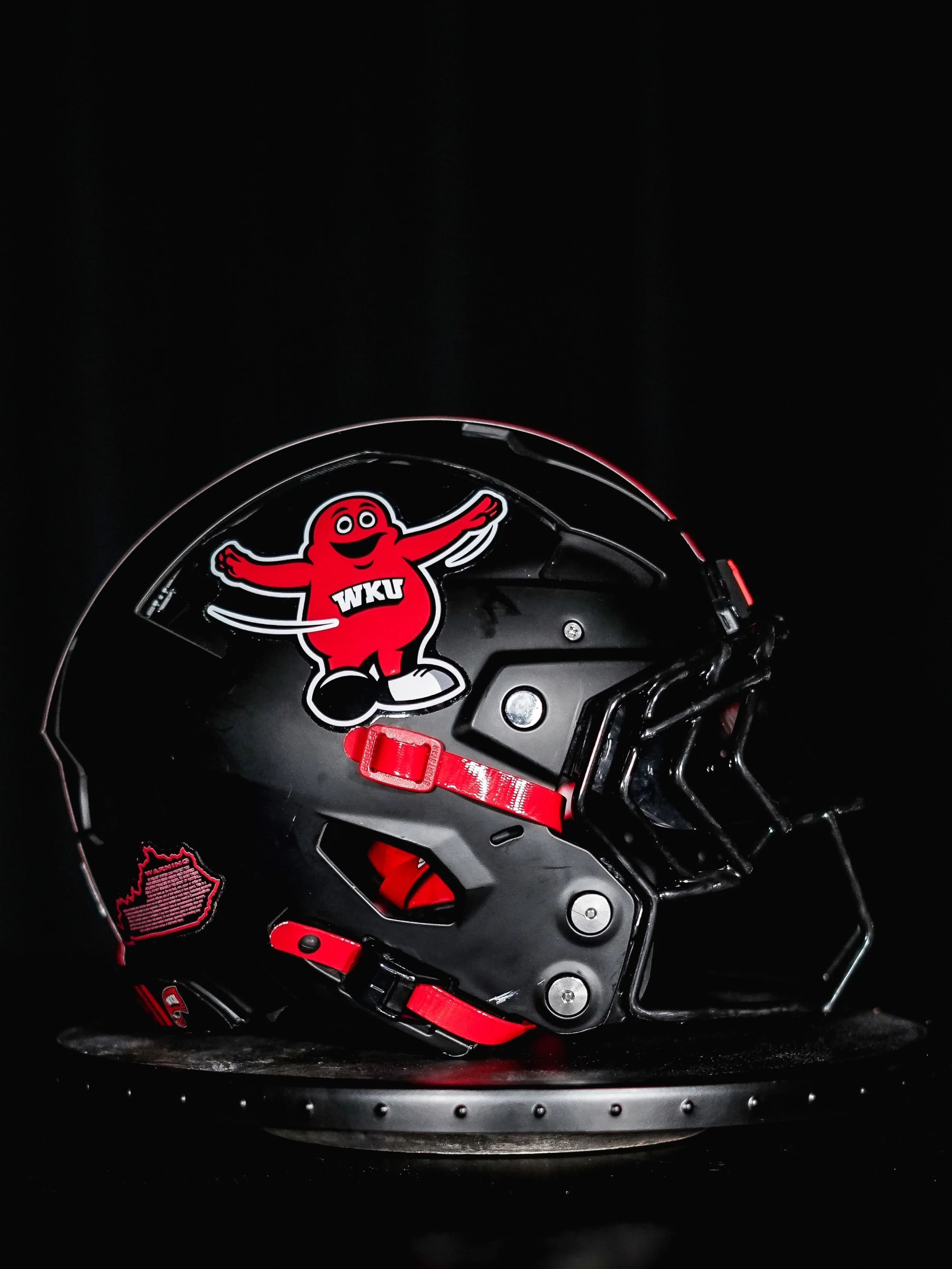
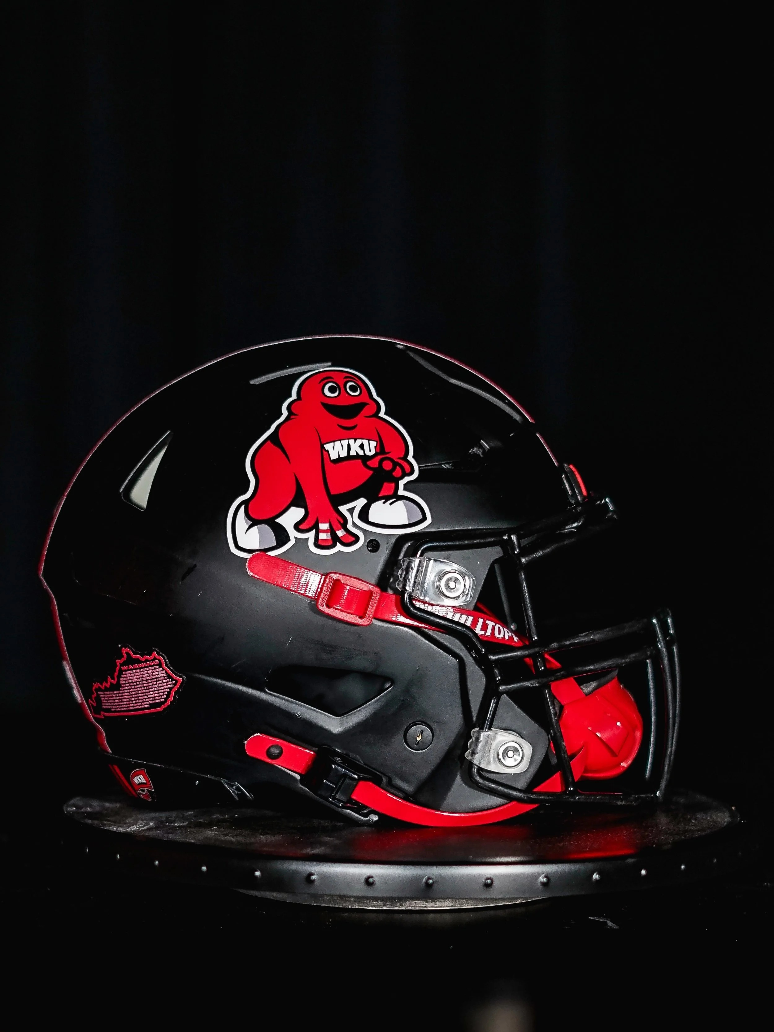
WKU Brings Back Seven Position-Specific Big Red Helmets

Big Red is taking on every role on the field. WKU is bringing back its position-specific helmets this week, giving the Hilltoppers seven different versions of their mascot based on the players wearing them.

The collection puts Big Red in football poses that reflect each position group’s responsibilities. Applied to black shells with Black facemasks, the red-and-white graphics give the helmets a consistent team identity while adding a different personality to each group.

Quarterbacks wear Big Red throwing a football, while running backs feature the mascot striking the Heisman Trophy pose. Receivers and tight ends share a version of Big Red catching a pass, connecting the helmet artwork directly to their role in the offense.

In the trenches, offensive and defensive linemen wear Big Red in a three-point stance. Linebackers get a hands-on-knees pose, ready for the next play, while defensive backs feature Big Red celebrating a pass breakup. Specialists complete the collection with a kicking version of the mascot.

The result is a helmet lineup that gives every position group its own mark without losing the connection between them. The shell, colors and mascot remain consistent; Big Red’s pose provides the variation. It is a playful approach that makes the details worth following across the entire roster.

SHOP WKU gear HERE


See What Else Is New

Related Articles


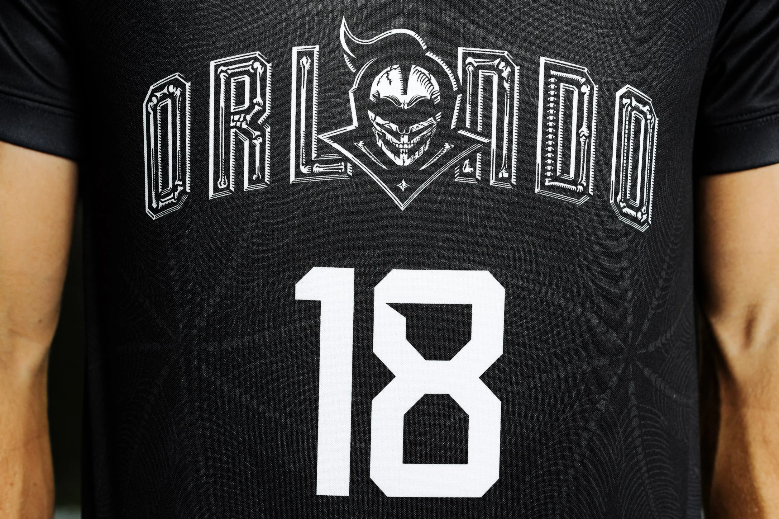
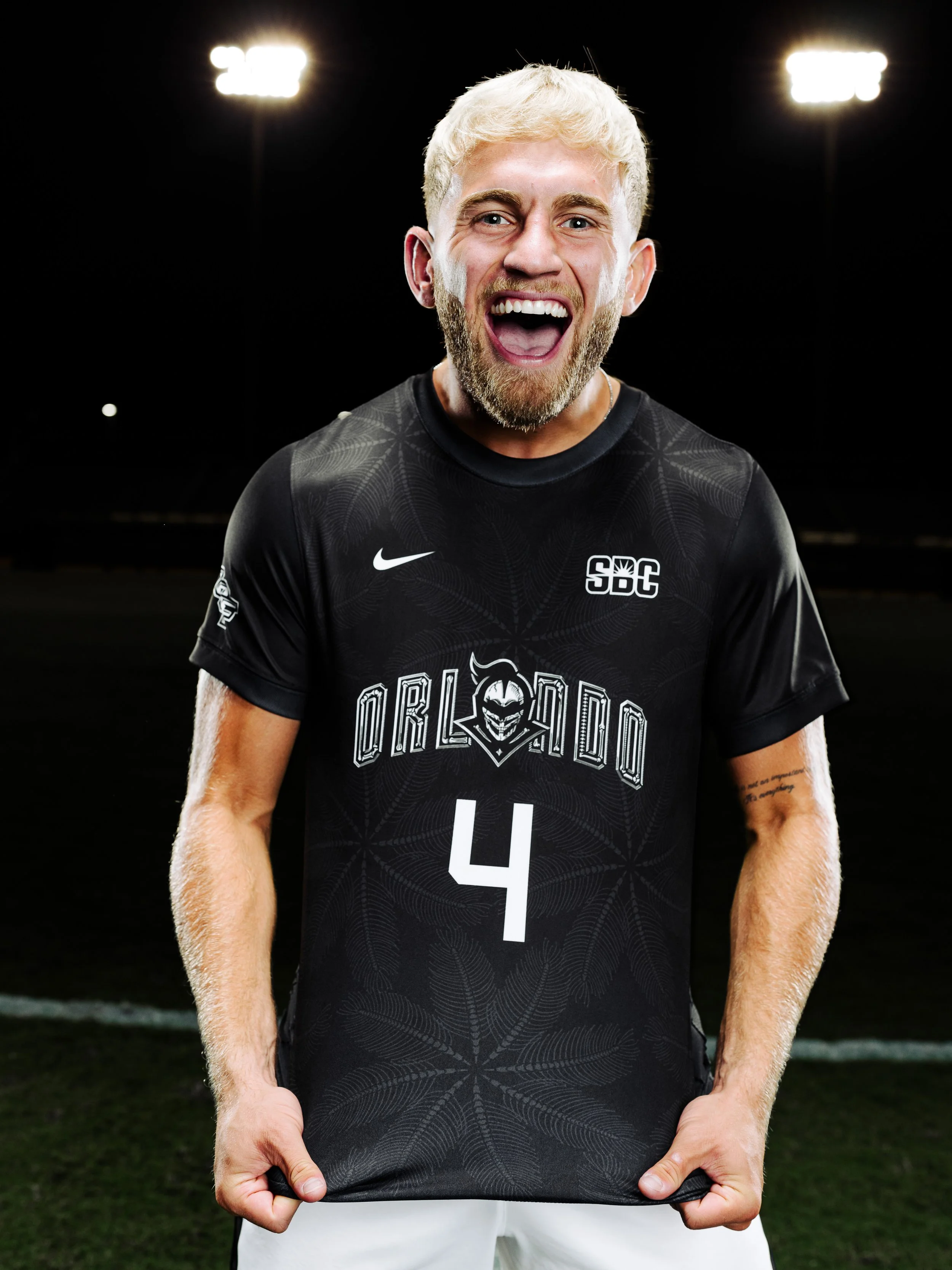
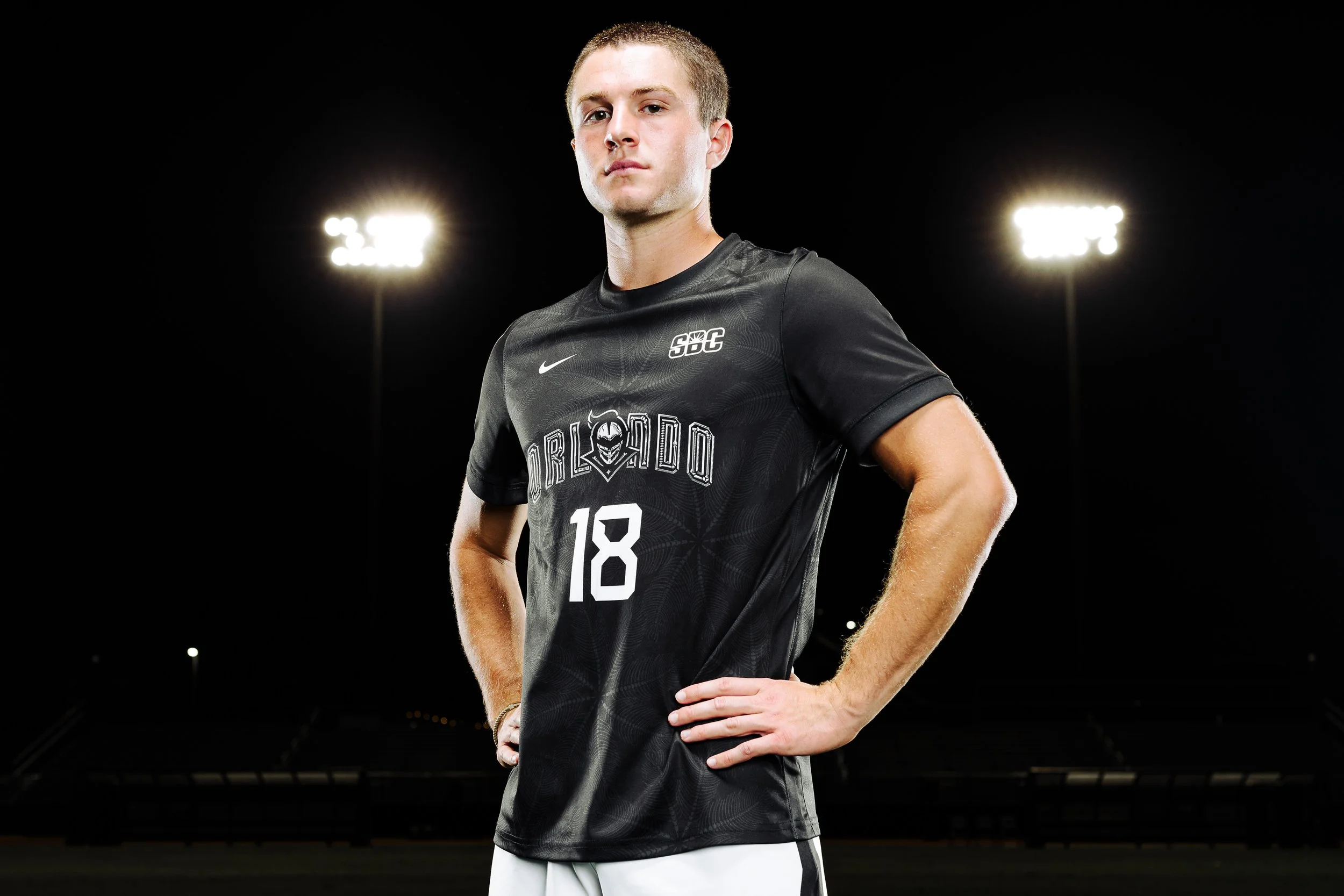
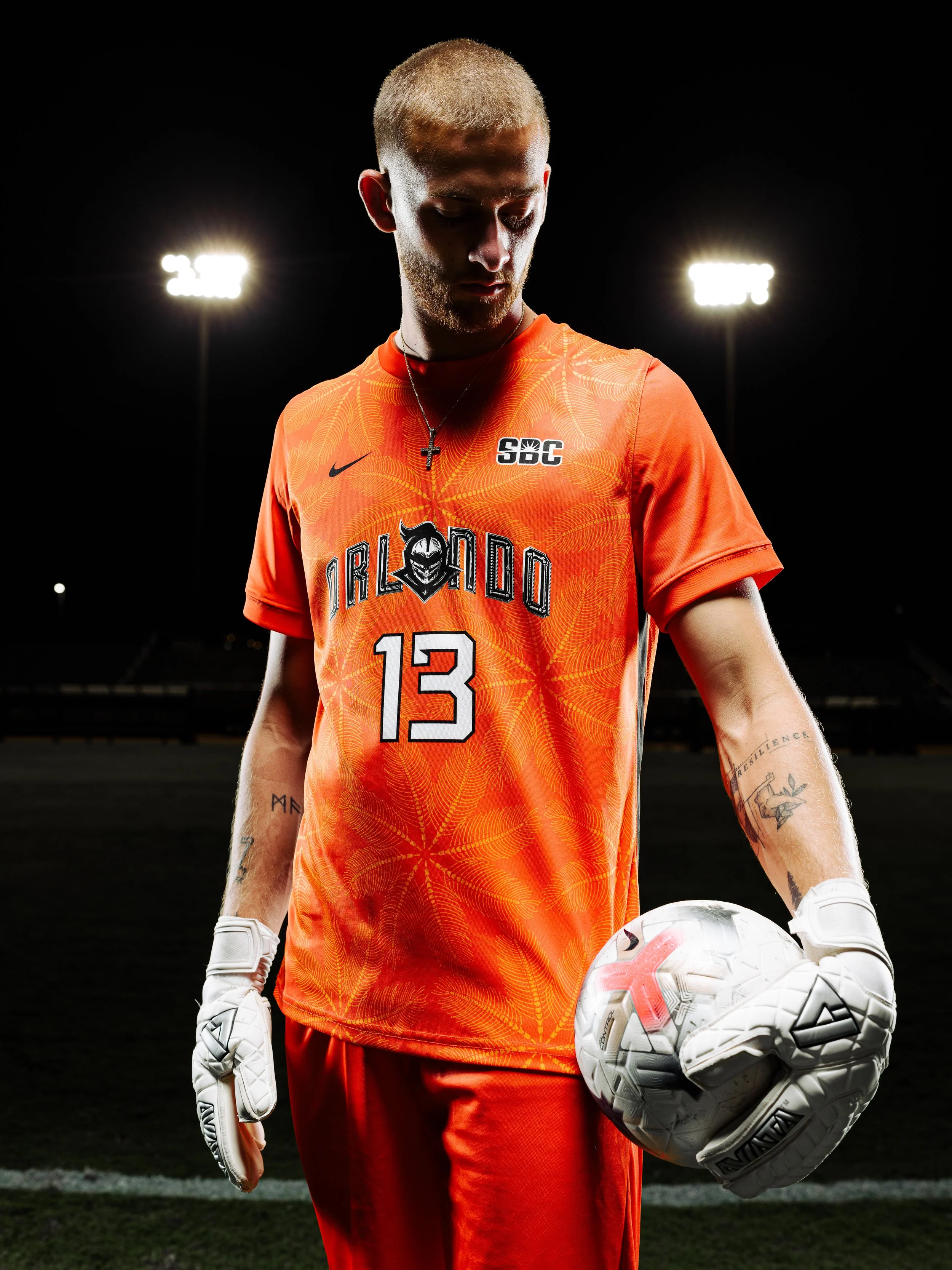
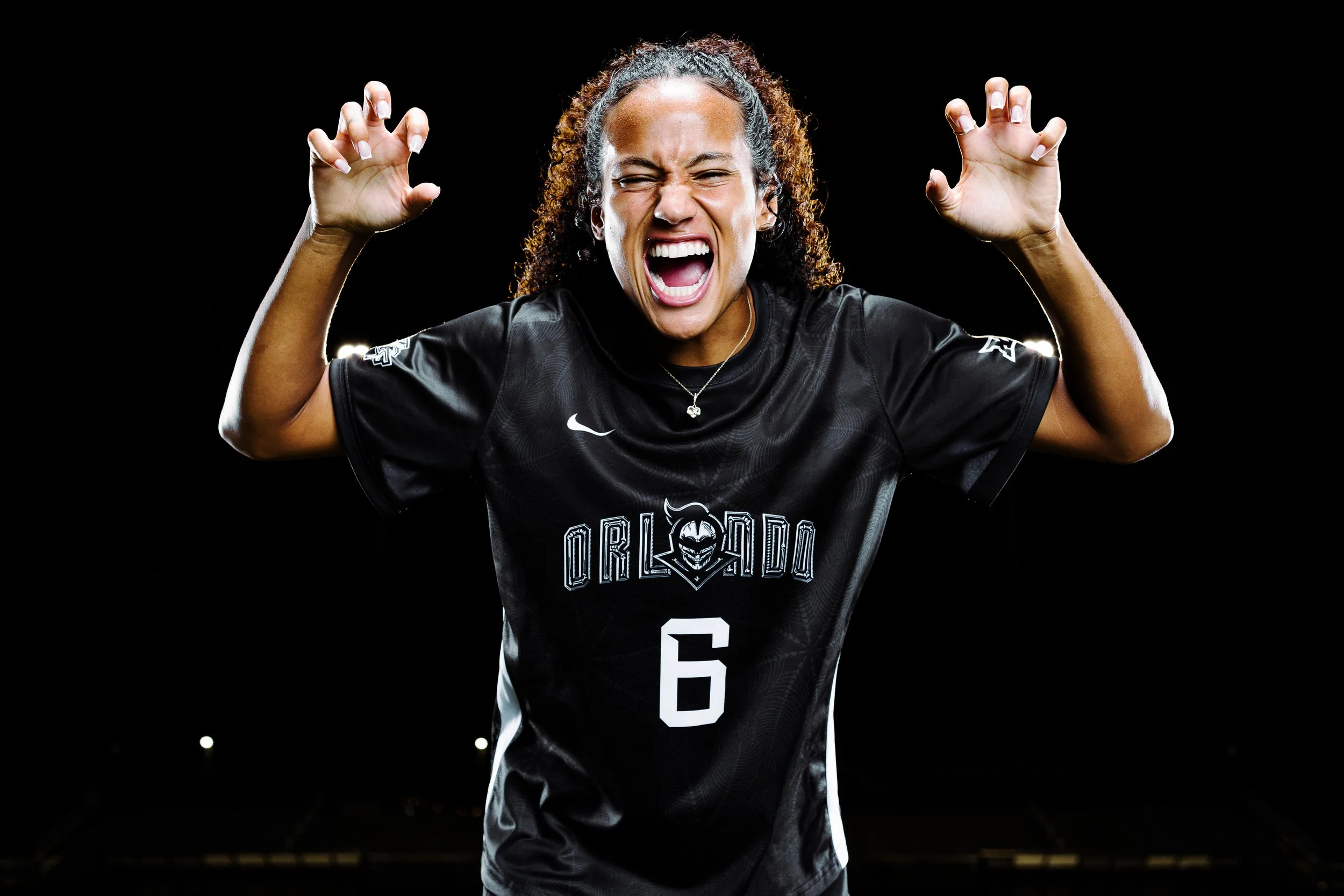
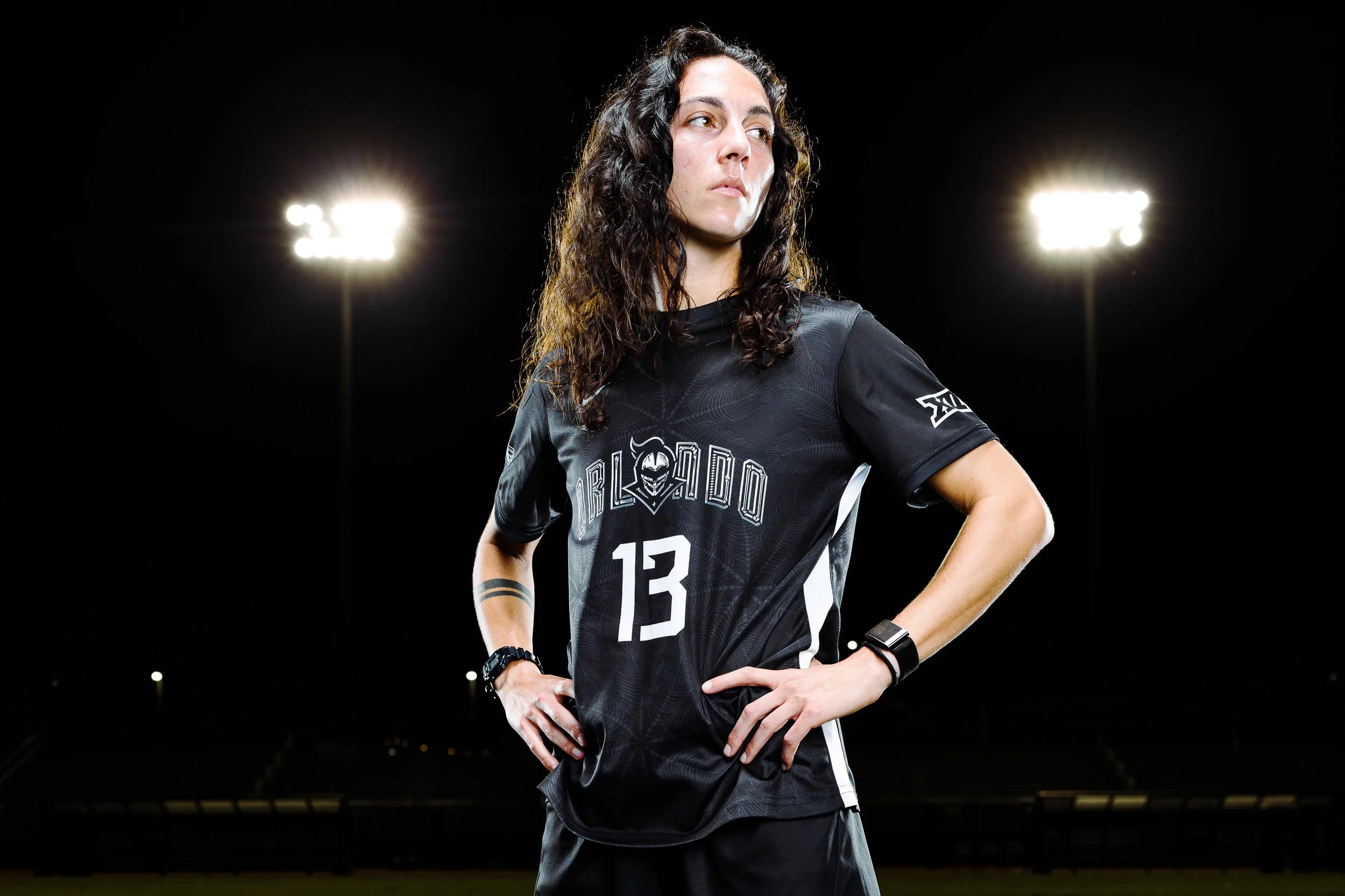
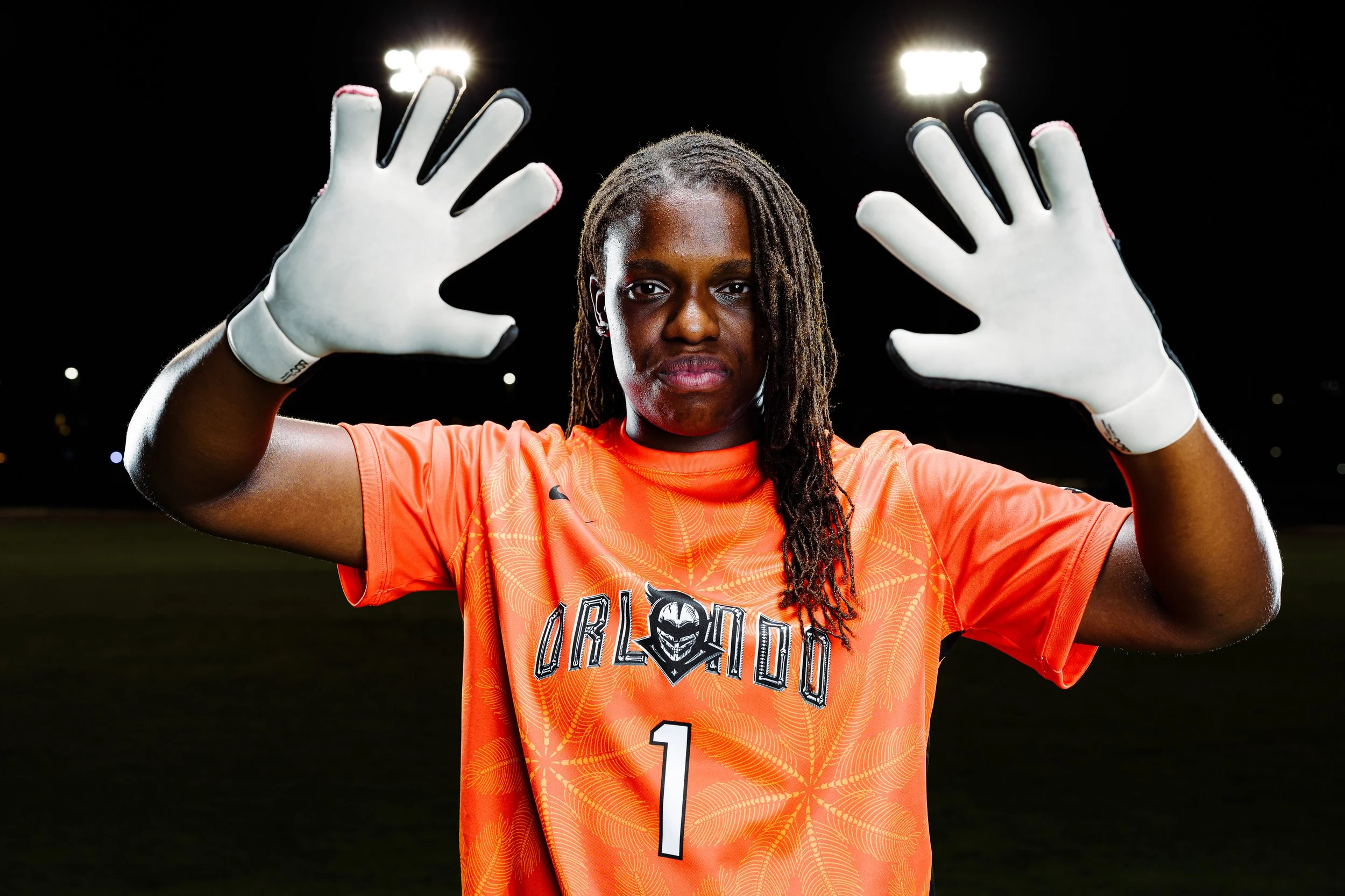
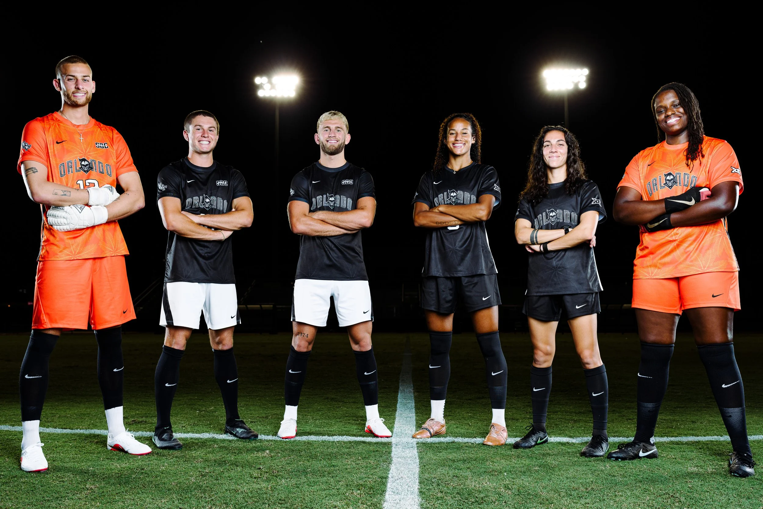
UCF Unveils Halloween-Inspired “Fright Mode” Soccer Kits for 2026

UCF is bringing Halloween to the pitch with its new 2026 “Fright Mode” kits for men’s and women’s soccer. The designs give familiar UCF branding a skeletal makeover, connecting the Knights’ on-field identity to Orlando’s celebration of the Halloween season.

Each fall, Orlando becomes a destination for Halloween experiences, from Universal’s Halloween Horror Nights and SeaWorld’s Howl-O-Scream to Mickey’s Not-So-Scary Halloween Party at Walt Disney World. Fright Mode draws from that local culture, giving both soccer programs a look that reflects the community around them.

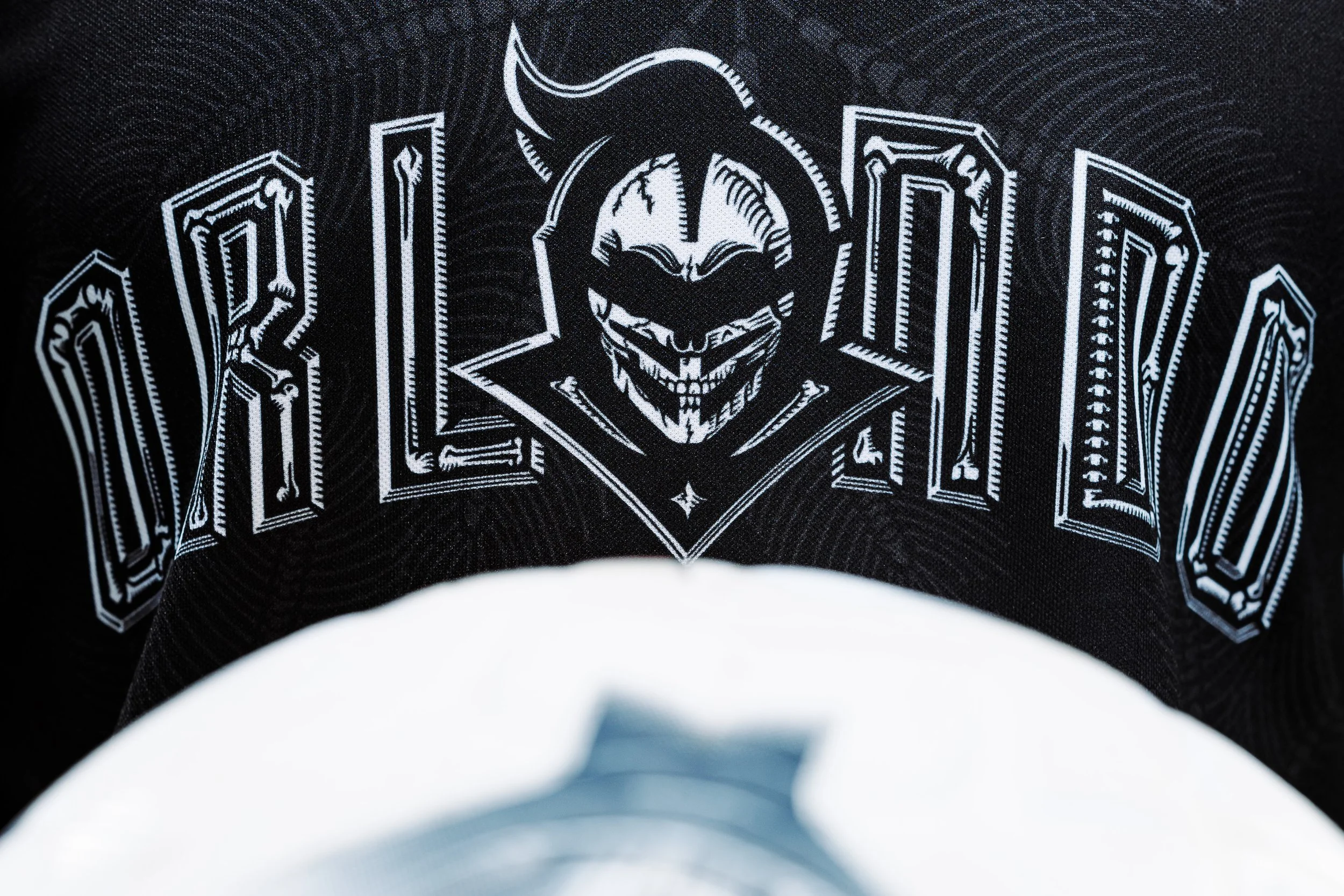
The centerpiece is a reworked version of UCF’s “Orlando” logo. The design reveals a skeletal Knight head, while bones form the interior of each letter. That treatment carries the Halloween concept directly into the branding, giving the familiar mark a distinct seasonal identity.

UCF’s palm pattern receives the same transformation. The palm leaves are constructed entirely from bones, adding a second layer of Halloween imagery to the jersey. The pattern retains its connection to Florida while introducing details that become more apparent when viewed up close.

Those two elements give Fright Mode a consistent design language. The skeletal logo establishes the theme, and the bone-built palms extend it across the jersey. Both draw from recognizable parts of UCF’s visual identity, making the kits feel connected to the Knights and their home city.

The close-up details are what make the concept compelling. A palm pattern already belongs naturally in an Orlando-inspired design; rebuilding it with bones gives that familiar feature a fresh purpose. The same approach carries through the lettering and Knight head, bringing the Halloween theme into the artwork itself.

With Fright Mode, UCF gives its men’s and women’s soccer programs a shared seasonal look rooted in Orlando culture. Fans can also purchase the new kits, taking the Knights’ Halloween-inspired identity beyond the pitch.

SHOP UCF Gear HERE


See What Else Is New

Related Articles


SoccerSkye TilsonComment