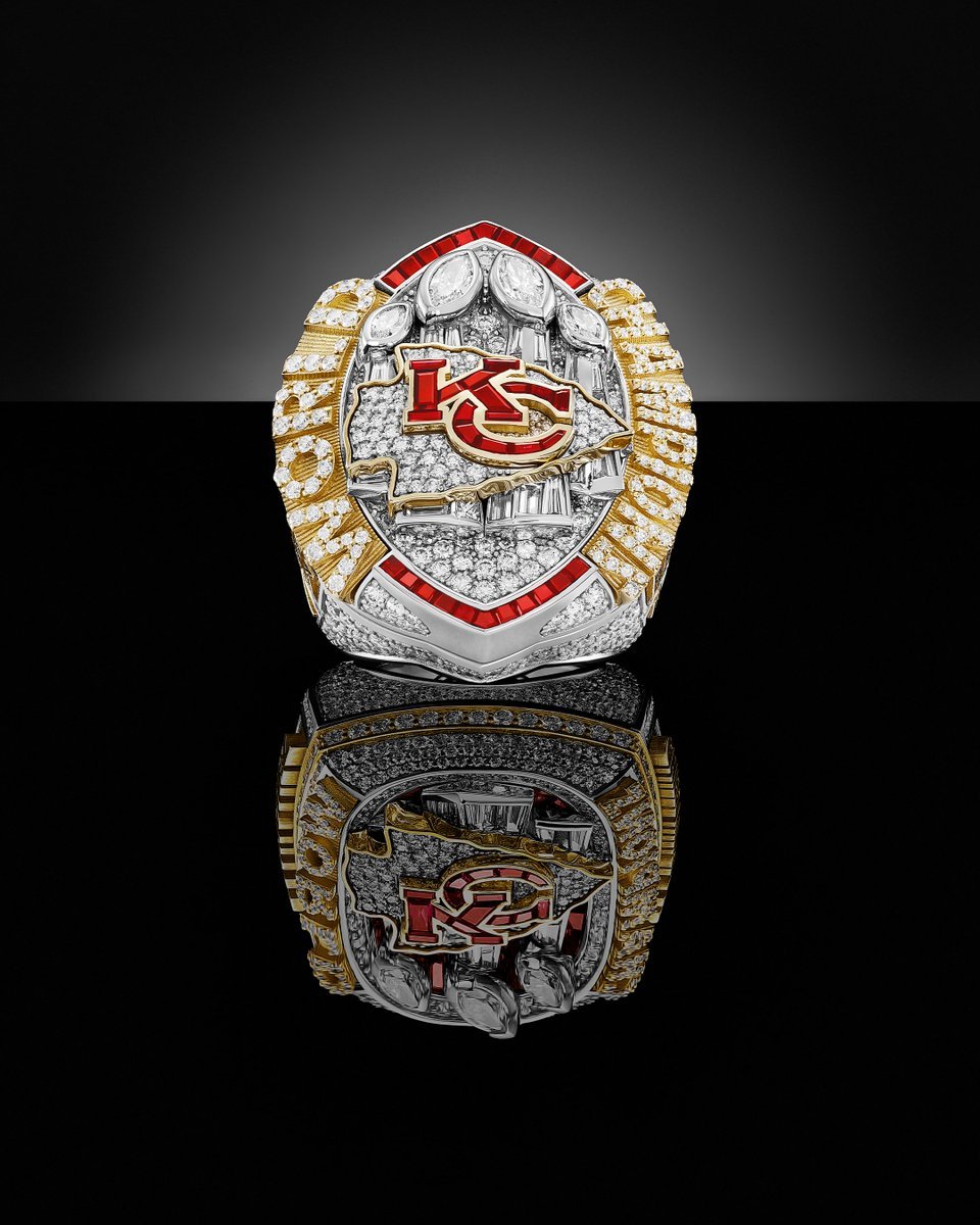
the Chiefs received their Super Bowl championship rings in an intimate ceremony at Kansas City's Nelson-Atkins Museum of Art.
Over 400 personalized rings were handed out during the ceremony, each one a testament to the franchise's storied history. Crafted by Jostens, these rings are adorned with 529 diamonds, 38 rubies, and 14.8 carats of precious gems, made from 10-karat white and yellow gold.
The ring's top showcases the Chiefs' iconic arrowhead logo, crafted from 16 custom-cut rubies to symbolize the franchise's 16 division titles. The yellow gold arrowhead is set with 50 diamonds, and the Chiefs' four Super Bowl trophies are outlined prominently. Flanking the top are the words "WORLD" and "CHAMPIONS."
One side of the ring features the phrase "Back-to-back," the Super Bowl LVIII logo, and the game's final score. The other side is customized with the recipient's name, position, and the years the Chiefs won the Super Bowl (1969, 2019, 2022, 2023). Additionally, it includes an outline of GEHA Stadium.
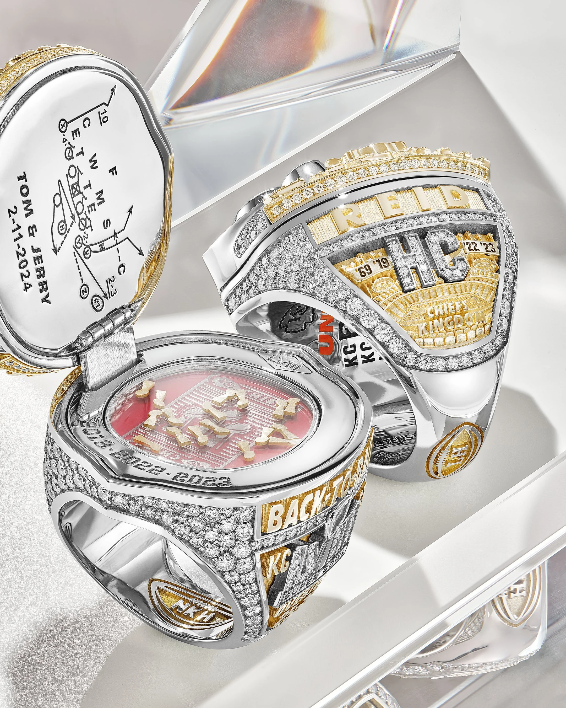
Inside the ring top, unique details commemorate key moments and figures:
The game-winning play "Tom and Jerry" from Super Bowl LVIII, written in Andy Reid's handwriting.
The words "Loud" and "142.2" to symbolize the fervor of Chiefs Kingdom.
22 sequential diamonds representing the points scored in the second half and overtime of the Super Bowl LVIII win.
19 diamonds within the Super Bowl LVIII logo, reflecting 11 consecutive winning seasons and eight AFC West titles.
A commemorative patch honoring Norma Hunt ("NKH"), who passed away in June last year.
The inside of the ring also features the years the Chiefs won Super Bowl trophies, inscribed beneath the removable top. This includes three years for key players and coaches like Patrick Mahomes, Travis Kelce, Chris Jones, and Andy Reid, who now aim for a fourth.
"The first thing I think of is how great last season was and the adversity we dealt with," Mahomes said before receiving his ring. "Then I'm going to think about how I can get another one for the pinkie finger. It's going to take a lot of hard work (to win three straight titles). It’s never been done before for a good reason. It takes a special group of guys, and I think we've got that group."
The Chiefs, the first team to win back-to-back Super Bowls in nearly two decades, lost five starters from their championship team but retain a strong core with Mahomes, Kelce, Reid, and Jones.
With eyes set on making history in 2024, the Chiefs are ready to embark on the journey towards a potential third consecutive Super Bowl victory.
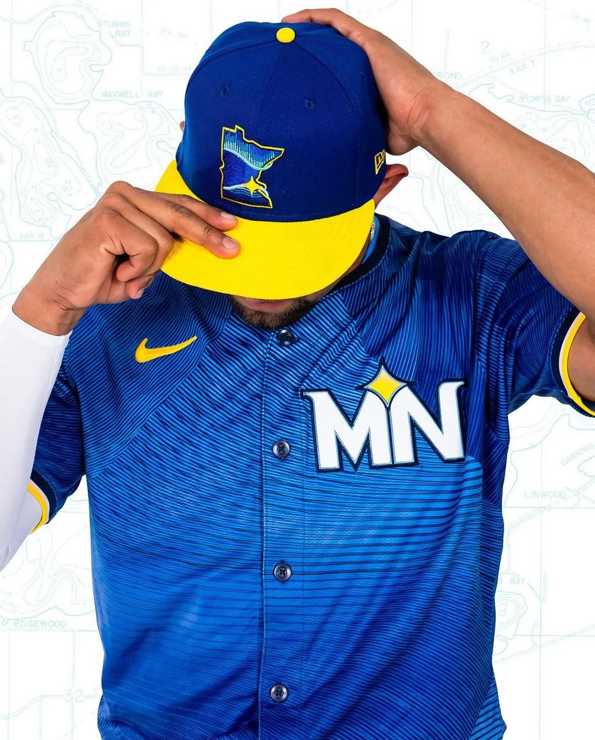
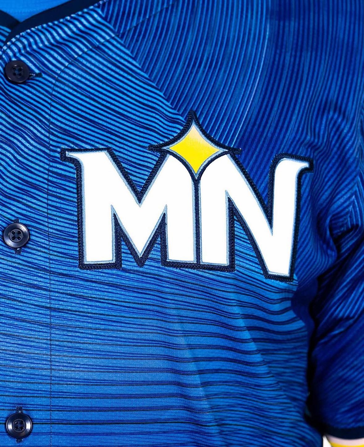
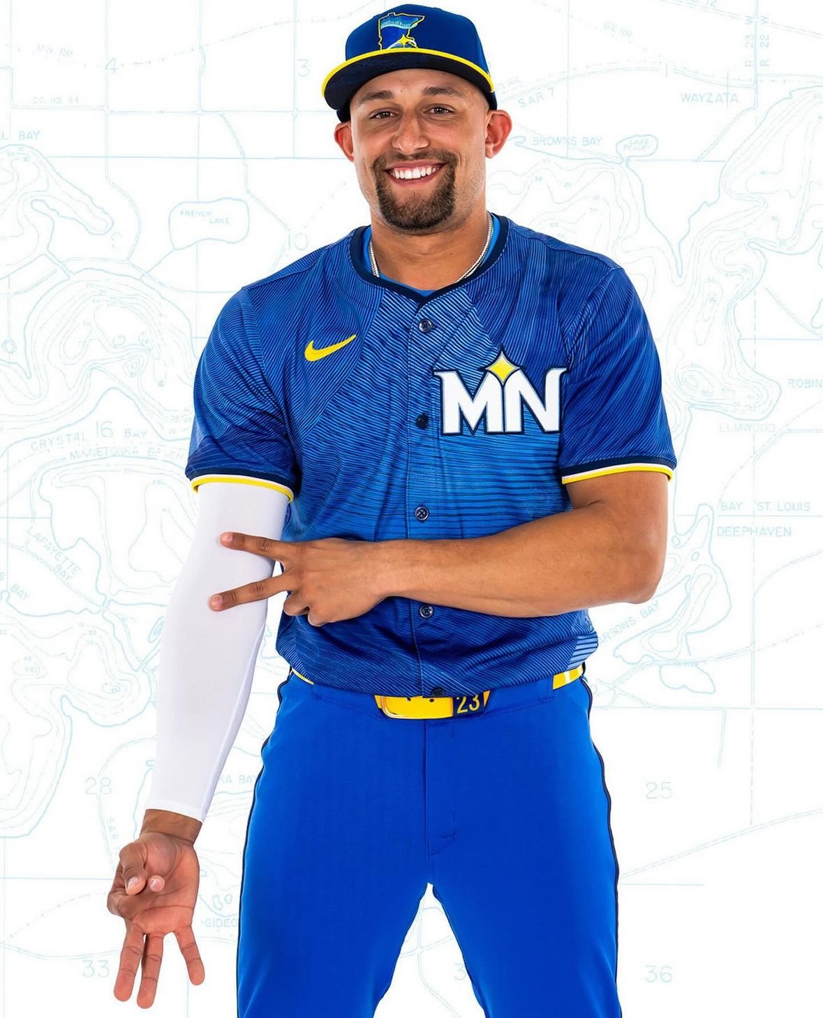
The Minnesota Twins have a legacy of representing their entire state rather than just their home city, and their new "City Connect" jerseys take this tradition to heart. The Twins' latest uniforms embrace a "State Connect" concept, paying homage to the Land of 10,000 Lakes.
The new uniforms, unified around an azure blue hue, reflect the central role of water in Minnesota. Accented with yellow belts and cap brims, the design evokes the sun shining over a lake. These uniforms will debut this Friday and be worn 10 more times throughout the 2024 regular season, primarily on home game Fridays.
"It's cool that they're different," remarked Joe Ryan. "It's cool to get away from what our normal uniforms look like. They did a good job with that. It will be fun to see what works and doesn't work with cleats and have a little bit of our own personal flair in there."
The design, developed over two years, embodies the "Ripple Effect" tagline. The intention was to go beyond a simple visual representation of lakes and to capture the serene, ripple-like impact lakes have on Minnesotans' lives.
"We really feel like that’s what the Twins do: We create positive action and we hope that that ripples out throughout the community," said Heather Hinkel, the Twins’ vice president of brand marketing. "So that’s the story we’re going to be telling, along with the jersey."
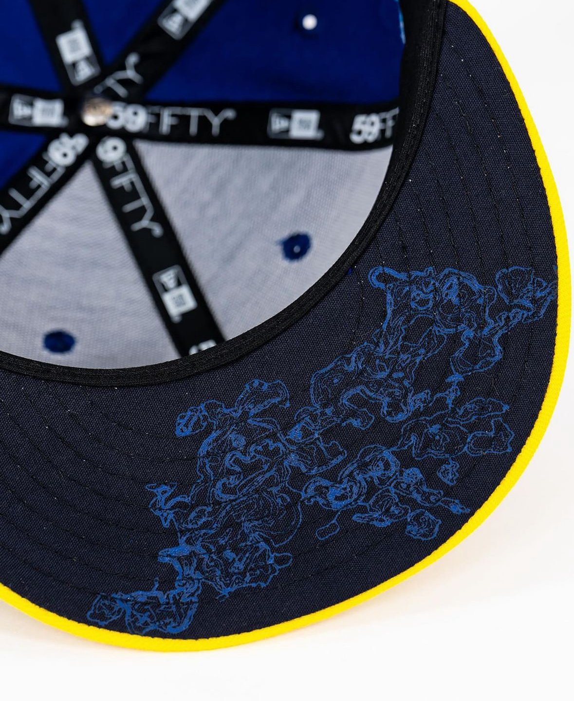
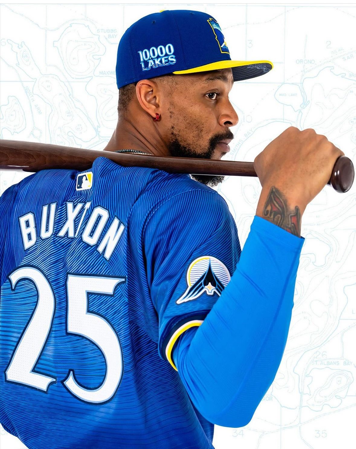
The dark blue caps with yellow brims feature a new insignia in the shape of Minnesota, outlined in yellow. The logo includes a North Star motif placed at the Twin Cities’ location, with the Northern Lights reflected in a lake’s water line.
"Really honing in on kind of what Minnesota stands for, where the water reflects the sky," Hinkel explained. "It doesn’t necessarily say Twins, but it really speaks to Minnesota."
The caps also feature a "10,000 Lakes" decal and a topographical depth map of Lake Minnetonka under the brim—a nod to Prince’s iconic "Purple Rain" movie line.
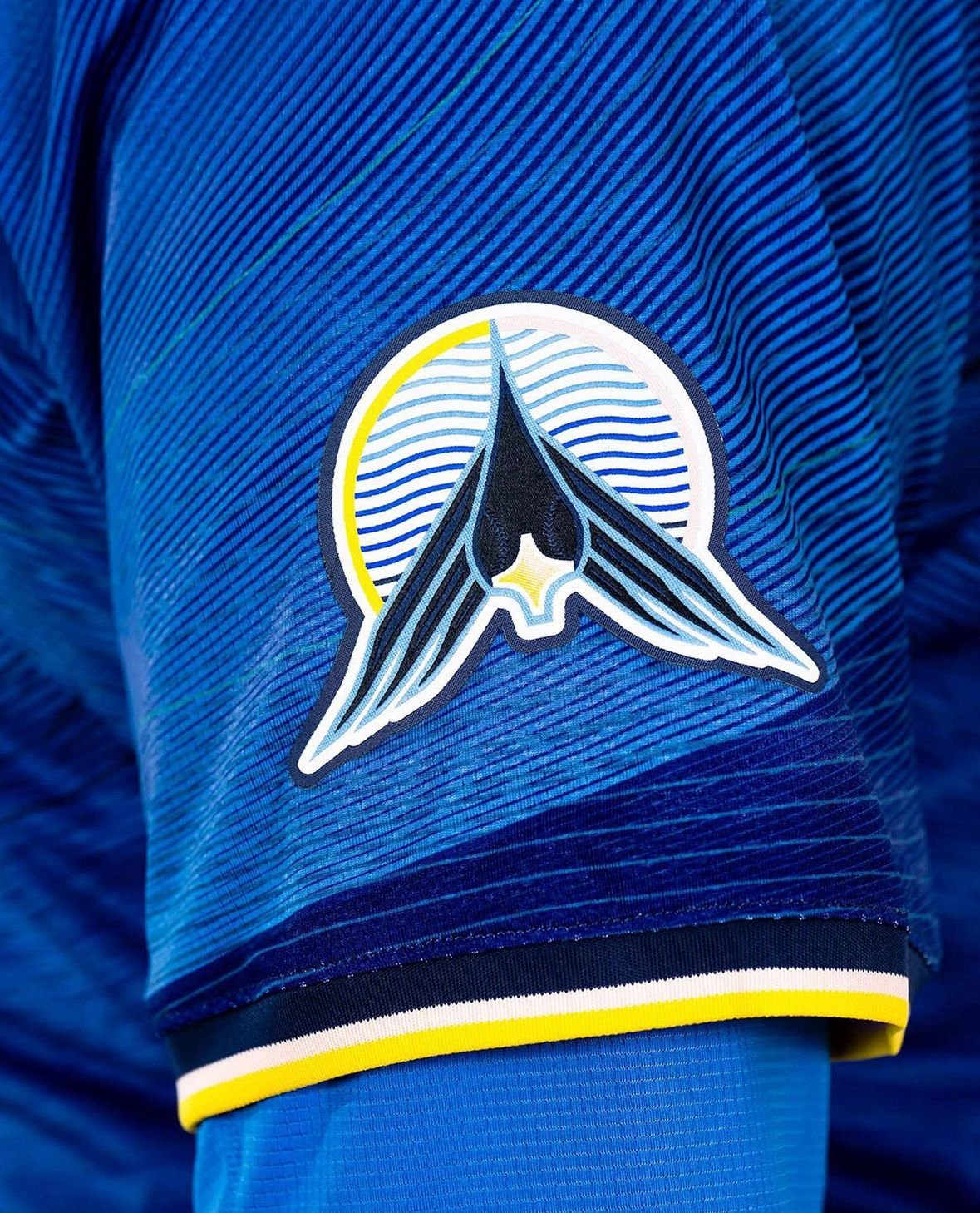
The jersey tops feature a sublimation pattern with various shades of blue and black striations, representing lake ripples. Instead of a traditional wordmark, the chest patch displays a white “MN” logo with the North Star motif, emphasizing the entire state rather than just Minneapolis and St. Paul. A loon logo on one sleeve, with baseball stitching for eyes and the North Star as its beak, adds another unique element.
The solid blue pants with neon yellow belts and multi-colored piping along the sides unify the look from head to toe. The piping, incorporating yellow, black, white, and pink, represents the varied colors of a sunset.
"That’s to reflect the hues of the sun setting over the lake," Hinkel said. "When you get that great sunset, it’s not just bright yellows. There’s some pink hues in there, so we’ve added the piping here."
While this year's iteration uses blue pants, the Twins are considering white pants for future seasons.
The Minnesota Twins have once again demonstrated their commitment to representing their state with pride, blending tradition with modern design in their new "State Connect" uniforms.
— Minnesota Football (@GopherFootball) June 7, 2024
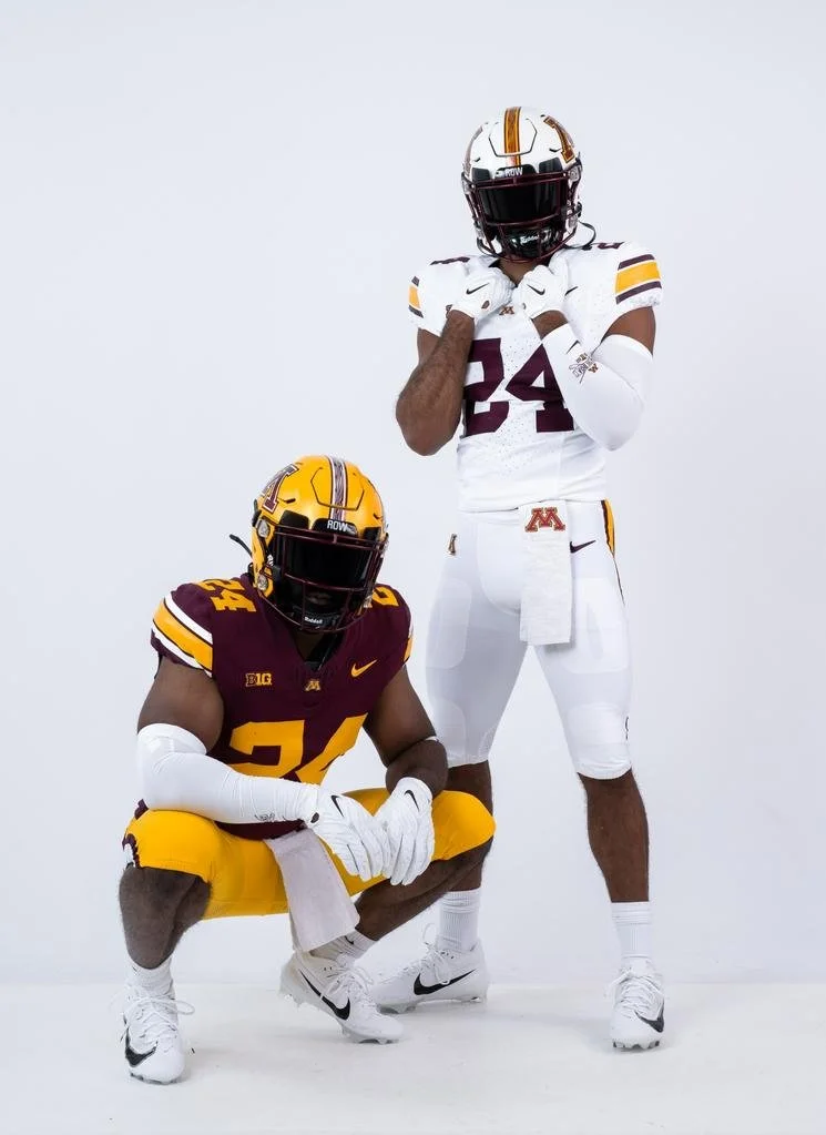
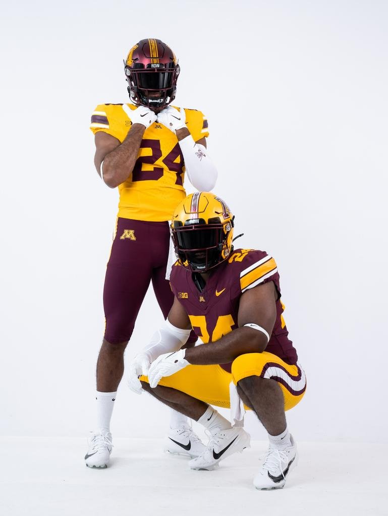
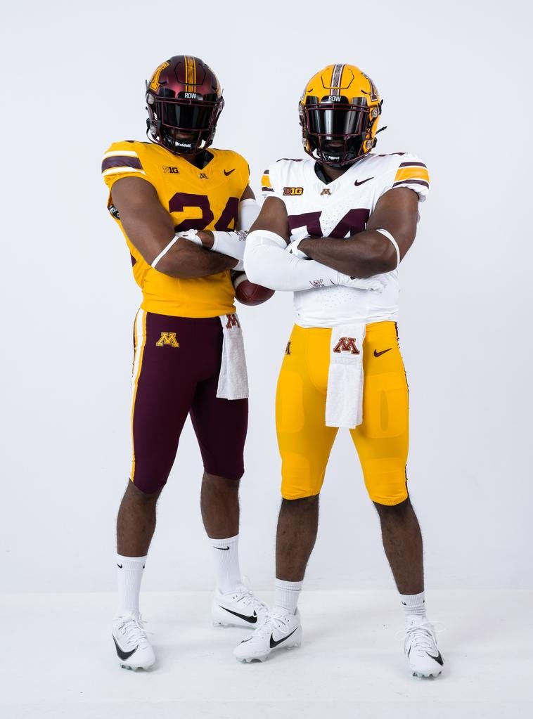
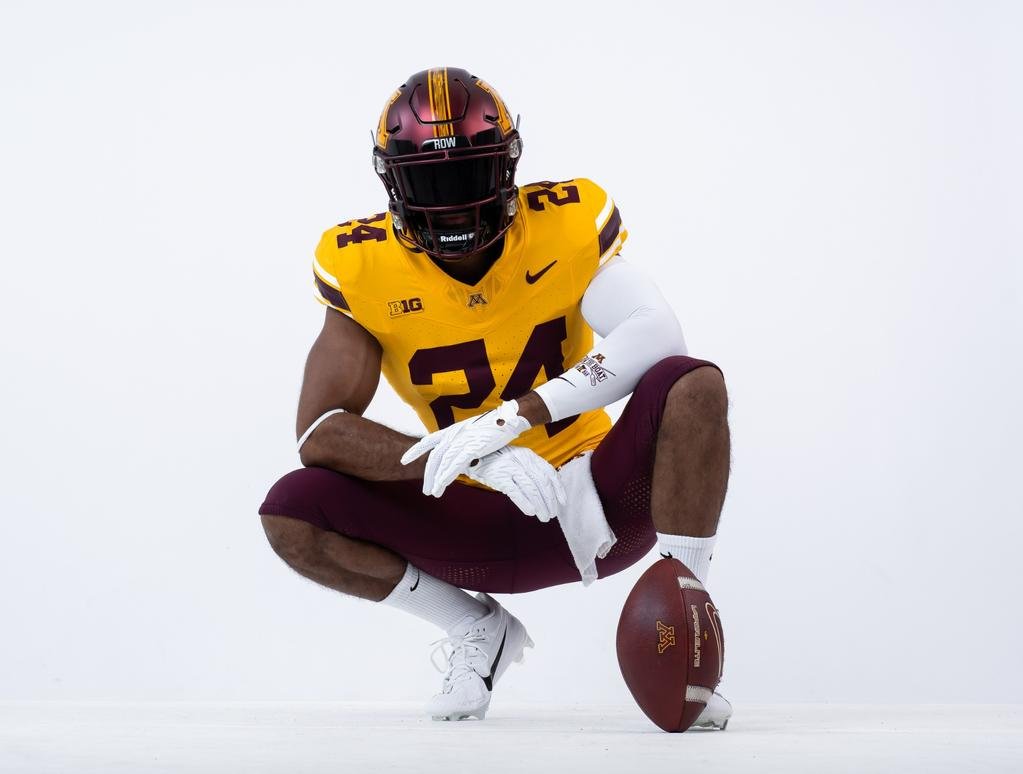
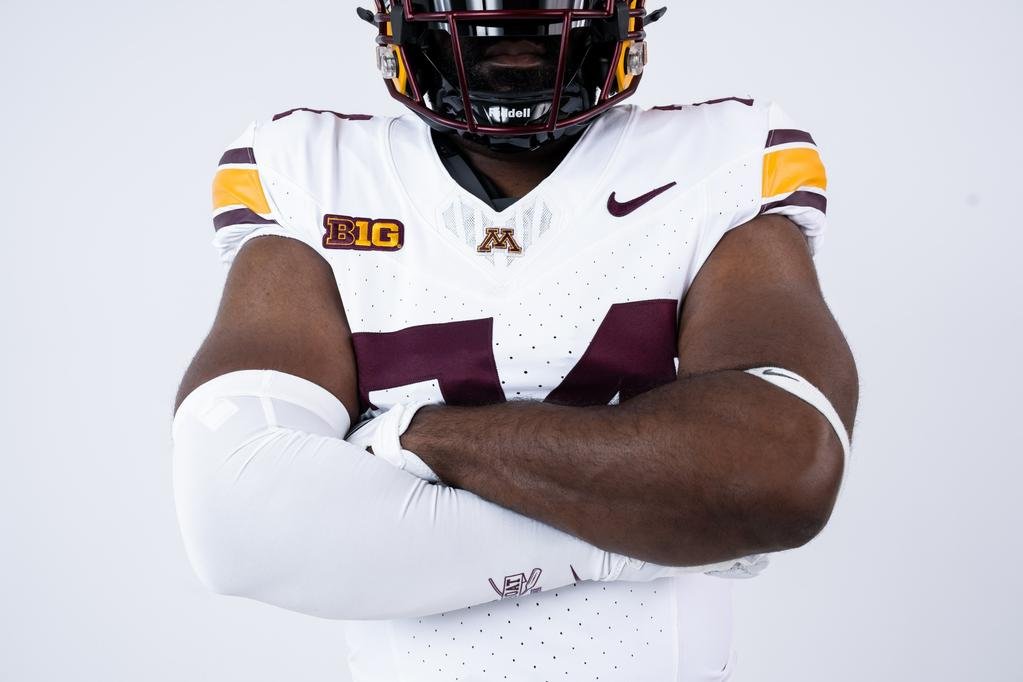
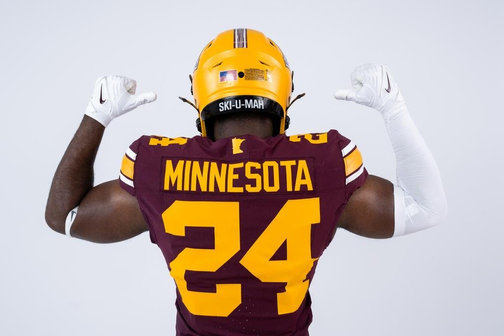
The University of Minnesota football team is set to turn heads in the upcoming 2024 season with the debut of their newly redesigned uniforms. This marks the first jersey relaunch for the Golden Gophers since their last update in February 2018.
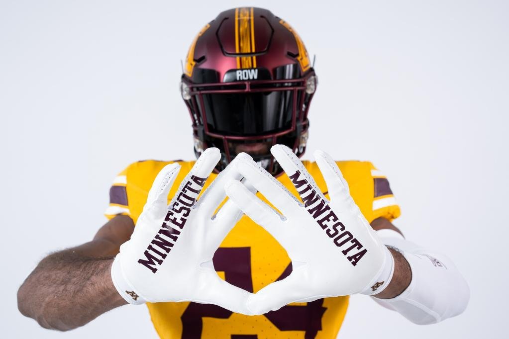
the new Nike uniforms embrace Minnesota's traditional colors of maroon and gold, complemented by a sleek white option for road games. Additionally, the team will retain their popular alternate black uniforms, offering a versatile array of looks for the season.
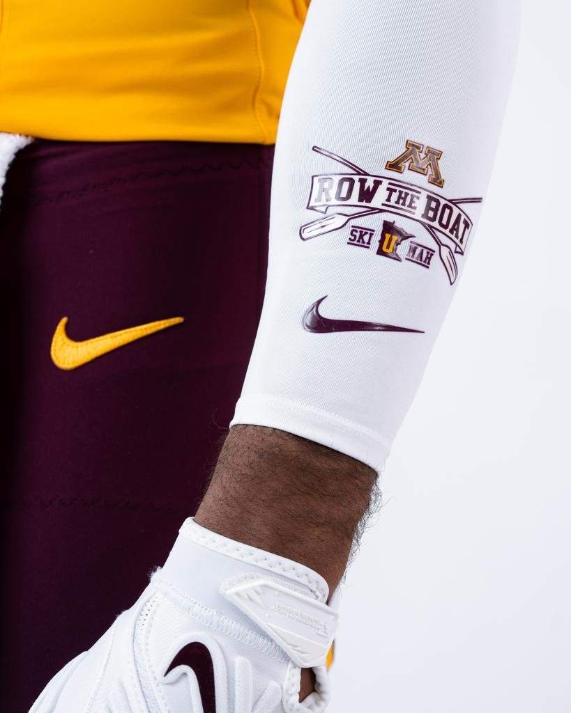
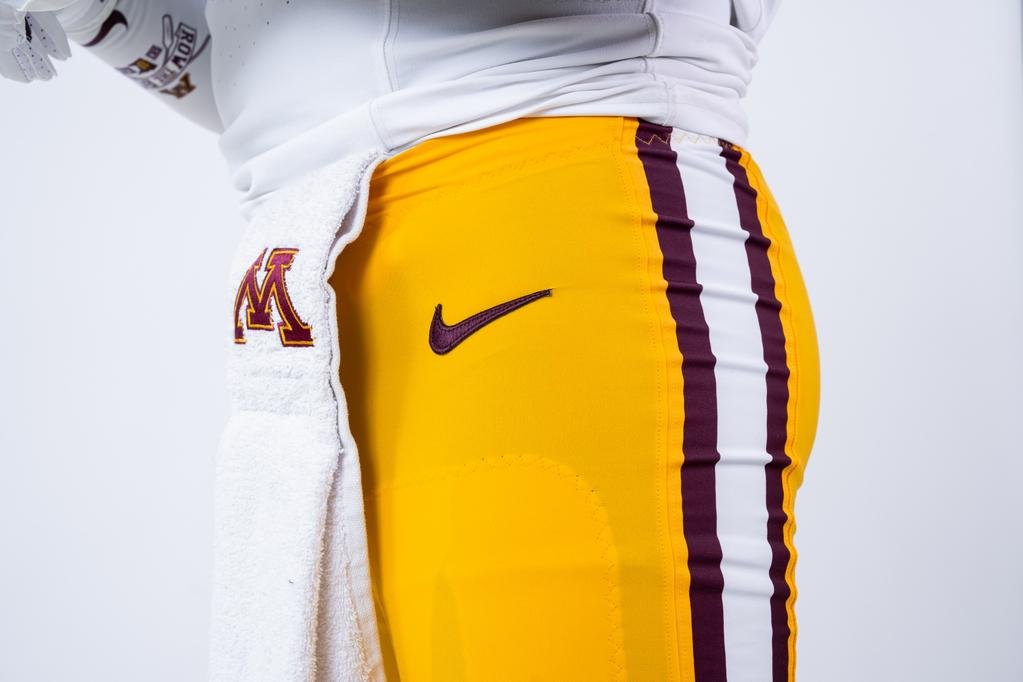
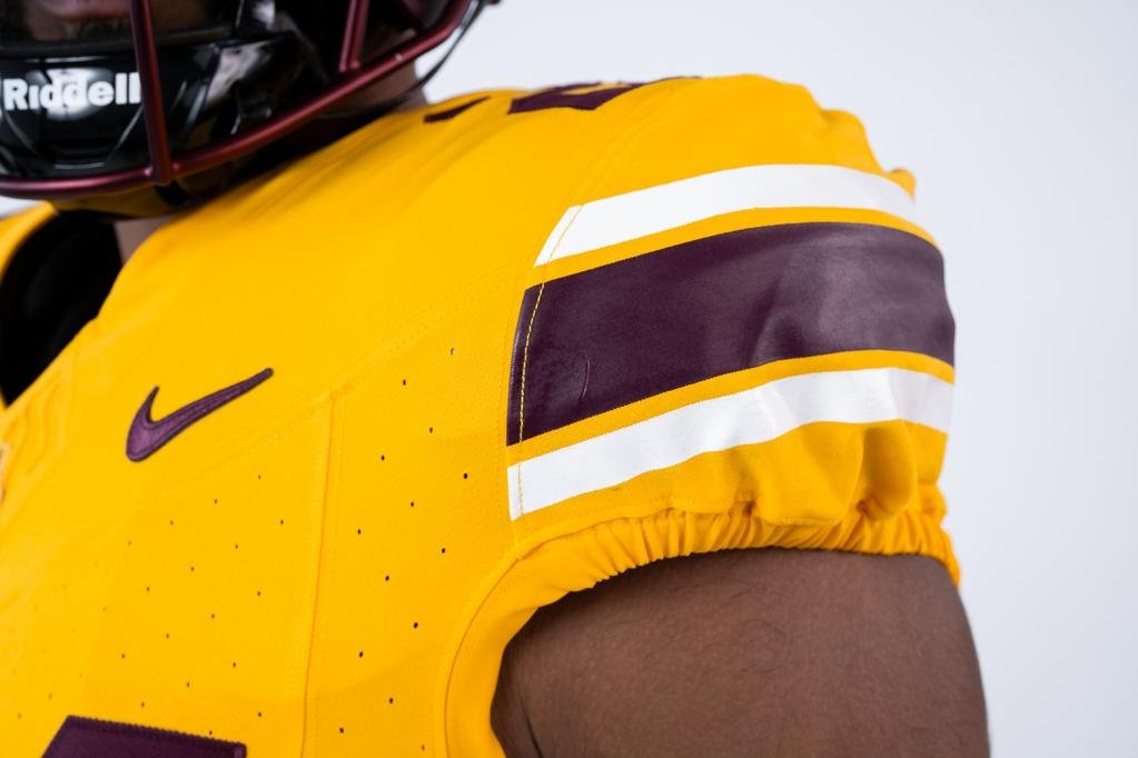
Key updates include the addition of bold shoulder stripes and side stripes on the pants, adding a fresh dynamic to the jerseys. Each uniform features the state of Minnesota proudly displayed on the outside collar, while the rallying call "Ski-U-Mah" is emblazoned inside the collar, reinforcing team spirit.
The iconic Block M remains a centerpiece on the front of the jersey, positioned just above the numbers. The right chest bears the Big Ten logo, and the Nike swoosh graces the left chest and left hip, ensuring the uniforms carry a modern, cohesive branding.
The maroon jerseys will now sport gold numbers, a shift from the previous white numbering. Official colors for the uniforms are Night Maroon, University Gold, and White, and the team’s helmets will match these hues.
These new uniforms won’t just be making an impact on the field—they’ll also be featured in the highly anticipated EA Sports College Football 25 video game, bringing the Golden Gophers' updated look to fans worldwide.
The University of Minnesota's fresh uniforms symbolize a blend of tradition and modernity, setting the stage for an exciting new chapter in Golden Gophers football. With these updates, the team is ready to make a statement both on and off the field.
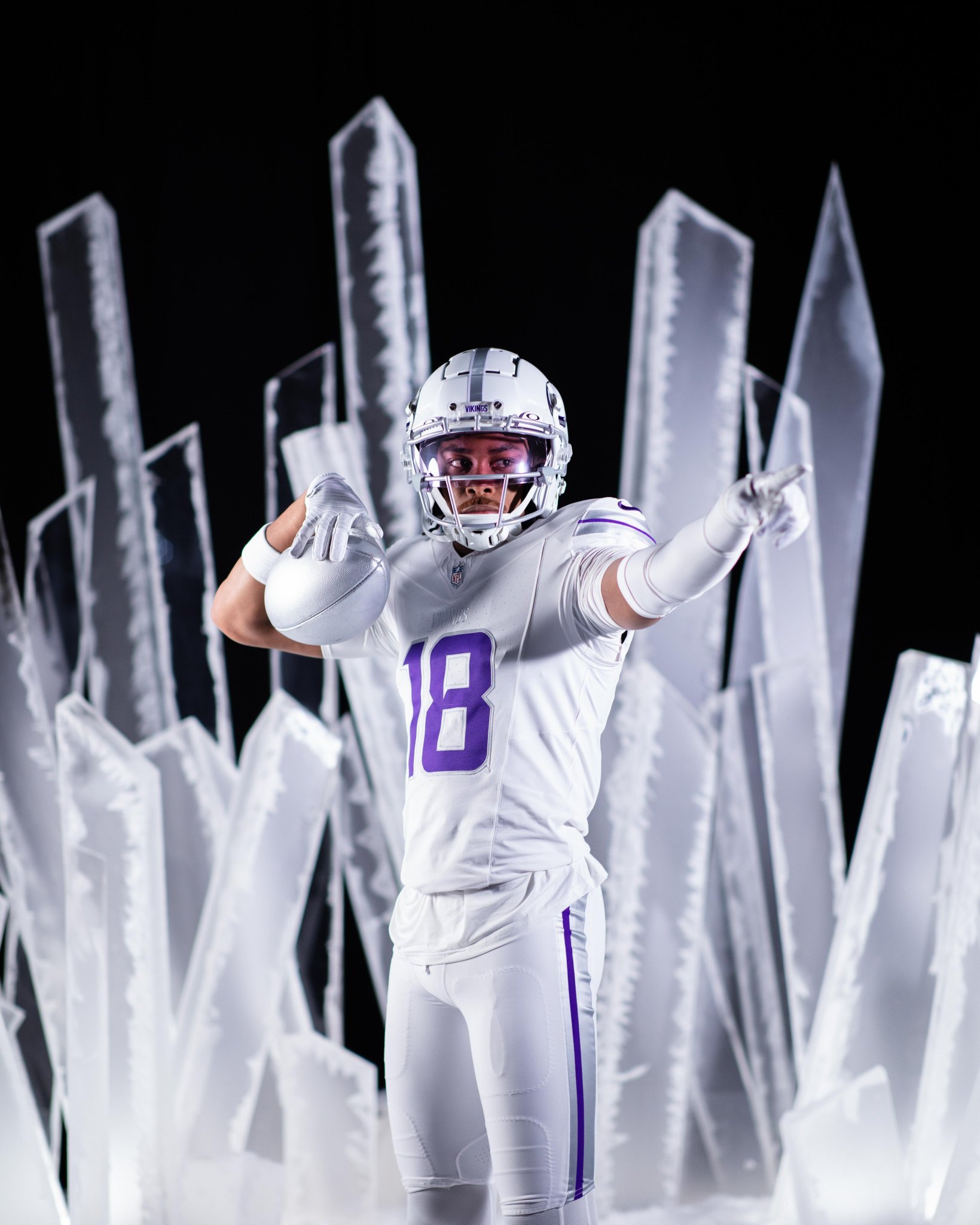
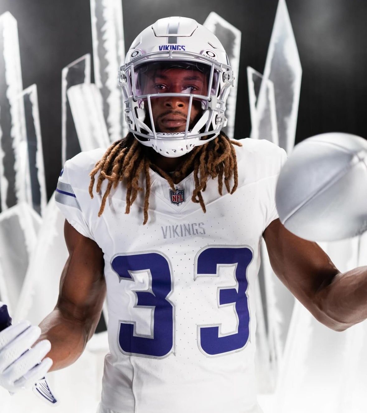
The Minnesota Vikings have unveiled their highly anticipated "Winter Warrior" uniforms, setting a new standard for their alternate game day attire. This striking ensemble includes white jerseys and pants, paired with the franchise's first-ever white helmet, creating a crisp and commanding look on the field.
The new uniforms feature accents of metallic gray, including the face mask, and the team’s signature purple. This combination adds a modern and fierce edge to the Vikings’ traditional colors. The centerpiece of this look is the matte white helmet with a gray stripe, marking a significant milestone in the team’s uniform history.
Star wide receiver Justin Jefferson expressed his excitement about the new look with a blend of irony and enthusiasm. "It's fire," Jefferson said with a smile. "It's beautiful. The gray, the purple, of course being all white, they've got that clean look. But you know, it's a dirty game. So we're definitely looking to get those jerseys a little dirty," he laughed. "The matte white helmet with the gray stripe, I mean, it's beautiful. It's fire."
Vikings Head Coach Kevin O'Connell was equally impressed. "Goodness gracious," he said upon first seeing the uniform against an Arctic-themed backdrop. "Our fans, they've gotta like these, right? These are sweet. I love the metallic. White helmets? I love it. Where's mine? Where's the coach's head-to-toe white warmup jumpsuit?" O'Connell quipped.
The introduction of the Winter Warrior uniforms caps a design process that began over two years ago. The initial concepts were created by Vikings Art Manager Jackie Ramacher, with the "Winter Whiteout" uniforms debuted in 2022 as a market test. The overwhelmingly positive response led to the development of the Winter Warrior look.
"We wanted to see, 'Would people embrace wearing all-white? How would it go?' Our fans loved it, and that's how we knew we really wanted to embrace this direction for our new alternate uniforms," said Vikings Creative Director Alicia Dreyer. "Some of the biggest feedback we got from fans with our Winter Whiteout was wanting to see an all-white helmet, but it's a two-year process to create new uniforms and helmets – so we appreciate people being patient with us."
The Winter Warrior uniforms feature a cool-toned color palette inspired by ancient Viking culture and the harsh Northern climate. Key design elements include metallic gray replacing gold, creating an icy, modern look. The numbers feature "dripping icicle" accents, a unique twist on the existing SKOL font serifs.
The helmet includes a metallic stripe as a modern interpretation of the riveted metal strips used in early battle helmets. "The ancient Vikings were innovative, creating new technologies for armor and weapons," Dreyer said. "The goal with new uniforms was to incorporate new techniques and finishes, which also includes the matte, metallic gray of the pant stripe."
The uniforms also include the VIKINGS wordmark on the chest in the SKOL font, and a Nordic knot design embroidered on the back neckline. This revised knot design features three shields, nodding to O'Connell's mantra: "Our Way. Our Team. Our Process."
"It's just been a really amazing process working the past two years with the NFL and Nike," Dreyer said. "It's so wonderful and gratifying to see it finally come to life. To go from initial concepts to actually showing this to our fans and wearing it for a game is so exciting."
The Winter Warrior uniforms will join The Vikings Classic as Minnesota's two alternate uniforms permitted by the NFL. Fans can look forward to seeing these stunning new uniforms on the field, embodying the spirit and resilience of both the Vikings and the state of Minnesota.
The Ottawa REDBLACKS are set to celebrate their 10th anniversary season in style with the official reveal of their new home uniforms.
“We are thrilled to kick off our 10th anniversary season by debuting these new uniforms in front of RNation,” said REDBLACKS President Adrian Sciarra. “Our new home set pays homage to the proud history of football in the nation’s capital, while serving as a modernized look that we can’t wait to show off under the lights at TD Place.”
The new uniforms are a modern tribute to the classic Ottawa Rough Riders, incorporating the storied tradition of football in Ottawa while introducing sleek, contemporary elements. The black jersey is the centerpiece, featuring bold, forward-facing white stripes with red outlines on the shoulders. The revamped ‘R’ logo, now without the original saw blade background, adorns the sides of the shoulders, adding a fresh yet nostalgic touch.
The new helmets will look familiar to fans, drawing inspiration from the Rough Rider-inspired specialty helmets. These helmets, featuring a white stripe with a red outline down the middle, debuted for one night only in 2022 and made appearances during the 2023 season. This retro-inspired helmet design will now be paired with the new home jersey, completing the iconic head-to-toe look.
To mark the 10th anniversary celebration, the front of the jersey includes a special 10th anniversary logo, positioned on the right side just above the “REDBLACKS” team name bar. This emblem also highlights the partnership with TD Bank, a founding partner of the REDBLACKS, celebrating a decade of collaboration in 2024.
As the REDBLACKS prepare for their milestone season, these new uniforms symbolize both a connection to their rich past and a step forward into the future, promising an exciting season for RNation.
As we look to the horizon, we see the next generation of Rider Nation rising, fuelled by a spirit of strength and endurance. United in Green, in every shade.
Welcome to a New Era, marked with an Obsidian alternate — creating a family of colours, born from Rider Green. pic.twitter.com/CJBb4dloxz
— Saskatchewan Roughriders (@sskroughriders) May 31, 2024
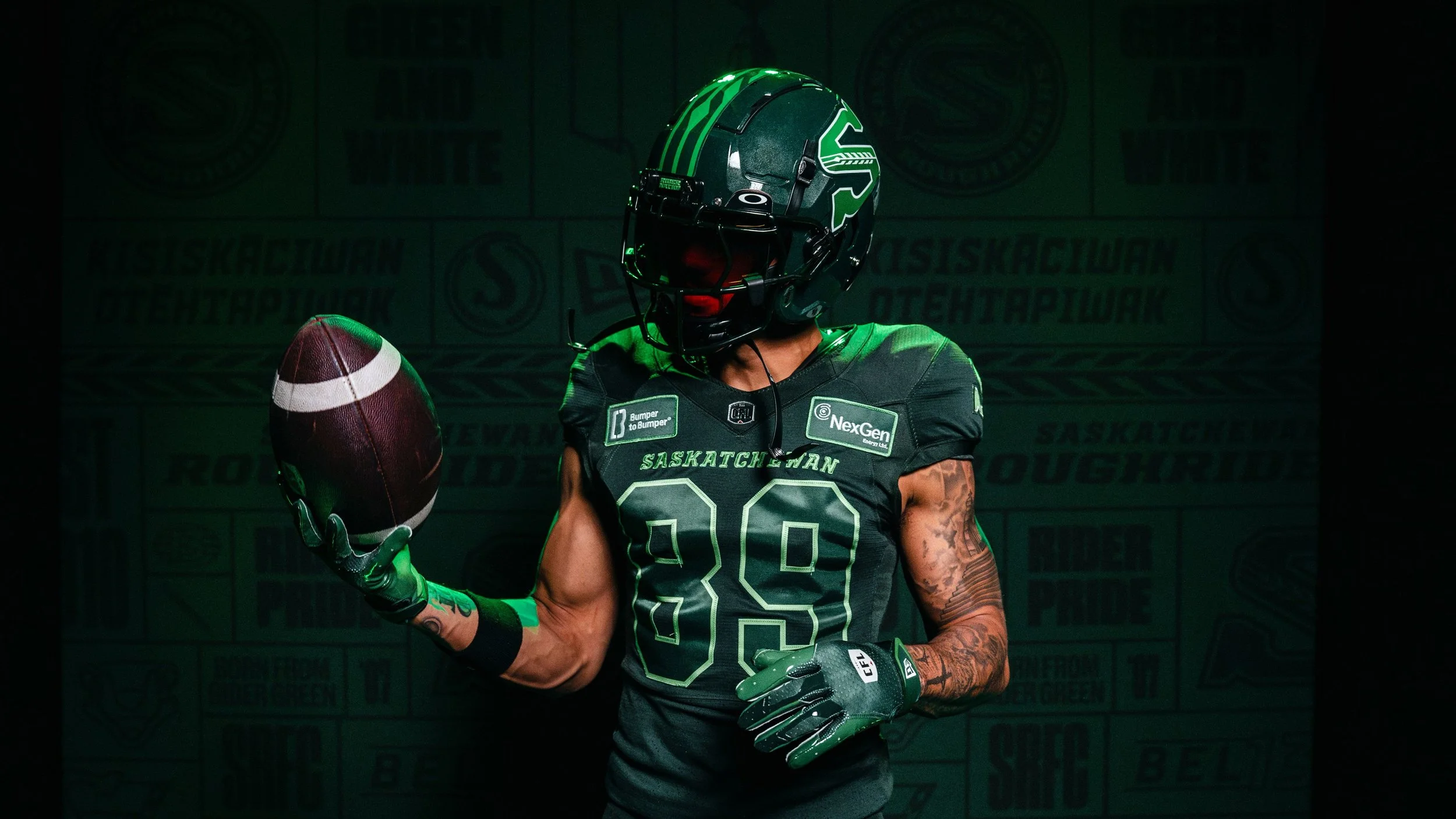
The Saskatchewan Roughriders have unveiled their latest uniform innovation: the Obsidian Green alternate jersey. Revealed at the Mosaic Stadium store, this new look aims to symbolize a new era for Rider Nation while paying homage to the team’s deep-rooted traditions and the dedicated fan base.
The dominant color of the new alternate jersey, Obsidian Green, has been subtly present for quite some time. Mark Habicht, the CFL team’s Director of Retail Operations and Licensing, explained, “Mosaic Stadium’s lower-bowl headwalls are Obsidian Green. We’ve kind of been playing our cards in plain sight.”
This shade was also featured in the 2022 Grey Cup Festival logo, hinting at its future prominence. “We introduced the color in the Grey Cup Festival logo because we liked it so much,” Habicht added.
The concept of an alternate uniform was first discussed over five years ago by a select group including Habicht, President-CEO Craig Reynolds, former Chief Brand Officer Anthony Partipilo, and Director of Marketing and Fan Engagement Miriam Johnson.
“The first meeting was as simple as, ‘Hey, we want to start talking about an alt jersey and an alt mark, potentially,’” Reynolds recalled. After considering a return to black, which had been used successfully in the past, the team decided to explore new avenues that stayed true to the Roughriders’ brand identity.
The new jerseys feature several symbolic design elements:
13 Kernels on the Wheat Sheaf: A tribute to the “13th Man,” representing the passionate fans.
RIDER NATION on the Helmet: For the first time, the team’s helmet will bear the phrase "RIDER NATION," symbolizing unity with the fans.
“The jersey fabric has been able to achieve something very unique. At different times, your eyes can see it as a different color. When the players are in the tunnel and it’s dark, it looks like they’re wearing black uniforms. As soon as they hit the light and the sun bounces off the uniform, the green pops,” Partipilo elaborated.
The alternate uniforms will be officially showcased on July 19 during the Green is the Colour Game against the Winnipeg Blue Bombers and again on October 26 against the Calgary Stampeders during the Fan Appreciation event.
Quarterback Trevor Harris, already donning the new look, shared his excitement: “There’s a fresh aura around the team and maybe this will help to energize the fan base and get them excited about the new logo.”
As the Roughriders embark on this new chapter, the unveiling of the Obsidian Green jersey marks the end of a long-held secret and the beginning of a vibrant new phase for the team and its fans. “It’s kind of like the end of Phase 1 and the beginning of Phase 2, so here we go,” Habicht concluded.
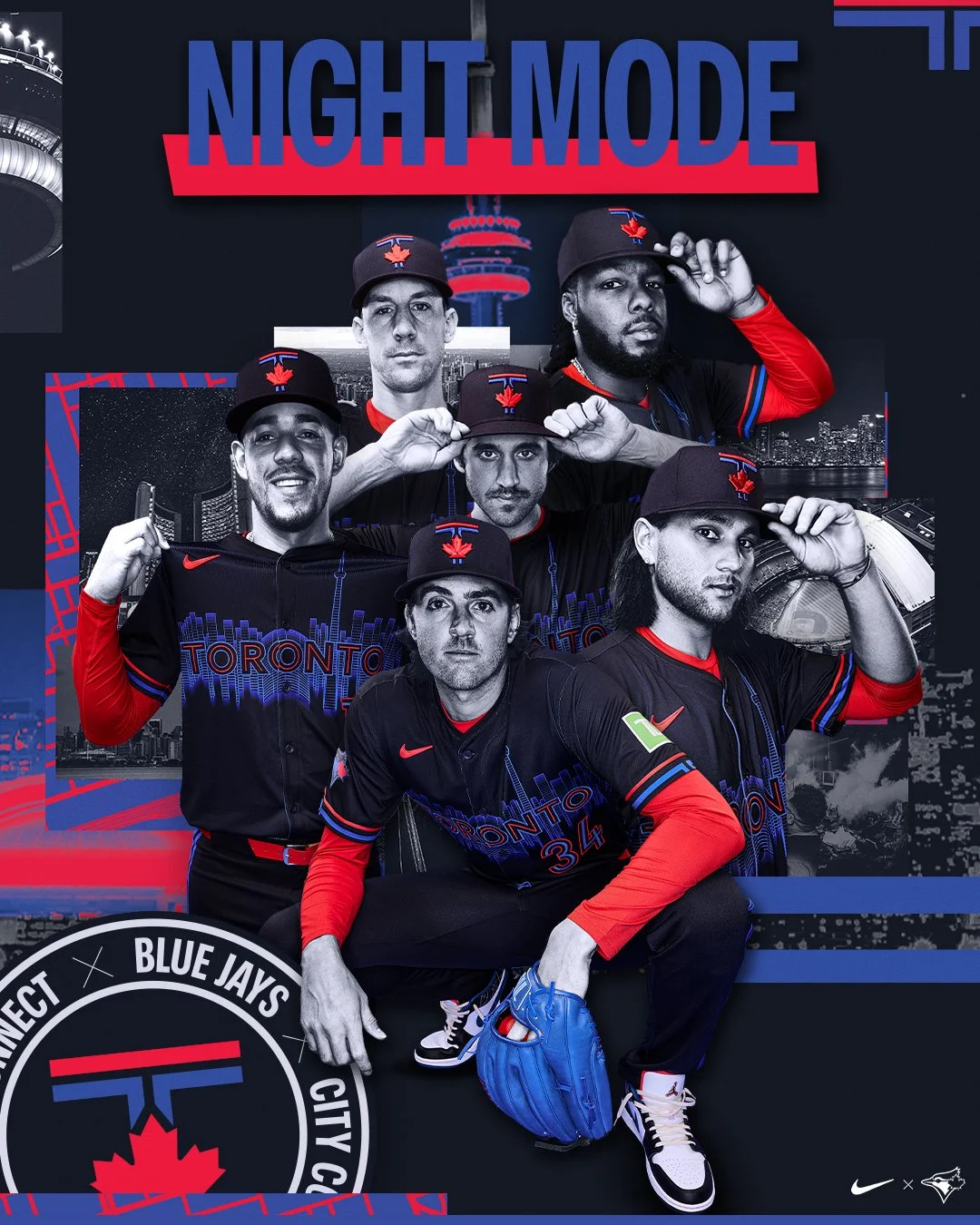
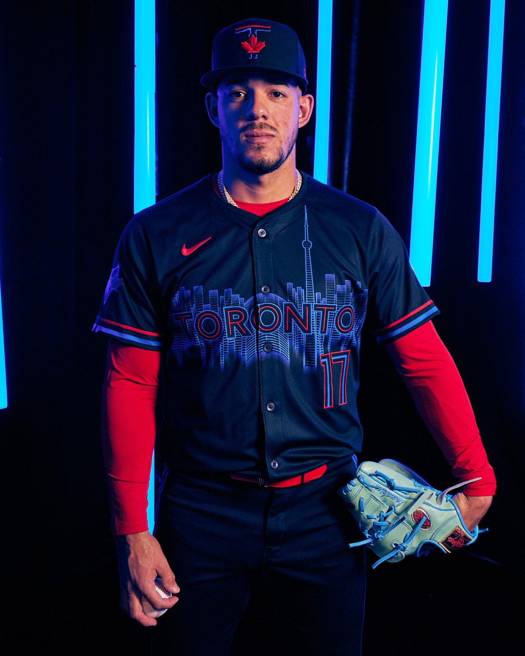
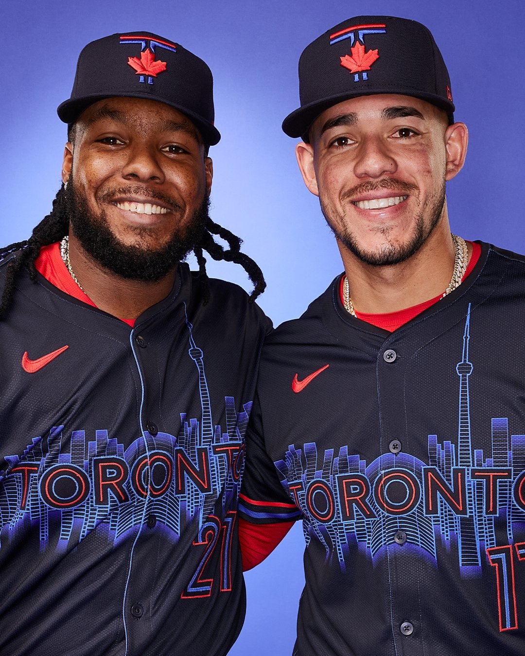
The Toronto Blue Jays are embracing the city's vibrant nightlife with their new "Night Mode" City Connect uniform. “The Blue Jays are at the core of the city, and those who call Toronto home know how the city comes alive at night," said Marnie Starkman, the Blue Jays’ executive vice president of business operations. "Our new City Connect uniform aims to emulate that ‘Night Mode’ feeling in the vibrant colours, the rhythmic skyline reflecting off the lake, and all the distinct details that make our city so dynamic."
With a darker blue base, complemented by pops of brighter blue and red, the new uniforms outline the Toronto skyline across the chest. This marks the first dark base for a Blue Jays jersey since 2011. The team has dubbed this color “pitch blue,” inspired by the reflection of Lake Ontario at night. The design is further enhanced with “hyper royal blue” and “speed red” accents, which are also featured on the cap, showcasing a “T” that emulates the pillars of city hall atop a maple leaf.
In the center of the chest, surrounded by the CN Tower and the buildings of downtown Toronto, rests Rogers Centre, a familiar sight for many Torontonians. "Toronto is a great city. It’s diverse. But Toronto also knows how to have fun, and a lot of that happens after hours,” said Blue Jays legend José Bautista, who was in town for the release. “There are definitely a lot of different options in the nightlife around the city. It’s good to live in a place where, if you choose to and you want to partake, you have plenty of options. Toronto does know how to have fun, and we experienced a little bit of that when we were here.”
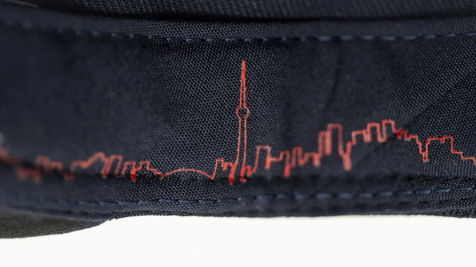
The uniforms also feature some hidden details. Inside the cap, the Toronto skyline is depicted as a rhythmic heartbeat. Inside the collar of the jersey, where you’d find the tag on a shirt, it reads “Diversity is Our Strength,” a phrase from Toronto’s coat of arms.
Fans can look forward to seeing the new "Night Mode" uniforms during night games throughout the season. This decision keeps in line with the theme, highlighting the vibrant nightlife that inspired the design.
The Blue Jays’ new City Connect uniforms not only represent a bold fashion statement but also capture the essence of Toronto’s dynamic and diverse culture. Fans eagerly await to see their team shine under the night lights in these vibrant new kits.
— Nashville Sounds (@nashvillesounds) May 28, 2024
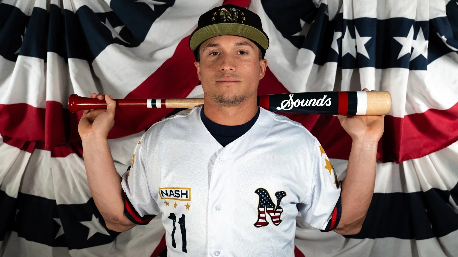
The Nashville Sounds announced that they will don specialty military jerseys for Military Appreciation Night on Thursday, June 6, and again on Friday, July 5, as part of the team’s Independence Day Weekend celebration. These game-worn jerseys will be auctioned off, with proceeds benefitting The Charlie and Hazel Daniels Veterans and Military Family Center at Middle Tennessee State University (MTSU).
The special jerseys are rich with symbolic design elements that honor the service and sacrifice of military personnel. The Nashville ‘N’ logo, placed over the heart, is emblazoned with the American flag, representing the love for one’s country that is central to all who serve. Gold accents around the logo mirror the gold trim found in military service uniforms, adding a touch of elegance and reverence.
A distinctive "NASH" nameplate is positioned over the right chest, mimicking the nameplates on military service uniforms. This nameplate includes all who served in the Middle Tennessee area, providing a localized tribute to veterans and active-duty service members.
Each sleeve of the jersey features three gold stars, totaling six stars to represent the six branches of the United States Military: Army, Navy, Air Force, Marine Corps, Coast Guard, and Space Force. The three stars on each sleeve also pay homage to retired Army Lieutenant General Keith M. Huber’s rank. General Huber, who serves as senior advisor for veterans and leadership initiatives at MTSU, has been a key figure in supporting veteran services at the university.
“The Daniels Center is tremendously grateful for our partnership with the Nashville Sounds in support of our continuous efforts to serve all Veterans concerning their earned VA benefits as well as military-connected students and families through a variety of services to help them succeed both academically, professionally, and personally,” said General Huber. “And I’m deeply appreciative of the Sounds’ recognition of the military service of our Veterans through these commemorative jerseys.”
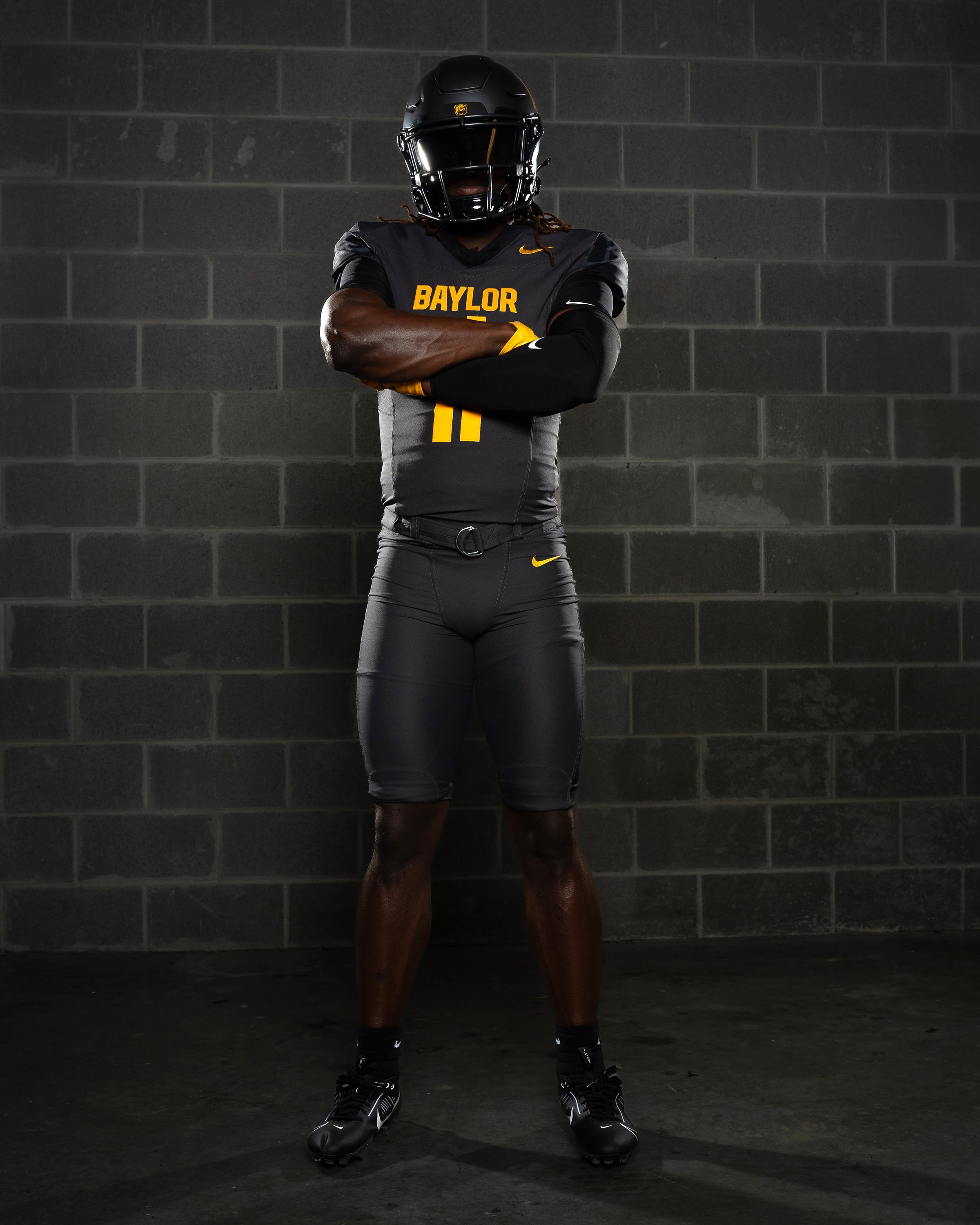
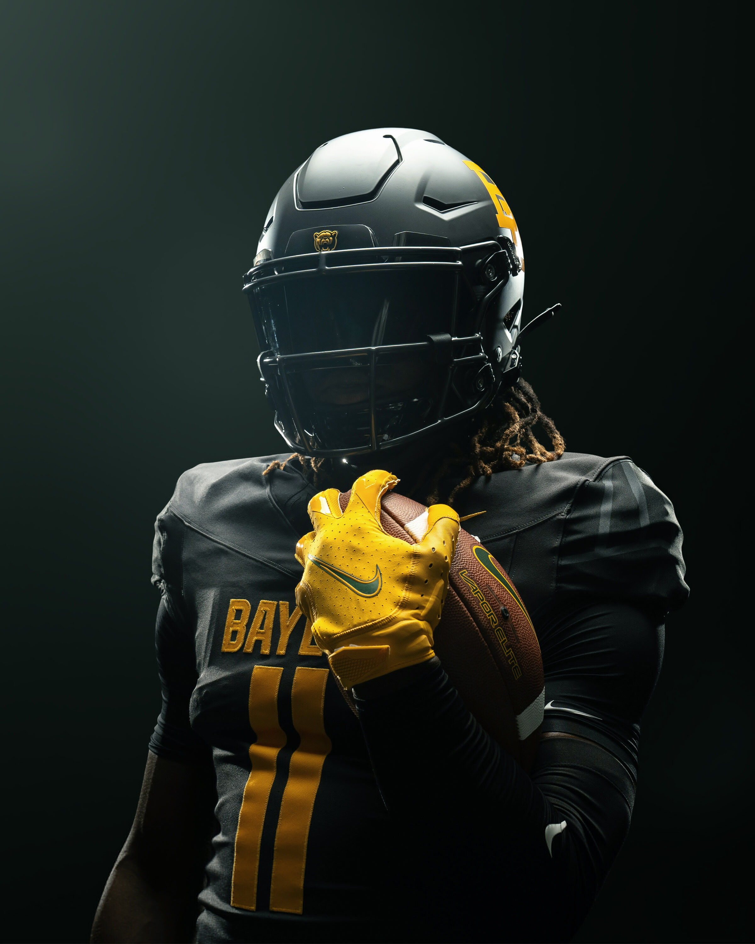
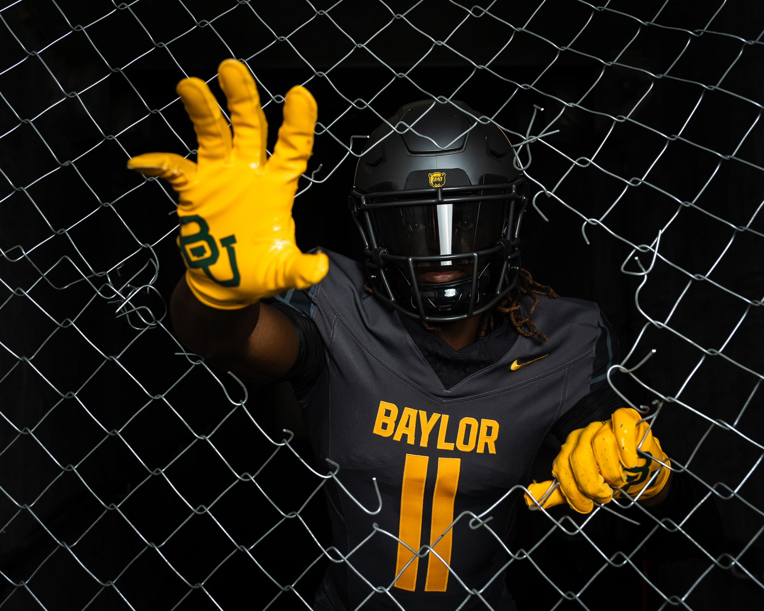
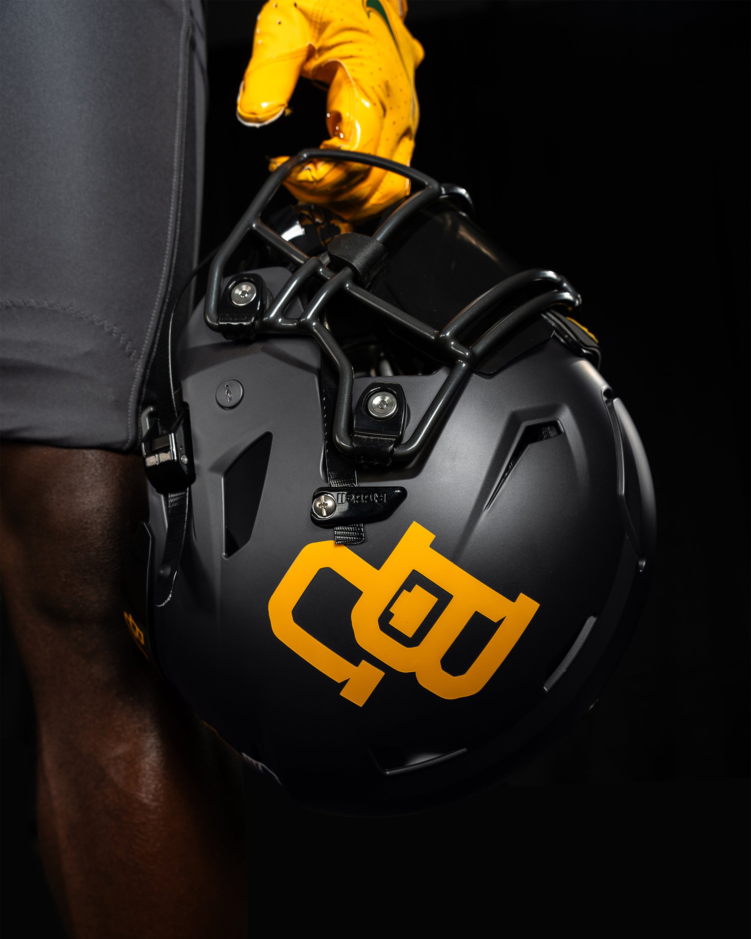
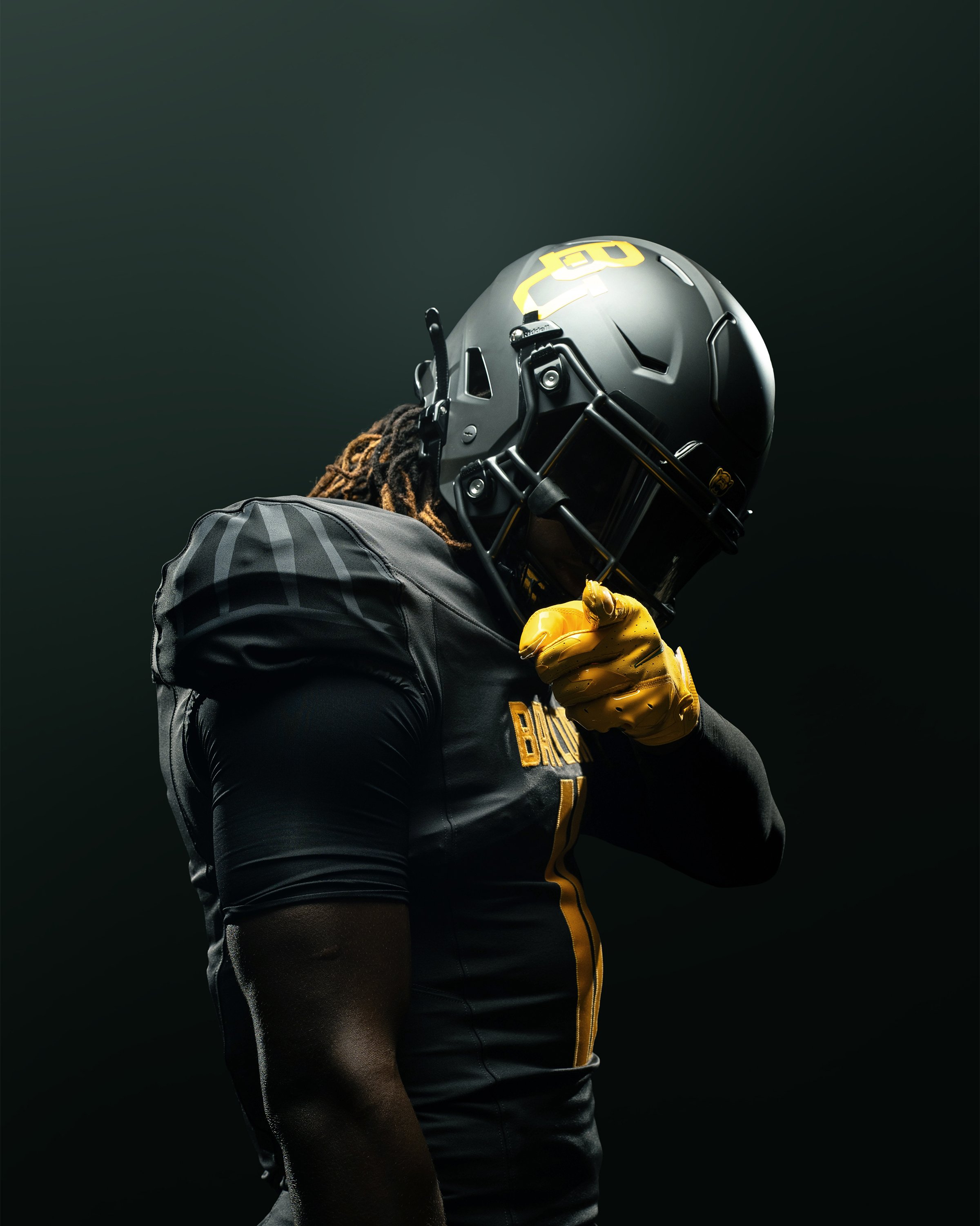
Baylor football is expanding its uniform lineup with the introduction of a striking new Anthracite option for the 2024 season. This fresh design incorporates unique elements that pay homage to some of the most memorable uniform combinations in the program’s history.
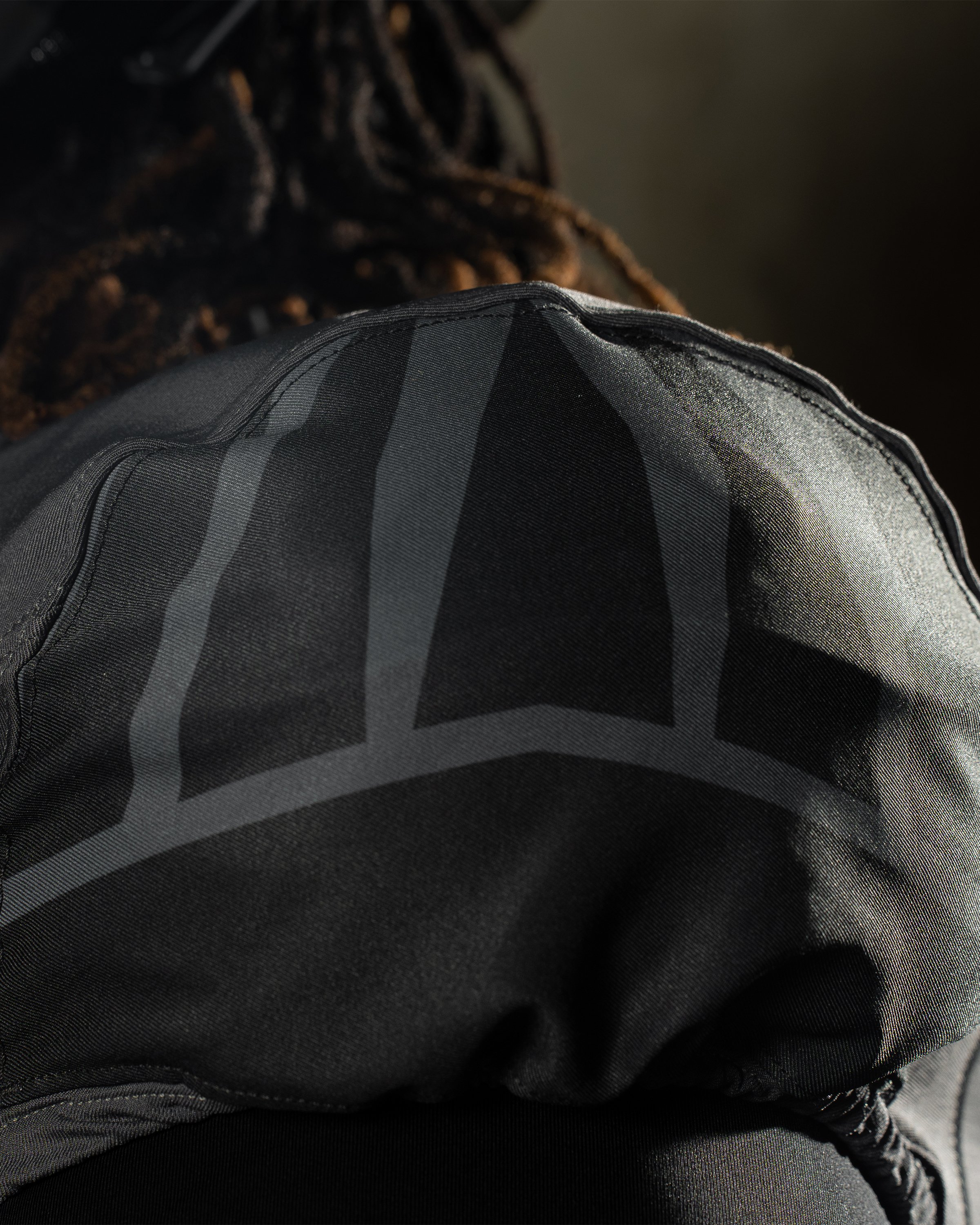
The new Anthracite jersey prominently features "BAYLOR" across the chest in bold gold lettering, with matching gold numbers. Adding a distinctive touch, the sleeves are adorned with a bear claw print, a tribute to the 2013-14 Big 12 Championship teams. This subtle yet meaningful design element connects the current squad with one of the most successful periods in Baylor’s recent history.
Complementing the jersey, the Anthracite pants break from tradition with a subtle stripe, offering a sleek contrast to the sharp green, white, and gold stripes of the core uniform pants. This understated design adds a modern twist while maintaining a cohesive look with the rest of the uniform.
The helmet for the Anthracite uniform features a front bumper with a Bear head, further emphasizing the team’s identity and pride. This new option will serve as a supplemental choice, adding variety to the primary Green, Gold, and White uniforms that remain Baylor’s core.
With the addition of the Anthracite uniform, Baylor continues to innovate while honoring its storied past. Fans can look forward to seeing the Bears take the field in this dynamic new look, blending tradition with modern style as they strive for excellence in the upcoming season.
— Illinois Football (@IlliniFootball) May 29, 2024
In celebration of Memorial Stadium's 100th anniversary, the Illinois football team will don three iconic throwback helmets throughout the 2024 season. The helmet designs, which span nearly 50 years of the Fighting Illini program from 1962 to 2012.
"We are excited to celebrate 100 years of Memorial Stadium and our program's history in one special season," said head coach Bret Bielema. "Our helmets will honor a different era each week, appealing to our entire fan base, regardless of age, and bringing back Memorial Stadium memories to our alumni and Illini famILLy. We're looking forward to releasing more details soon about the rest of our 100th Anniversary plans."
Four Stars (1962-68)
Famously worn during Dick Butkus' years at Illinois, the Four Stars helmet is a nod to one of the most celebrated periods in Illini history. These helmets feature the players' numbers beneath four stars and a gray facemask with white-blue-white center stripes. Butkus and the Illini wore these helmets en route to the 1963 Big Ten title and a Rose Bowl victory over Washington.
Arched Illini (1971-87)
The Arched Illini helmet, worn from 1971 to 1987, will return with gray facemasks and a blue-white-orange-white-blue center stripe pattern. This design harkens back to the era when Head Coach Mike White led Illinois to a perfect 9-0 Big Ten Conference record and a Rose Bowl appearance in 1983.
Underlined Illinois (1989-2012)
The Underlined Illinois helmet, used from 1989 to 2012, will also make a comeback. The 2024 edition will feature a white facemask and blue-white-blue center stripes. This design was part of the team’s uniform during two Big Ten titles in 1990 and 2001, as well as appearances in the 2002 Sugar Bowl and 2008 Rose Bowl.
As Illinois commemorates a century of Memorial Stadium, these throwback helmets will play a pivotal role in honoring the rich history and tradition of Fighting Illini football. Fans can look forward to a season filled with nostalgia and pride as the team pays tribute to its storied past.