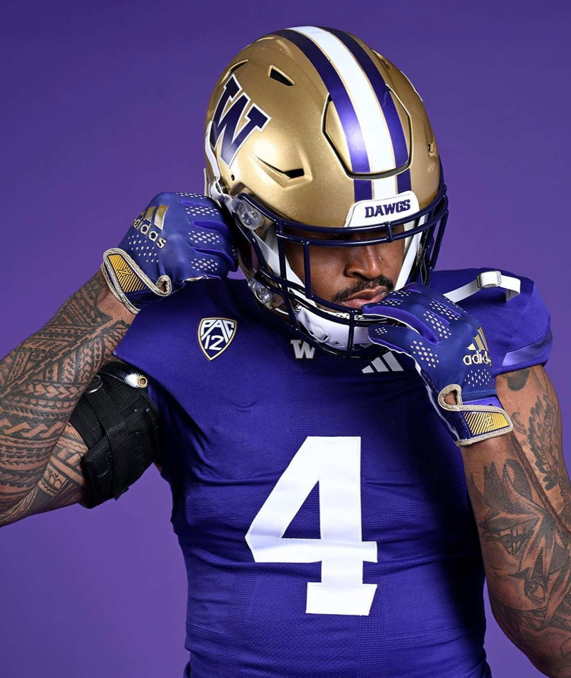
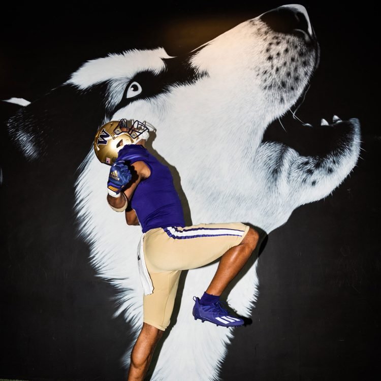
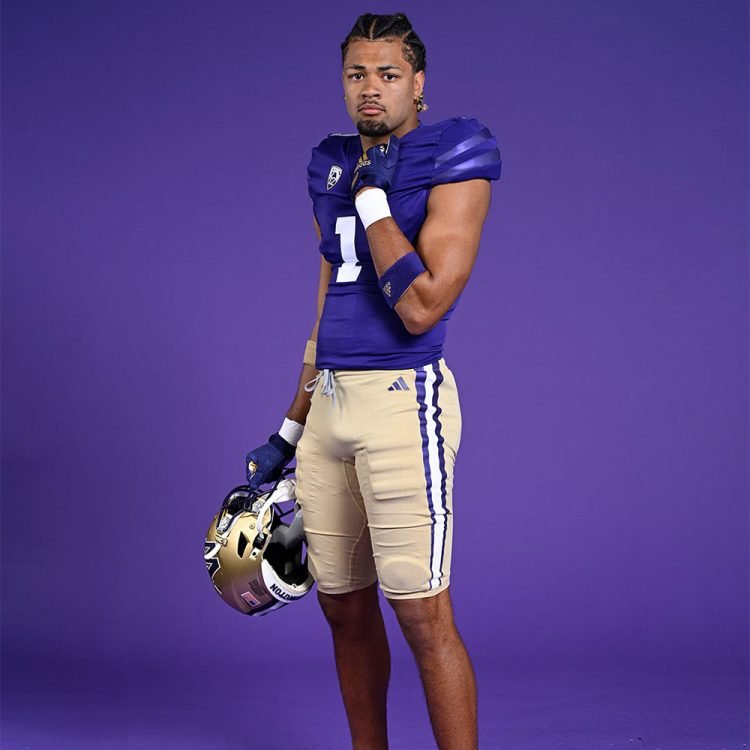
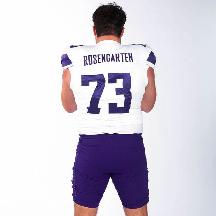
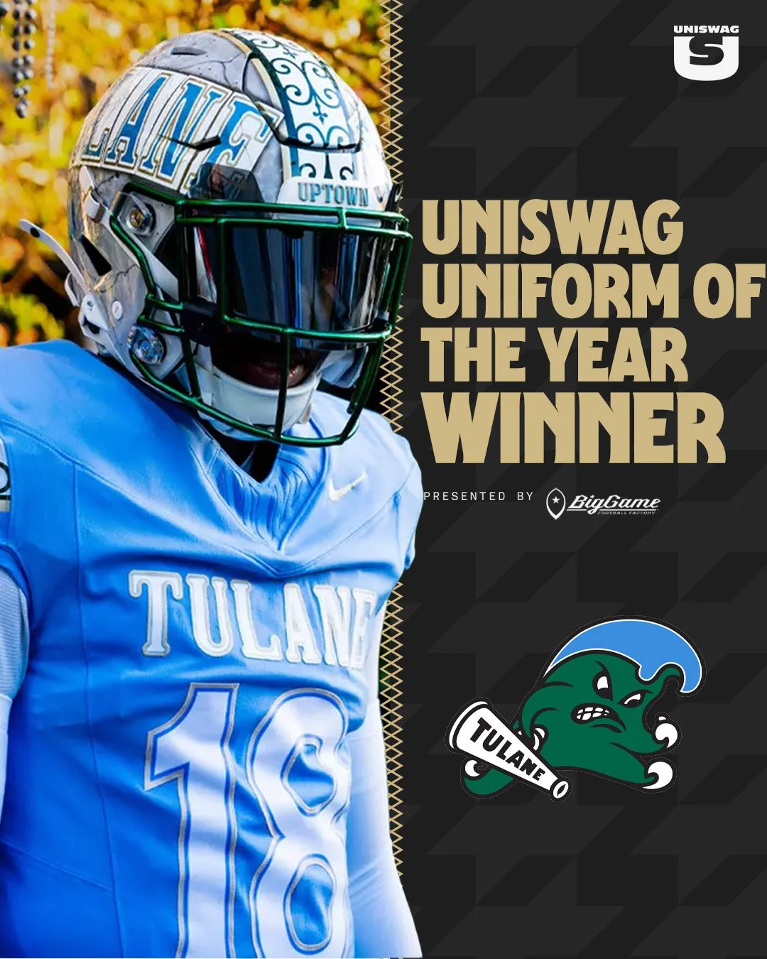
In a delightful nod to their illustrious football history, the Washington Huskies recently unveiled subtle yet significant changes to their football uniforms. While retaining their timeless appeal, the updated design introduces classic elements that pay homage to the team's remarkable achievements. Let's dive into the details of these revisions and explore how the Huskies have beautifully merged tradition with a modern touch.
The Huskies have always taken pride in their rich football legacy, and the updated uniforms reflect their commitment to honoring their past triumphs. The sleeve stripes on both the purple home and white road jerseys remain unchanged, drawing inspiration from the 1991 national championship team. This iconic squad, led by legendary coach Don James, achieved an undefeated season culminating in a triumphant victory over Michigan in the Rose Bowl.
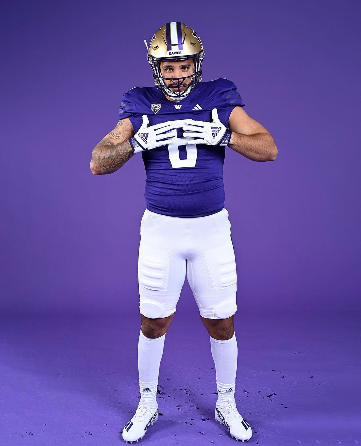
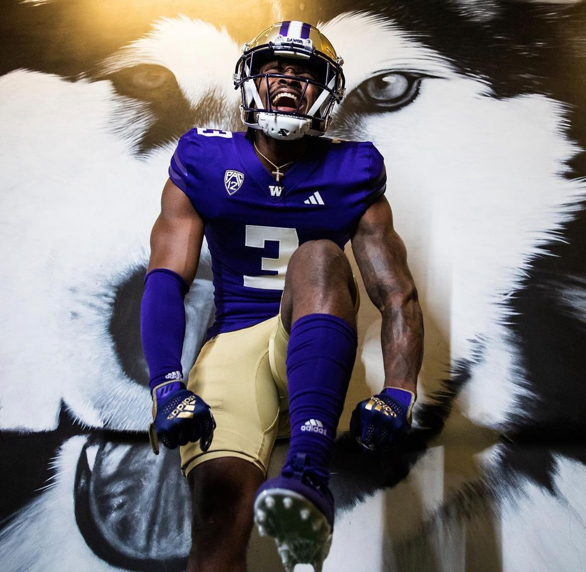
While maintaining the essence of the original design, the Huskies have introduced subtle alterations to their jersey numbers. The purple home jersey, adorned with sleeve stripes reminiscent of the historic 1991 team, now features solid white numerals. This change replaces the previous gold-outlined numbers, enhancing the overall visual impact of the jersey while preserving a clean and classic aesthetic.
The attention to detail in the uniform update is evident in the refinement of the white road jerseys. The solid purple numbers no longer bear a white stroke, a modification that might have gone unnoticed by casual observers but significantly improves the legibility and visual presence of the numerals. By removing the stroke, the numbers now appear bolder and more prominent on the jerseys, allowing for easier identification of players on the field.
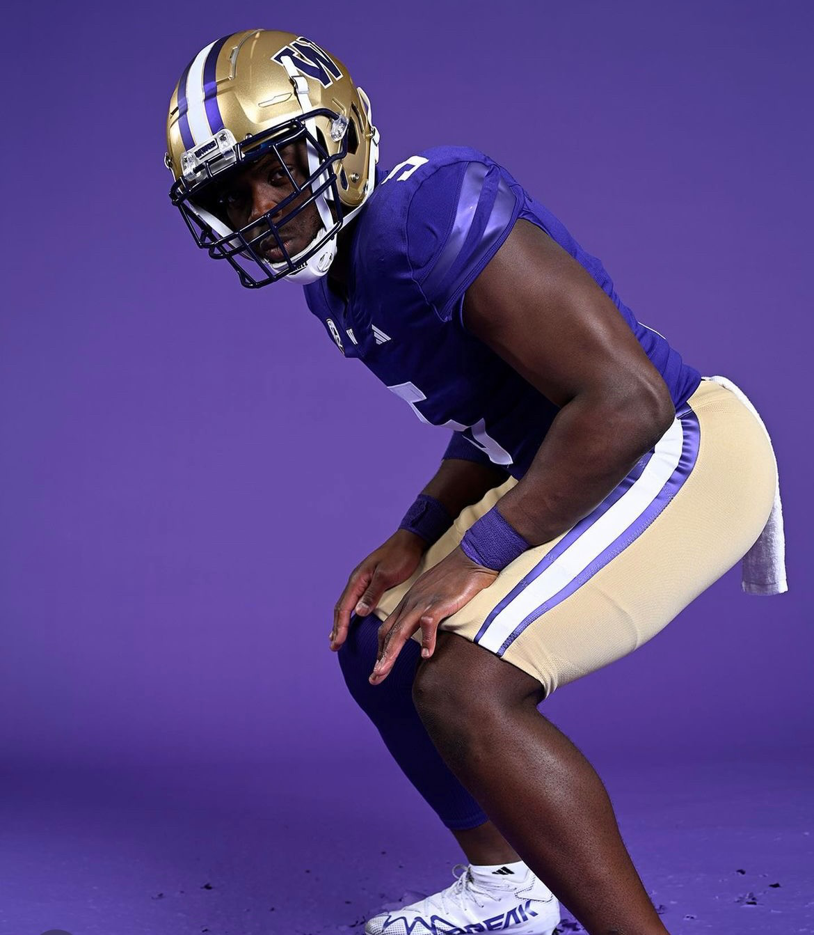
One of the most notable changes in the Huskies' uniform update can be found in the pants. Previously featuring a solid color, the pants now boast tapered stripes down the sides, injecting a fresh dynamic into the overall aesthetic. The gold pants showcase purple and white stripes, while the purple and white pants seamlessly match the sleeve stripes on their respective jerseys. This new design element adds an element of flair while maintaining a cohesive and harmonious look.
With their recent uniform update, the Washington Huskies have struck a perfect balance between honoring their storied football history and embracing modern design sensibilities.
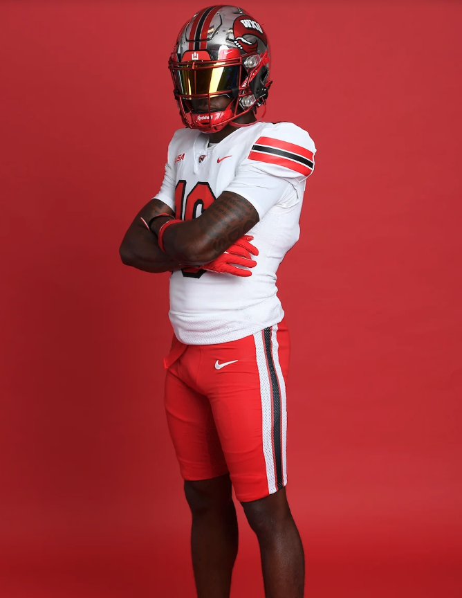
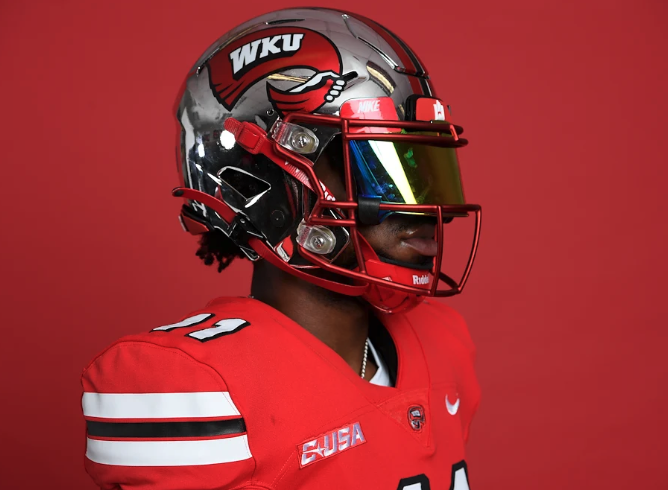
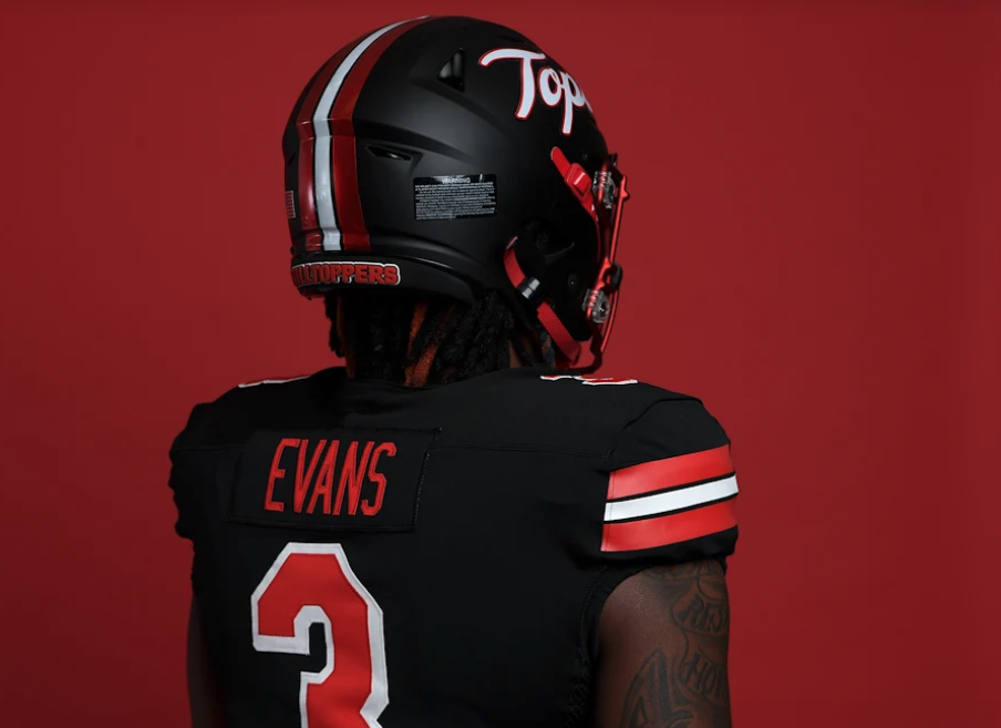
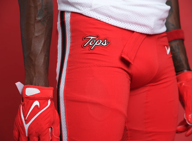
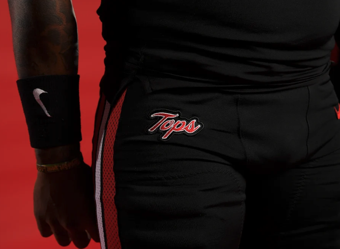
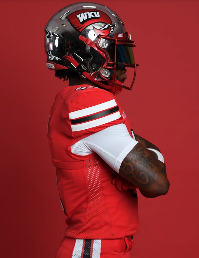
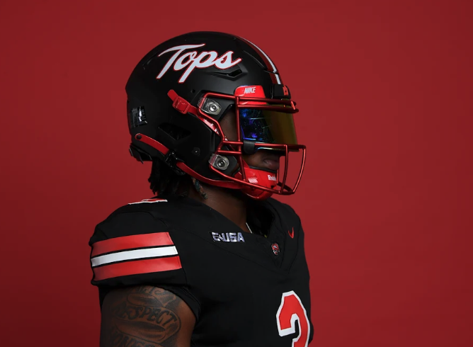
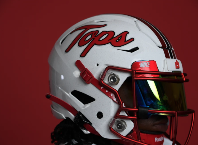
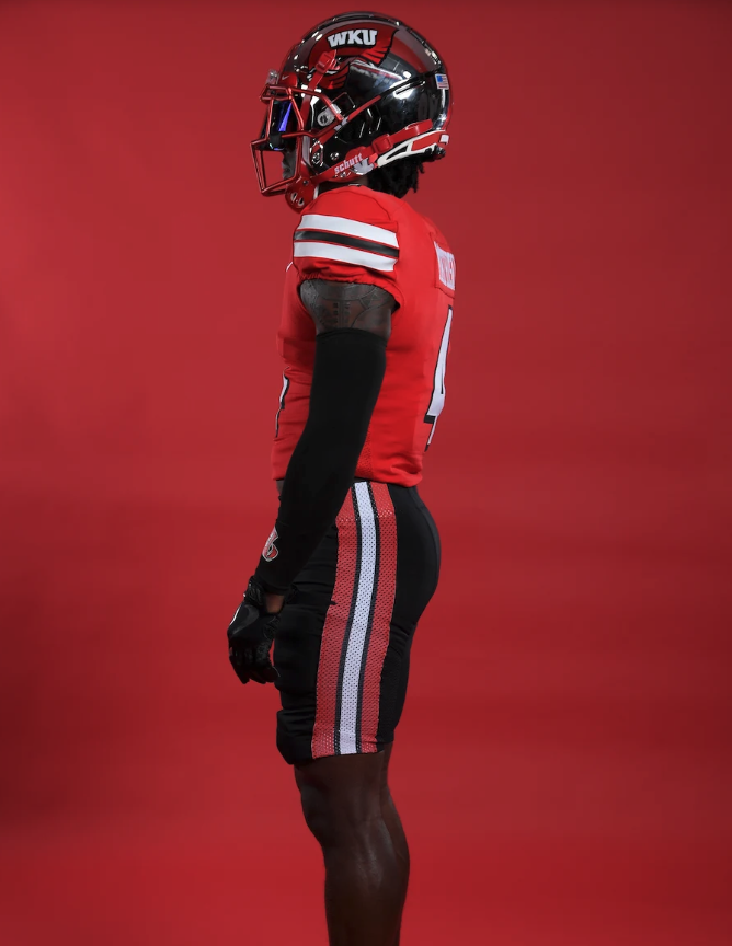
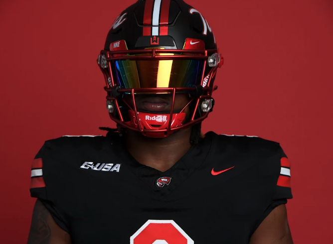
the WKU Hilltoppers have recently unveiled a series of impressive uniform upgrades that are set to invigorate both players and fans alike. With new shoulder and pant stripes, bigger helmet decals, the addition of the Tops logo, and an updated helmet stripe and facemask, these enhancements combine tradition with modern aesthetics, further elevating the team's identity on the gridiron.
One of the most noticeable updates to the WKU football uniforms is the introduction of new shoulder and pant stripes. These bold and eye-catching elements not only add visual appeal but also provide a sense of unity and identity among the players. The prominent stripes, blending the team's primary colors, serve as a striking representation of WKU's determination to dominate the field.
The new WKU football helmets are sure to turn heads with their enlarged decals. The iconic Hilltopper logo takes center stage, magnified to make a bold statement on the field. The team has updated the helmet stripe, incorporating a sleek design that seamlessly integrates with the overall aesthetic. Additionally, the facemask has been given a modern makeover, adding a touch of sophistication to the players' on-field presence. These updates demonstrate WKU's dedication to maintaining a classic look while embracing contemporary design elements.
The new WKU football uniforms represent a perfect blend of tradition and modernity, capturing the essence of the program's storied history while embracing the demands of the present.
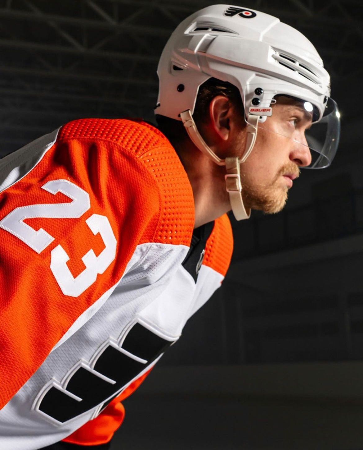
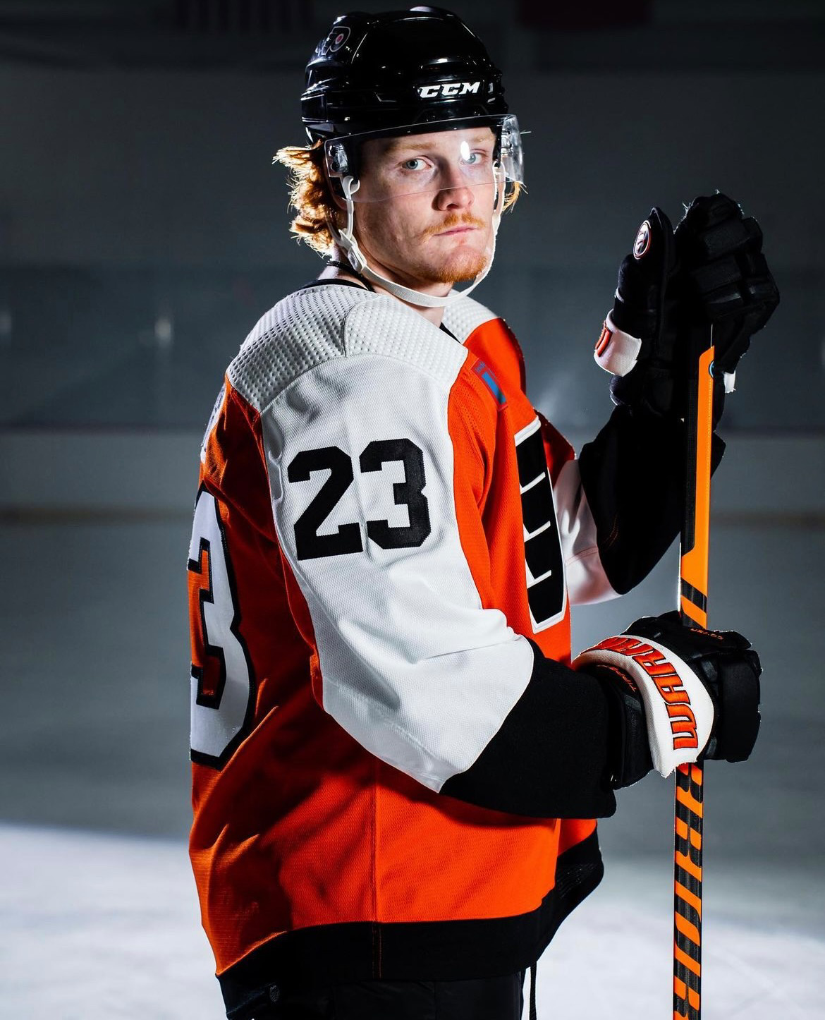
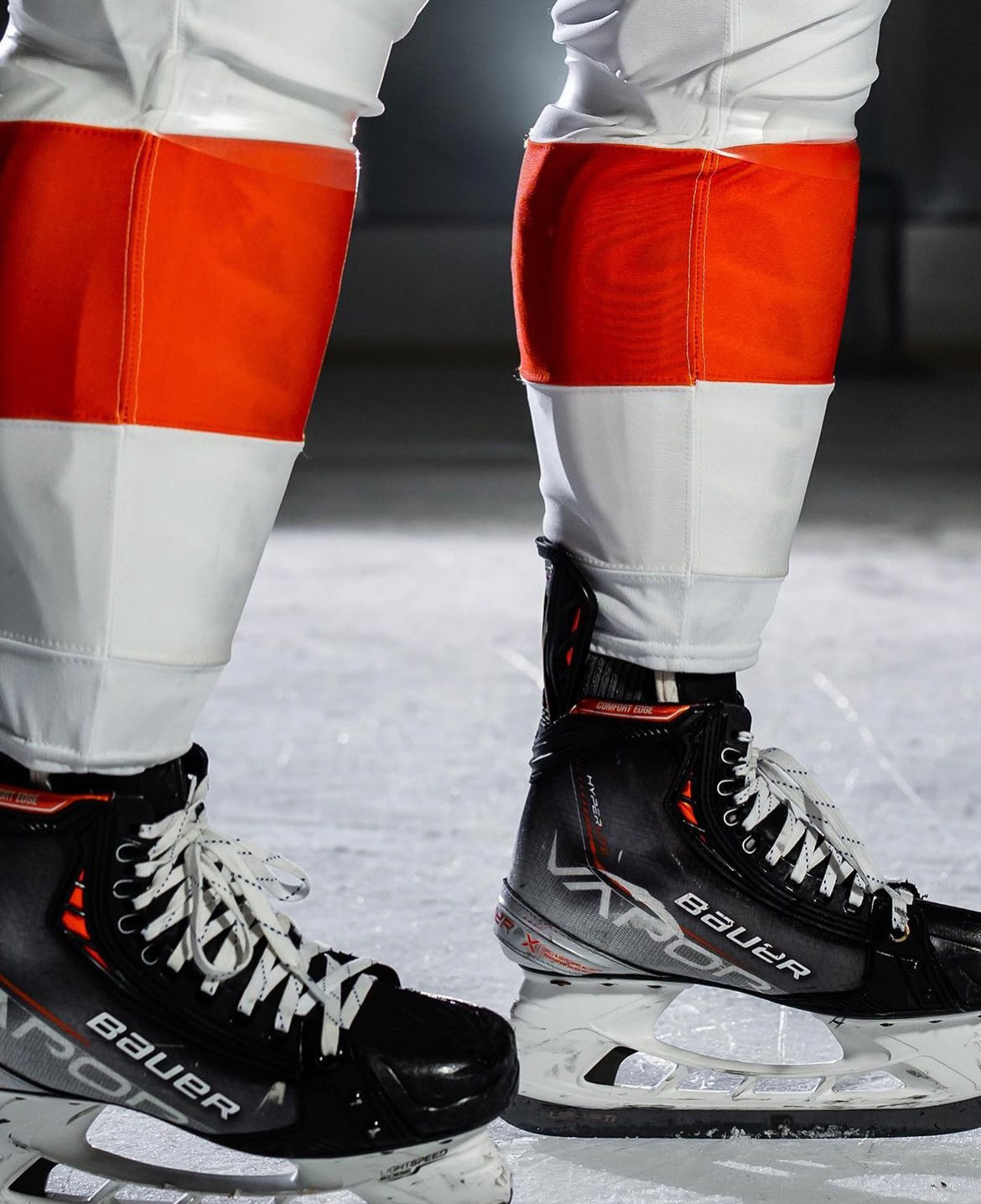
The Philadelphia Flyers have revealed their new home and road uniforms. This marks the official arrival of the team's New Era of Orange, combining a rich heritage with a fresh, contemporary design. The Flyers' iconic primary home and away uniforms have received their first significant updates since 2010, sending ripples of excitement through the fanbase and beyond.
Chairman & CEO of Comcast Spectacor and Governor of the Philadelphia Flyers, Daniel J. Hilferty, expressed his enthusiasm for the New Era of Orange, stating, "This new chapter in Flyers history is all about paying homage to our illustrious past while forging an exhilarating future. These new uniforms embody that sentiment flawlessly, blending nostalgic elements with a modern twist. We are thrilled to have Independence Blue Cross as our inaugural jersey patch partner, a company that holds immense significance for me personally and the entire Philadelphia region."
Collaborating with adidas, the NHL's league-wide uniform partner, the Flyers embarked on an extensive design journey that involved input from various stakeholders. Flyers season ticket members, alumni, and broadcasters were among those consulted, ensuring a collective vision and a true representation of the team's spirit.
To honor their tradition while embracing a new era, the Flyers have ingeniously merged distinctive elements from their iconic jerseys of yesteryears into a contemporary adaptation. The wide, eye-catching shoulder and arm striping, a trademark feature of Flyers uniforms, has been enhanced to encapsulate each player's numbers seamlessly, resulting in a sleek and streamlined aesthetic. Furthermore, the sleeve numbers have returned to a single-color design reminiscent of the original 1967-1970 uniforms, reintroducing a classic touch not seen for decades.
Delivering a visual punch, the black horizontal stripe has been relocated to the bottom edge of the jersey, aligning harmoniously with the black pants to create a fluid and cohesive look reminiscent of the uniforms introduced in 1982. The striking contrasting name-plate design, introduced in 2008, remains a distinctive feature exclusive to the Flyers among NHL teams.
Undoubtedly, the jerseys' crowning glory is the highly sought-after "burnt orange," which defined the Flyers' powerhouse teams of the 80s and 90s. This iconic shade takes center stage, serving as the base color for the home jerseys and adorning the arm and shoulder panels, as well as the prominent player numbers on the away jerseys. The burnt orange theme extends to both sets of socks, ensuring a complete and visually captivating ensemble.
Throughout the dynamic design changes, the Flyers' legendary "flying P" logo remains at the heart of the uniform set. This timeless emblem, tracing back to the team's inception in 1967, epitomizes speed and the exhilarating motion of flying across the ice, symbolizing the spirit of the Flyers' franchise.
As the Philadelphia Flyers usher in their New Era of Orange, they do so with a profound appreciation for their storied past and an unwavering commitment to embracing a bright future. These revamped uniforms embody the team's rich heritage while infusing a modern and captivating aesthetic that is bound to leave a lasting impression on fans, players, and hockey enthusiasts alike. The Flyers are ready to take flight into this exciting new chapter, united under the banner of the New Era of Orange.
— Colorado State Football (@CSUFootball) June 16, 2023
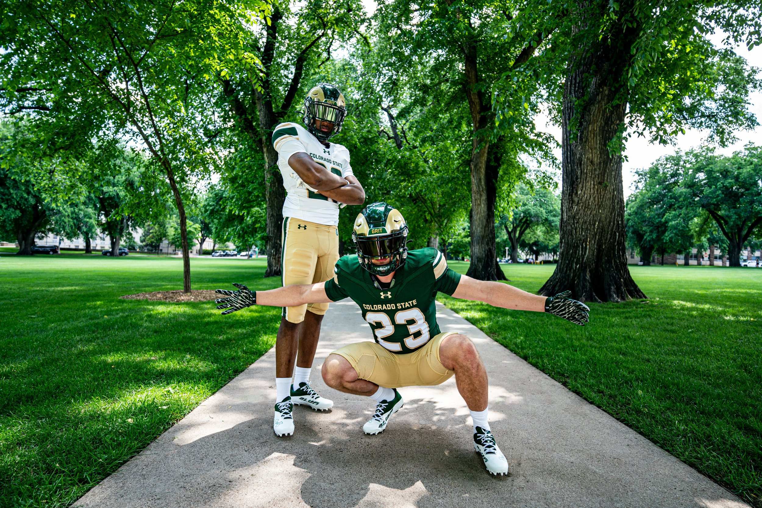
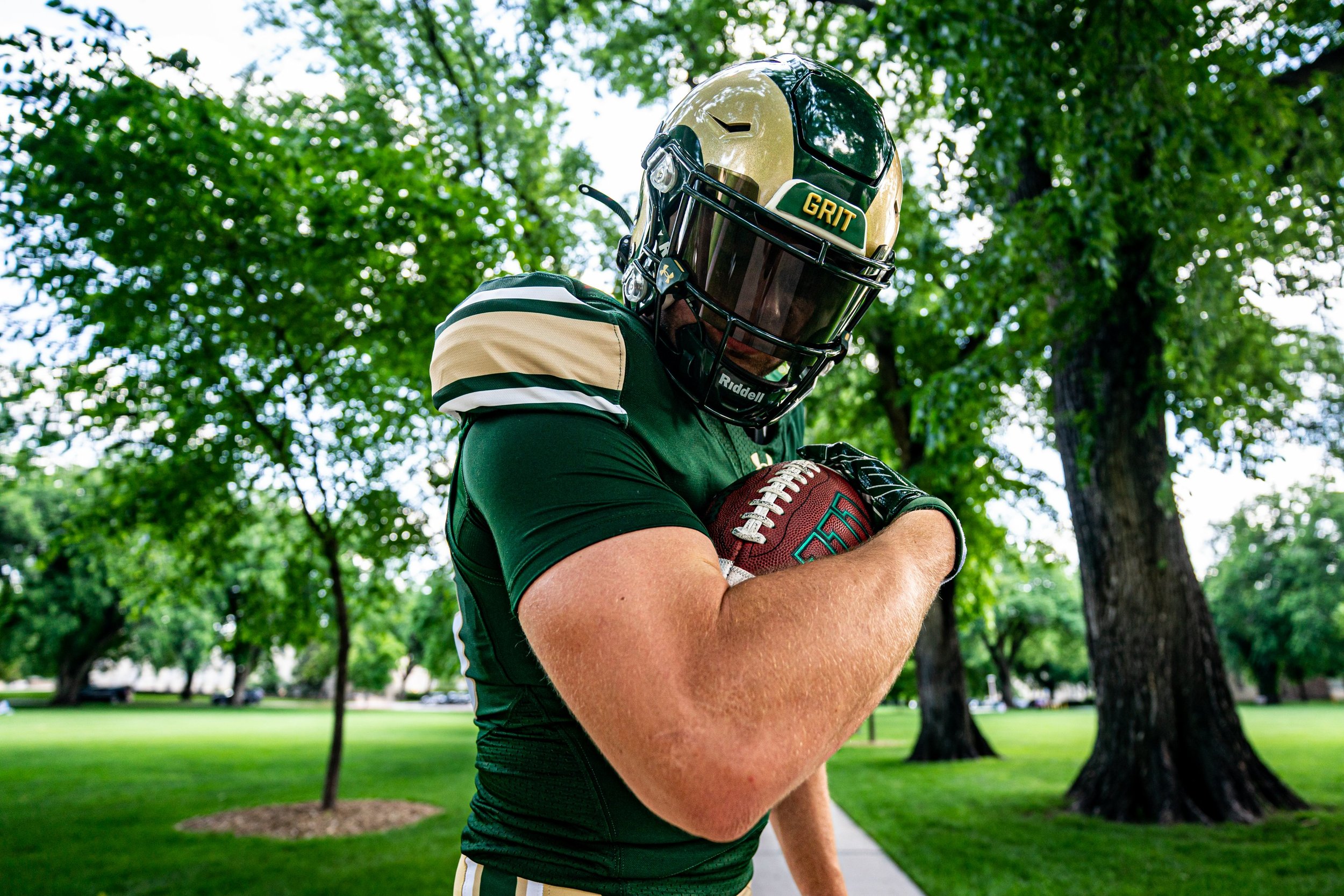
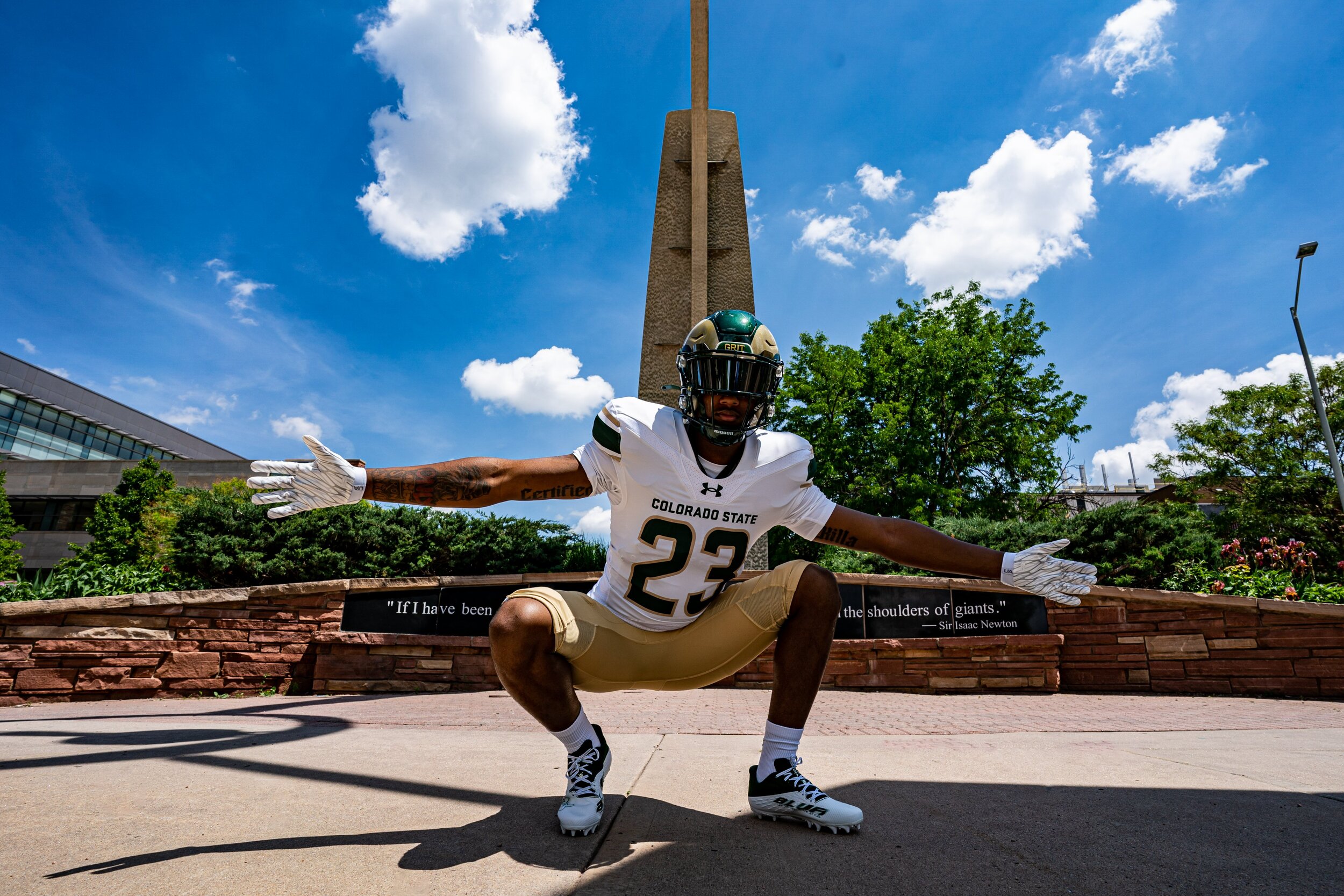
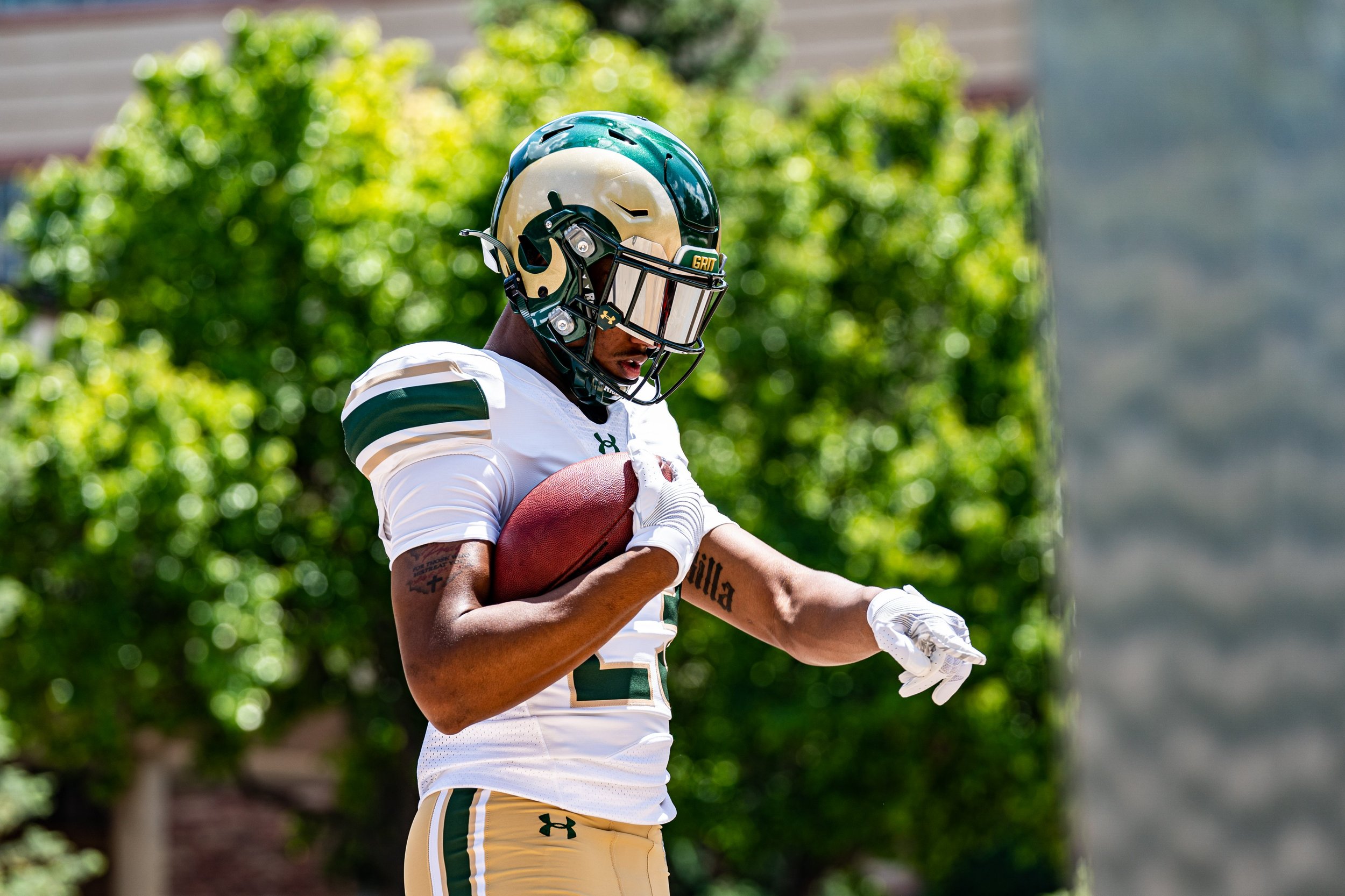
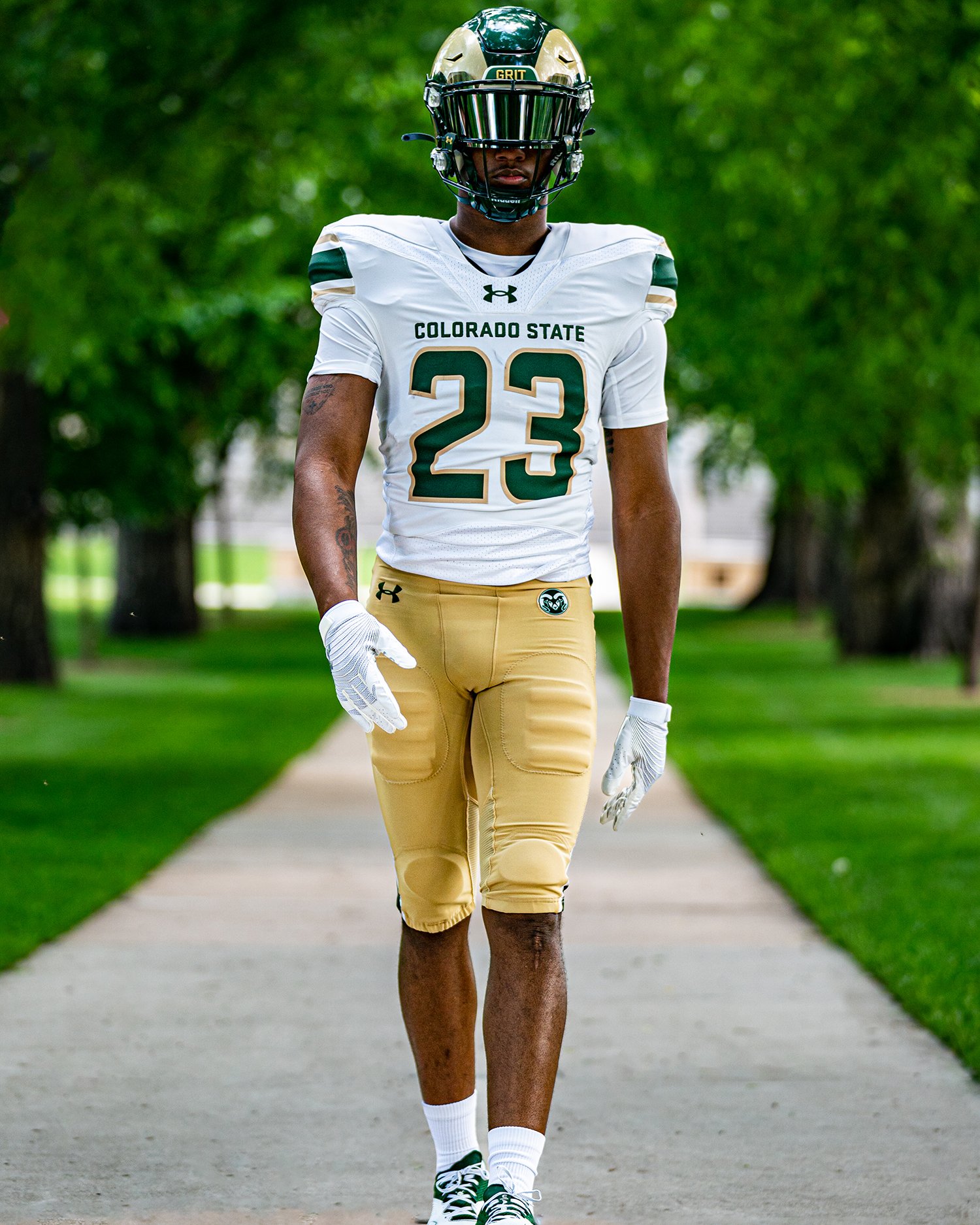
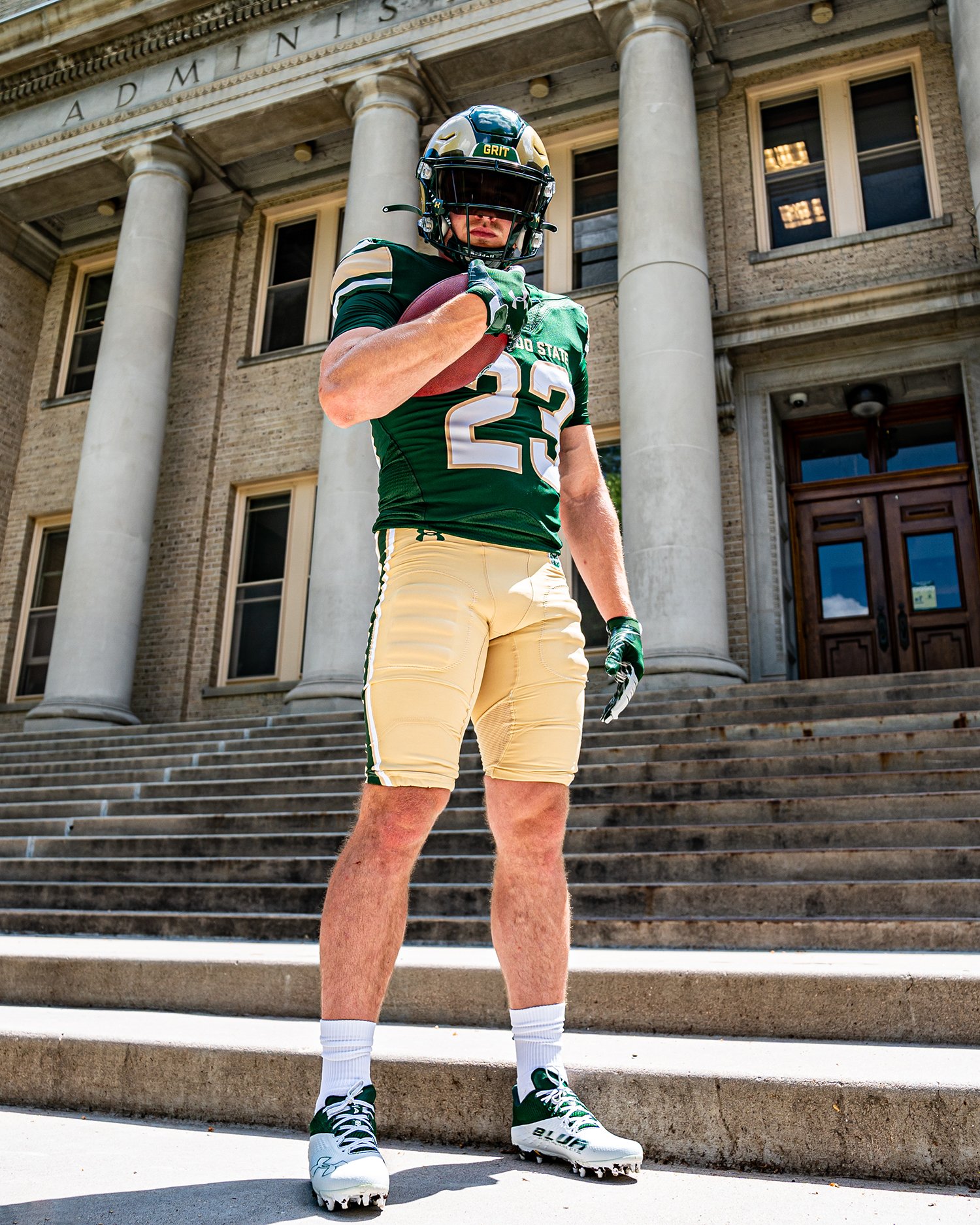
The Colorado State football team is gearing up for an exciting 2023 season with a brand new look. the Rams recently revealed their updated home and away uniforms, showcasing a modern design that pays tribute to their rich tradition. With sleek striping on the sleeves and "Colorado State" prominently displayed on the chest, the new uniforms breathe fresh life into the team's visual identity. Let's take a closer look at these revamped uniforms and their significance.
After seven years, the Colorado State football team bid farewell to their previous uniforms, which featured a Rams horn on the sleeves and "Colorado State" above the numbers on the front of the jersey. The new home uniforms boast a vibrant green color that signifies the team's energy and enthusiasm. Accompanied by gold pants with stylish striping on the sides, the green jerseys make a bold statement on the field.
For away games, the Rams will don sleek white uniforms, exuding a sense of purity and determination. Similarly, the away jerseys feature the same striping design on the sleeves and are paired with the distinctive gold pants. The white uniforms perfectly complement the team's green counterparts, creating a cohesive and visually appealing ensemble.
In this update, Colorado State opted for a more streamlined and classic aesthetic. While the team still retains its beloved orange "Ag Day" and Colorado-flag-themed "State Pride" uniforms for special occasions, the new green and white uniforms will serve as the primary attire for the majority of the season. The decision to eliminate green and white pants, along with the seldom-used gray uniform, reflects the team's commitment to simplicity and unity.
As the 2023 season approaches, the Colorado State football team is ready to make its mark on the field with a refreshed look. The unveiling of new home and away uniforms brings a sense of excitement and rejuvenation to the team and its fans. With sleek striping, vibrant colors, and a return to simplicity, the Rams' updated uniforms represent a fusion of tradition and modernity. The anticipation grows as the team prepares to showcase their new attire, aiming to captivate audiences with their performance and distinctive visual identity.
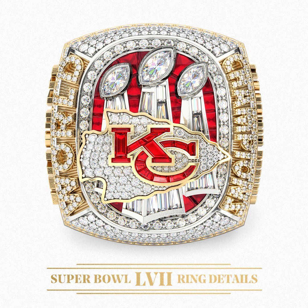
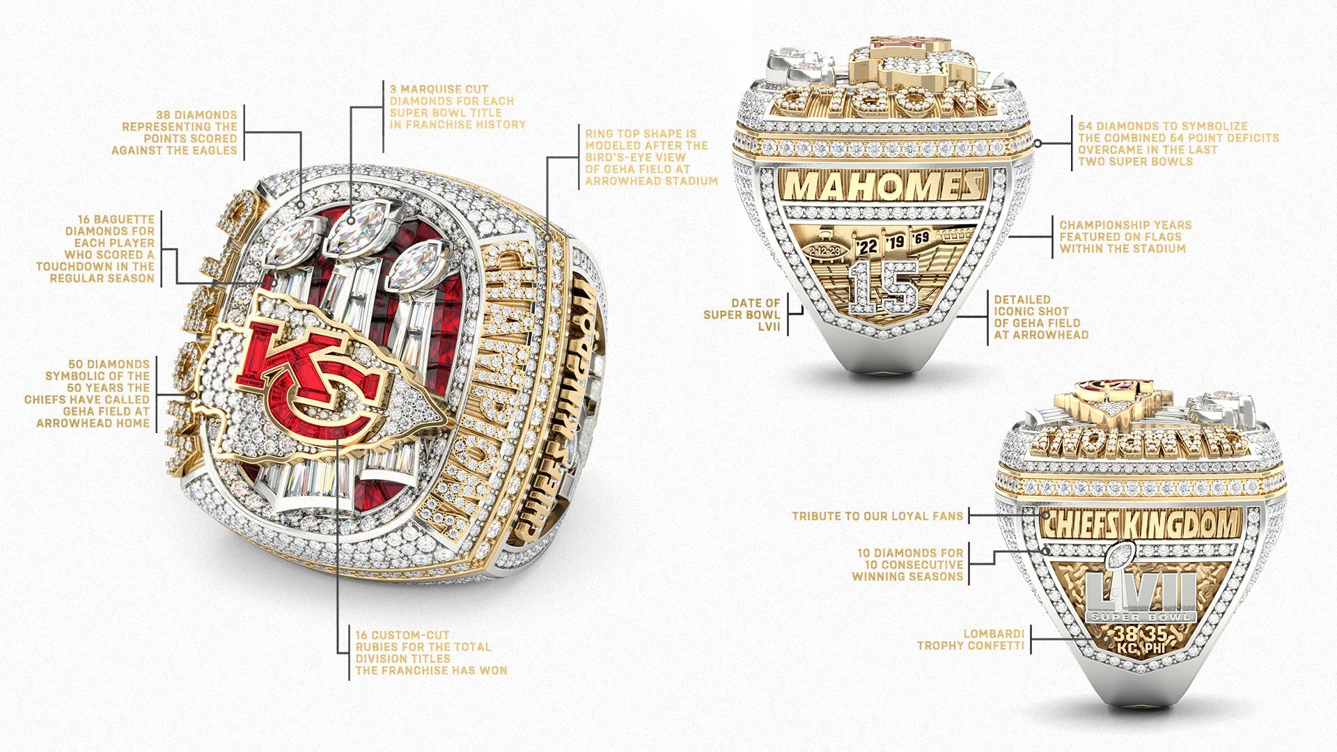
Following an offseason filled with celebrations of their championship triumph, the Kansas City Chiefs have added another jewel to their collection. The grand reveal took place at the Chiefs' ring ceremony and red carpet event held at Union Station in Kansas City, Missouri, where the team showcased their remarkable Super Bowl LVII championship ring. This exquisite piece of jewelry is an ode to the Chiefs' storied history and their exceptional 2022-23 campaign, embellished with intricate details and precious gems.
The rings design honors all three of Kansas City's Super Bowl victories on one side, while paying homage to the loyal Chiefs Kingdom above the Super Bowl LVII logo on the other. The top of the ring boasts an awe-inspiring sight, displaying all three of the team's Lombardi trophies. What's truly remarkable is that the top of the ring can be slid off, revealing a miniature replica of Arrowhead Stadium nestled within the ring itself.
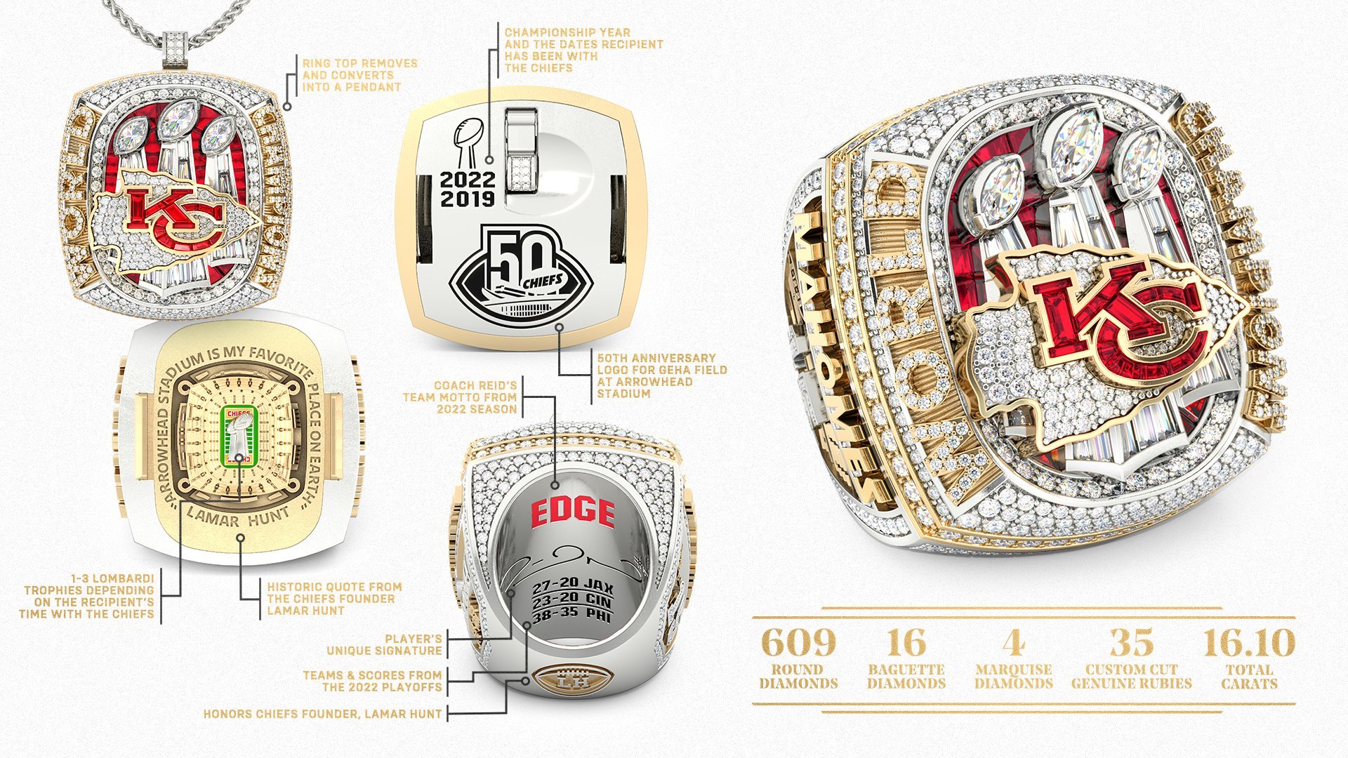
To elevate the ring's allure, the top section can be entirely removed and converted into a pendant, thanks to a hidden bail that seamlessly folds into the ring top. Once detached, the story continues within the ring. The shape of the ring top mirrors GEHA Field at Arrowhead Stadium, which celebrated its 50th anniversary in 2022. Inside the ring, a yellow gold miniature version of the stadium is displayed, featuring a full-color field adorned with Lombardi Trophies at the center. The number of trophies varies depending on the recipient's time with the organization. Encircling the stadium is a powerful quote from Lamar Hunt himself, declaring, "ARROWHEAD STADIUM IS MY FAVORITE PLACE ON EARTH." On the backside of the pendant, the recipient's championship year-dates with the Chiefs, the 50th-anniversary logo, and an image of the Lombardi Trophy are prominently showcased.
The Kansas City Chiefs' Super Bowl LVII championship ring epitomizes the culmination of their remarkable journey and commemorates their triumph in stunning fashion. A testament to the team's rich heritage and their unforgettable 2022-23 campaign, this exquisite piece of jewelry encapsulates the dedication, talent, and relentless pursuit of excellence that define the Chiefs. As the team members proudly wear their rings, they embark on a new season, ready to overcome new challenges and build on the legacy they have created.
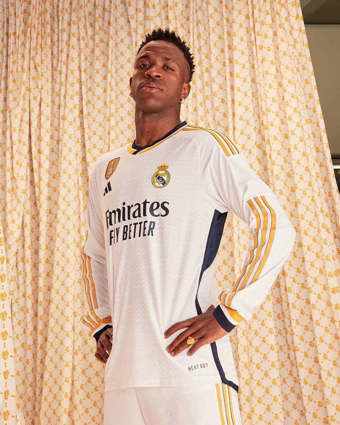
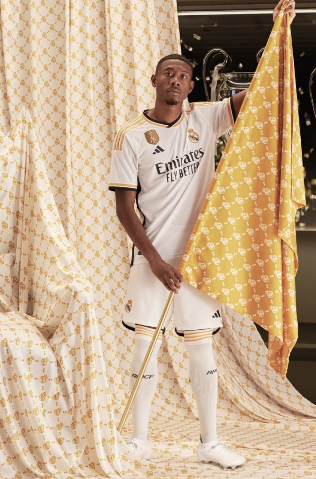
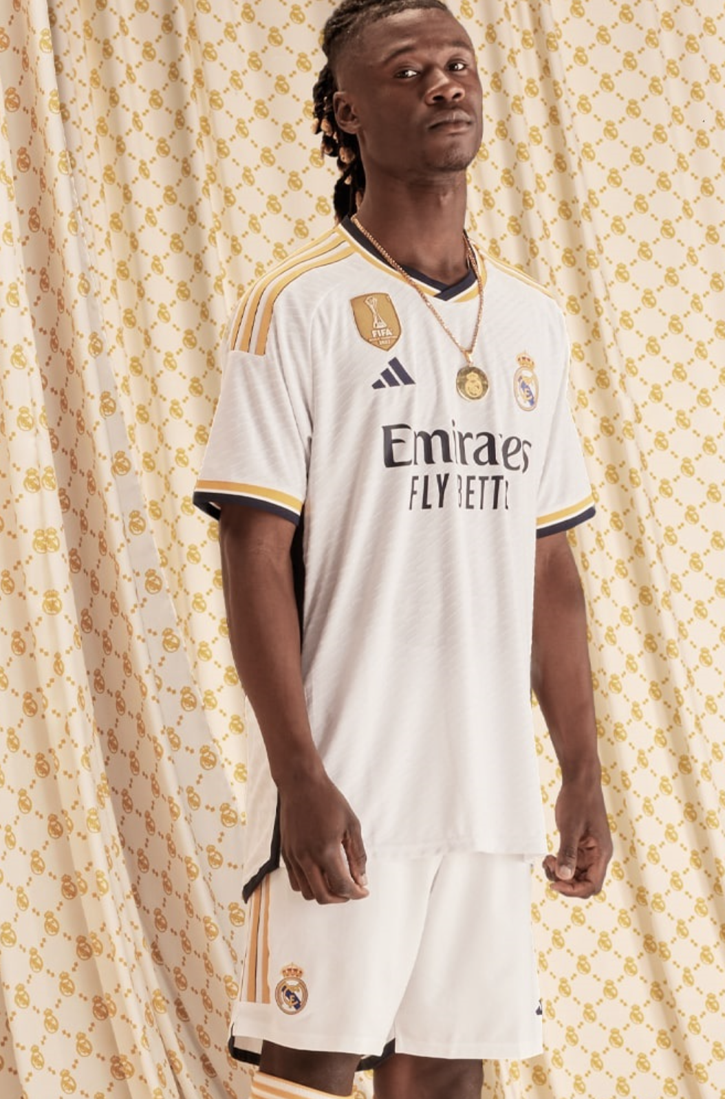
Los Blancos, the beloved football club from Madrid, have recently revealed their eagerly anticipated new kit for the 2023-24 season. Staying true to their traditional template, the pristine white base of the jersey exudes elegance and regality. However, this year's design brings a fresh twist with rich trimmings and vibrant accents, setting the stage for a captivating season ahead.
In a departure from last season's subtler purple accents, the 2023-24 Los Blancos shirt boasts striking two-tone detailing. The collar, sleeves, and three iconic Adidas stripes adorning the shoulders feature an eye-catching combination of yellow and dark navy. These contrasting hues inject energy and dynamism into the kit, creating a visual spectacle both on and off the pitch.
The navy edging on the Los Blancos jersey extends beneath the arms and elegantly runs along the flanks, adding a touch of sophistication. This creative design choice creates a distinctive border along the bottom edge of the reverse of the shirt, accentuating its aesthetic appeal. Moreover, the fabric itself showcases a subtle "flock" effect woven into the lightweight mesh, providing a delightful dash of luxury that befits the prestigious club.
Embracing change, Los Blancos have opted for a simple round crew neck in their latest kit, replacing last year's fold-over button collar. But that's not all. The back of the neck proudly displays the club's motto and anthem, "¡Hala Madrid!" This prominent placement is a first in the club's history, emphasizing the deep pride and passion associated with these iconic words.
The unveiling of Los Blancos' new kit for the 2023-24 season has captured the imagination of fans worldwide. With its pristine white base, augmented by rich trimmings and captivating details, the jersey exudes a sense of grandeur and sophistication. As the team steps onto the pitch adorned in this majestic attire, the colors and design will symbolize the legacy, tradition, and aspirations of one of the world's greatest football clubs.
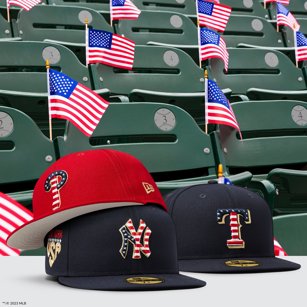
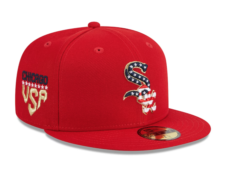
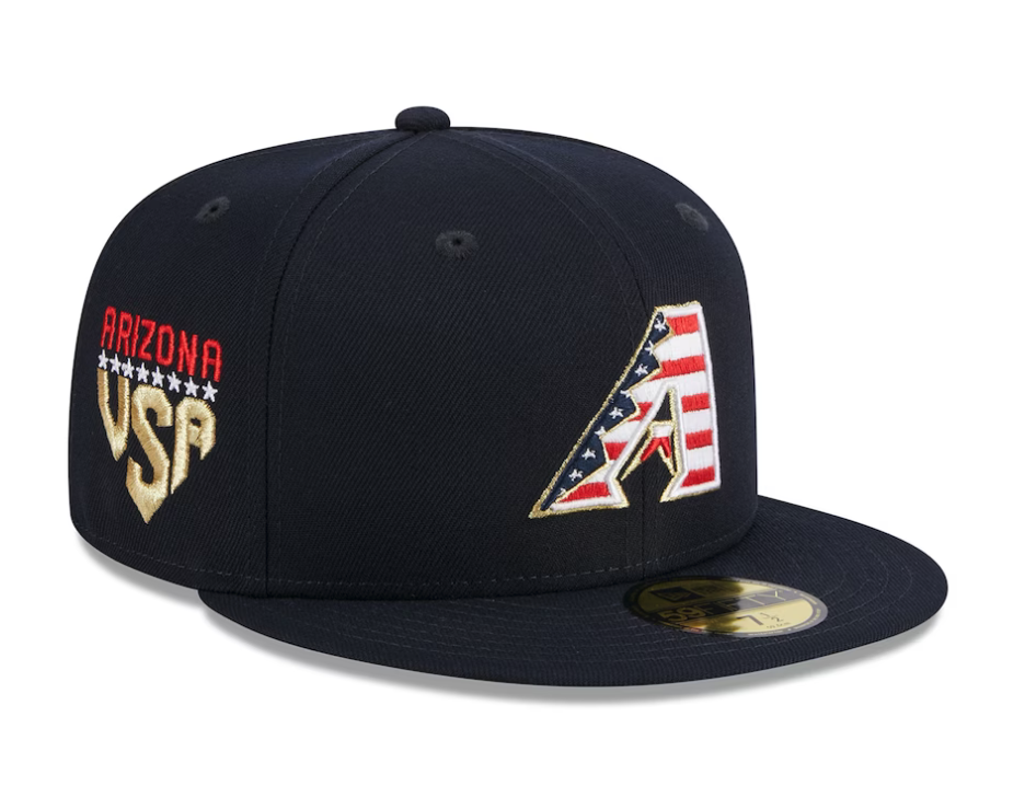
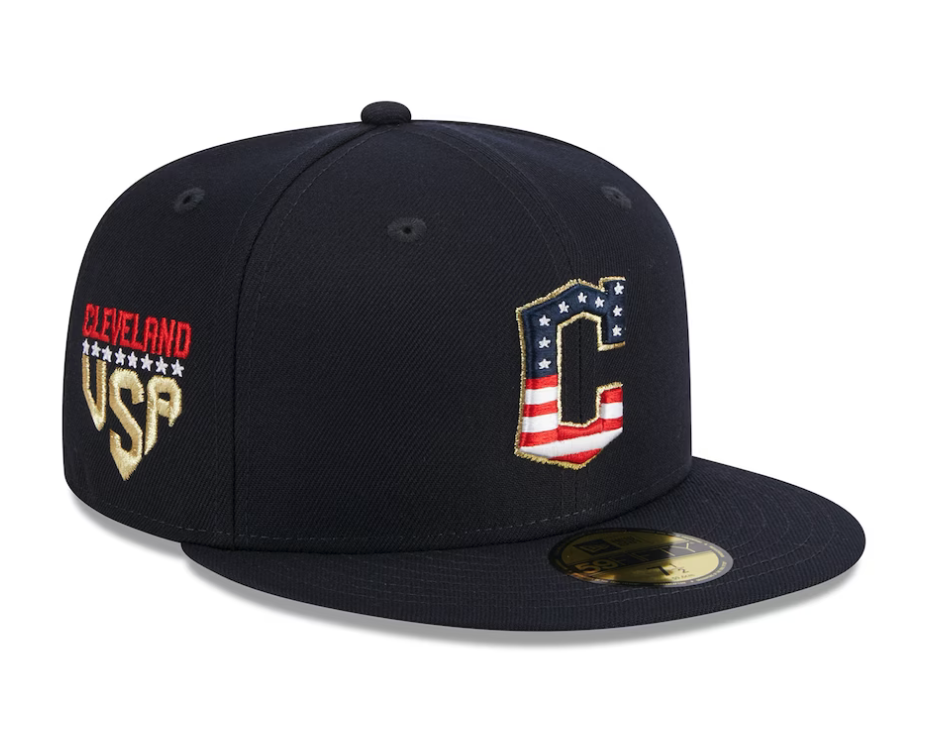
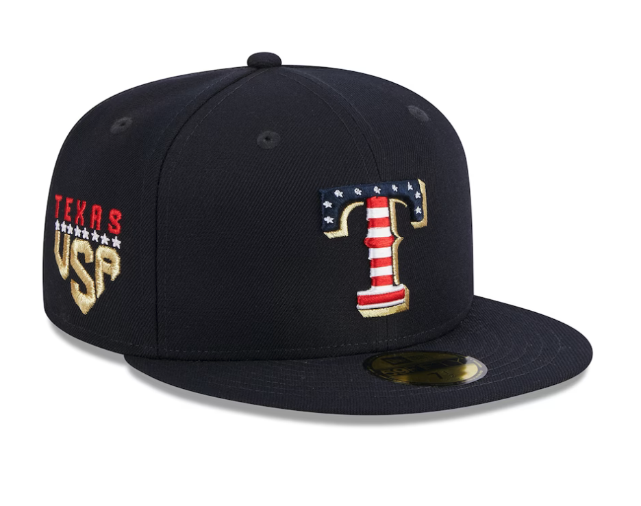
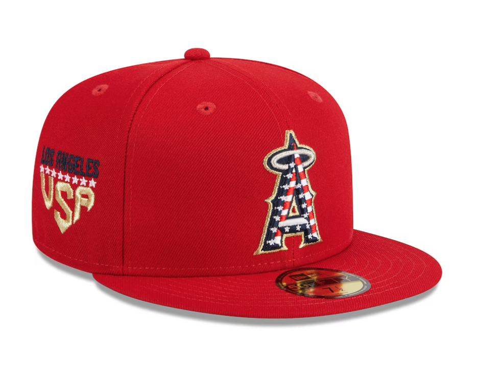
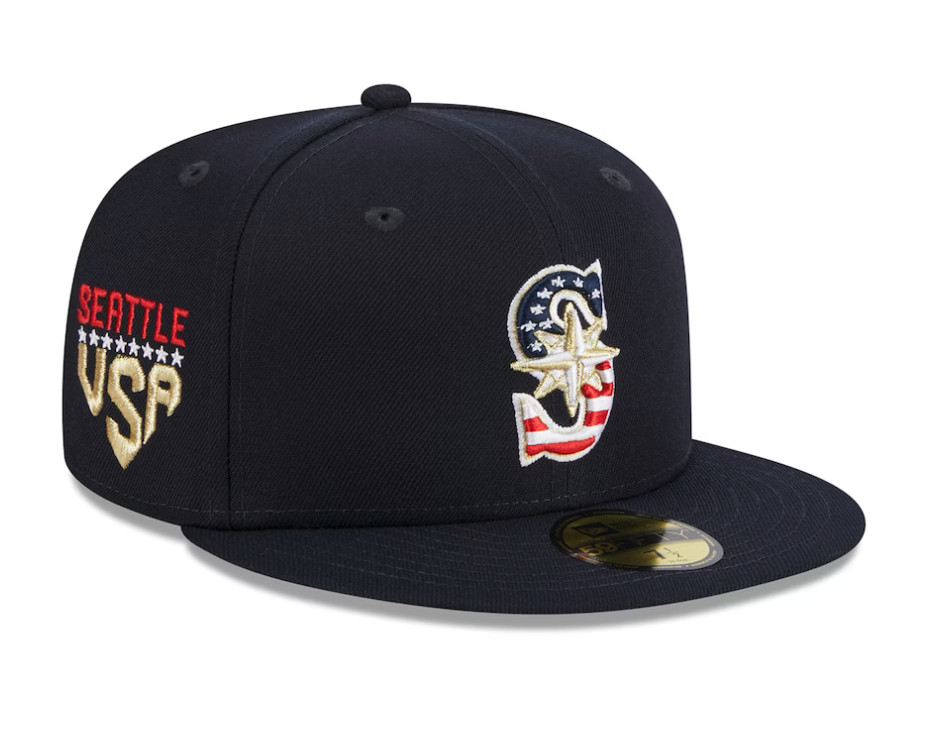
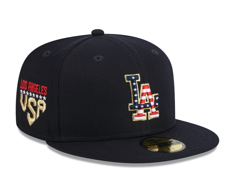
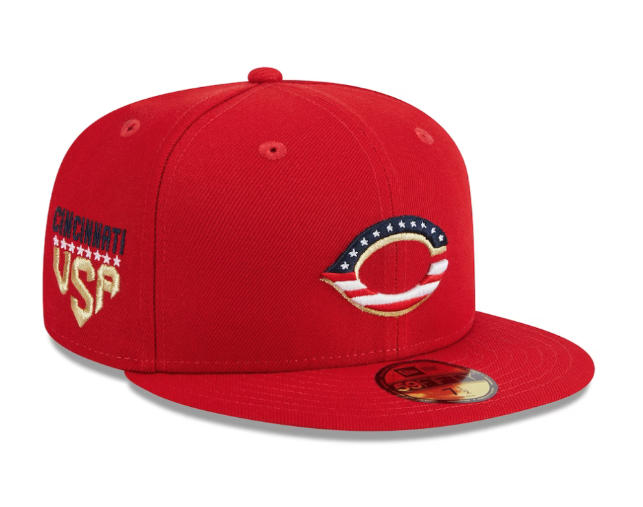
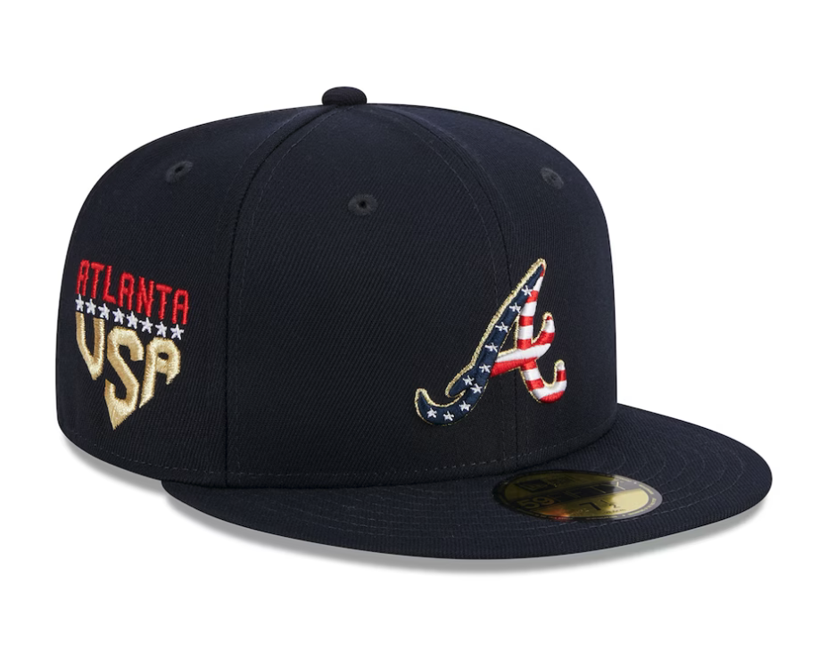
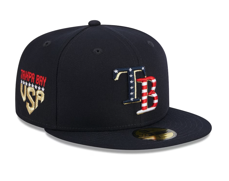
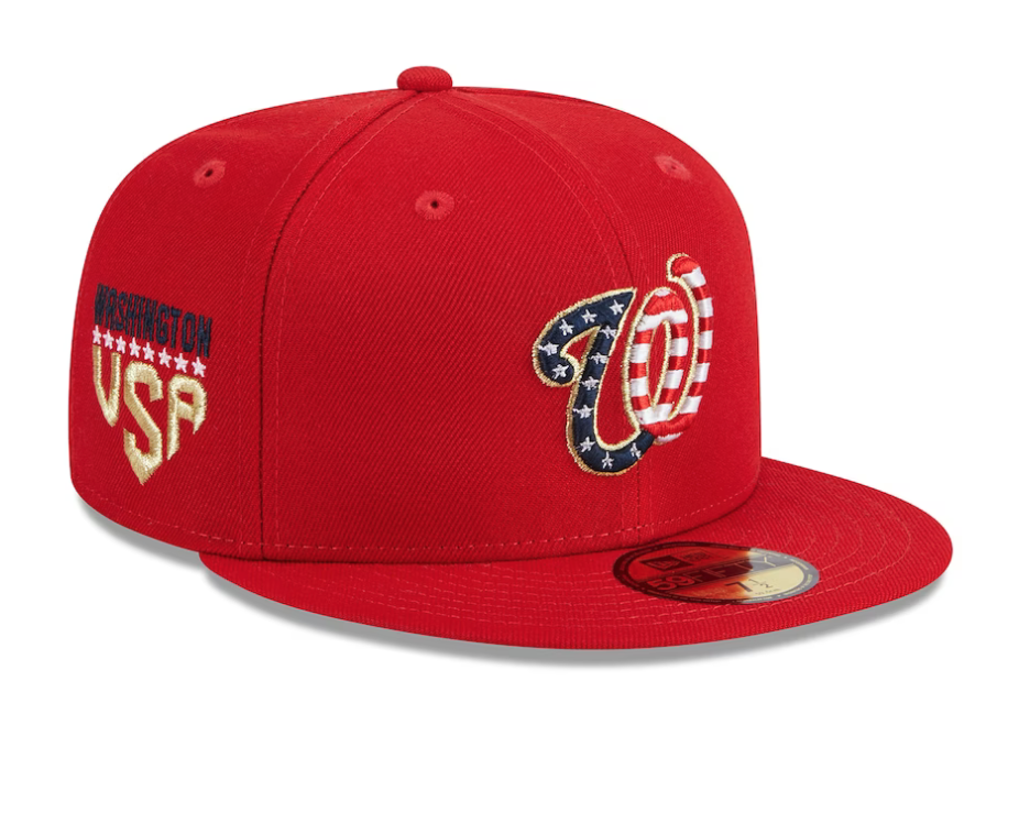
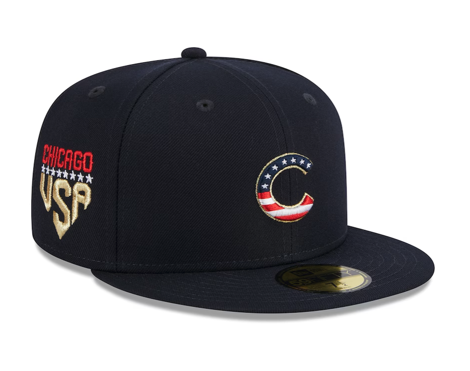
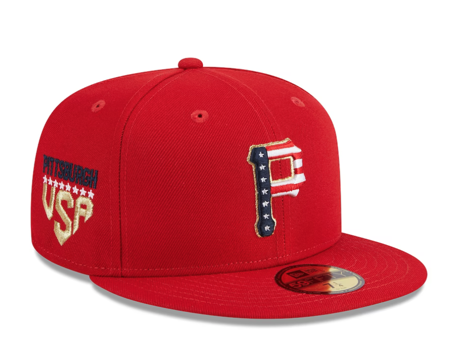
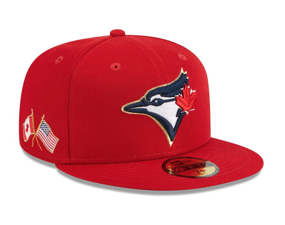
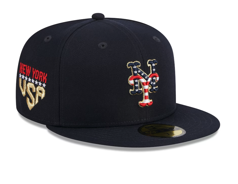
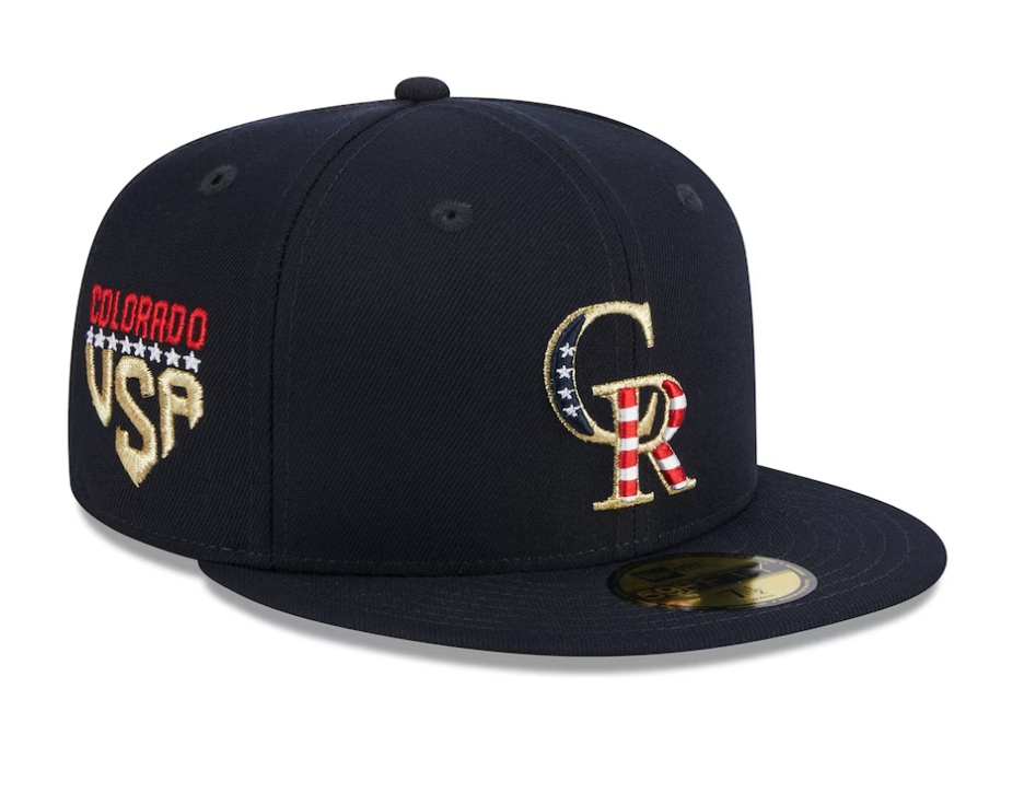
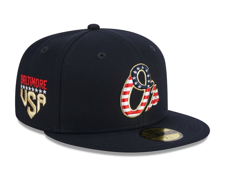
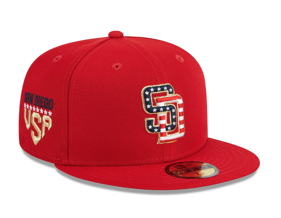
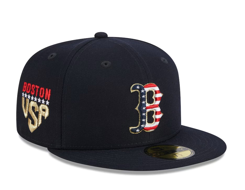
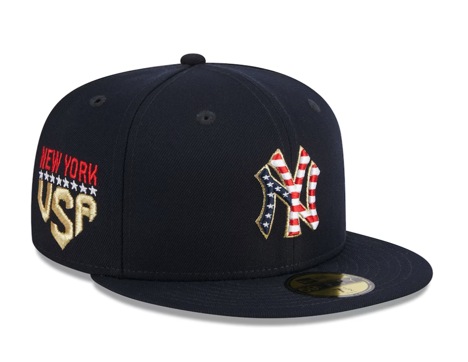
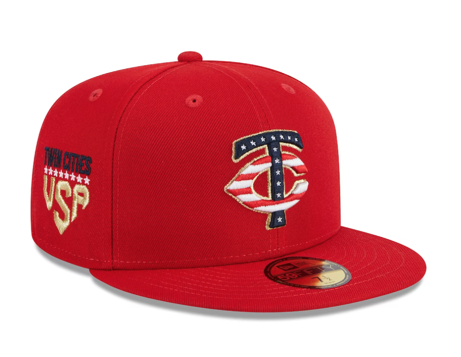
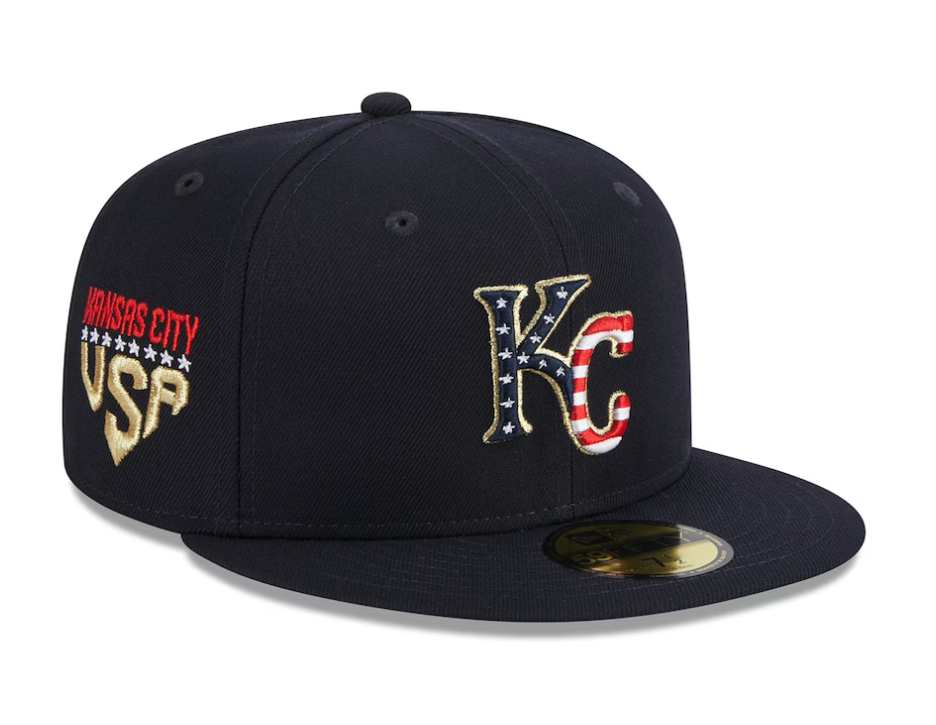
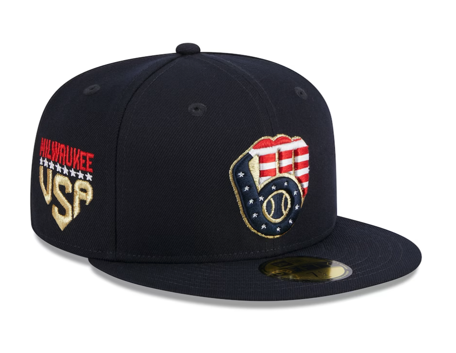
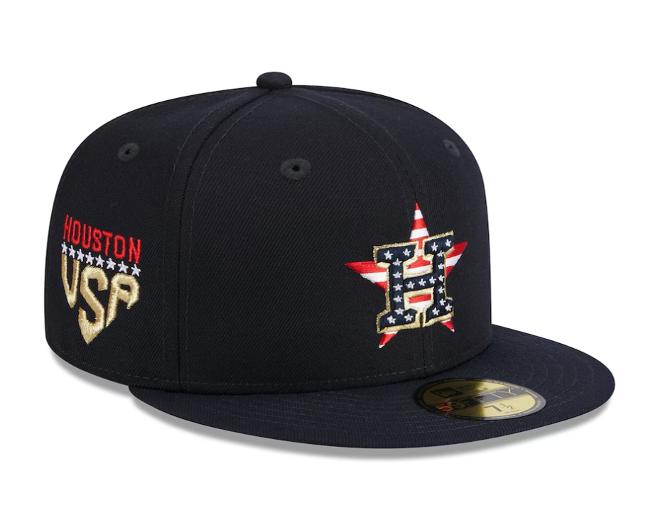
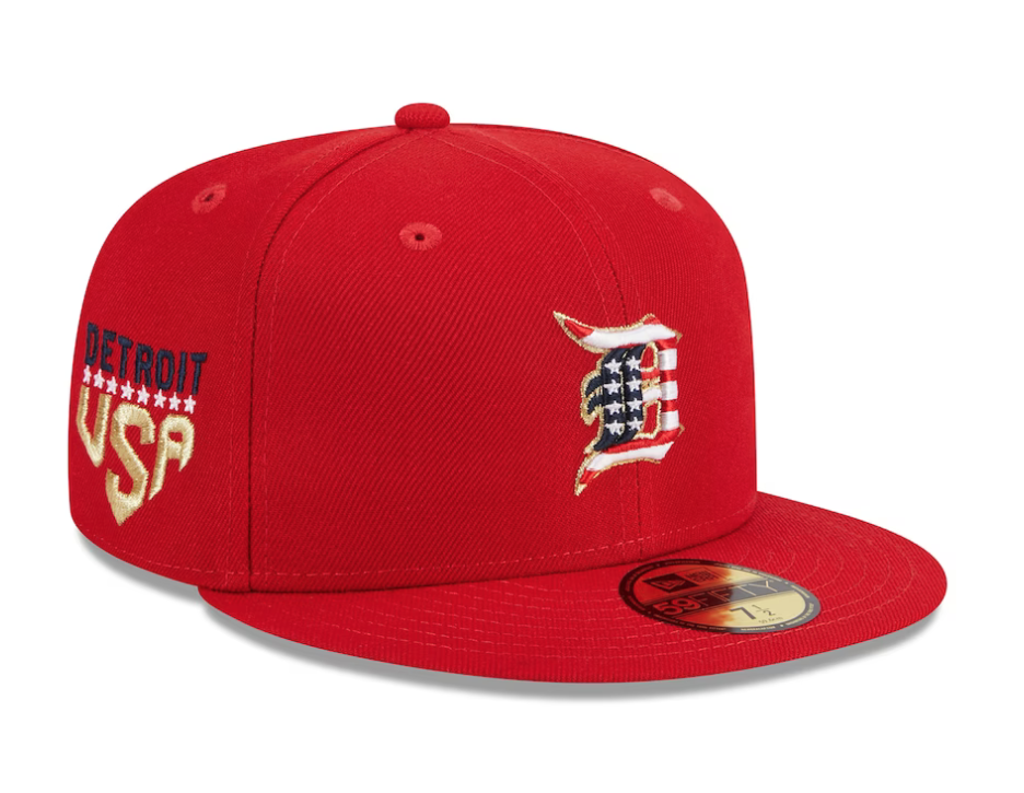
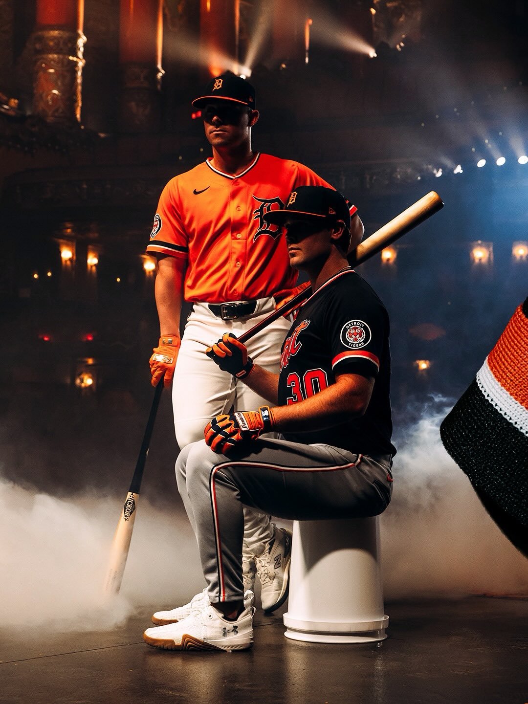
Get ready for the Fourth of July with the stylish Independence Day 2023 59FIFTY Fitted Cap of your favorite team. This cap features a stars and stripe themed team logo embroidered on the front panels and a matching MLB Batterman logo at the rear. The cap also includes the city name and USA wordmark on the right-wear side, along with a gray undervisor.
— Rawlings Baseball (@RawlingsSports) June 9, 2023
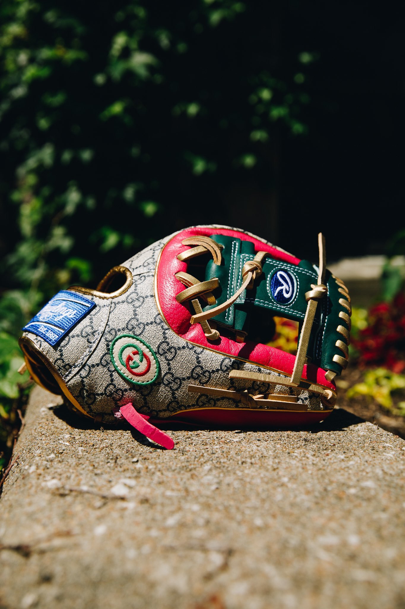
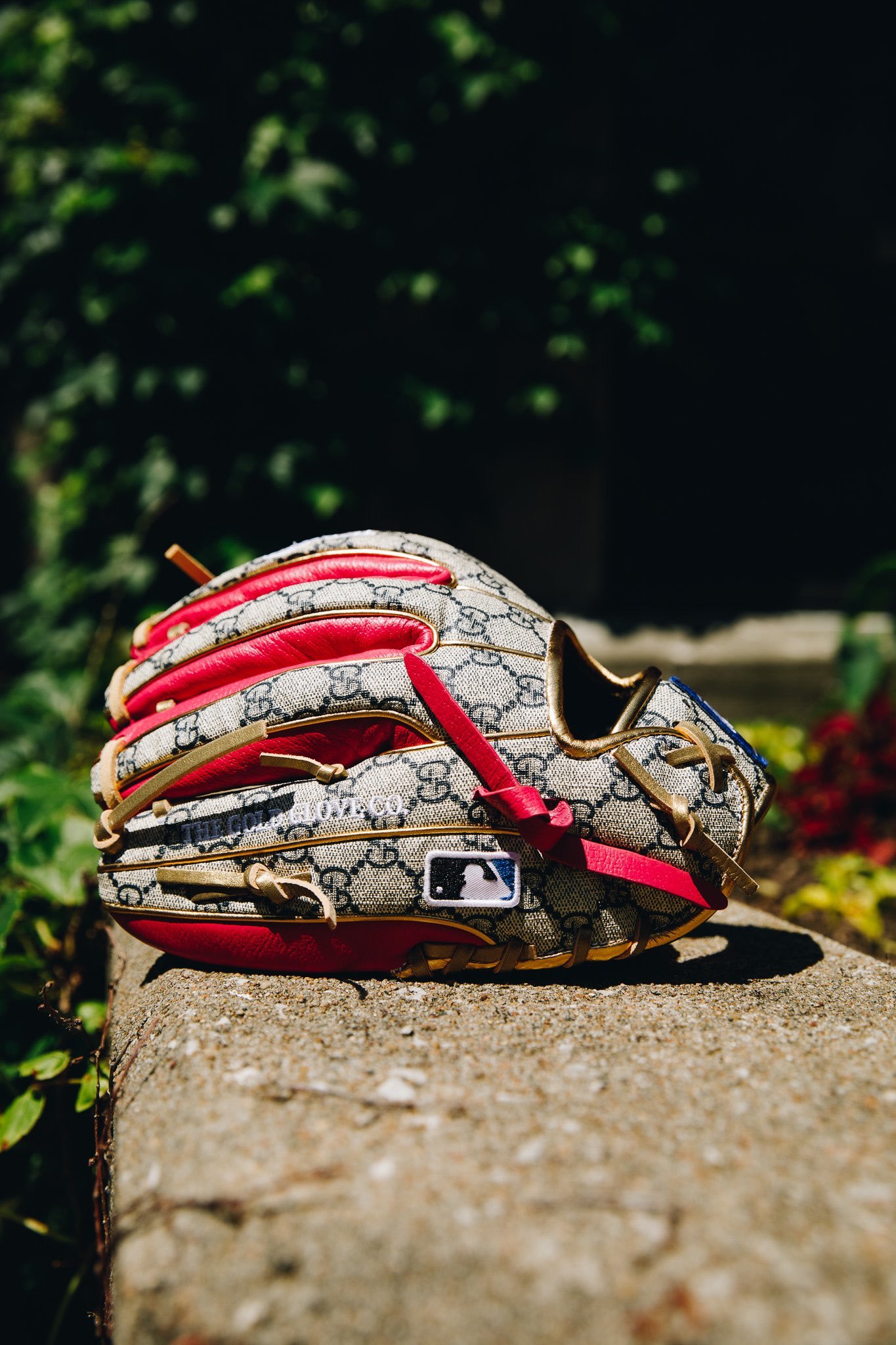
In the realm of sports, few athletes can seamlessly blend style and substance like Francisco Lindor. Renowned for his fashion-forward approach, Lindor recently unveiled a groundbreaking collaboration that transcends the boundaries of traditional sports gear. a one-of-a-kind baseball glove, a collaboration of Rawlings craftsmanship and Gucci's iconic design sensibilities.
Lindor, known for his involvement in designing his Rawlings gloves and his own New Balance shoe line, was taken aback by the Gucci collaboration. With no input in the glove's look or style, he found himself the fortunate recipient of a remarkable masterpiece. "I never thought I would own a Gucci glove," Lindor confessed, chuckling. "It was completely out of my realm of imagination. But now, anything seems possible."
The Gucci x Rawlings collaboration represents a significant milestone in the convergence of fashion and Major League Baseball. Lindor understands the broader impact of such collaborations, recognizing their potential to captivate fans from diverse corners of the world. "I think it's really cool," he enthused. "It's a fun glove. And it's great for the game that brands like Gucci partner with MLB, attracting fans who may not be familiar with baseball but are drawn in by the allure of iconic brands."
Francisco Lindor's foray into the Gucci x Rawlings collaboration signals a paradigm shift where fashion and baseball converge like never before.
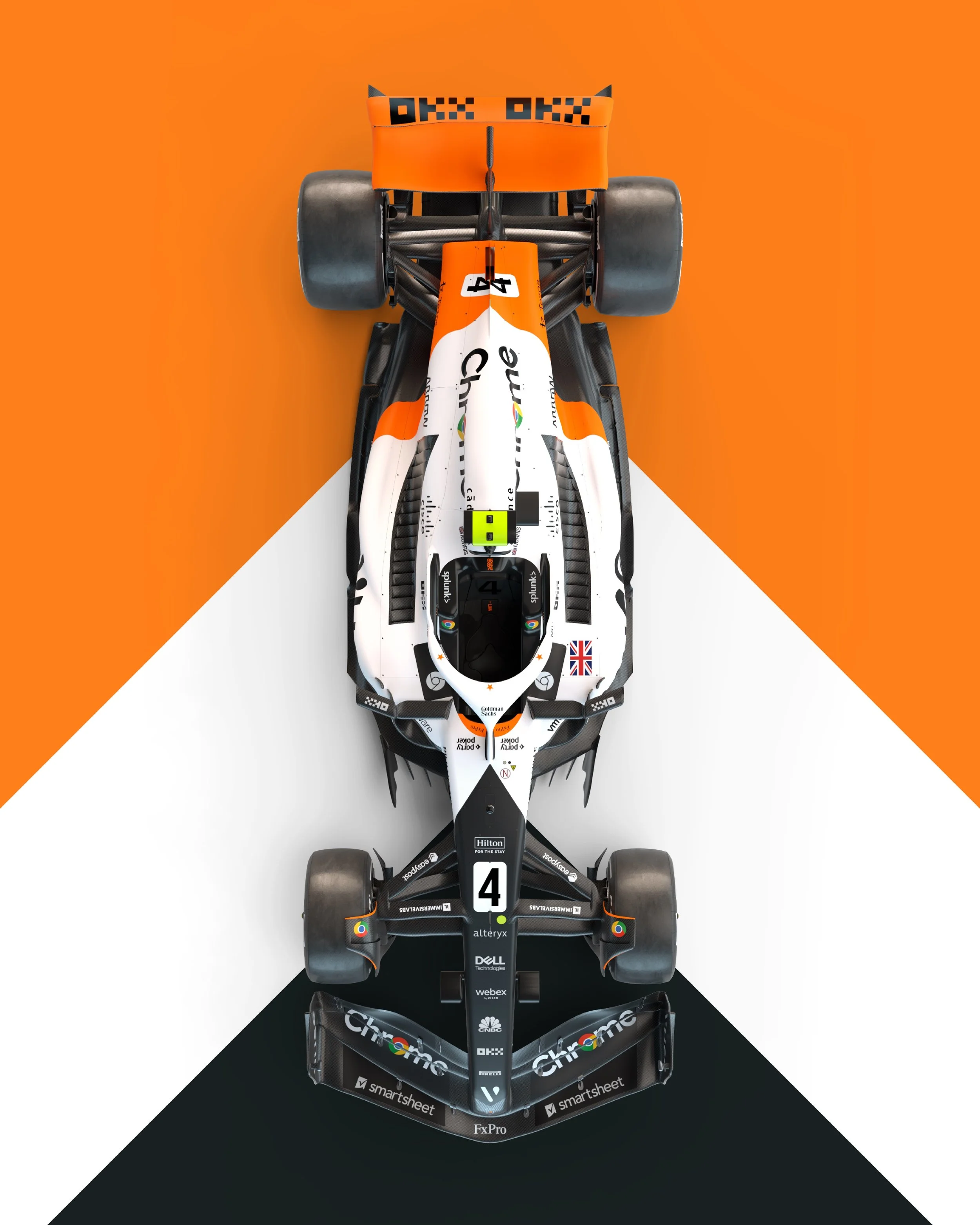
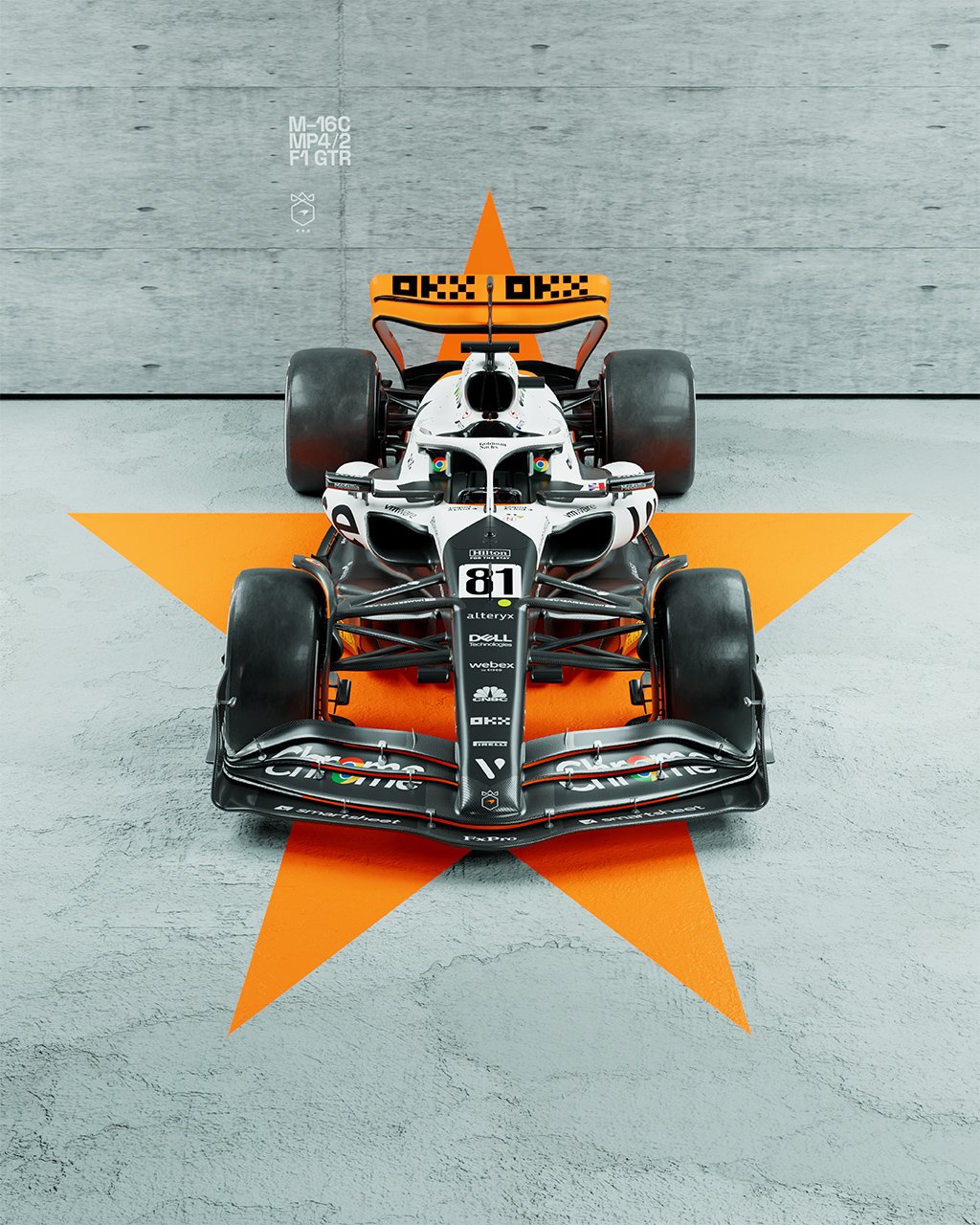
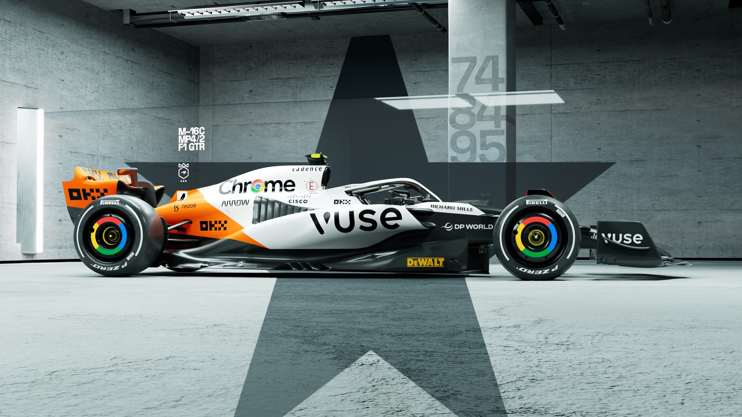
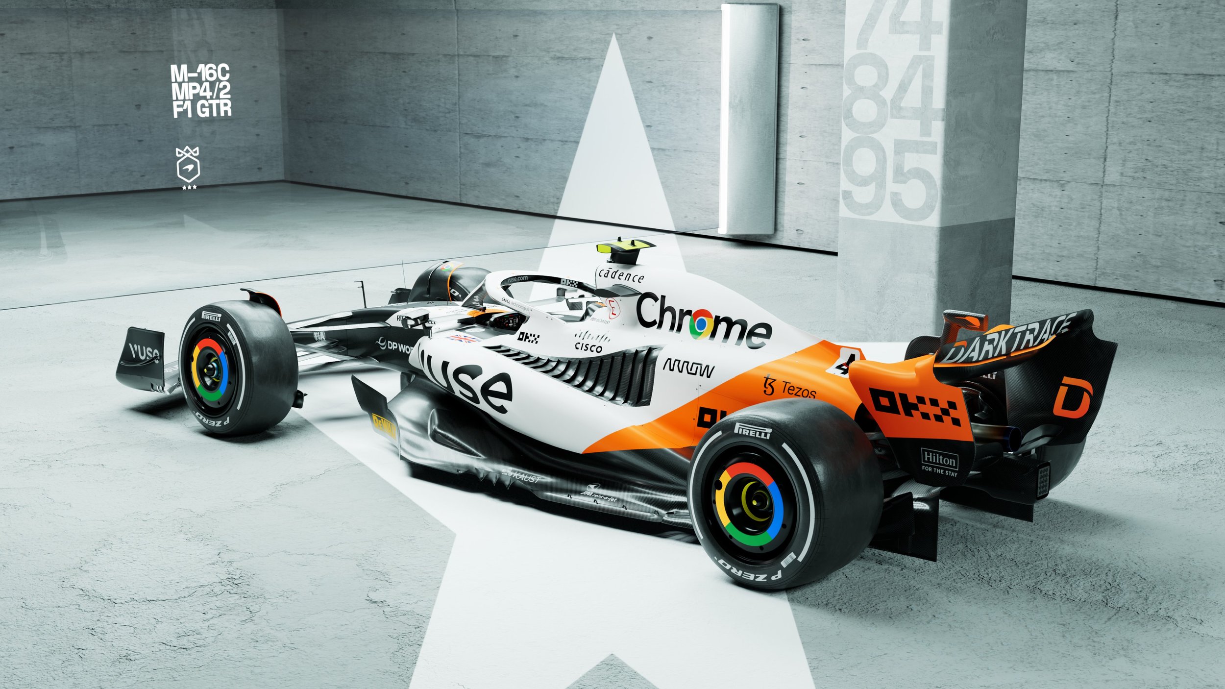
McLaren is set to dazzle fans with a special one-off livery at the upcoming Monaco Grand Prix. As part of their 60th anniversary celebrations, the renowned racing team will showcase a unique combination of colors, paying homage to their illustrious Triple Crown achievements. The Triple Crown consists of victories in Formula 1's Monaco Grand Prix, Indycar's Indy 500, and the legendary Le Mans 24 Hours endurance race. With a captivating blend of papaya, white, and black adorning the MCL60, McLaren aims to honor their rich history and commemorate their extraordinary triumphs.
Zak Brown, CEO of McLaren, expressed pride in celebrating the team's 60th anniversary and honoring the legacy of Bruce McLaren with this exceptional livery. The unique design pays homage to McLaren's remarkable achievement of winning the Triple Crown and showcases the team's rich history in motorsport. The special livery is a testament to the dedication and excellence that have defined McLaren over the years.
For Lando Norris, being part of McLaren Racing's 60th anniversary celebrations is an immense privilege. Combining three iconic race-winning liveries into one for the Monaco Grand Prix promises to be a special moment for the entire team. Norris, who experienced a podium finish in Monaco in 2021, is eager to race hard and celebrate Bruce McLaren's enduring legacy.
Oscar Piastri, in his first Monaco Grand Prix as a Formula 1 driver with McLaren, is thrilled to be a part of this momentous occasion. With McLaren's rich history at Monte Carlo, Piastri feels immensely proud to line up on the grid in the MCL60, adorned with the same colors as the three Triple Crown-winning race cars.
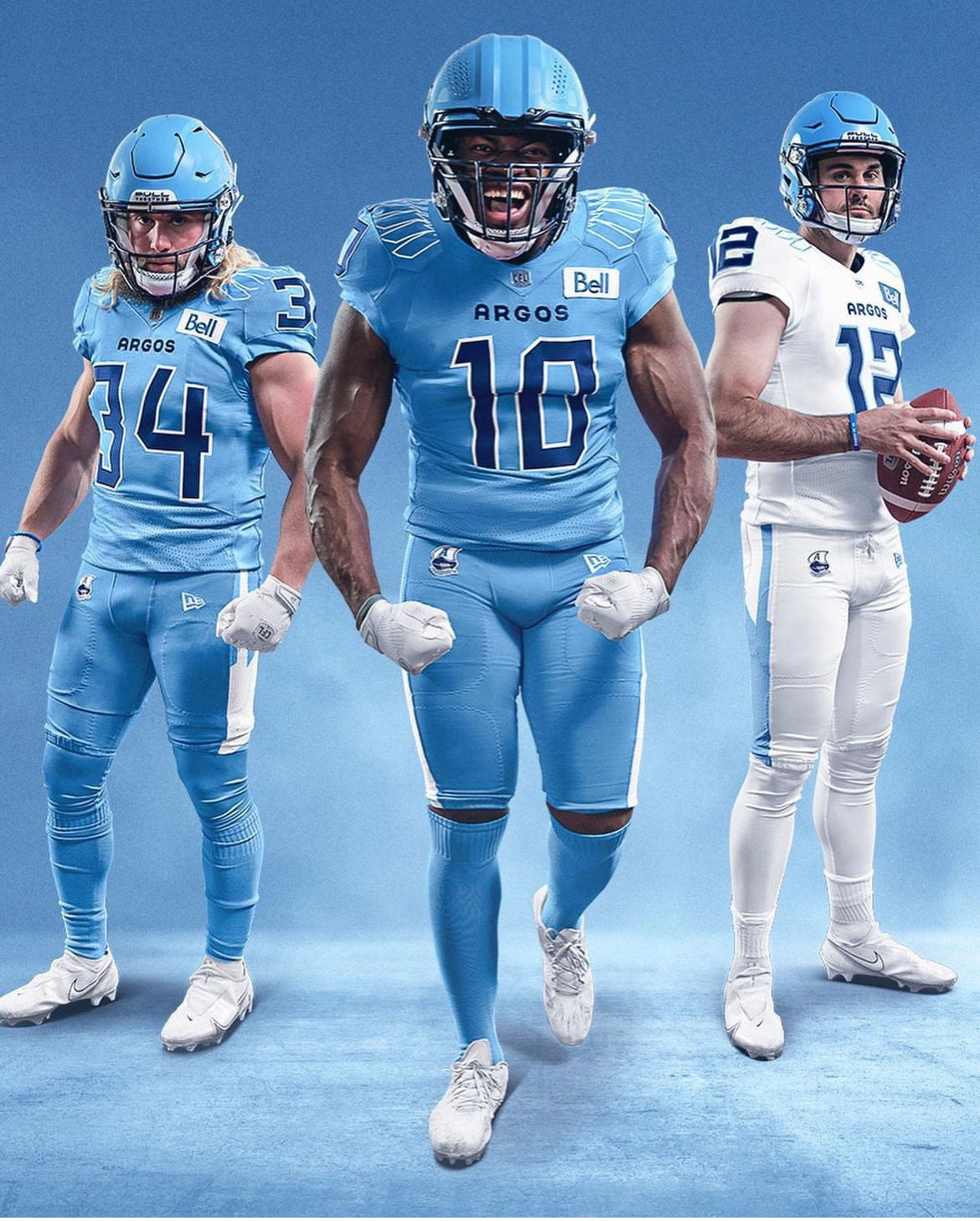
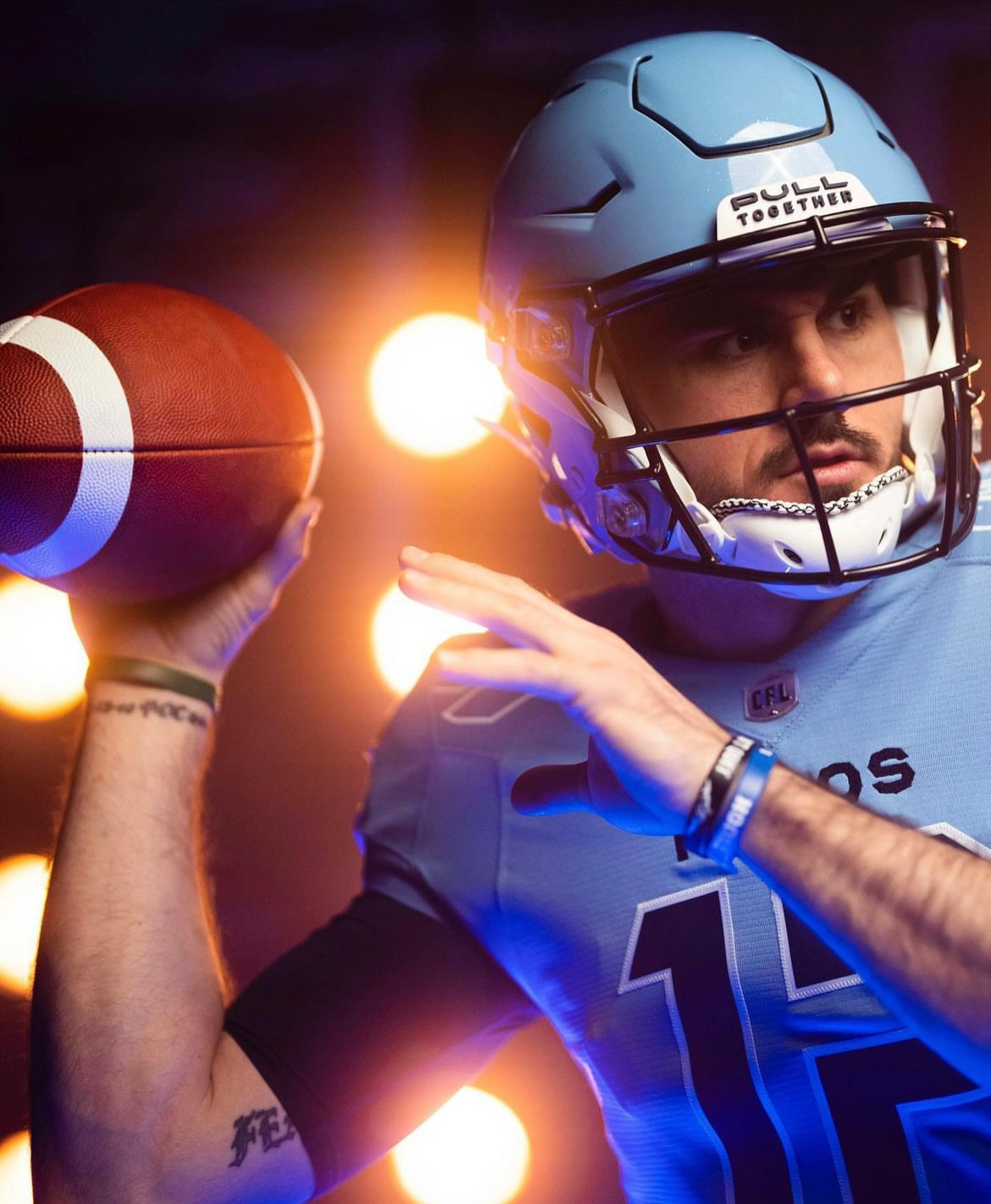
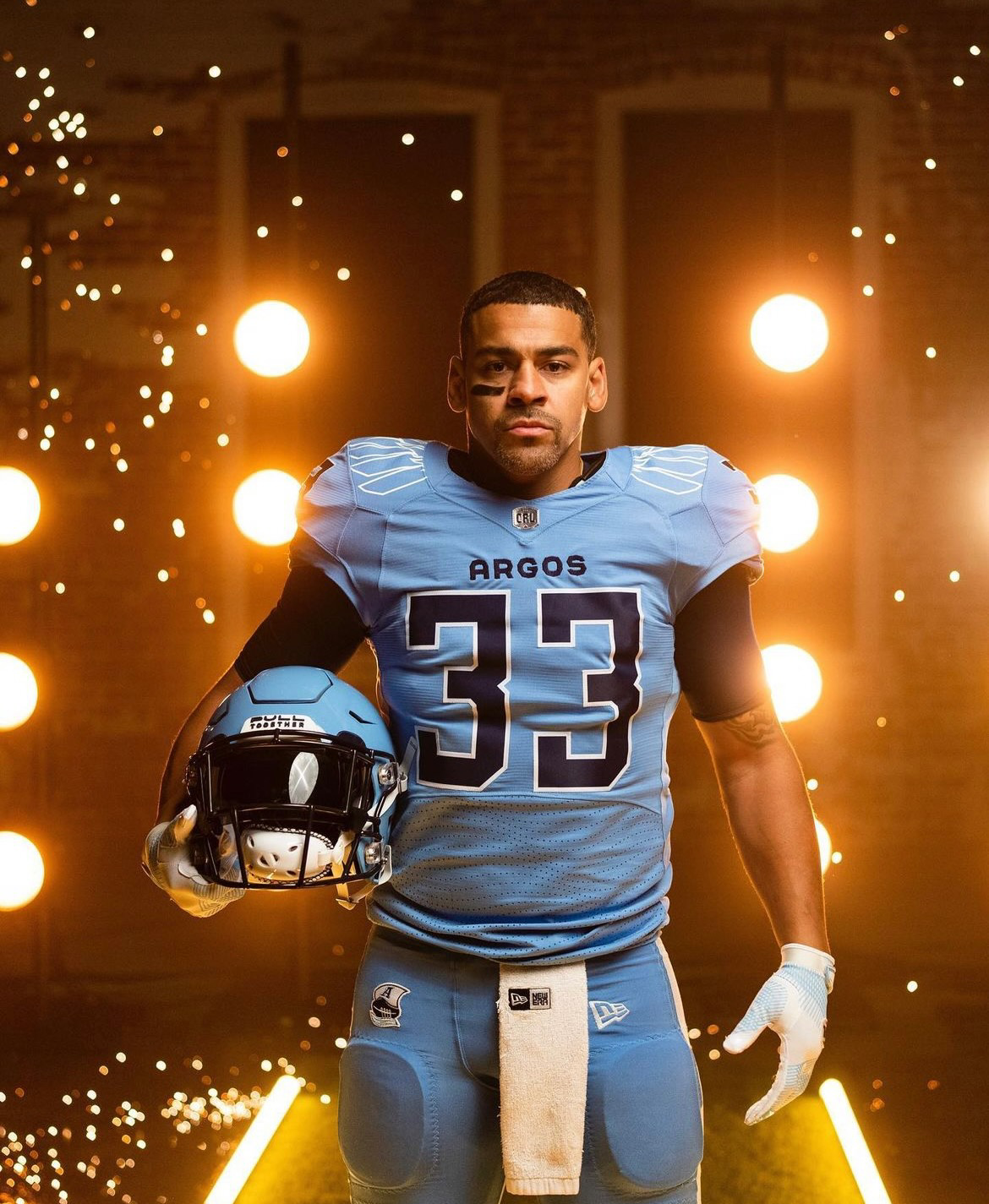
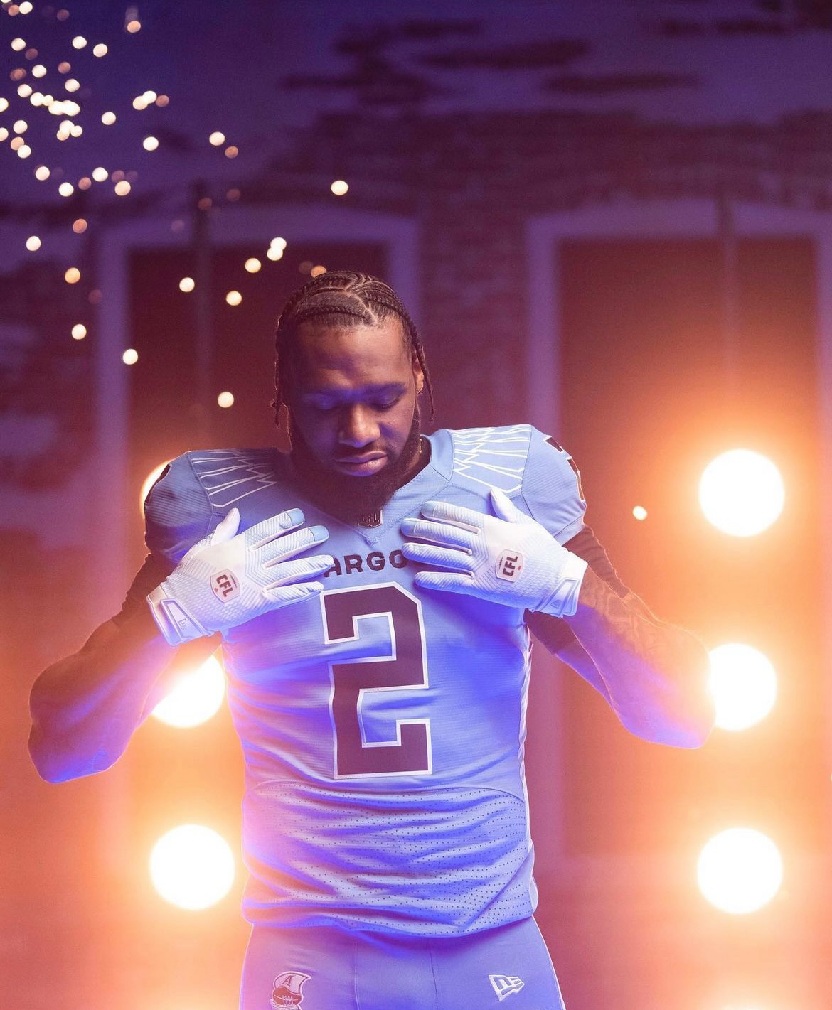
The Toronto Argonauts, reigning Grey Cup Champions, are set to make a bold statement this season with a brand new look that combines their rich traditions with fresh inspiration. As the franchise celebrates 150 years of football history, the Argos have unveiled a set of uniforms that pays homage to their nautical heritage, symbolizes unity, and creates a modern identity for the team. The new uniforms, designed in collaboration with New Era, encapsulate the spirit of the Argonauts as they defend their championship and embark on the next chapter of their storied franchise.
In a nod to the team's past, the Toronto Argonauts unveiled new helmets in Cambridge Blue, a color they haven't sported since 1962. The helmet design features an oversized version of the Argos 'Boat logo,' which made its return in 2020. The logo, depicting oars working in unison to propel a boat forward, embodies the team's rallying cry of "Pull Together." Through this symbolic representation, the Argonauts honor their origins with the Argonaut Rowing Club and the band of heroes in Greek mythology who sailed on the ship Argo in search of the Golden Fleece.
The newly unveiled home and away uniforms proudly showcase the team's traditional 'Double Blue' color scheme, composed of Cambridge and Oxford blues. This classic palette pays homage to the early 1960s, evoking a sense of nostalgia while maintaining a modern edge. The combination of these two blues creates a fresh and vibrant look that will inspire both players and fans alike.
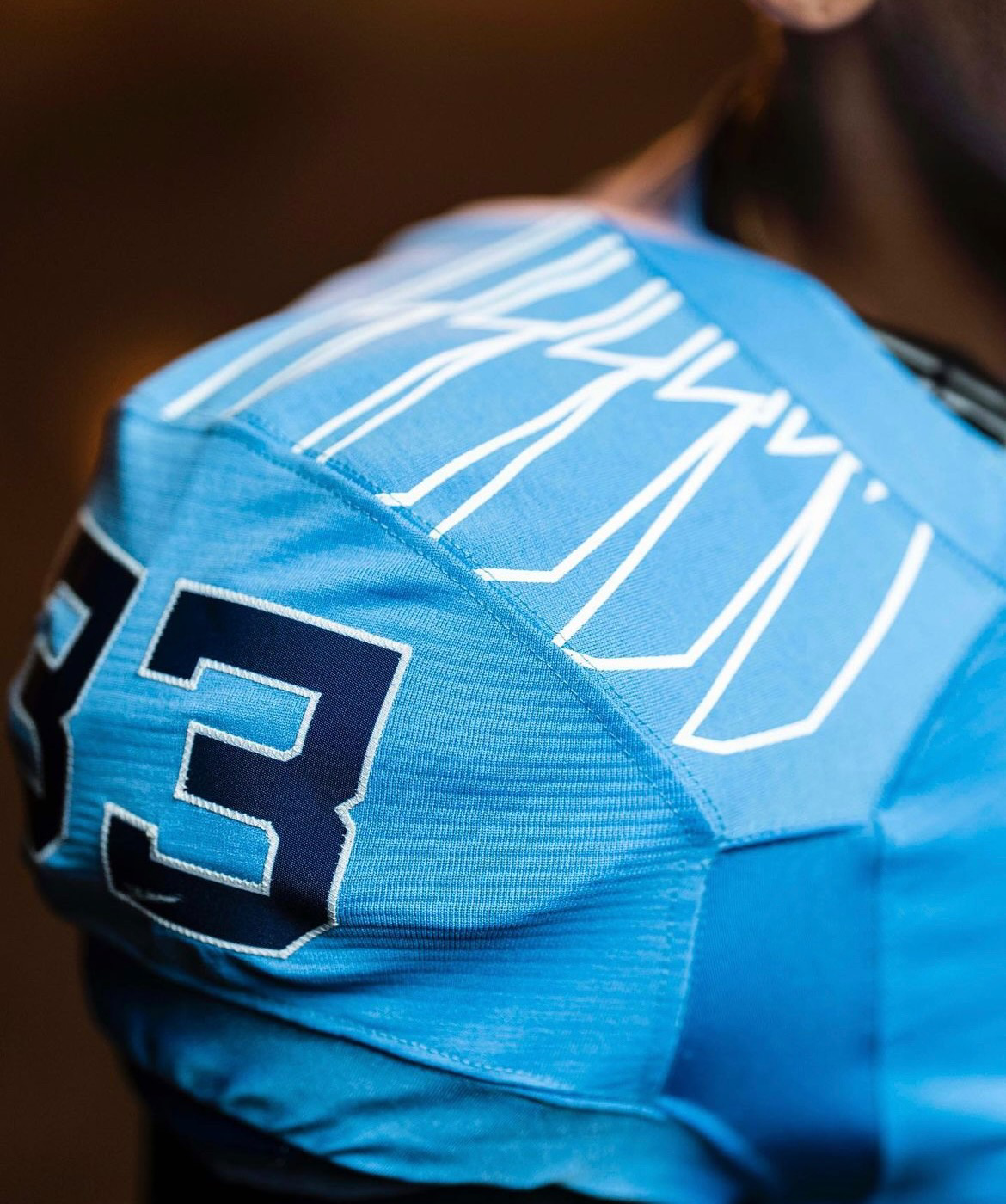
Every aspect of the new Argonauts uniform has been meticulously designed to reflect the team's heritage and create a unique identity. The Pro Force Edge jersey, a first of its kind in the CFL, features sleeker lines and shapes, emphasizing a modern aesthetic. The custom laser-cut mesh on the jersey creates a captivating 'wave' effect, symbolizing the team's connection to water and its nautical roots.
The graphic designs on the uniform pay tribute to the 12 players on the field, with six oars adorning each shoulder. Additionally, the traditional stripe on the pants has been replaced by a single oar on each side. The numbers on the jerseys draw inspiration from the Royal Canadian Navy ship numbers, modernized to perfectly fit the jersey and add a touch of distinction. Notably, inside the collar of the jersey, the team's motto, "Pull Together," serves as a constant reminder of the unity and resilience that define the Toronto Argonauts.
The Toronto Argonauts' new uniforms mark a momentous occasion in the franchise's history. As they take the field in these striking garments, the team proudly commemorates a century and a half of football excellence. The uniforms honor the team's legacy, capture the spirit of their nautical heritage, and create a modern identity that will inspire both players and fans throughout the season.