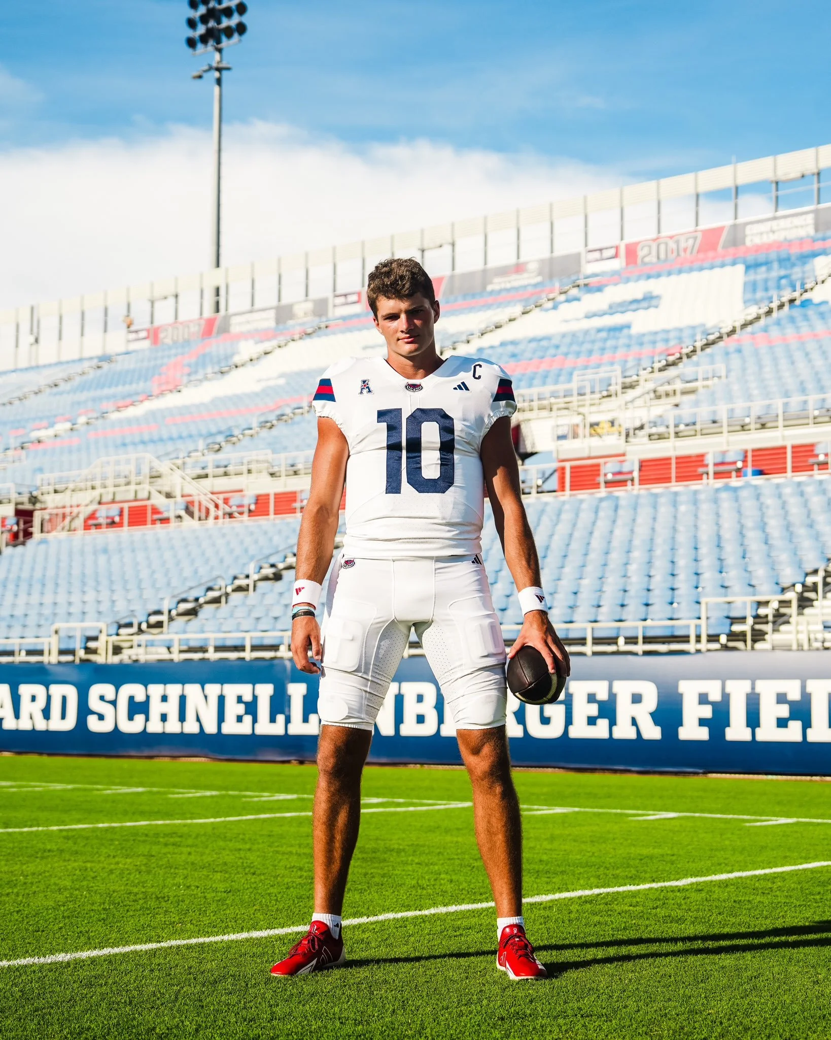
Florida Atlantic Football is turning 25 years old this season, and the Owls are marking their Silver Anniversary with a brand-new look. On August 21, just nine days before their season opener, FAU revealed their updated uniforms. The redesign also signals the start of the Zach Kittley era, ushering in a streamlined aesthetic that leans heavily into tradition and simplicity. The new set features: Two helmets: blue and white, Two jerseys: blue and white, and Two pants: blue and white.
Noticeably missing from the lineup is red, which has been reduced to an accent color rather than a primary element. This marks a significant shift from FAU’s recent uniform history, where red, along with black and even sand-colored alternates, made appearances throughout the last decade. For now, the Owls are keeping it clean and consistent, with blue and white as the foundation of the program’s identity.
While FAU may eventually reintroduce red helmets, jerseys, or pants down the line, the initial reveal focuses on four core combinations that balance tradition with a modern edge. The stripped-down look is designed to give the program a strong, cohesive brand presence as they enter their 25th season on the gridiron.
For a team looking to make a statement in the American Conference, these new uniforms represent more than just a change of wardrobe — they’re a symbol of a new era for FAU Football.
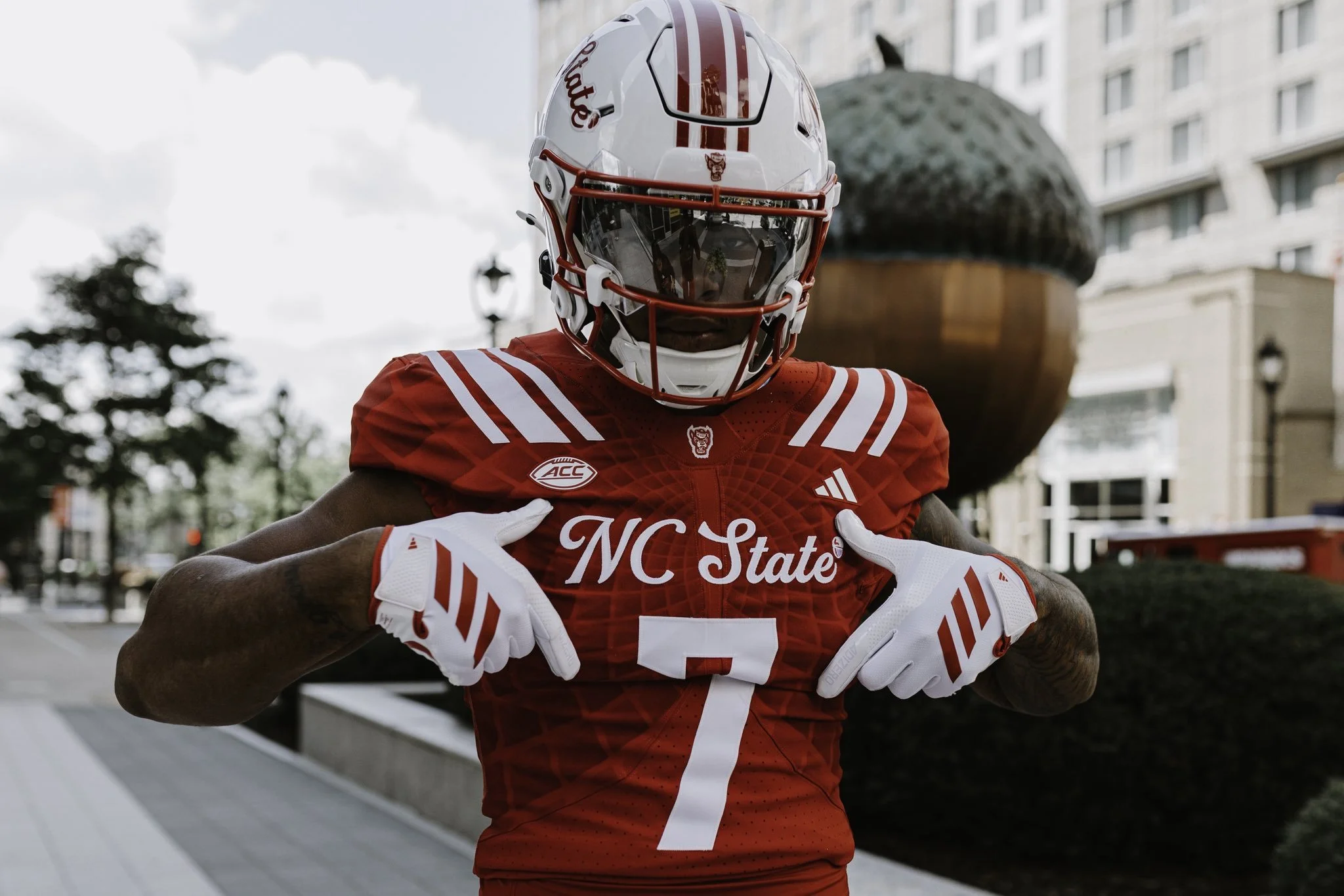
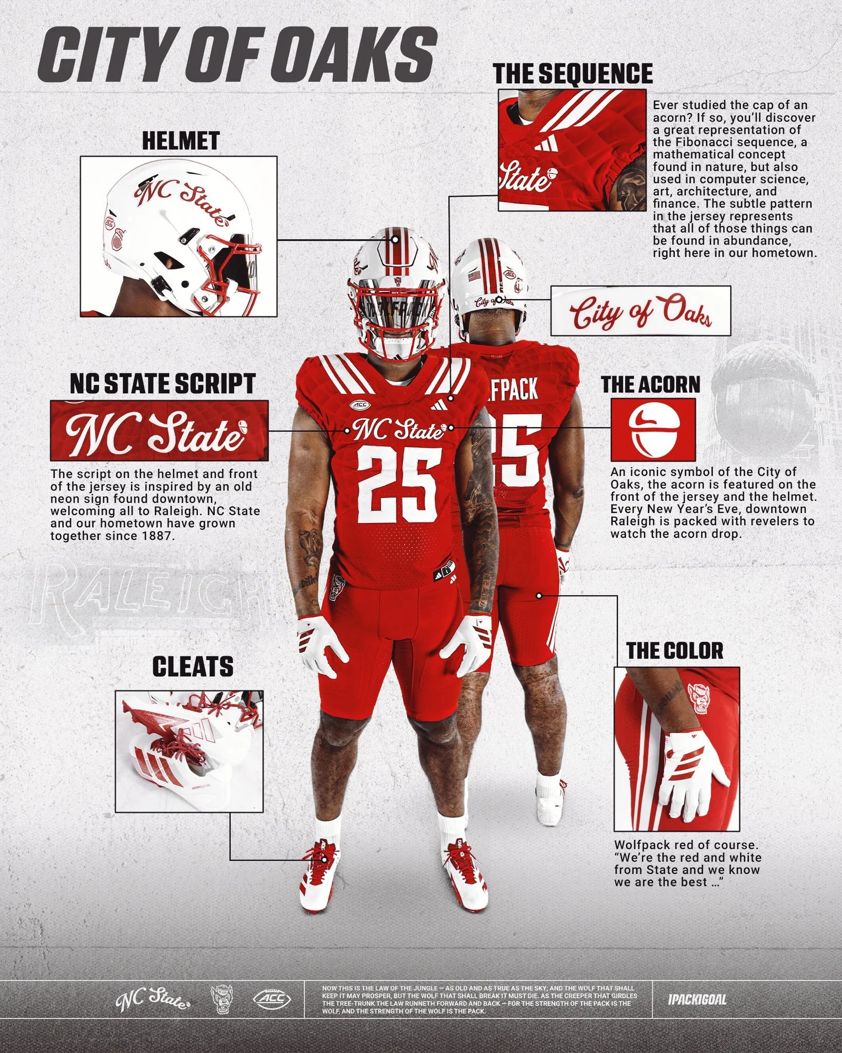
NC State has revealed a new uniform that blends tradition, local pride, and modern design in a way that perfectly represents the Wolfpack and their hometown of Raleigh, the City of Oaks.
The defining feature of the uniform is the script "NC State" showcased on both the helmet and the front of the jersey. The inspiration comes from an old neon sign once found downtown, welcoming all to Raleigh. Just as NC State and the city have grown together since 1887, this script pays homage to that shared history.
Look closely at the jersey fabric and you’ll find a subtle pattern inspired by the Fibonacci sequence, a mathematical design rooted in nature. Much like the acorn’s cap, where this sequence is famously visible, the detail reflects how art, science, architecture, and innovation thrive throughout Raleigh, making the city a true hub of culture and progress.
No symbol is more closely tied to Raleigh than the acorn. Known as the City of Oaks, the acorn is featured proudly on the front of the jersey and helmet. It’s a nod to a beloved local tradition, where every New Year’s Eve thousands gather downtown to watch the giant acorn drop at midnight.
And of course, no NC State uniform is complete without Wolfpack Red — bold, fierce, and instantly recognizable. As the school fight song reminds us: “We’re the red and white from State, and we know we are the best…”
With these thoughtful design touches, the “Script Pack” uniform is more than just a look; it’s a celebration of Raleigh, its history, and the Wolfpack’s connection to the city they proudly represent.
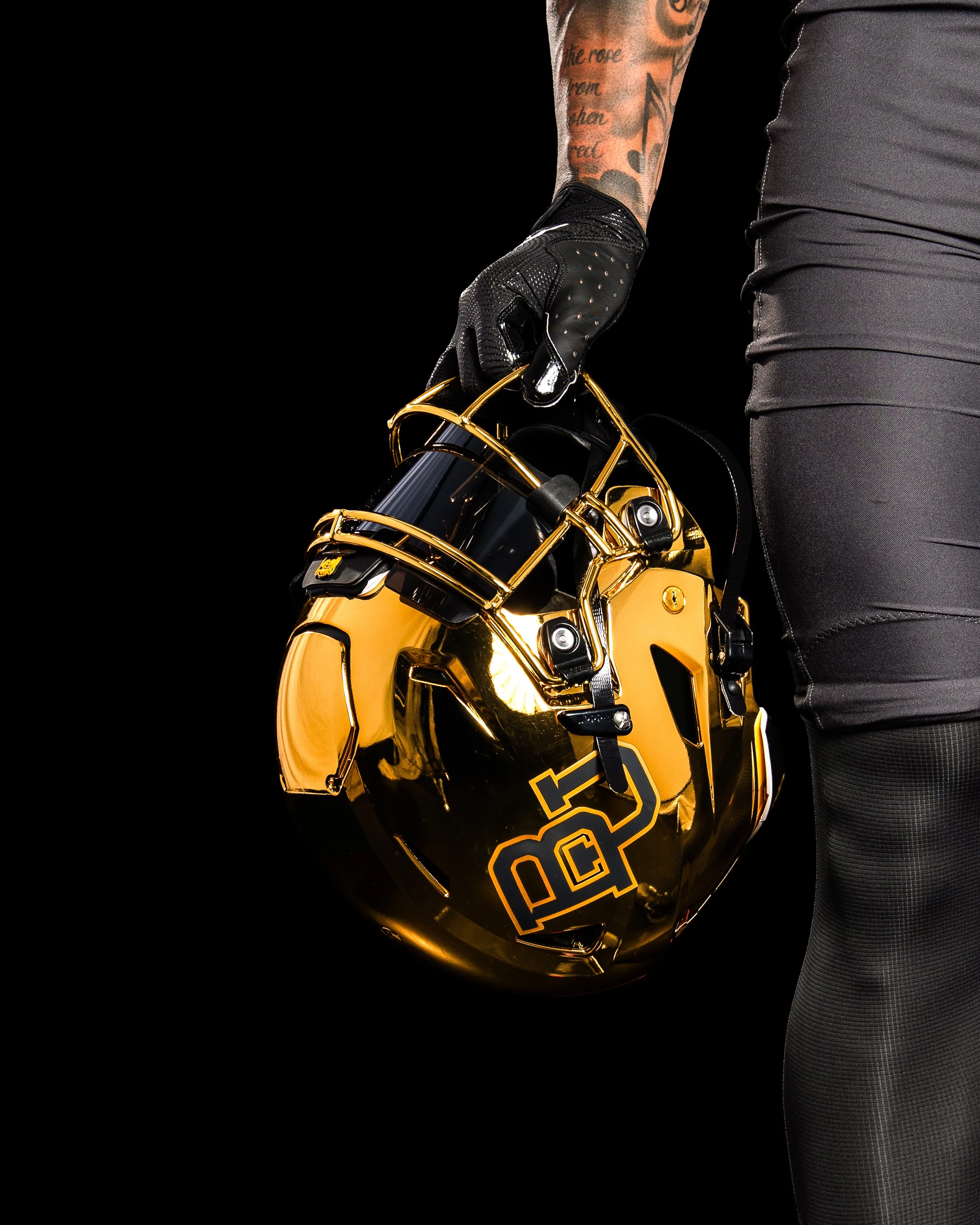
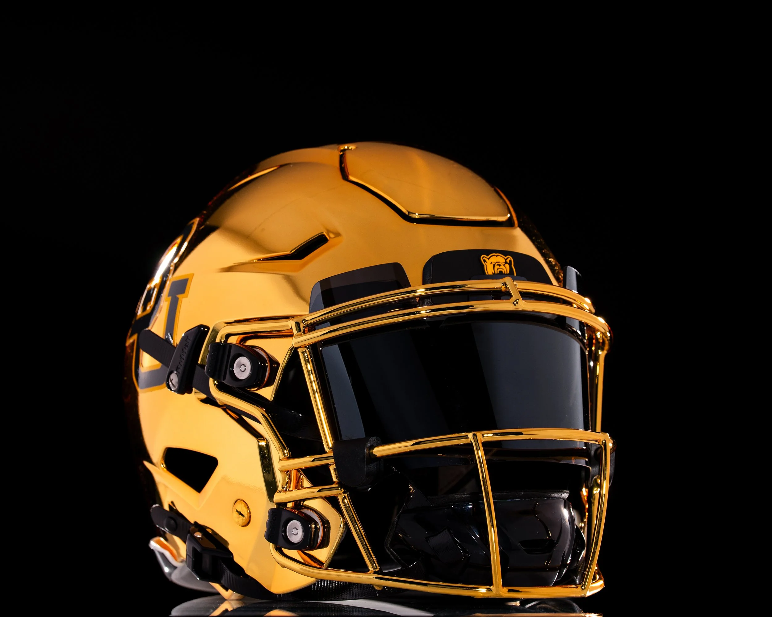
The shine is back in Waco. Baylor football is officially bringing chrome helmets back to the field for the first time since 2017, adding a bold and modern twist to its 2025 uniform lineup.
The Bears first introduced chrome lids in 2013 during one of the program’s most successful stretches in history, wearing them through the 2017 season. That era included back-to-back Big 12 championships, four straight bowl appearances, and some of the most explosive offenses college football has ever seen.
Deputy Athletics Director and COO Jovan Overshown explained that the return has been in the works for years.
“This helmet has been a secret passion project for a couple of years now. We wanted the perfect look and perfect moment — one that nods to the storied success of those who wore the chrome before us, while giving it a modern, refined edge that captures the energy and expectation of today and the future.”
The chrome helmet made its Baylor debut on October 5, 2013, in a 73–42 blowout win over West Virginia. Over the next four years, the helmet became a signature look, worn in nine games — including the unforgettable 61–58 win over TCU and the 38–27 Big 12–clinching victory against Kansas State in 2014. The final appearance of the original chrome came on November 11, 2017, against Texas Tech.
Those years are remembered not just for championships, but also for an offense that lit up the scoreboard. During Baylor’s 2013–2014 title run, the Bears wore chrome six times, piling up 167 touchdowns, 1,259 points, and more than 15,000 yards of total offense.
The 2025 reveal featured none other than Baylor legend and 2025 Athletics Hall of Fame inductee Bryce Petty.
“Look good, feel good, play good,” Petty said. “If you can’t feel good in that thing, then I don’t know what you can feel good in. We’re going to play fast, and we’re going to win a lot in these things.
For Petty, who quarterbacked those high-flying Baylor offenses, the helmet represents more than just style — it’s a symbol of Baylor football’s energy and swagger returning to the spotlight.
Head coach Dave Aranda echoed the sentiment:
“It’s really cool to be part of bringing something back that carries so much meaning and reflects such an energized period in Baylor football. Seeing our student-athletes’ excitement, former players and our fans, it further fuels everything we’re about.”
After nearly eight seasons away, Baylor’s chrome helmets are back brighter, bolder, and ready to bring a new shine to the Bears’ future.
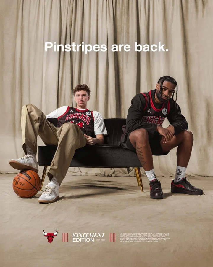
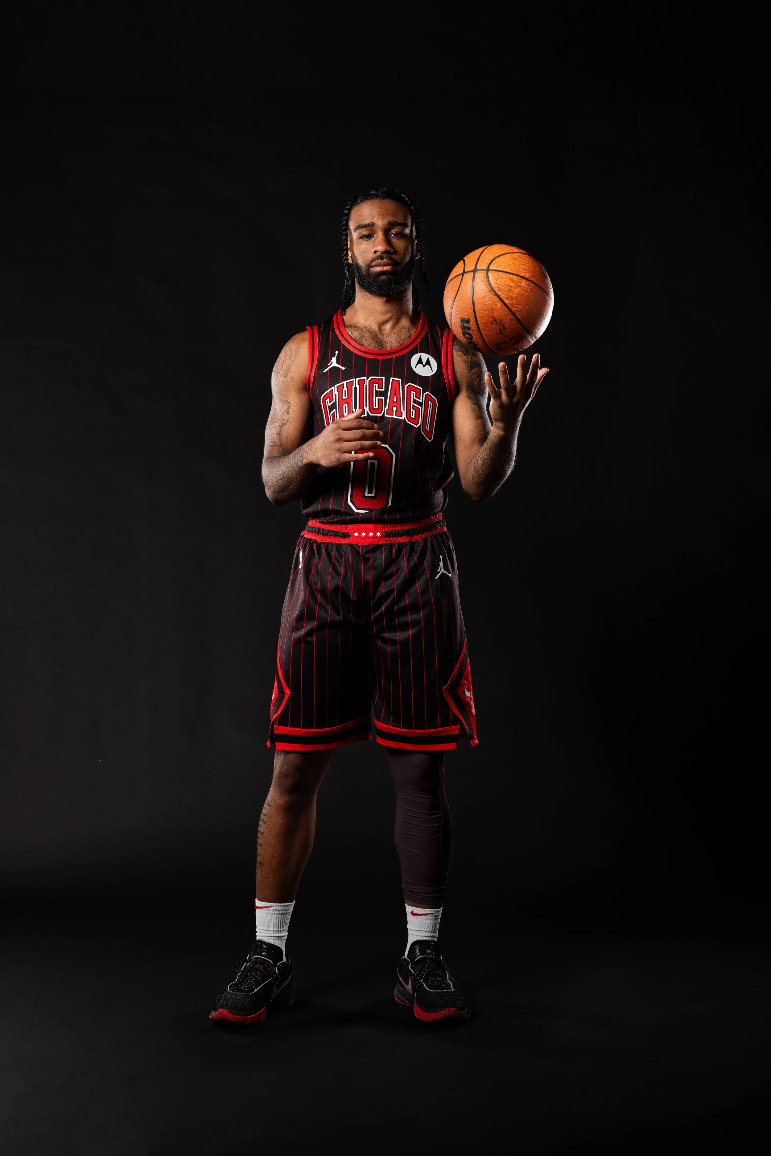
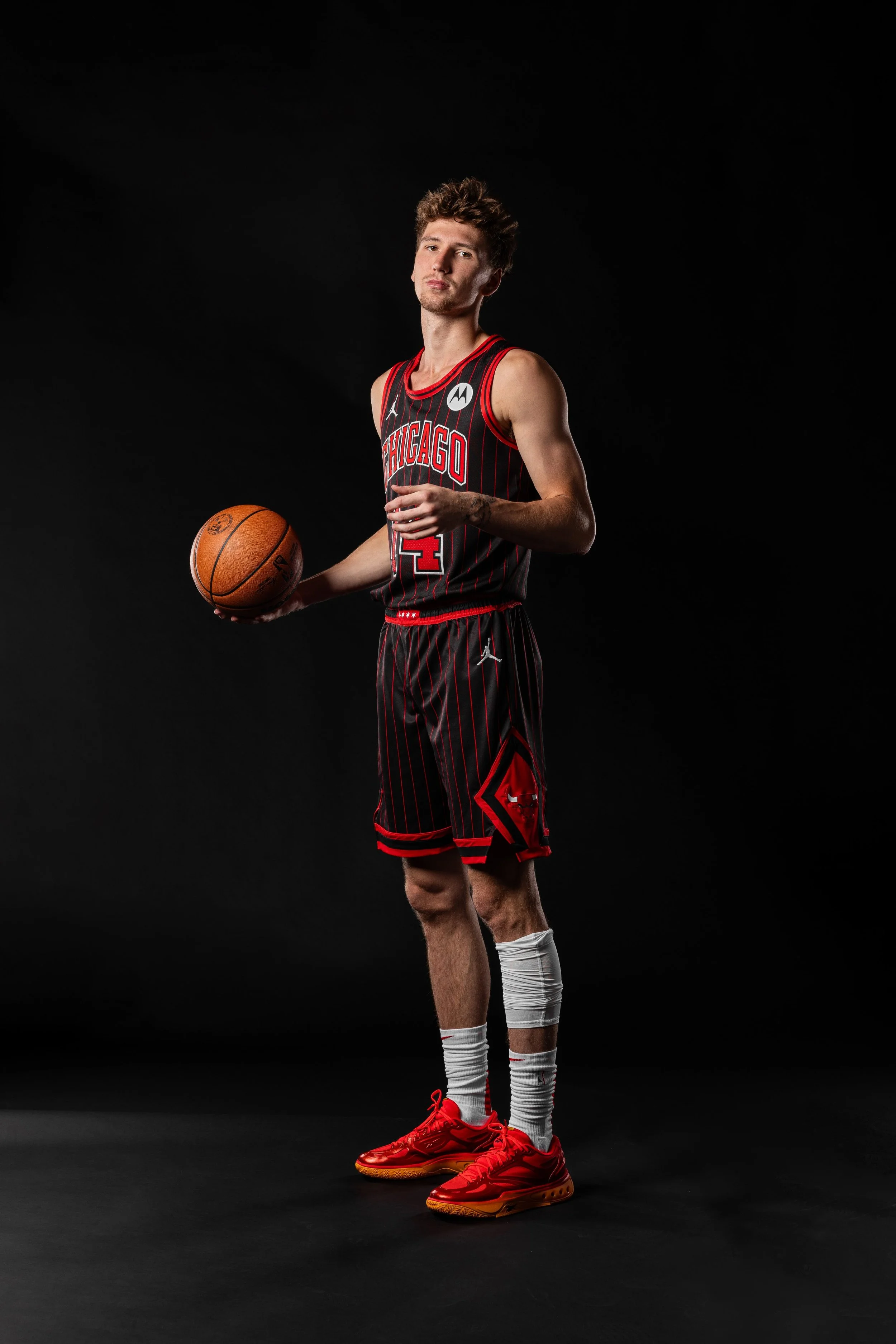
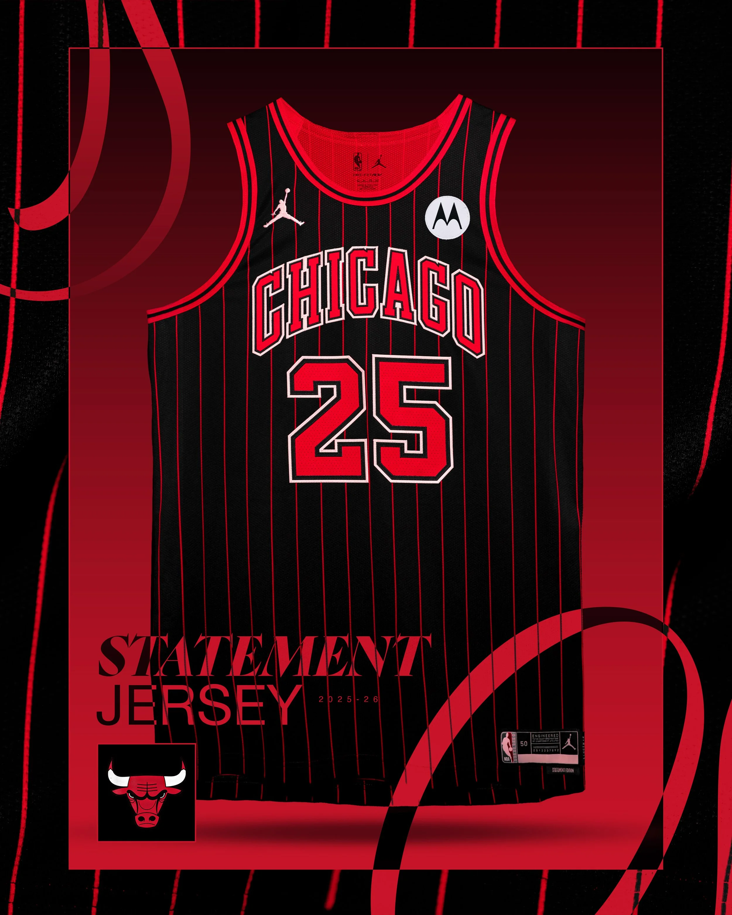
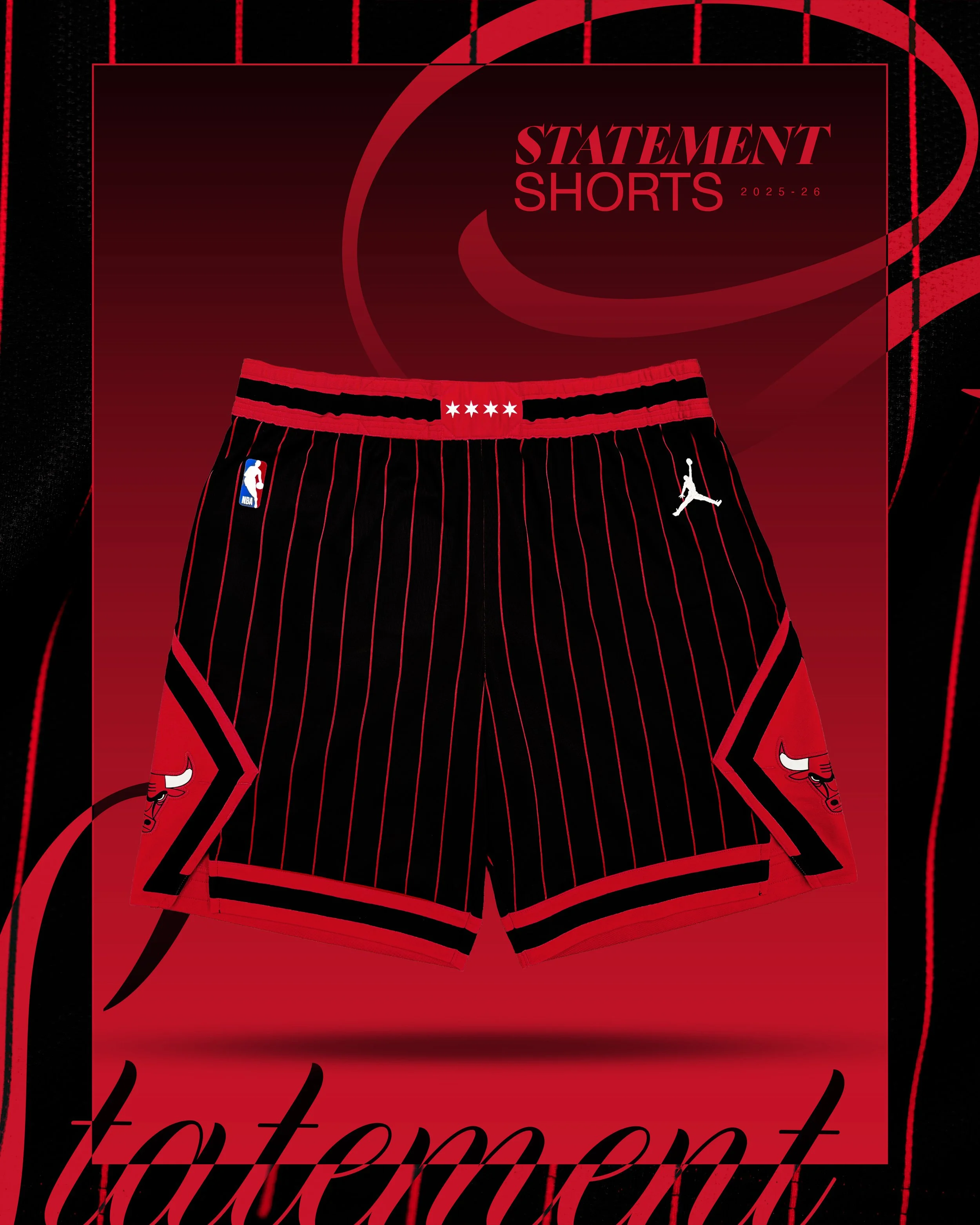
There’s never a wrong time for the Chicago Bulls to dip into the Michael Jordan era, and they just did it again, big time.
The Bulls officially revealed their 2025-26 Statement Edition uniforms, a black-and-red pinstriped look that instantly calls back to their legendary dominance in the '90s. First introduced during the 1995-96 season, a year the Bulls went 72-10 and won it all, this iconic uniform design hasn’t hit the court since the 2012-13 season. Now, it’s back and reimagined for a new generation.
Chicago turned to a fitting face for the reveal: Dennis Rodman, who rocked the pinstripes alongside MJ during back-to-back championship runs. In a hype video with current Bulls Coby White and rookie Matas Buzelis, Rodman got his hands on the new look and summed it up perfectly:
“These are nice. I remember when we first introduced this. It was legendary, man. These jerseys right here are legendary. It's not even a throwback — it’s brand-new for the new generation. This is gonna be really cool for Chicago … this brings back memories.”
The return of the pinstripes isn’t just a visual win, it’s a statement of legacy. From Jordan’s mid-air moments to the grit of the '96 squad, this design is soaked in Bulls history. It’s also a continuation of the black-and-red pinstripe takeover in Chicago sports, the White Sox unveiled a similar City Connect look earlier this year.
The Atlanta Hawks are running it back with a fan favorite. For the 2024-25 NBA season, the Hawks are bringing back their iconic “Peachtree” City Edition uniforms, a bold, black-based look that reps one of Atlanta’s most legendary streets and the soul of the city itself.
Originally introduced as a tribute to Peachtree Street, the heart of ATL, this year’s version builds on the legacy. The uniform features a clean black base with sleek peach and white accents. "Peachtree" is front and center across the chest in crisp white lettering with a peach outline, and the look is tied together with peach and white trim along the collar, arms, and down the sides.
This isn’t just a jersey. It’s a statement. It’s Atlanta culture stitched into every thread — from the colorway to the name to the vibe it brings on and off the court.
The new Peachtree set is an evolution of the original, blending fresh design updates with a deep connection to the city’s roots. It’s a visual reminder of the Hawks’ bond with the ATL community — and a uniform that continues to stand out as one of the NBA’s best City Editions.
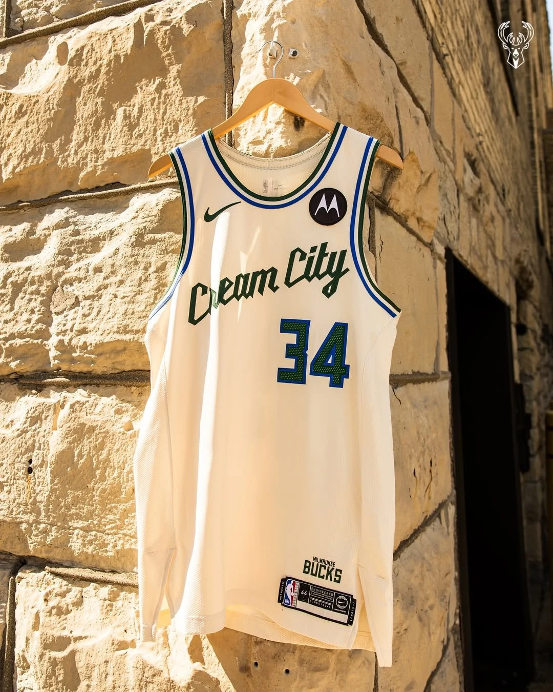
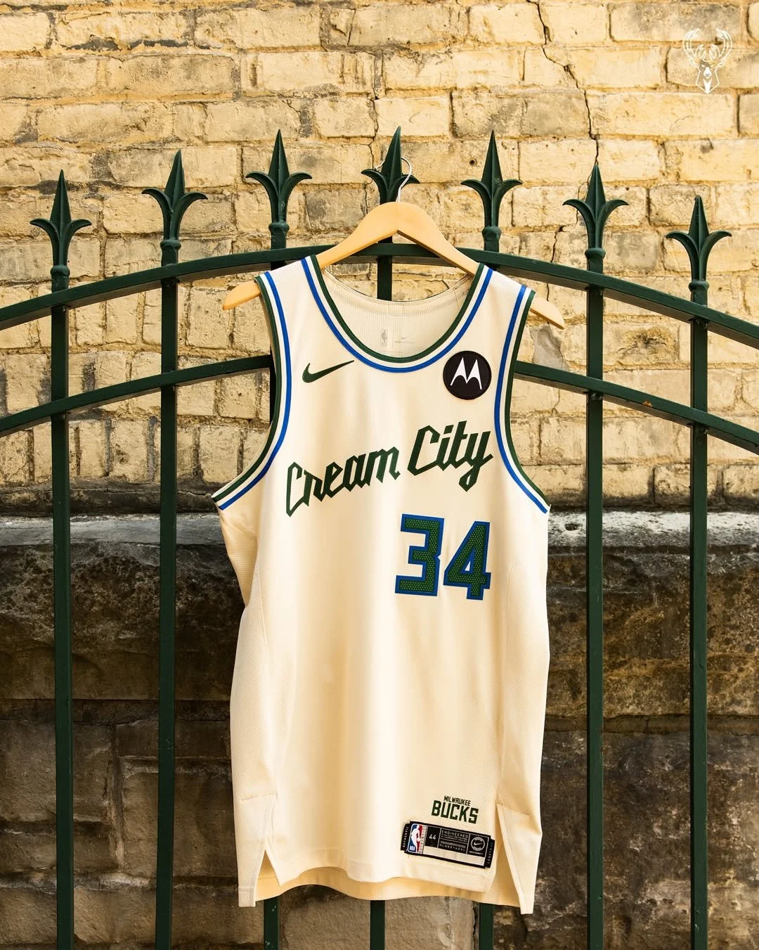
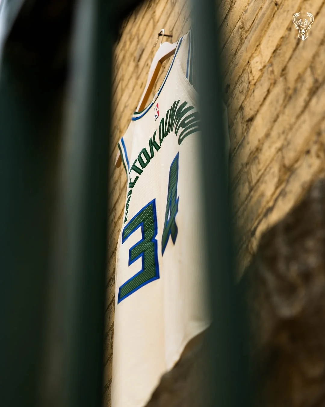
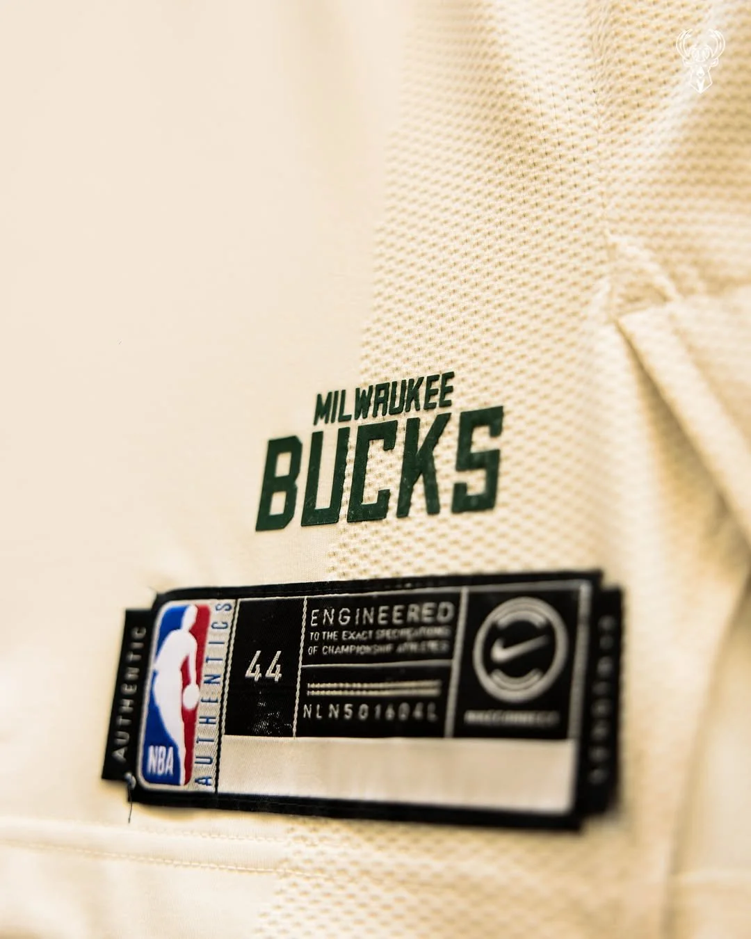
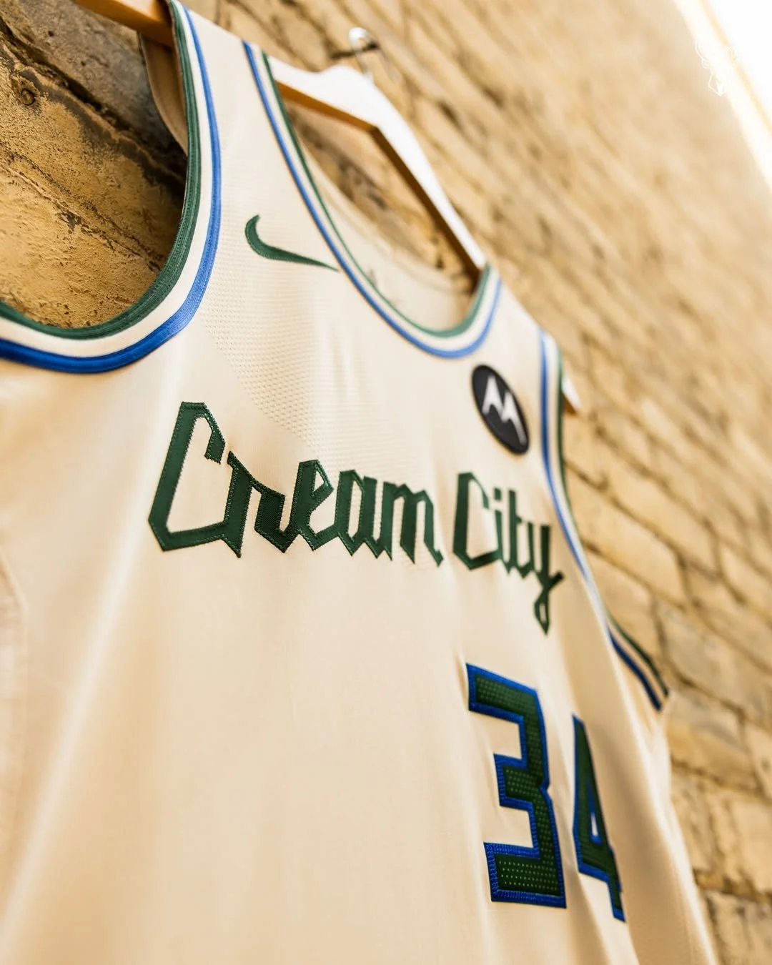
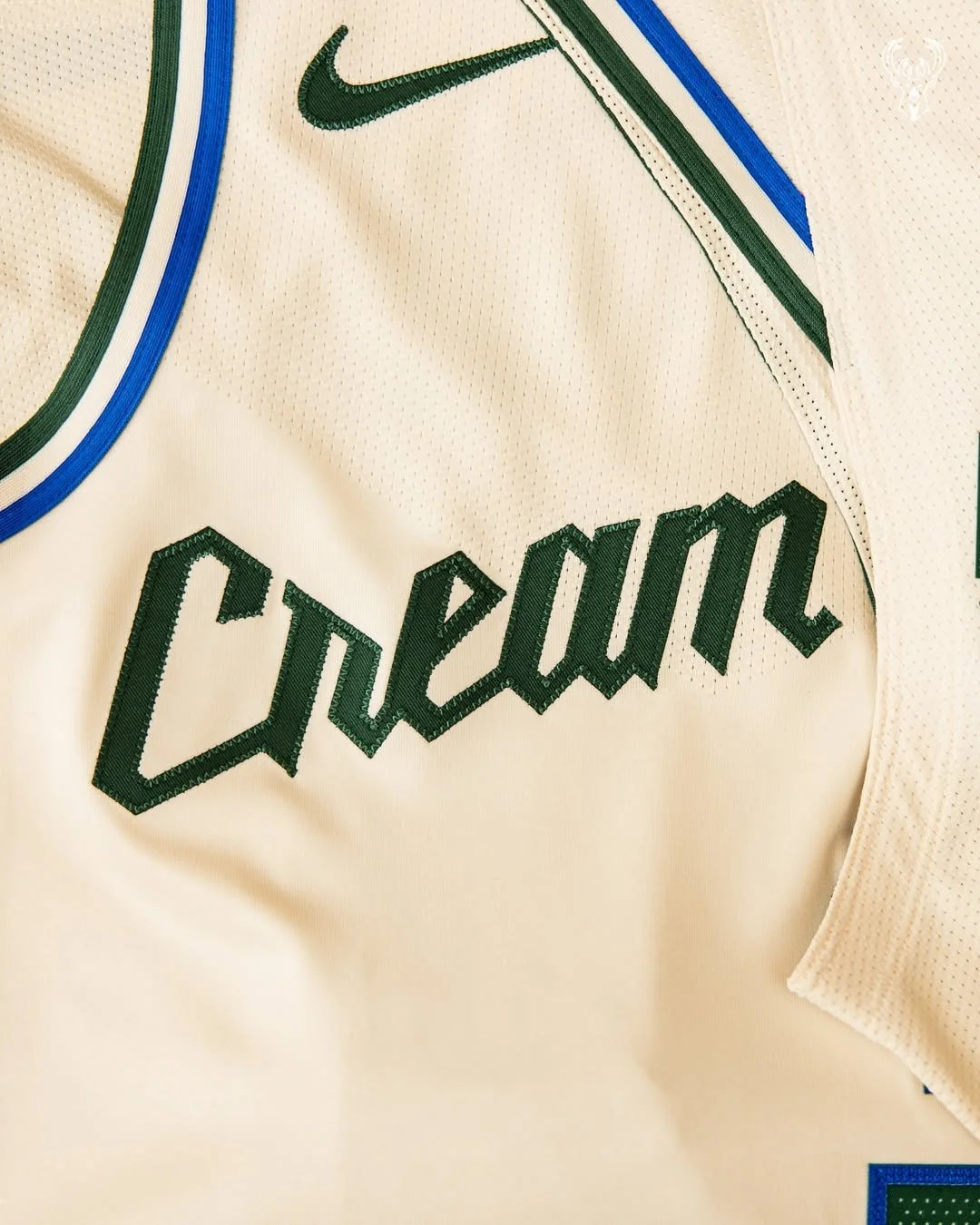
The Milwaukee Bucks are bringing back their beloved "Cream City" uniforms for the 2025-26 NBA season, marking the first time the look will hit the court since 2019-20.
Inspired by Milwaukee's iconic light-colored bricks, the cream-toned jerseys were previously shelved due to technical issues with on-court digital advertising. According to the team’s Chief Sales and Marketing Officer, those issues have been resolved—clearing the way for a long-awaited comeback.
The updated uniforms stay true to the original, featuring the signature cream base with green and blue striping and a script-style font. The shorts include a stylized “M” and a nod to the state of Wisconsin on the buckle. To complete the look, the Bucks will also debut a custom court designed to match the Cream City aesthetic.
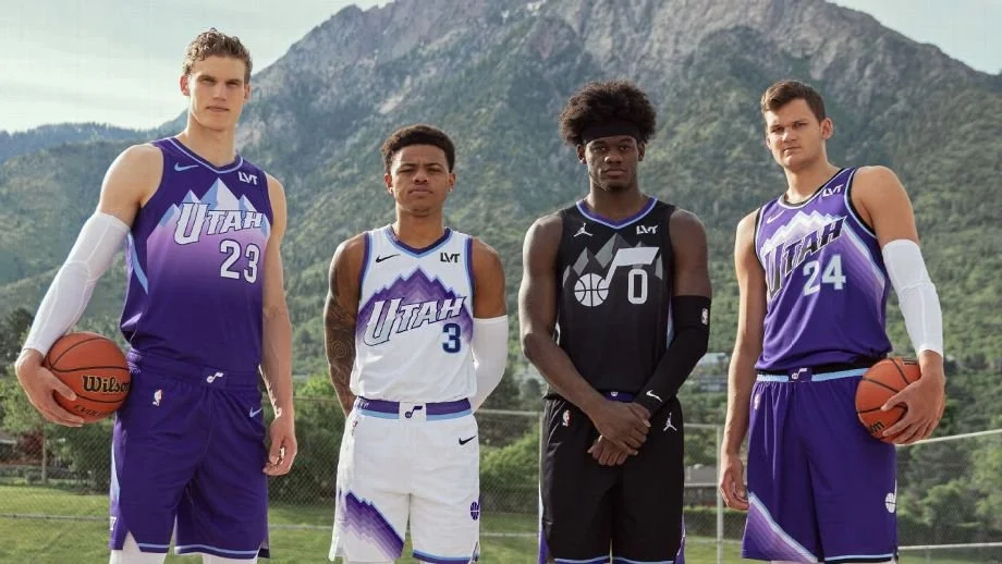
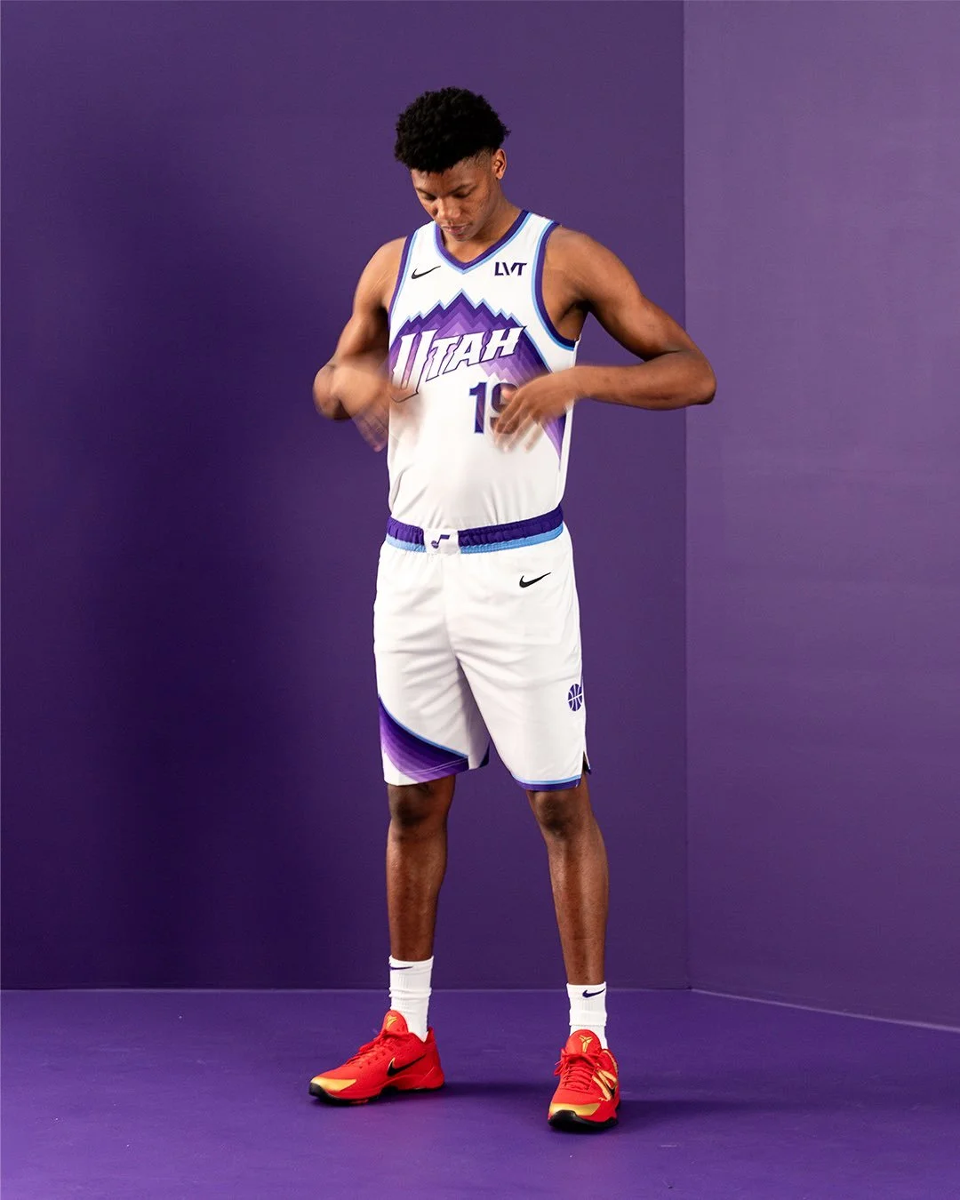
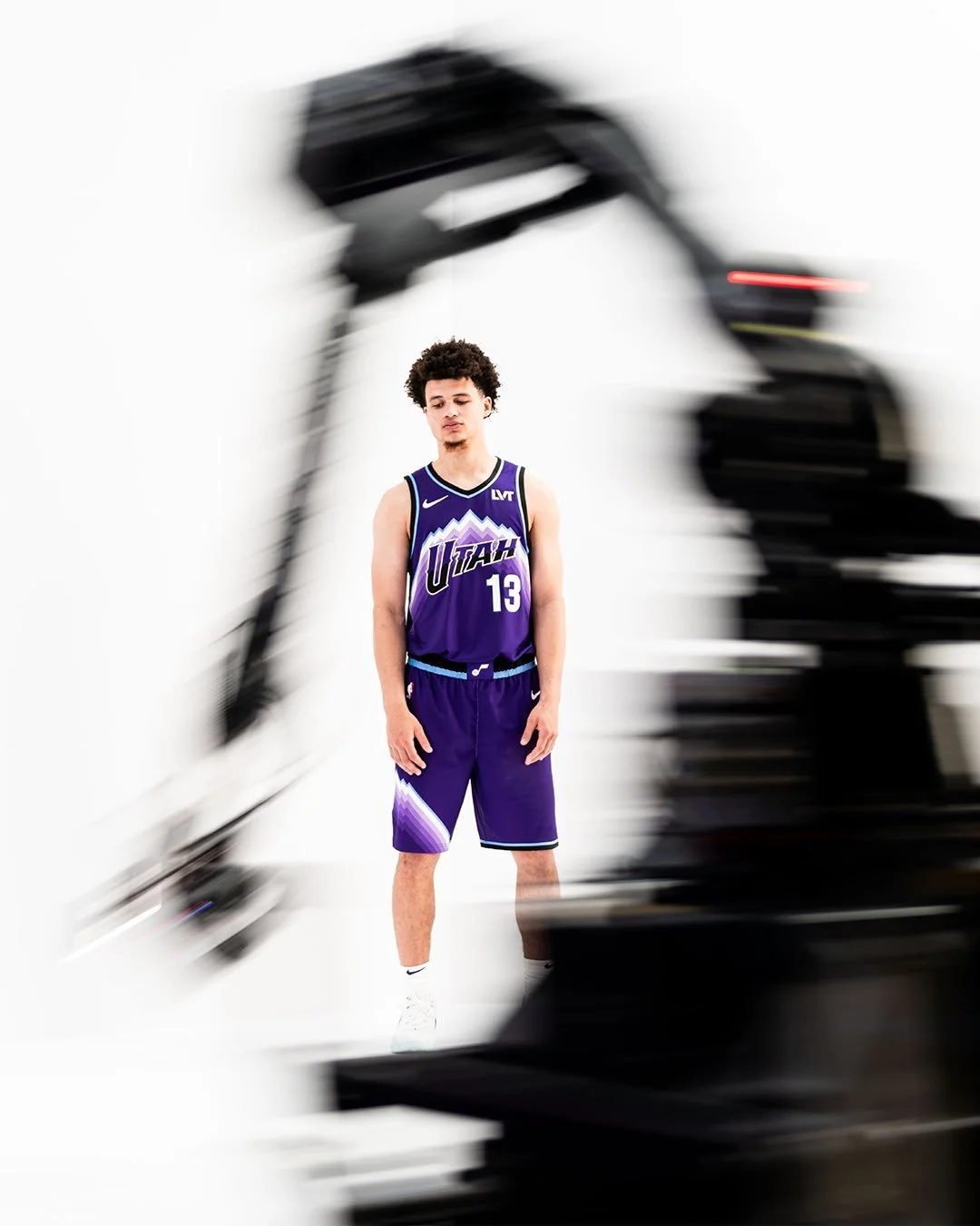
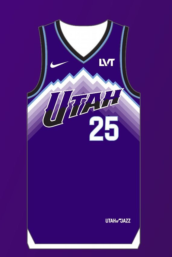
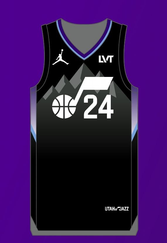
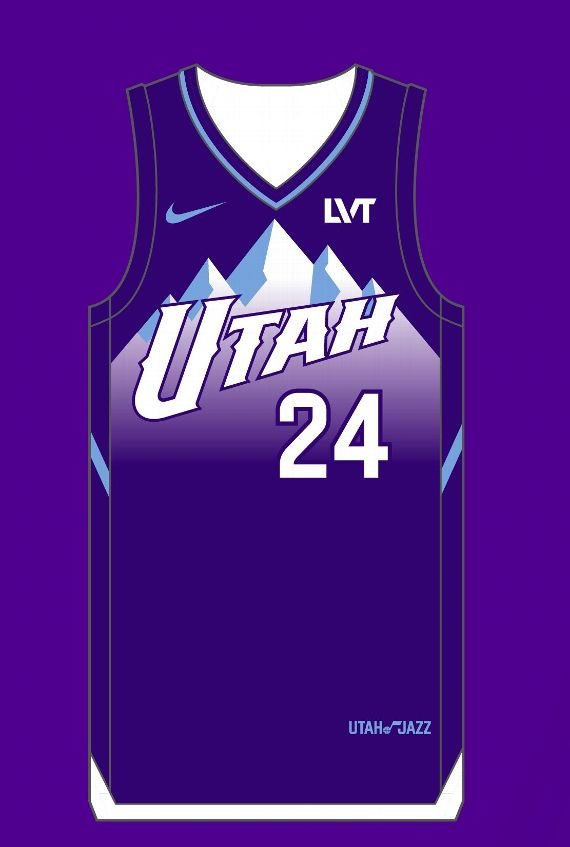
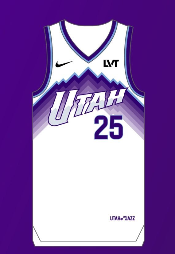
the Utah Jazz introduced "Mountain Basketball," a brand philosophy that has shaped Jazz culture since 1979. This new direction reflects Utah's unique spirit by combining a passion for basketball, a dynamic and growing community, and the influence of the state’s mountainous landscape on daily life. Alongside this announcement, the Jazz unveiled their primary uniforms for the next two seasons, showcasing a prominent use of purple and mountain symbolism. New colors in the expanded palette include Mountain Purple, Midnight Black, and Sky Blue.
"Our branding will always be an iterative process as we, our fanbase, and the game of basketball continue to grow," said Ryan Smith, governor of the Utah Jazz. "It’s clear that Mountain Basketball and purple are at the soul of Utah and the Jazz, and we’re excited to share with our community what they have to look forward to."
For the 2024-25 season, the Jazz will sport four uniforms—two new designs and two existing ones. The current white Association Edition jersey will be worn throughout the season. The existing black Statement Edition jersey will be replaced by a new black design in January 2025, featuring the Mountain Basketball color palette. The 2024 City Edition will introduce a refreshed purple mountain design.
In the 2025-26 season, the Jazz will debut a new primary white Association Edition and a purple Icon Edition uniform, along with the black Statement Edition from January 2025. These uniforms lean into classic mountain imagery, and three designs prominently feature the bold UTAH logo on the chest. The iconic Jazz Note remains central across all uniforms, apparel, and team imagery, with #TakeNote continuing as the rallying cry.
Stay tuned for more updates as the Utah Jazz continue to celebrate Mountain Basketball and their 10th anniversary season.
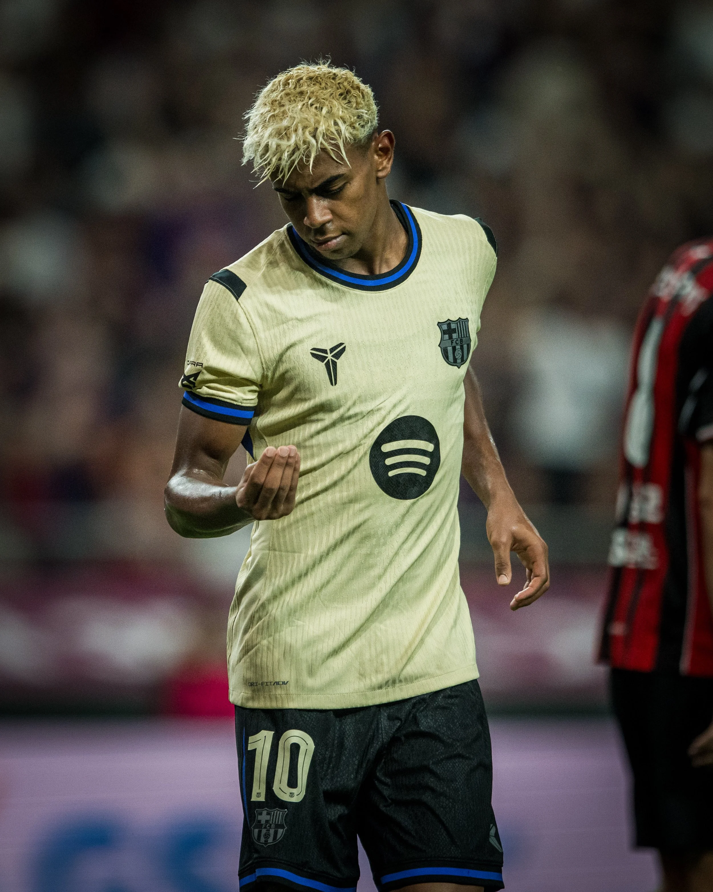
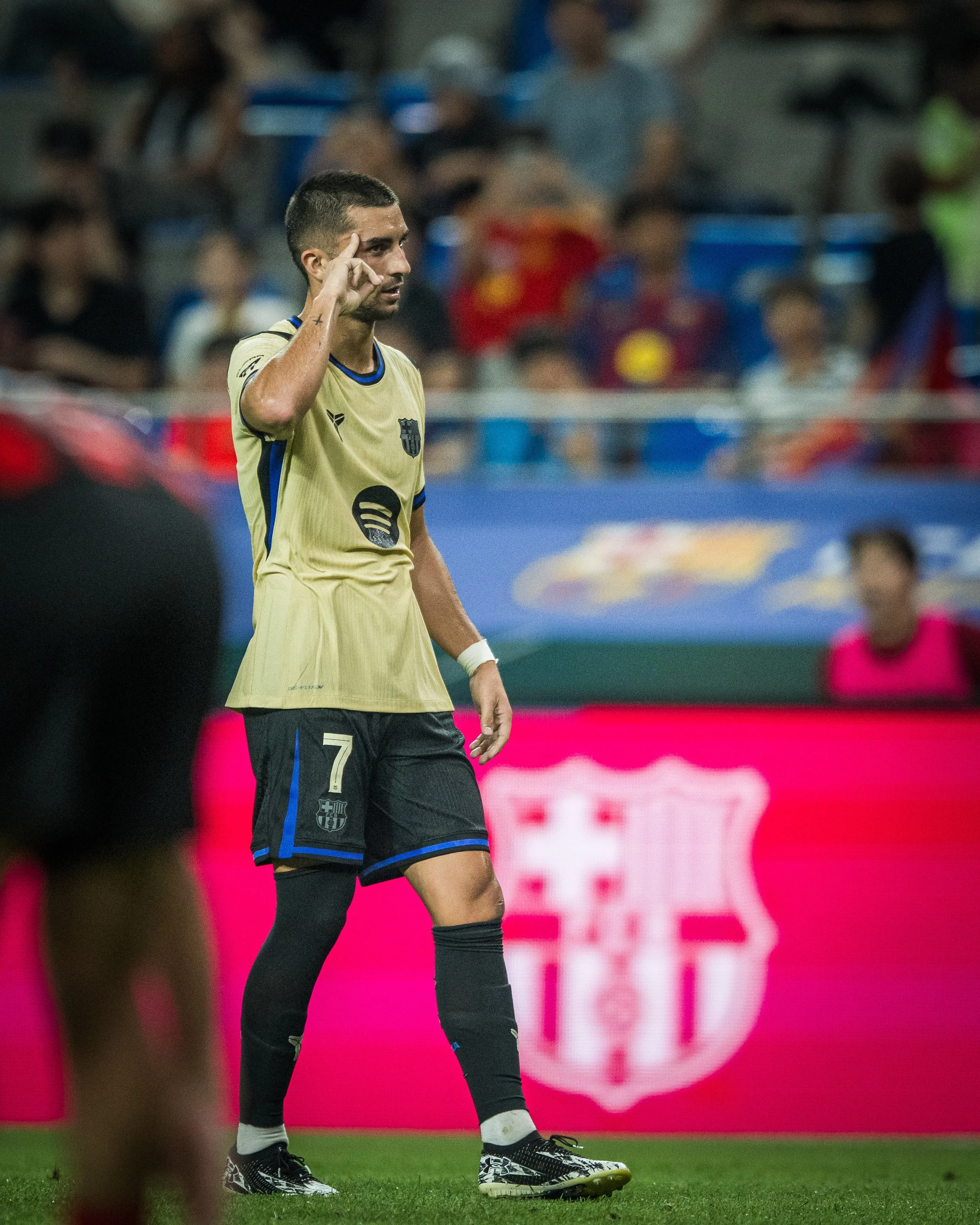
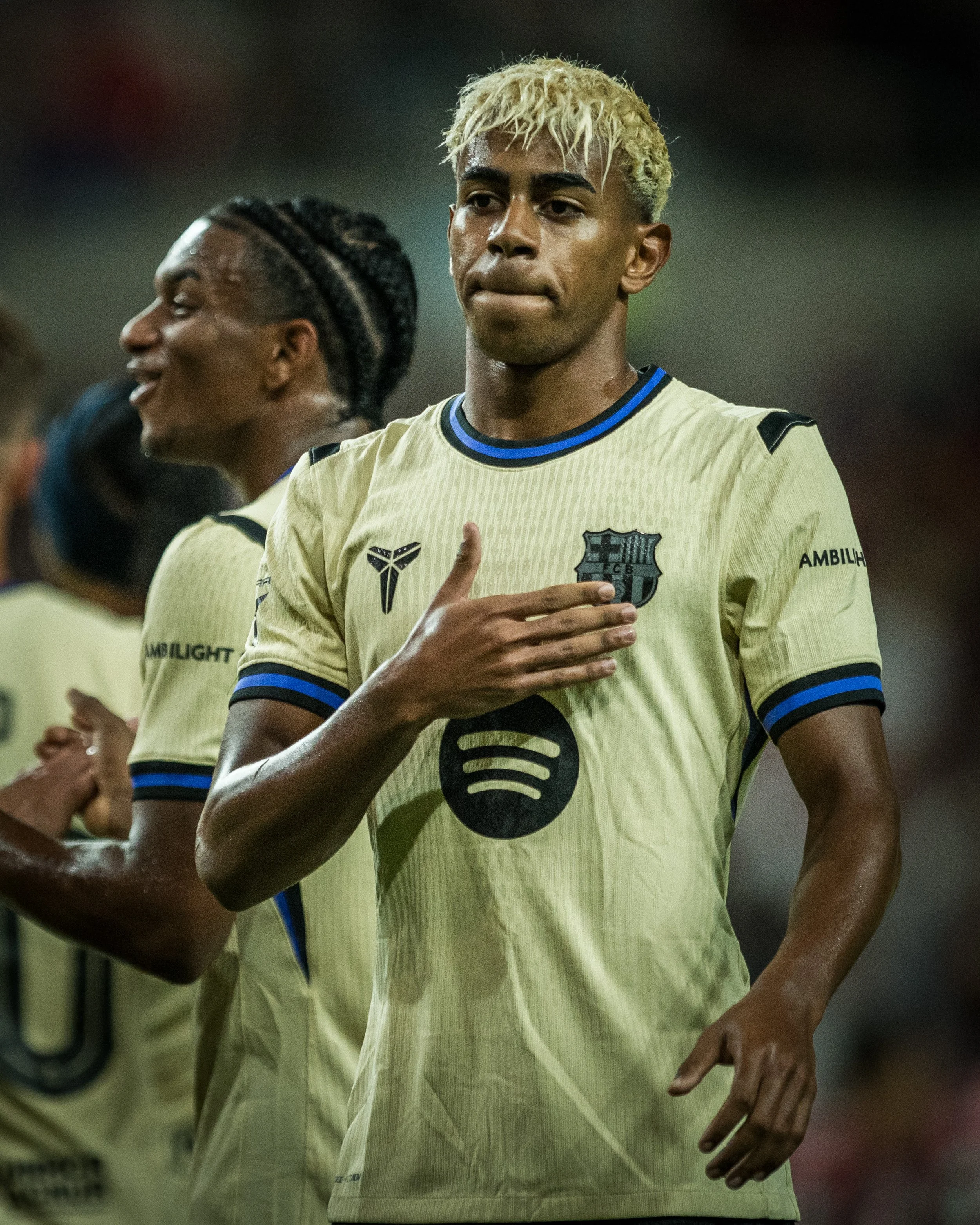
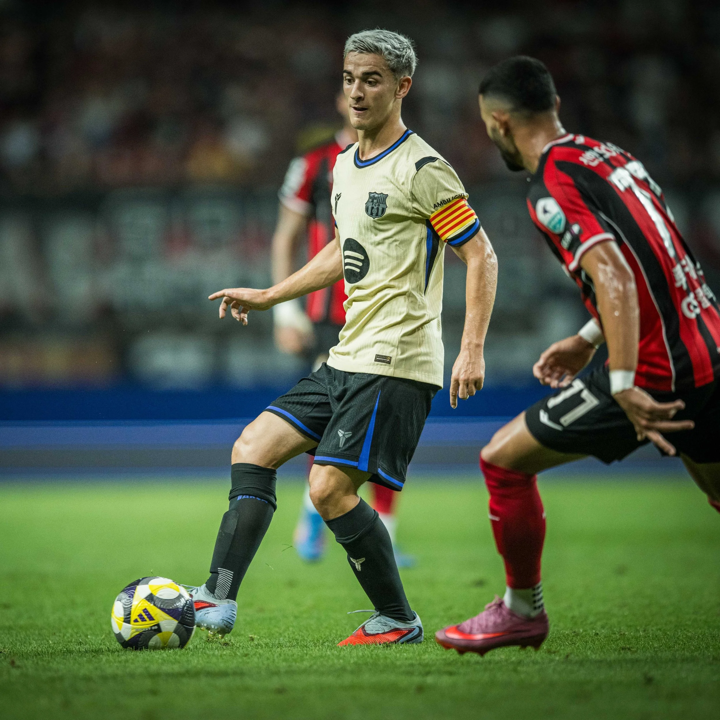
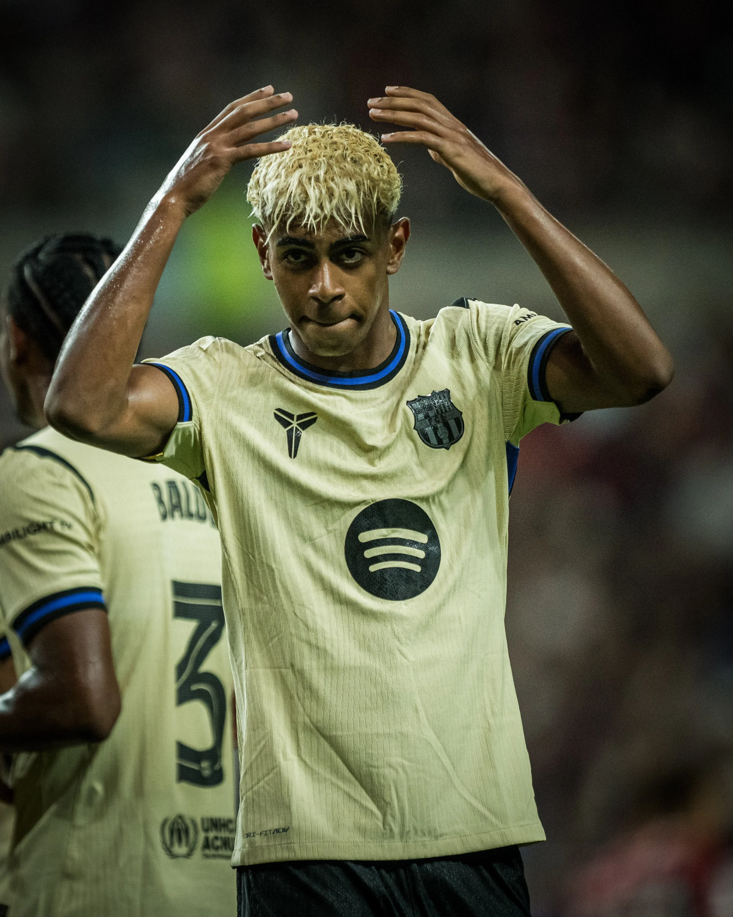
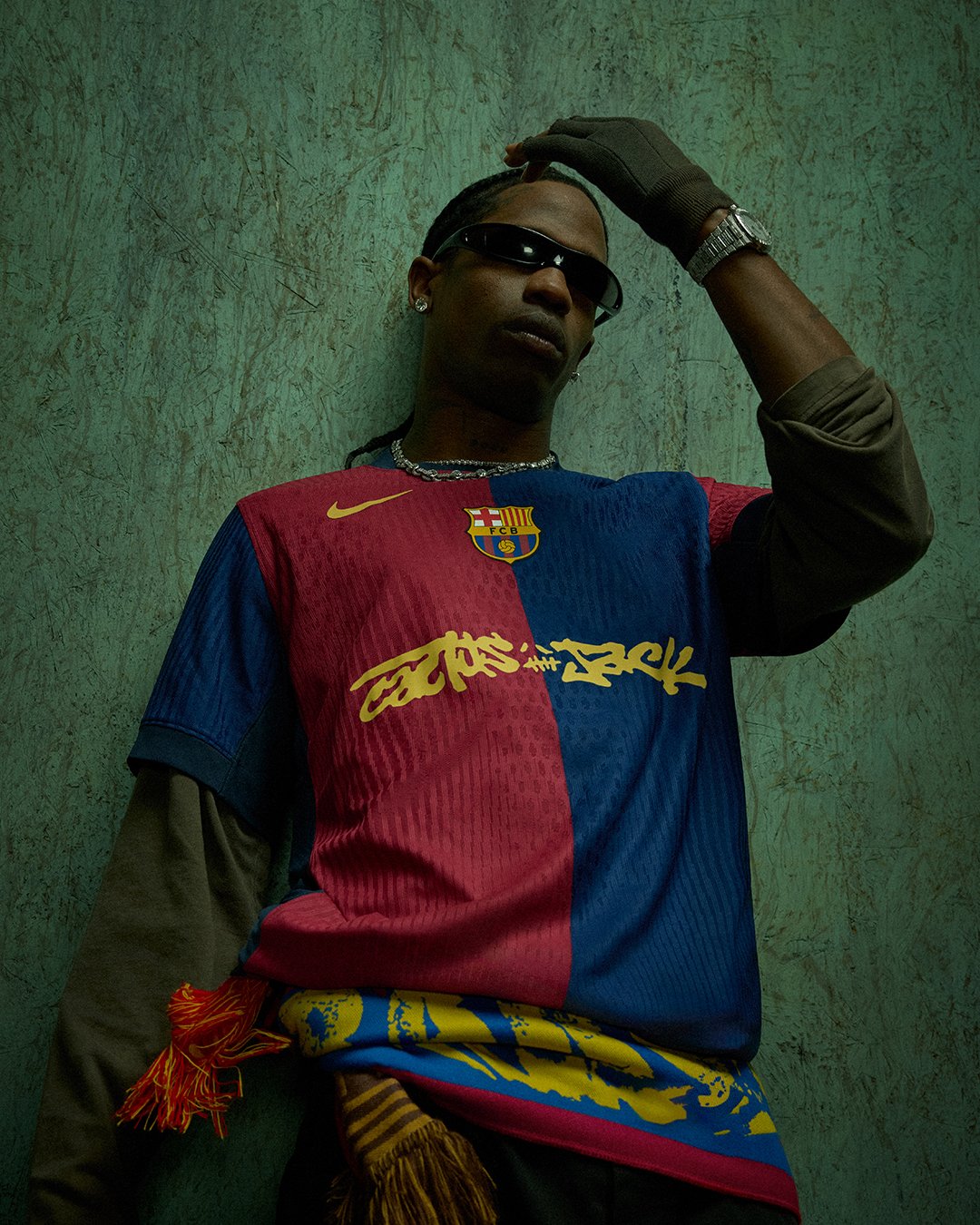
FC Barcelona just changed the game—again. In a bold and unprecedented move, Nike and Barça have teamed up to infuse the spirit of one of the greatest athletes of all time into one of the world’s most storied clubs. The result? A second kit for the 2025/26 season that doesn’t just break tradition—it redefines it.
For the first time ever, the iconic Nike Swoosh steps aside, making way for the Kobe Sheath, the unmistakable symbol of the late, great Kobe Bryant. This is more than a kit update. It’s a tribute. It’s a statement. It’s a legacy move.
Born from a shared culture of relentless pursuit of excellence, precision, and an obsession with the craft, this collaboration is all about two worlds colliding in a most powerful way. Kobe Bryant wasn’t just a fan of football. He was a fan of Barça. From visits to Camp Nou to connecting with first-team players on U.S. tours, the bond ran deep. Now, it’s official.
Running through 2027/28, this three-season partnership aims to extend Kobe’s influence into global football, bringing Mamba Mentality to the pitch, training ground, and streets. It’s about inspiring new generations to chase greatness with everything they’ve got—whether you’re rocking the new kit in a stadium, a local park, or your own journey.
The kit was unveiled through an electrifying video centered around Barça’s legendary rondo training drill—symbolic of both Barça’s football philosophy and Kobe’s mental intensity. Featuring stars like Gavi, Alexia Putellas, Frenkie de Jong, and Salma Paralluelo, the "Mamba Rondo" fuses creativity, control, and competitiveness—the hallmarks of both football artistry and the Black Mamba’s mindset.
The design itself? Sleek. Modern. Meaningful. And unmistakably Kobe.
— Portland Trail Blazers (@trailblazers) July 29, 2025
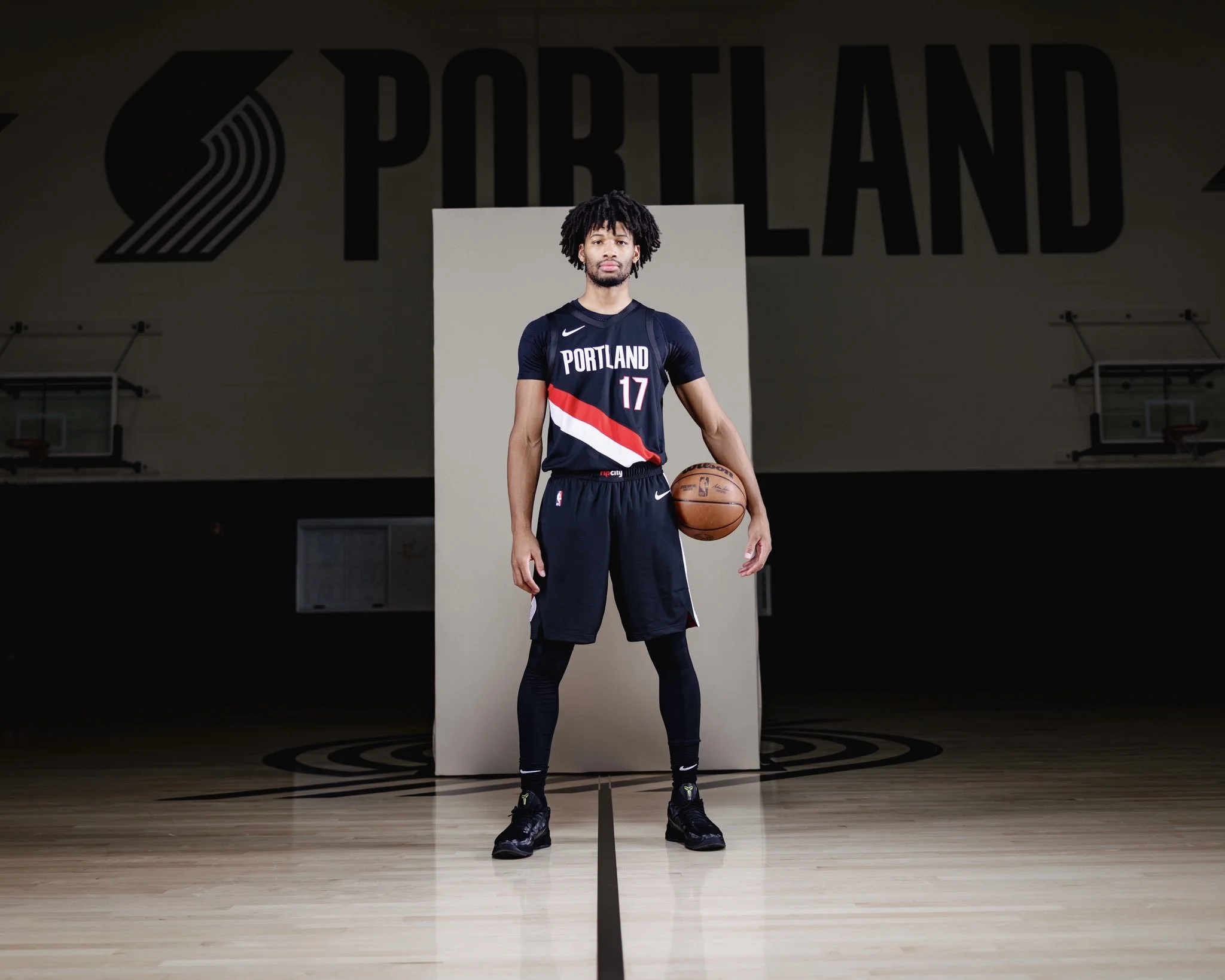
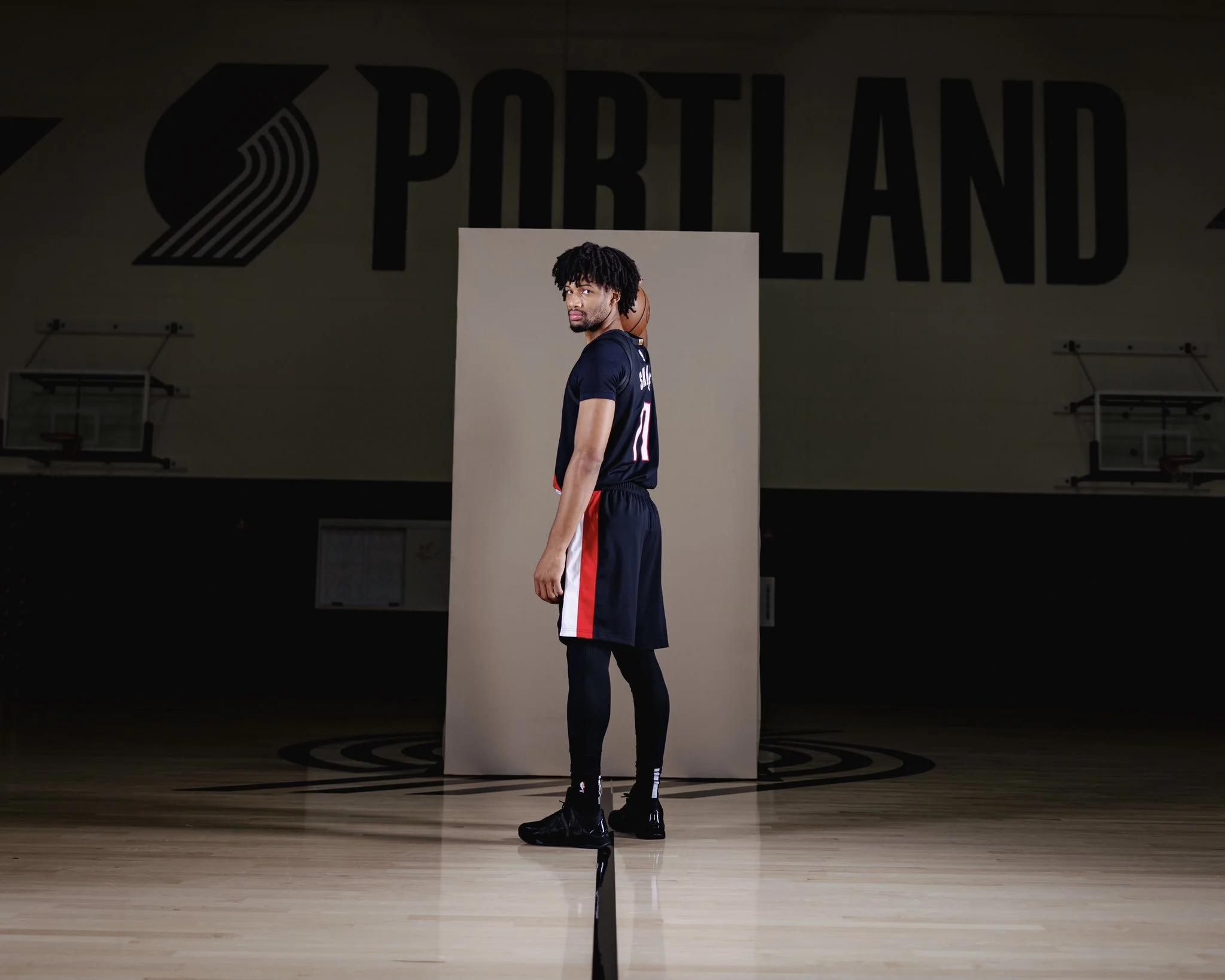
The Portland Trail Blazers are keeping it classic, with a modern twist. Ahead of the 2025-26 NBA season, the Blazers have dropped their updated Association and Icon Edition uniforms, offering fans a subtle yet meaningful evolution of the team’s timeless look.
While the design honors tradition, it’s anything but outdated. The iconic diagonal sash remains front and center—still bold, still unmistakable—but now reimagined in a clean two-tone format. “Rip City” branding takes its rightful place on the beltline, a tribute to the fans who fill the Moda Center night after night. And that unmistakable pinwheel? Still holding it down on the shorts, keeping the energy high.
Gone are the silver accents and intricate trims. In their place: a streamlined, confident look built around the core colors that have defined the franchise since 1970—Black, University Red, and White.
This is more than a uniform update. It’s a celebration of the past, present, and future. Whether it’s Shaedon Sharpe and Toumani Camara lighting up the court, die-hard fans rocking the look in the stands, or weekend warriors repping Rip City at the local gym—these kits are built to stand out.
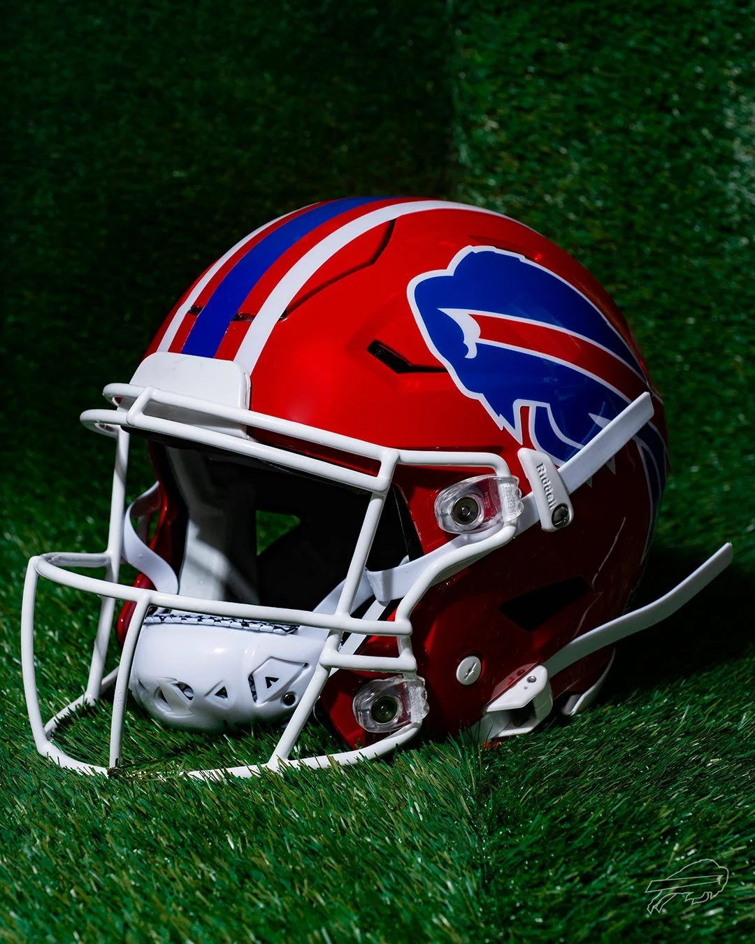
It’s official: the red lids are making their return to Buffalo.
The Buffalo Bills have announced the comeback of their iconic red helmets, worn from 1987 to 2001, for a special Week 18 matchup against the New York Jets — marking the final regular season game at the current Highmark Stadium before the team moves into their new home in 2026. And that’s not all. The Bills will also revive their classic Standing Buffalo throwback uniforms for two additional games during the 2025 NFL season.
With bold red shells, traditional blue-and-white striping, and a crisp white facemask, the red helmet is a direct throwback to a golden era of Bills football — the Super Bowl runs of the '90s, the legends that built the franchise, and a look that is forever etched into league history.
“There’s no better way to celebrate our fans and honor our team’s history than by bringing back the red helmets,” said Pete Guelli, Bills COO. “This is a great way to commemorate the closing of Highmark Stadium in our regular season finale.”
As the team prepares to move on from the current Highmark Stadium, the return of the red helmets and the classic throwbacks give fans a proper send-off. It’s a tribute not only to the players who built the franchise but also to the most loyal fanbase in football. For Week 18, expect the crowd in Orchard Park to be loud, proud, and decked out in red.
This is more than just a uniform drop — it’s a celebration of Bills history, a moment to reflect, and a look forward to the next era of Buffalo football.