— West Virginia Football (@WVUfootball) June 30, 2025
The Mountaineers are bringing back the beloved glossy Flying WV helmets for the 2025–26 season, a look last seen during Rodriguez’s first tenure and worn by legends like Pat White, Steve Slaton, and Geno Smith. The change marks a move away from the matte finishes introduced in 2013, answering the prayers of Mountaineer faithful who've long wanted these classic lids back in the mix.
Whether the glossy helmet becomes the team’s full-time primary is still unknown. There’s no word yet on the fate of the matte gold and white options either. But one thing is clear: this is a massive W for fans craving the visual identity that defined WVU’s most electric era.
The revival of the glossy helmet is just the latest in a string of throwback moves for West Virginia. This past spring, the program introduced new uniforms with shoulder stripes reminiscent of the early 2000s, evoking memories of the Pat White-Tavon Austin era. They even brought back the iconic double stripe on the pants, a nod to the Don Nehlen days.
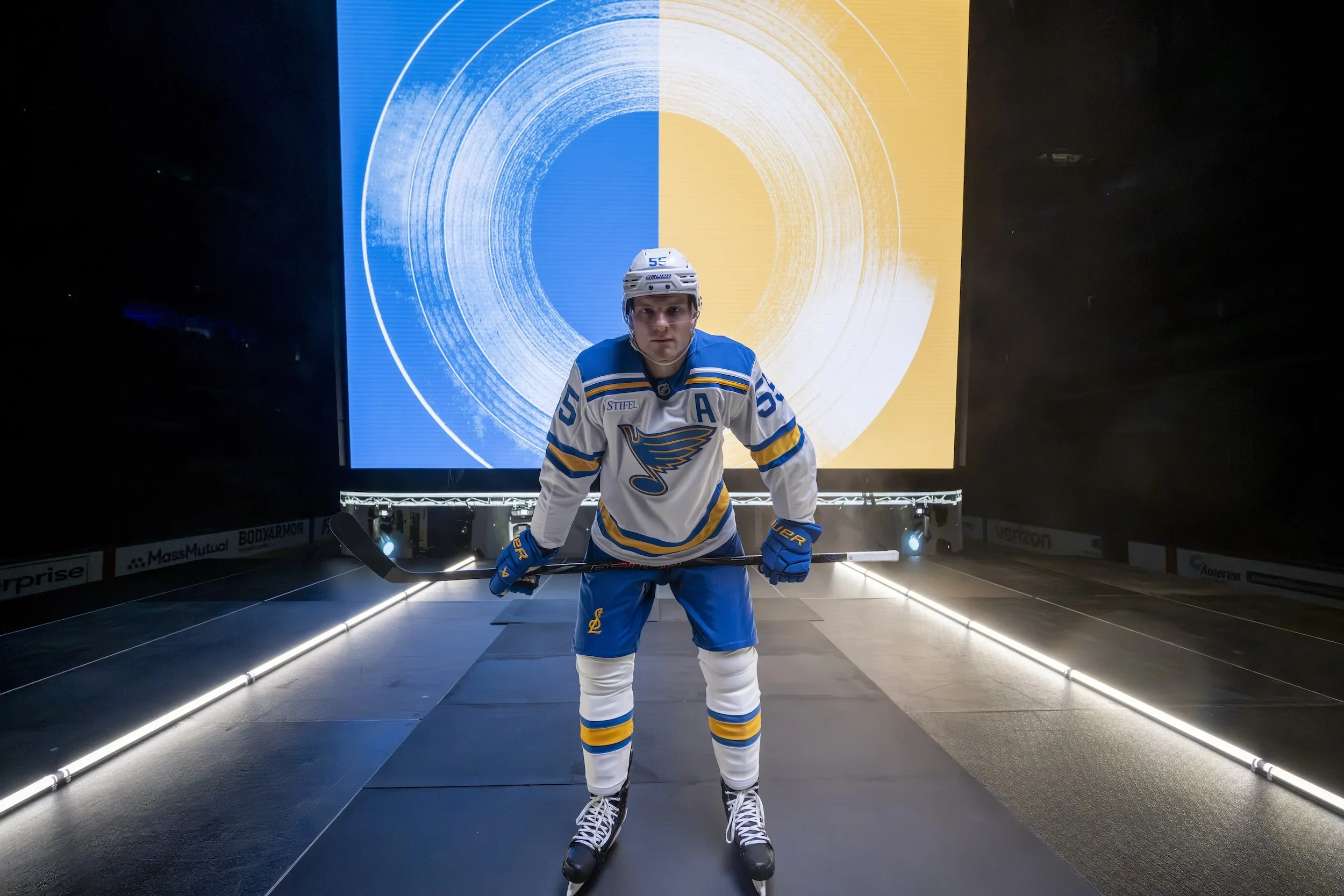
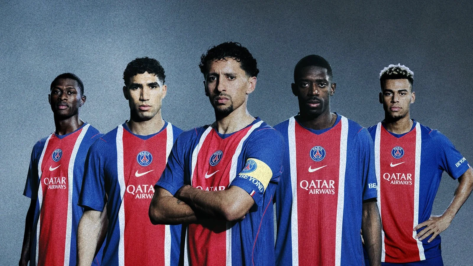
The St. Louis Blues are striking a powerful chord with their fanbase once again, this time through a comprehensive reimagining of their core look. The NHL franchise has officially unveiled brand-new primary home and away uniforms, embracing the club’s roots while harmonizing their history with a sharp, modern identity. The result? A bold new era built on decades of musical and cultural legacy.
Inspired by the jerseys first worn in 1967, the new look marks a return to the Blues’ original color palette—a vibrant blue and yellow refreshed for the modern age. Designed in collaboration with RARE Design and Fanatics over a three-year span, the updated uniforms and brand system are the latest example of how a team can respect its past while confidently stepping into the future.
Fans of the Winter Classic series will recognize the inspiration behind the new threads. The home set draws from the 2017 Winter Classic uniform, while the away jersey references the 2022 Winter Classic design, swapping the cream base for crisp white to align more closely with traditional NHL looks. The Blues are also transitioning the royal blue jersey (formerly their primary) to a new role as their official third jersey, giving the fresh primary set more room to shine.
Design enhancements include:
One-color numbers for improved clarity and visual impact
A new interlocking STL logo on the pant leg, tying together the city and the team
Thicker striping and bold color blocking reminiscent of the club’s early years
The legendary Blue Note logo, one of the most iconic symbols in all of hockey, has undergone a subtle yet significant transformation. Moving from three colors to two—eliminating beige—the updated Note features thicker blue and yellow keylines and a slightly reshaped design that balances modernity with familiarity. This evolution ensures the logo pops across all platforms, from HD screens to retail gear.
Introduced in 1997-98, the previous version served the franchise for over two decades. The new Blue Note is more dynamic and digitally optimized, while still playing the same timeless melody fans know and love.
The Blues didn’t stop at the jersey. They’ve also added new tertiary and secondary brand marks that celebrate the unique identity of St. Louis:
The Fleur – A refined fleur-de-lis inspired by the St. Louis city flag, with a treble clef flourish and note head stem
Interlocking STL – A bold, modern emblem blending musical elements with civic pride
River Music – A stunning mark combining the Gateway Arch and the Mississippi River to form a trumpet—a tribute to the city’s jazz and blues heritage
These marks allow fans new ways to represent their team and city, deepening the emotional connection between community and club.
The brand overhaul also introduces custom wordmarks and typography that dance to the rhythm of the Mississippi. The primary wordmark mirrors the river’s steady flow, while a stylized version pays homage to the iconic 1914 "St. Louis Blues" sheet music cover by W.C. Handy.
The custom Blues font merges sharp edges with smooth curves—a typographic reflection of the intensity and grace of the game itself.
“Remixed. Remastered. Reborn” isn’t just a tagline—it’s a philosophy. The fan-favorite looks of the past are no longer reserved for special events. Based on overwhelming support from fans and feedback from surveys and jersey contests, the heritage-inspired identity is now the foundation of the Blues brand moving forward.
“Evolving one of the most iconic marks in our sport was a responsibility our brand team and equipment staff undertook with great pride,” said Chris Zimmerman, Blues President and CEO of Business Operations. “The evolution of the Blue Note, and development of additional brand marks, provides our fans new ways to express and celebrate their support for the St. Louis Blues.”
From jersey to logo, font to symbolism, the Blues’ 2025 identity is a masterclass in how to modernize without losing soul.
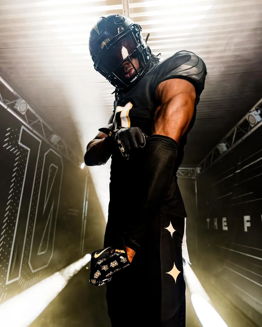
The UCF Knights have officially ushered in a bold new era with the release of their 2025 core football uniforms, an unveiling that perfectly balances heritage, innovation, and identity. Designed on Nike’s state-of-the-art Vapor F.U.S.E. template, the new look is more than just a uniform; it’s a statement. One that speaks to UCF’s evolution as a program and their unrelenting commitment to defining themselves on their own terms.
At the center of this redesign is the introduction of Knighted Eras, a brand-new custom typeface that’s bigger, bolder, and brimming with purpose. Inspired by defining moments throughout UCF history, this type of treatment isn’t just for looks; it’s forged from championship DNA, from Bortles to Boom, and from 2013’s Fiesta Bowl glory to the Big 12 battlegrounds of today.
The jersey numbers are a time capsule in themselves. The drop shadow design takes direct influence from UCF’s 1998 threads, a subtle yet powerful nod to the program’s early days in Division I football. The notches embedded in the numbers—originally introduced in 2013—mimic the block “KNIGHTS” wordmark found in the Bounce House’s end zones, tying the visual identity of the stadium to the team’s on-field look. And with the larger number size reminiscent of the 2016–2021 seasons, visibility and presence are turned all the way up.
The uniform’s shoulder design reintroduces an iconic piece of UCF’s aesthetic arsenal: oversized Pegasus wings, first seen in the fan-favorite 2023 “Mission VII” space game uniforms. Sleek, aggressive, and symbolic of flight and freedom, the wings span from the collar to the upper bicep, reinforcing the Knights’ ambitions to rise above the rest.
But perhaps the most meaningful design element is found in the details of the pants. Each leg proudly displays three Polaris stars, representing UCF’s past, present, and future. These stars are more than celestial symbols—they’re anchors in UCF’s journey, grounding the team in its legacy while pointing toward what’s next.
Built on Nike’s Vapor F.U.S.E. chassis, the 2025 uniforms deliver a modernized fit and performance edge. The cut is tailored for speed, with minimal seams for maximum movement and breathability. But it's not just tech—this template gives UCF the canvas to elevate its storytelling, from shoulder to sock.
And yes, shoulder numbers are back—another classic touch making a comeback that fans will love.
Whether in crisp white or black, this uniform package speaks fluently in UCF’s core color palette. The contrast is clean. The detailing is sharp. And the overall effect is futuristic without being flashy—a disciplined, confident kit that doesn’t need gimmicks to get noticed.
UCF’s new core uniform is a masterclass in modern college football design: rooted in history, elevated through innovation, and unapologetically Knight. Welcome to the next chapter—Knight Nation, suit up.
Houston rolled out an updated look for the 2025 season, their first major uniform refresh since 2022, and it’s packed with historical nods, modern details, and city pride.
Houston’s drop included their classic red and white looks, plus the return of the fan-favorite “Houston Blue” alternate. One of the most eye-catching updates is found up top: a bold center stripe now runs down the Cougars’ primary red helmet — something we haven’t seen since 1999. It’s a subtle but powerful nod to the past, reconnecting with an era of Houston football that many fans still hold dear. The white helmet remains stripe-free for now, but could be altered on a game-to-game basis depending on the matchup, much like weekly facemask color changes.
Another standout change is the update to the jersey wordmark. Houston has officially moved away from the rigid, all-caps serif font and replaced it with a sleek, flowing script “Houston” — a design element previously reserved for alternate helmets since 2022. It’s a refined touch that adds personality and aligns perfectly with the city-pride aesthetic the Cougars have leaned into over the last few seasons.
The collar and sleeve trim updates may be subtle, but they go a long way in defining the new look. The red jersey now features white collar and sleeve trim, while the white jersey flips it with red detailing. This marks the first time since 2012 that Houston has rocked a contrasting collar color. The shoulder sleeve treatment is a quiet callback to the 2016–17 era uniforms, though with a softer, modern twist that fits today’s streamlined jersey trends.
The “Houston Blue” uniform made its debut in 2023 as a tribute to the city’s football legacy, an obvious nod to the classic Houston Oilers palette. That first version, however, sparked legal pushback. After a cease-and-desist from the NFL (with the Titans owning the Oilers’ trademarks), Houston adjusted the design in 2024 and reintroduced it on senior night against Baylor, complete with a full Blue Out from the crowd.
For 2025, the Cougars are doubling down on the alternate. The newest version keeps most of the 2024 updates intact, with one key change: the collar shifts from blue to white, creating a cleaner contrast. Expect to see it once again this fall — the Cougars have already scheduled the blue set for their Oct. 4 matchup against Texas Tech, continuing the tradition of using the alternate in a Texas rivalry game.
Houston’s 2025 uniforms don’t reinvent the wheel; they elevate it. From the return of the red helmet stripe to the shift in jersey fonts and the continued evolution of the Houston Blue look, every detail feels intentional. It’s a blend of legacy and modern swagger that fits the Cougars' identity as both a proud program and a rising force in college football.
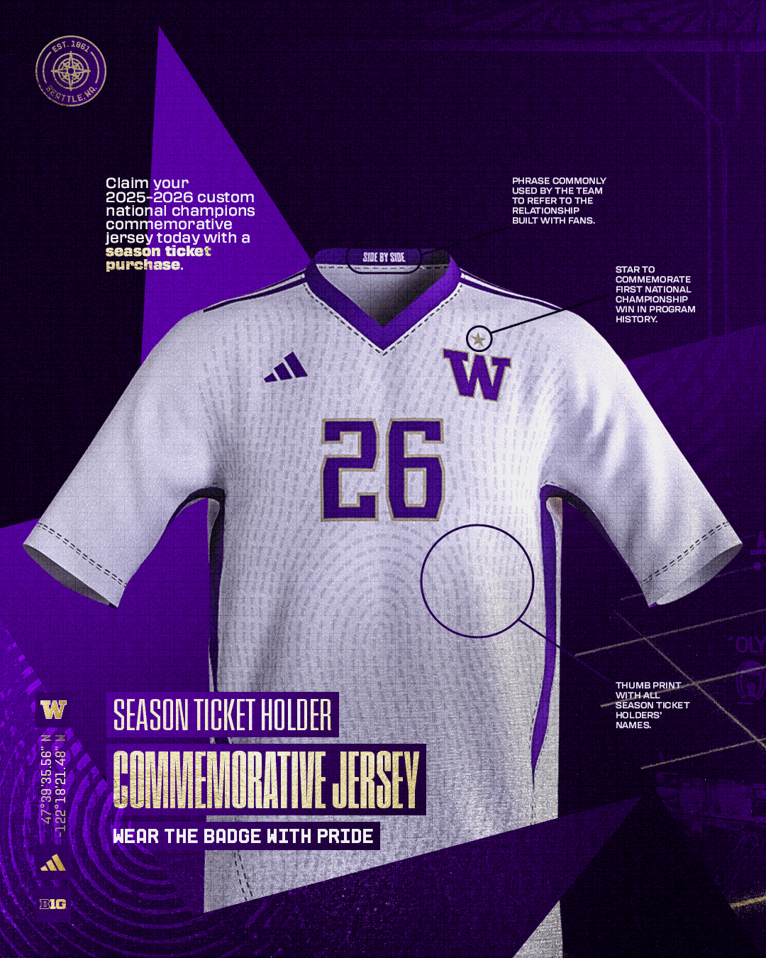
For the first time since linking up with adidas in 2019, the Washington Huskies have refreshed their core uniforms, and while the changes aren’t drastic, the new look shines in all the right places. Literally.
At first glance, the home purple and road white sets look familiar, and that’s by design. The Huskies have kept their identity intact, but with one significant upgrade: gold is back in a big way.
On the home purple jerseys, the previous triple-stripe design on the shoulders — three subtle purple bands that often faded into the fabric — has been replaced by bold gold shoulder stripes with a clean white accent stripe cutting through the middle. It’s a small change that makes a big impact, giving the jersey more definition and presence.
The purple pants echo the same updated striping pattern, adding more gold to the lower half of the uniform and creating better visual balance with the jerseys.
The gold pants remain largely the same — they’ve kept the classic look with purple stripes surrounding a white center stripe — but they pair more naturally now with the reworked tops thanks to the enhanced gold accents.
Where fans will notice the biggest shift is with the white road jerseys. These have been completely reimagined in the stripe department. Instead of the minimalist look of past seasons, the sleeves now carry a strong purple-gold-purple stripe pattern that gives the away look a ton more attitude and personality.
Both uniforms also now feature gold-outlined numbers, a nod to the chrome-effect lettering seen on the fan-favorite “Husky Royalty” alternates from 2022 and 2023. It's a subtle callout that adds polish and keeps the aesthetic sharp under the lights.
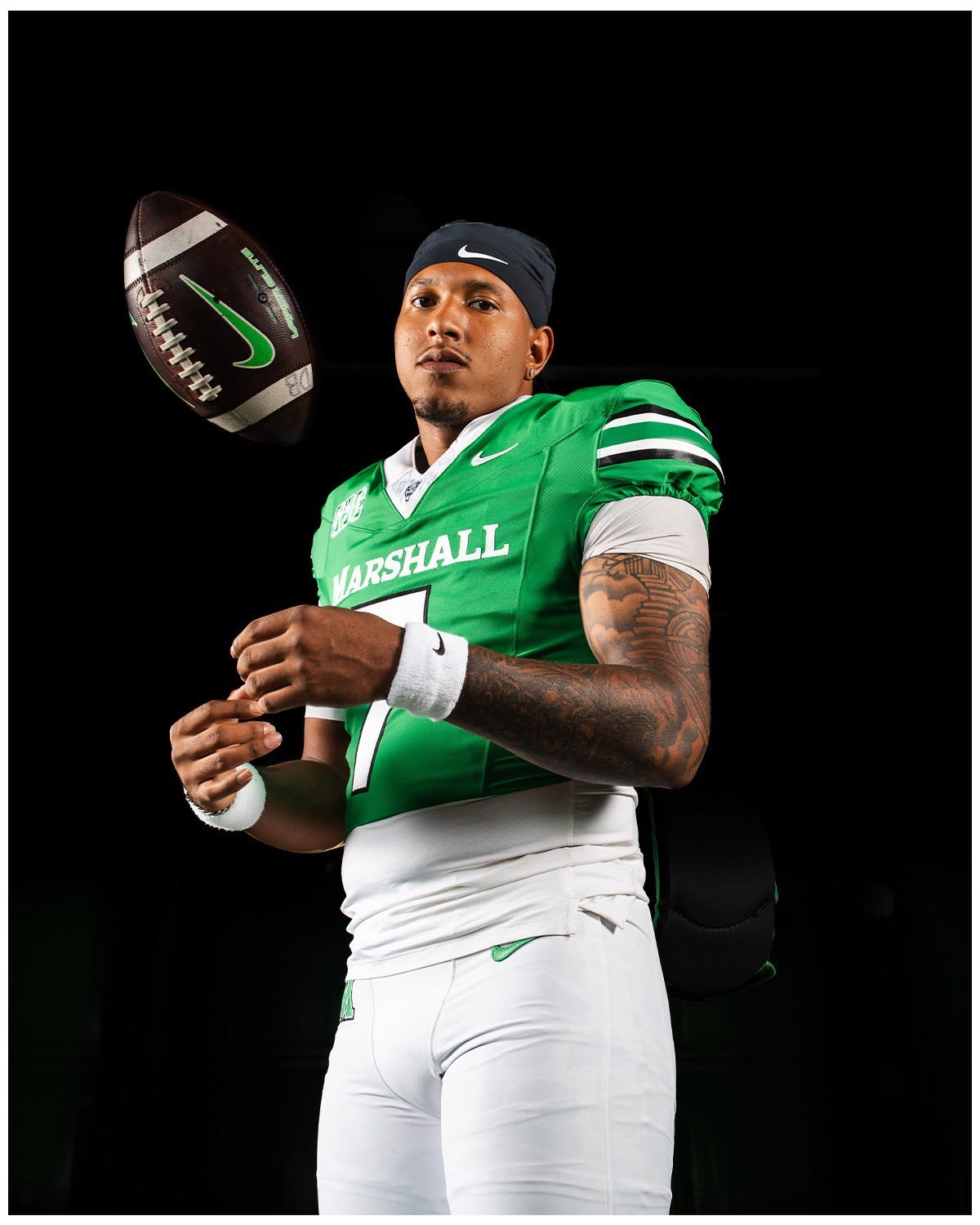
The Marshall Thundering Herd are rolling into the 2025 season with a fresh touch on their classic green and white uniforms. While the changes may be subtle, they’re the kind of fine-tuning that fans and uniform purists alike will appreciate.
Now competing in the Sun Belt Conference, the biggest change comes to the sleeves: both jerseys now feature a modified stripe in black/white/green/white/black. It’s a sharp addition that ties in directly with the striping on Marshall’s white helmets — a small detail that creates a much more cohesive look across the entire uniform.
There’s also an update to the collar color. The green jersey will now sport a white collar, and the white jersey will feature a green collar a departure from the black collars seen on both in recent years. Topping it off, the Thundering Herd logo now appears on the front collar, providing a subtle but meaningful brand presence.
Even though these are modest updates, the impact is noticeable. Sleeve cap stripes almost always elevate a jersey, especially when they tie in with helmet design. Dropping the black collars in favor of color-matched trims is another solid move — cleaner, more intentional, and better aligned with the school’s identity. While we would’ve loved to see stripes on the pants to complete the look, the solid color trend continues to dominate across college football.
Overall, the upgraded striping and improved color balance make this a solid step forward for Marshall’s look. We’re excited to see the Thundering Herd hit the field this fall in these refreshed fits.
— Boston College Football (@BCFootball) June 18, 2025
The Boston College Eagles are ushering in a new era of style and innovation with the reveal of their 2025 football uniforms, designed in collaboration with New Balance. As the first major NCAA football program to partner with the Boston-based brand, BC is making history, and looking sharp doing it.
This season, the Eagles will take the field in two fresh uniform combinations. The first is a deep maroon set with clean white lettering, while the second flips the palette with a crisp white jersey and bold maroon accents. The designs strike a balance between tradition and performance, paying homage to Boston College's heritage while embracing New Balance’s modern aesthetic and commitment to high-performance athletic wear.
The uniform drop follows the June 2 announcement that Boston College had expanded its relationship with New Balance to cover all athletic programs, making the brand the Eagles’ official outfitter. The partnership marks a major milestone for both institutions, representing New Balance’s first full-scale foray into major college football outfitting.
"Boston College is thrilled to grow in its relationship with New Balance,” said William V. Campbell Director of Athletics Blake James. “Since 2021, BC has been proud to align with New Balance — a Boston-based company that is a premium, world-class athletic brand. Serving as their flagship school in the collegiate athletics space, New Balance has demonstrated their commitment to Boston College by providing significant resources and the highest quality product lines to all of our teams and student-athletes."
The collaboration reflects more than just gear — it’s about identity, innovation, and community. For Head Coach Bill O'Brien, it’s a game-changer.
"Our players and staff are thrilled to represent two iconic brands — Boston College and New Balance," said O'Brien. "Being the only power conference college football program to align with a cutting-edge organization like New Balance is a great opportunity that sets us apart."
As the 2025 season approaches, all eyes will be on The Heights to see how the Eagles perform — and how they look — in their new era of uniform excellence.
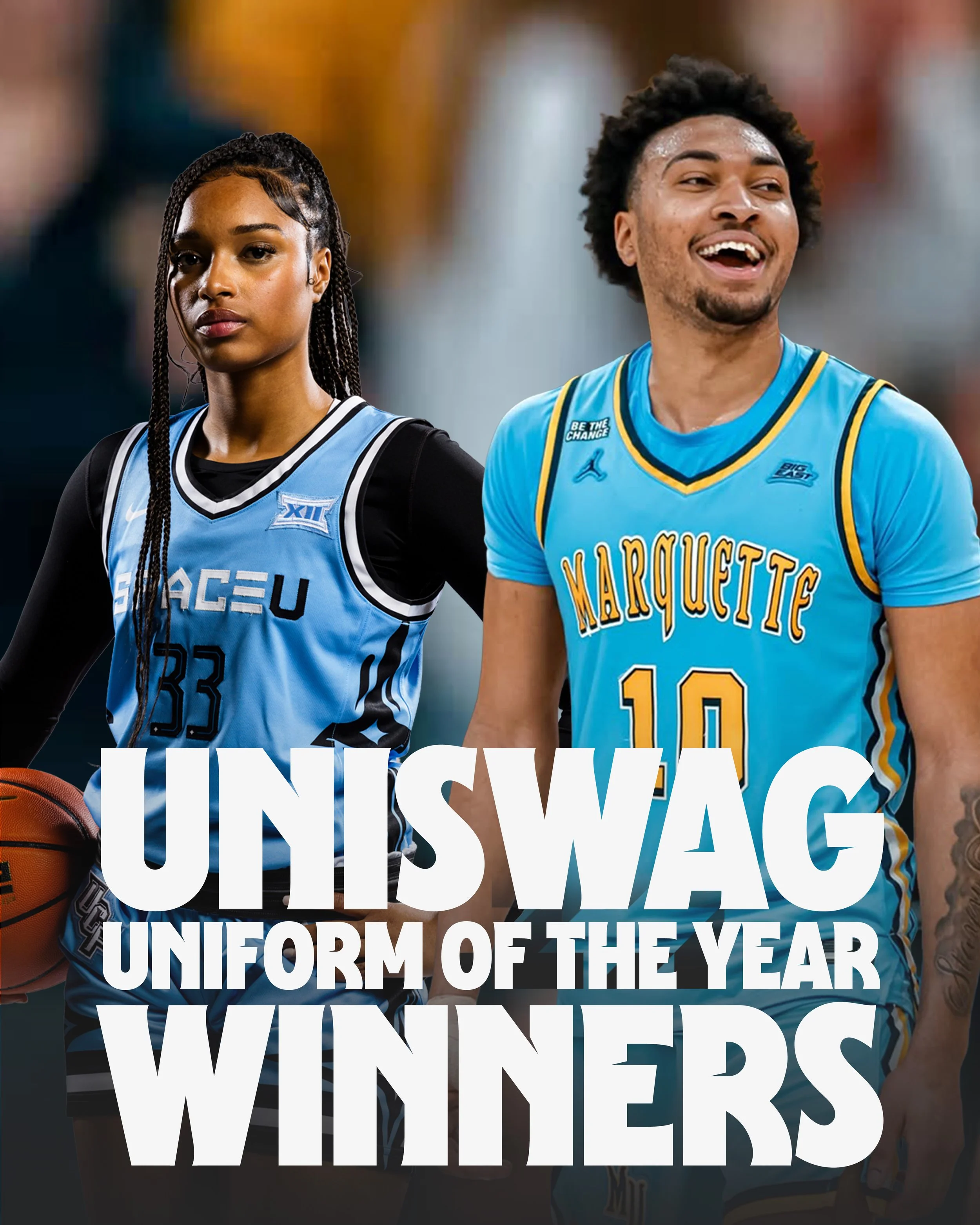
The votes are in, and the style game in college hoops has never been stronger. This year’s UNISWAG Awards spotlighted the best-dressed squads on the hardwood, with fans casting thousands of votes to crown the freshest uniforms in the game. Whether bringing the heat with modern flair or staying icy with clean, classic looks—these uniforms turned heads and owned the spotlight.
UConn Huskies – Women’s Basketball Uniform of the Year
When it comes to dominance, UConn doesn't miss—and neither did their threads this year. The Huskies earned the Women’s Uniform of the Year with their bold navy set that blends tradition, power, and purpose. With striking red and white trim, a statement UCONN chest mark, and the iconic Husky edge, this uniform is everything fans love: clean, confident, and built for big moments.
Cincinnati Bearcats – Men’s Basketball Uniform of the Year
Cincinnati’s sleek all-black alternate, complete with bold “CINCY” lettering and clawed-out detailing, claimed the Men’s Uniform of the Year title in dominant fashion. Matched with Jordan Brand swagger and accented textures down the sides, this look was unforgettable.
Inter Miami CF has officially dropped its new third kit for 2025, and it’s making a splash. Introducing the “Riptide” kit, a striking new look that mirrors the club’s momentum as it barrels into a defining season. With eyes on the FIFA Club World Cup, Leagues Cup, and Major League Soccer, this release feels like more than just a uniform—it’s a statement of identity.
Inspired by the raw force of the ocean, the Riptide kit reflects the team’s fearless, fast-paced play. Unpredictable and unrelenting, it channels the energy of a current that doesn’t wait—it pulls everything forward. It’s resilience, it’s rhythm, and above all, it’s Miami.
The kit leads with a bold Miami Blue base, complemented by signature accents in Miami Pink and White. The iconic Royal Caribbean sponsor logo rides front and center on both the jersey and matching shorts, a nod to the city’s coastal roots and global reach.
as Inter Miami continues its journey to make waves on the global stage, the Riptide kit is a perfect symbol of the ride—unpredictable, unstoppable, and unmistakably Miami.
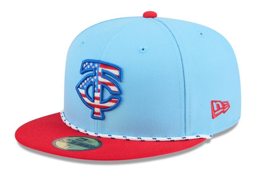
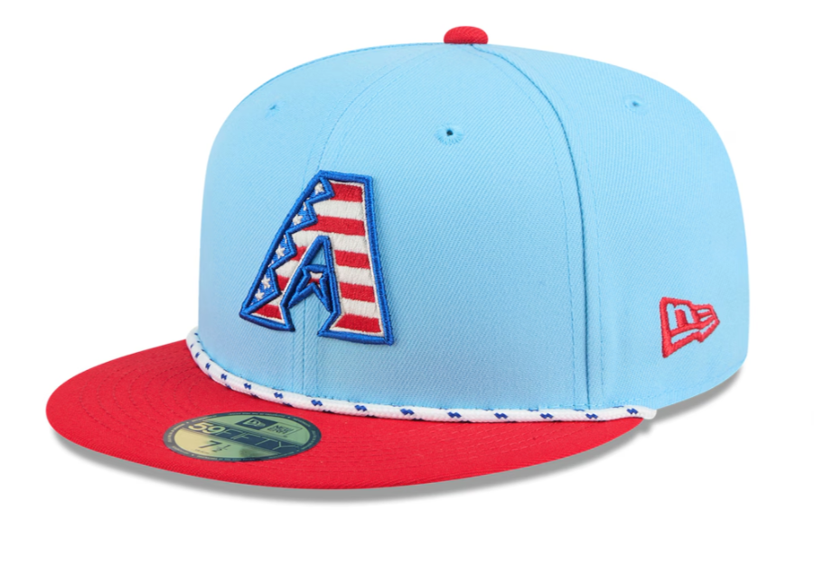
Just in time for Independence Day, Major League Baseball and New Era have dropped the 2025 edition of their annual Stars and Stripes cap collection, and this year’s look adds a fresh twist to a fan-favorite tradition.
All 30 MLB teams are represented in this year’s drop, which officially launched on June 9. The caps feature a light blue crown, a gray underbrim, and a contrasting white rope with flecks between the crown and the brim, giving off a vintage, nautical feel. The team logos across the front are outlined in royal blue and filled with the American flag pattern of stars and stripes, delivering a patriotic punch that's become a signature of these yearly designs.
Each team’s cap is styled with either a royal blue or red brim, with the squatchee (the button on top) and the New Era logo matching the brim color. The rope across the front features flecks that contrast with the brim (blue flecks on red brims, red flecks on blue brims), adding a subtle layer of detail.
On the back, U.S. teams’ caps carry the MLB batterman logo redesigned in red, white, and royal blue — continuing the Independence Day theme right through every angle.
But north of the border, the Toronto Blue Jays get a custom take. Their cap swaps the stars and stripes for a clean red and white version of their team logo with no American flag elements — a nod to Canada’s own national identity. The brim, top button, rope flecks, and New Era logo are all in red, while the back MLB logo goes red and white only.
The 2025 Fourth of July collection blends tradition and trend, with modern color blocking and vintage-inspired accents, making it one of the most wearable and collectible drops yet. Whether you're hitting the ballpark or the barbecue, this year’s Stars and Stripes caps deliver a full dose of summertime swagger.