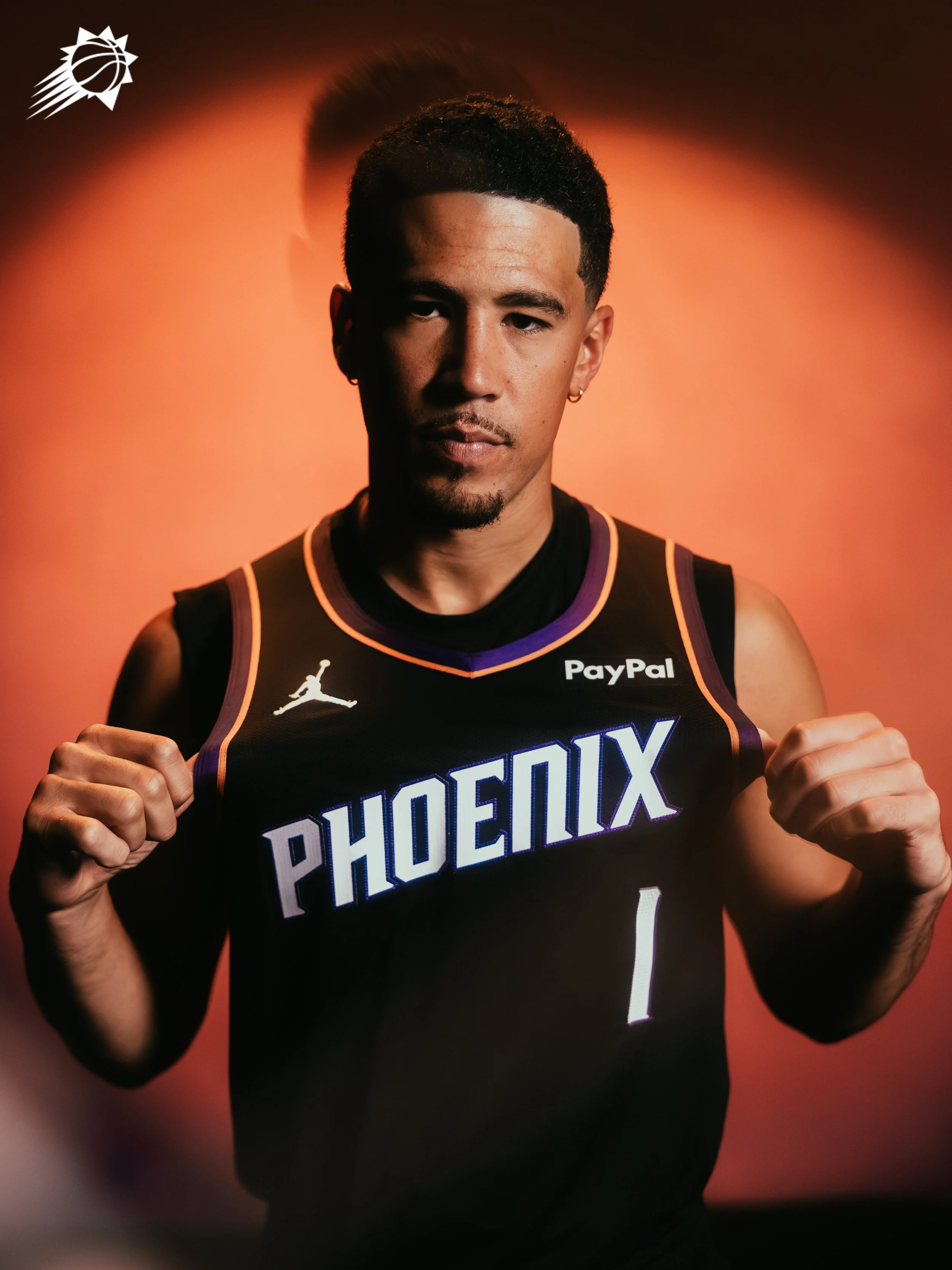
The Phoenix Suns are bringing a fresh look to the hardwood with the unveiling of their new Statement Edition uniform, a design that blends the team’s modern identity with bold updates inspired by the city and culture of Phoenix. The result is a jersey that channels both Valley pride and classic Suns swagger.
Front and center is a bold new “PHOENIX” wordmark stamped across the chest, a proud declaration of where the team plays and the community it represents.
The Suns’ iconic Sunburst logo gets a modern twist, reimagined with the team’s signature Valley gradient. This reinterpretation bridges the past and present, creating a symbol that feels both timeless and fresh.
The redeveloped Valley-inspired gradient runs throughout the jersey and shorts, drawing from Arizona’s signature desert sunsets. The look nods to the team’s fan-favorite “Valley” City Edition uniform while offering a unique spin for this Statement design.
This latest release is more than just a uniform; it’s a confident step forward for a franchise deeply connected to its city. From the sunset hues of the gradient to the bold Phoenix branding, the Suns’ Statement Edition is built to shine under the brightest lights.
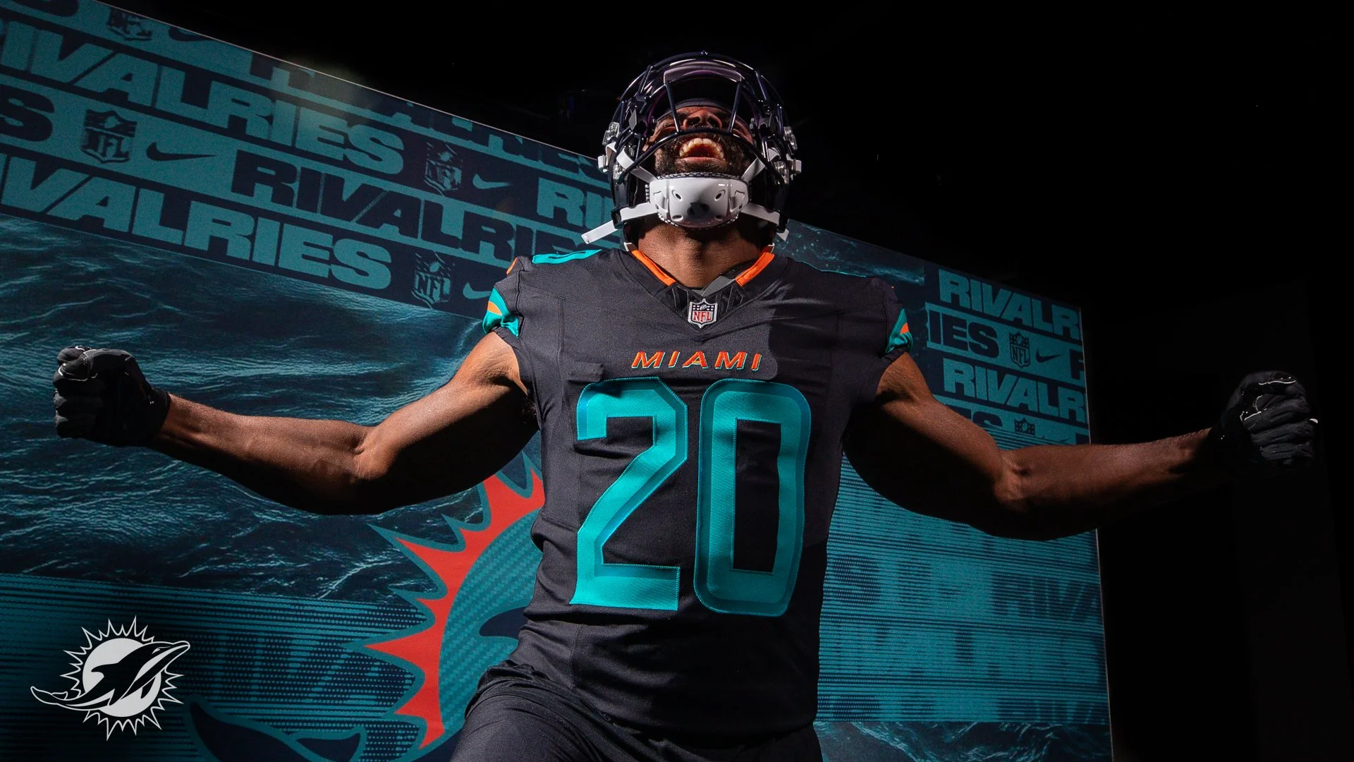
The Miami Dolphins are turning up the tempo in 2025 with the reveal of their all-new Rivalries uniform, a look designed to match the blazing speed of their roster and the energy of their fanbase.
With two of the league’s fastest playmakers in Tyreek Hill and De’Von Achane, Miami leaned into speed as the central theme of the design. The uniform introduces dark-pitch blue threads accented with iridescent aqua and sharp orange details, echoing the power and movement of dolphins cutting through water.
The helmet, sleeves, and pant stripes feature turbo green and orange striping, a bold nod to motion and acceleration. Inside the back collar, the Dolphins’ rally cry “Go Fins!” is stitched in orange — a detail built to fire up players and fans alike.
The uniform will make its on-field debut in one of the NFL’s classic rivalries: Miami vs. the New York Jets.
“The Jets have always been our biggest rival. They’re the team that, no matter what their record is, they’re always going to play us tough,” said former Dolphins wide receiver Nat Moore. “And with so many New Yorkers living in South Florida, the rivalry just feels that much more real.”
Completing the look are dark-pitch blue pants, giving the entire combination a sleek, modern edge.
This Rivalries drop continues the NFL and Nike’s effort to bring city and fan identity into uniform design. For the Dolphins, that identity is pure speed — and now it’s stitched into their game-day threads.
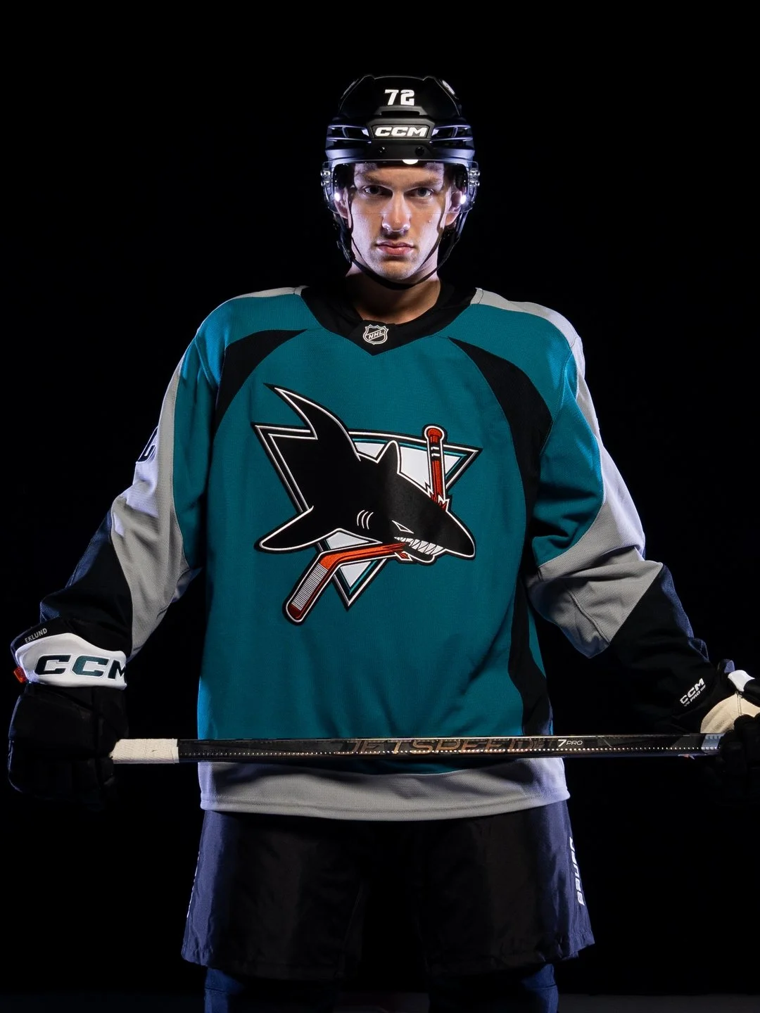
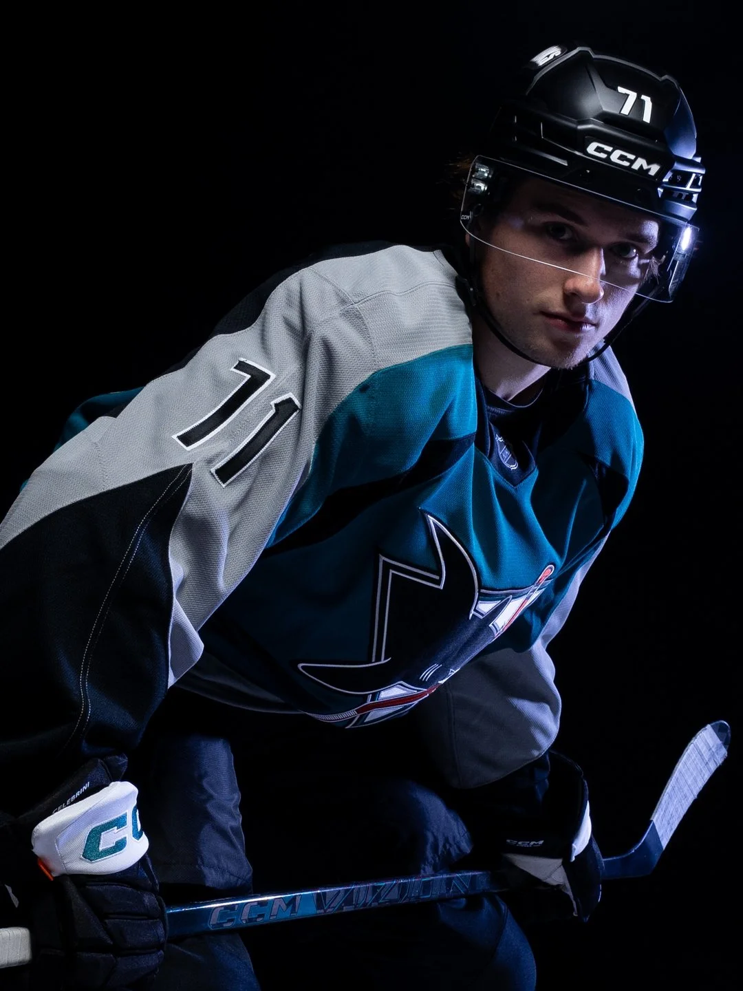
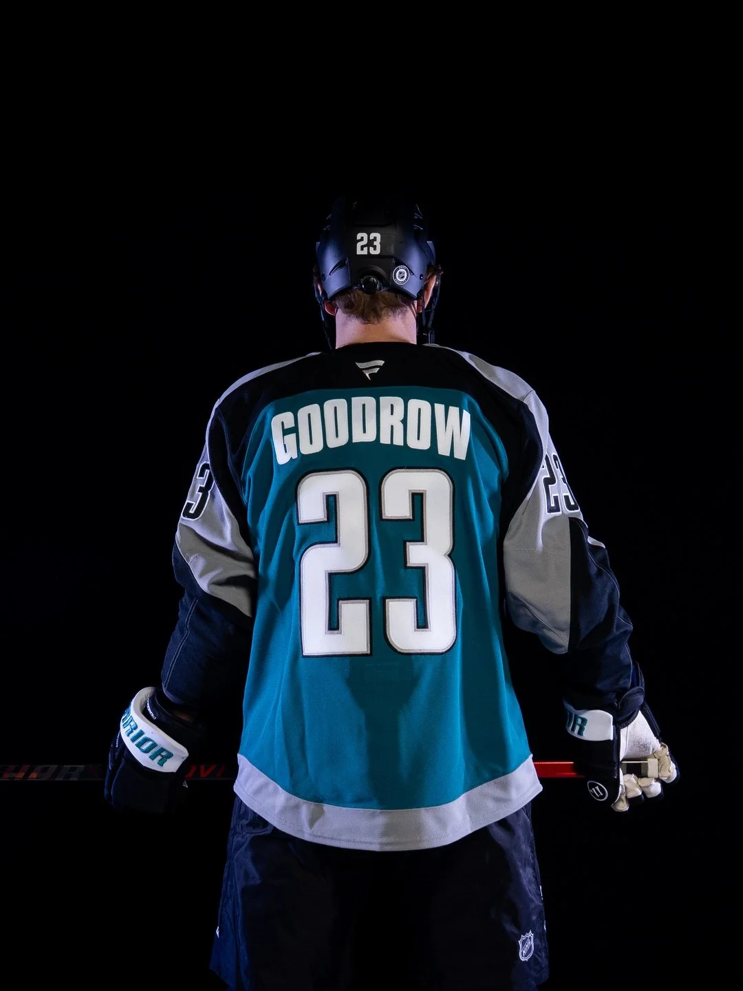
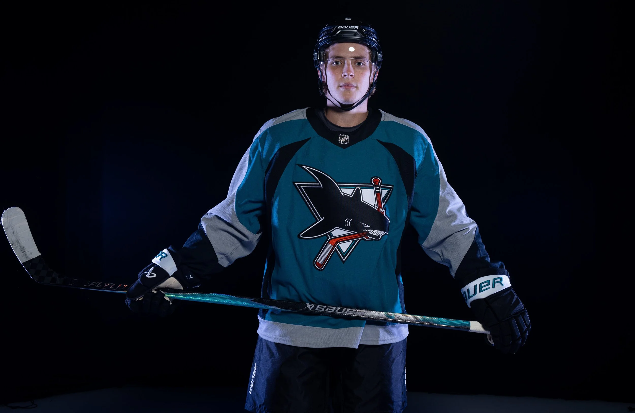
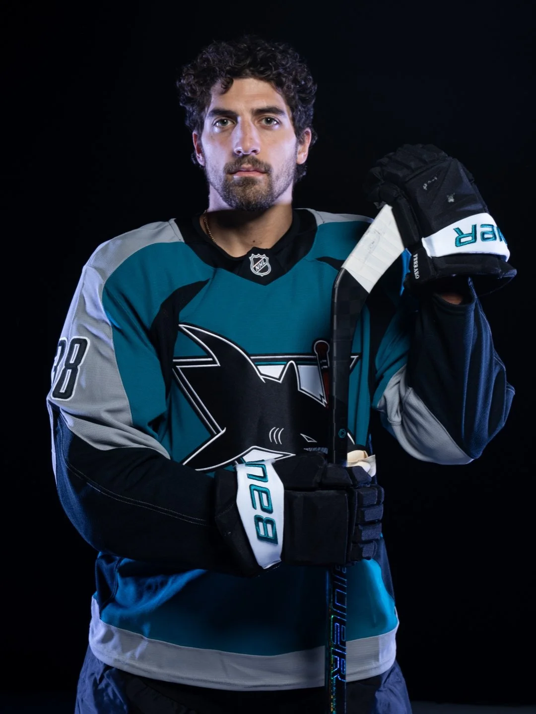
As the San Jose Sharks get ready to celebrate their 35th anniversary season, the team is turning back the clock while looking ahead to the future. The franchise unveiled the Sharks Heritage 2.0 jersey, a modern tribute to one of the most iconic looks in team history.
Originally worn between 1998 and 2007, the second-generation Sharks jersey became a symbol of an unforgettable era, defined by legends like Patrick Marleau, Joe Thornton, Evgeni Nabokov, Jonathan Cheechoo, Owen Nolan, and more. Now, the look is back with a fresh twist designed to connect fans across generations under one teal banner.
Heritage 2.0 carries forward the bold lettering and design of the original while refreshing the details for today’s game. The neckline “bleeds teal,” and every stitch is meant to tell the story of 35 years of Sharks hockey—from franchise-defining goals to the moments that built Sharks Territory.
Sharks Chief Marketing Officer Doug Bentz summed it up perfectly: “Heritage 2.0 isn’t just a jersey, it’s a symbol of the era that made us who we are, on and off the ice.”
The celebration extends beyond the ice. Fans can shop the full Heritage 2.0 merchandise line, which includes jerseys, hoodies, tees, hats, pins, pucks, and stickers—ensuring the look lives everywhere in Sharks Territory.
The UNISWAG Uniform of the Week Countdown is back for Week 5 of college football!
Check out which teams are turning heads with their uniform combos this weekend. The official Top 10 drops monday, leading up to the reveal of the Week 5 Uniform of the Week winner.
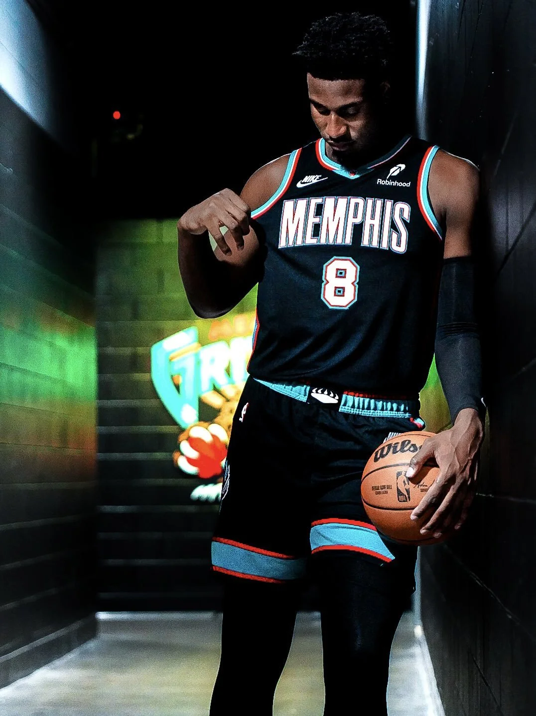
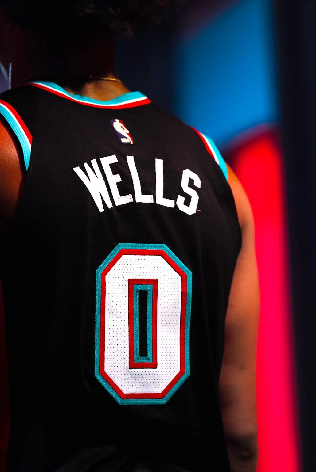
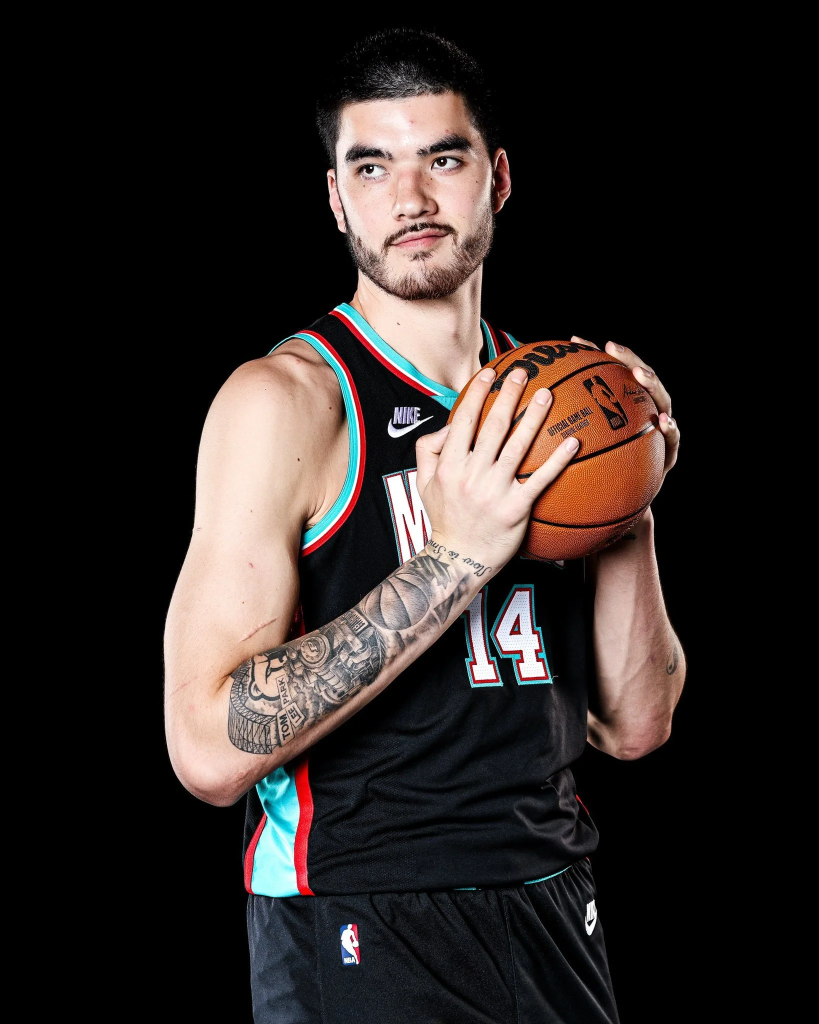
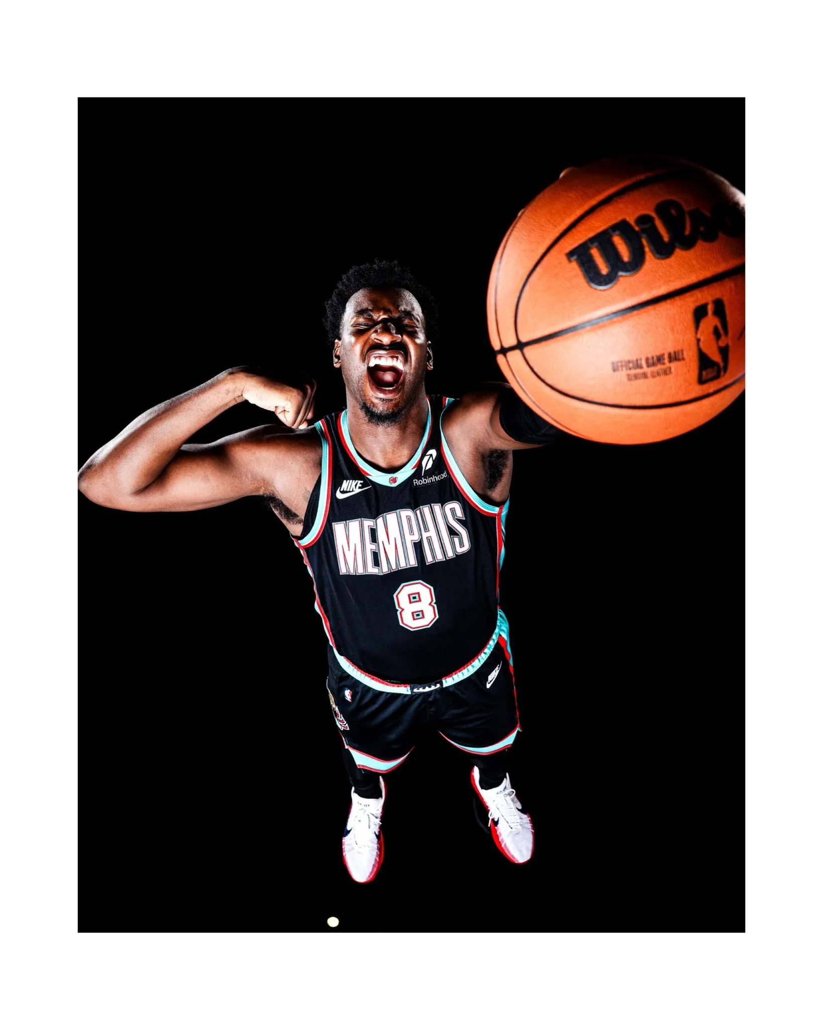
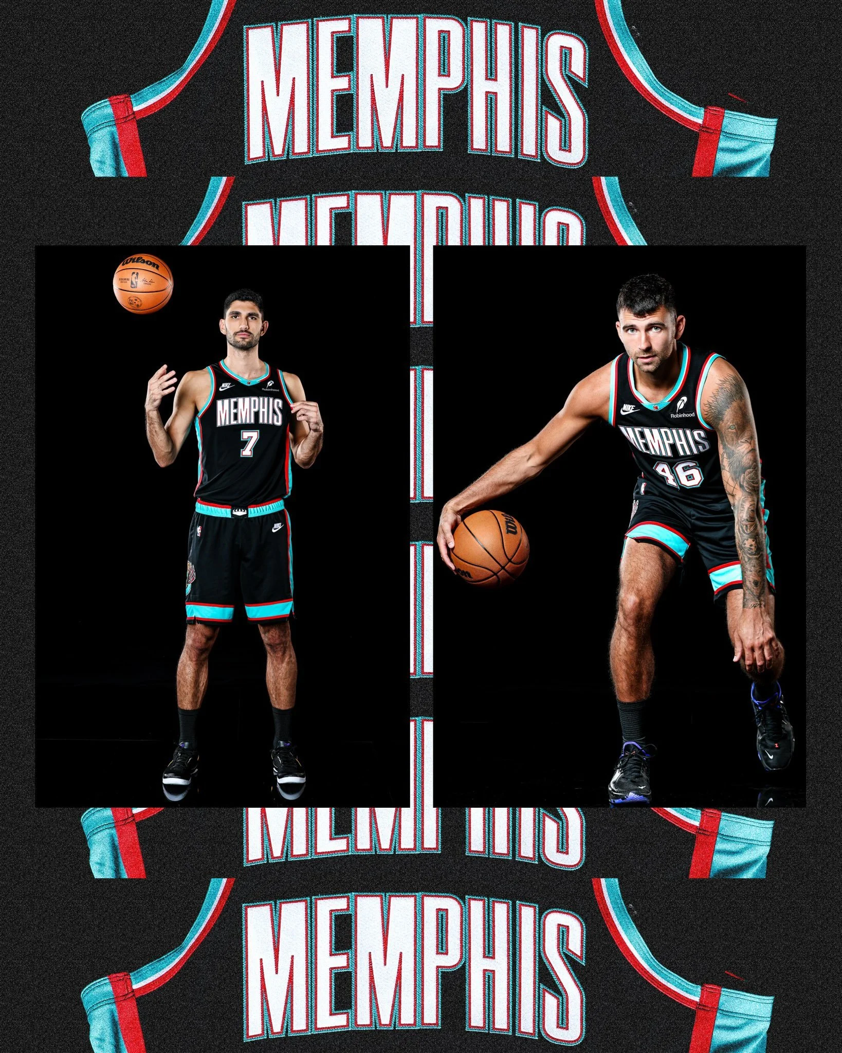
The Memphis Grizzlies are dialing up the nostalgia this season, taking the court in a bold throwback to their 2001-02 black uniforms, a look that represents the team’s very first year in Memphis.
When the franchise relocated from Vancouver to Memphis in 2001, the team brought along its alternate black uniform. But the Grizzlies quickly made it their own. The chest logo was swapped out for a sleek “Memphis” wordmark, paired with the signature asymmetrical trim in red, turquoise, and white. It was a fresh design that immediately gave the new era of Grizzlies basketball its identity.
For the first three seasons in Memphis, the team boldly featured “Memphis” across both home and away uniforms—a move that stood out in the NBA at the time, with very few teams opting to display their city so prominently.
The uniforms also featured the beloved Claw Ball, first introduced as a secondary logo in Vancouver back in 1995. It became part of the jersey in 2000 and still remains a staple of the Grizzlies’ brand identity over two decades later.
Another nod to the franchise’s roots, the G-Swipe logo, was carried over as well. First used during the inaugural Vancouver season, the fierce claw mark quickly came to symbolize the team’s intensity and edge on the court.
The return of the black 2001-02 uniforms isn’t just about looking back; it’s about celebrating the Grizzlies’ journey from their earliest days in Memphis to becoming a fixture of the city’s sports culture. For fans, it’s a chance to relive the moment when “Grizzlies Basketball” first took root in Tennessee, wearing one of the boldest kits of the early 2000s.
Memphis is making sure the throwback fits seamlessly with the present, honoring history while bringing a classic look back to the modern NBA stage.
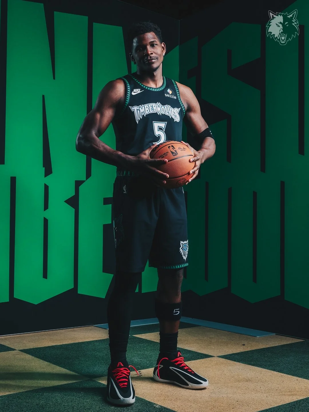
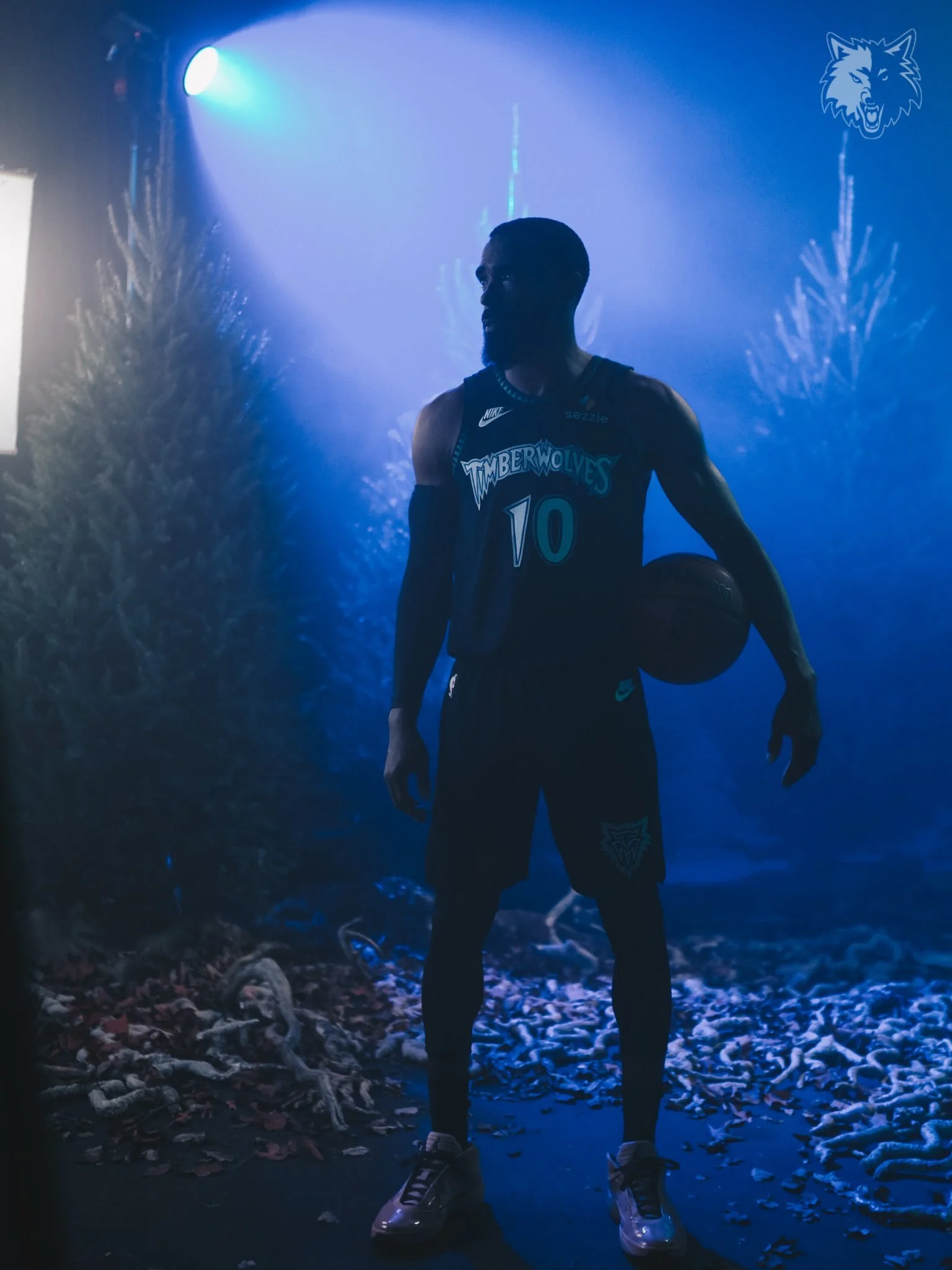
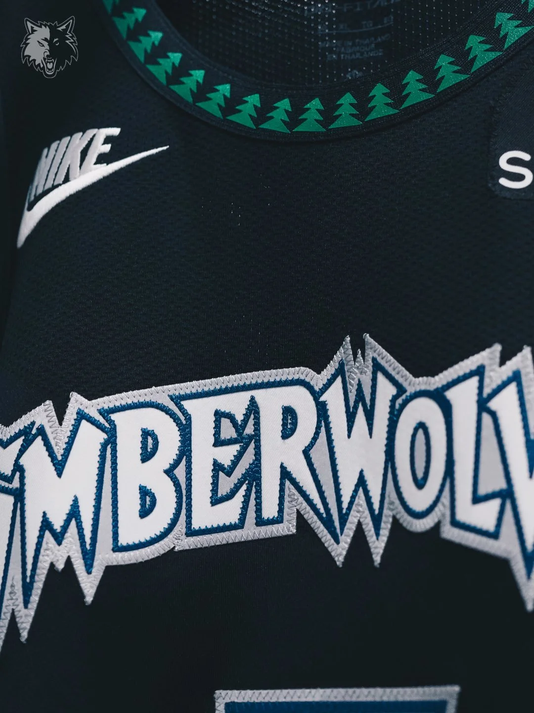
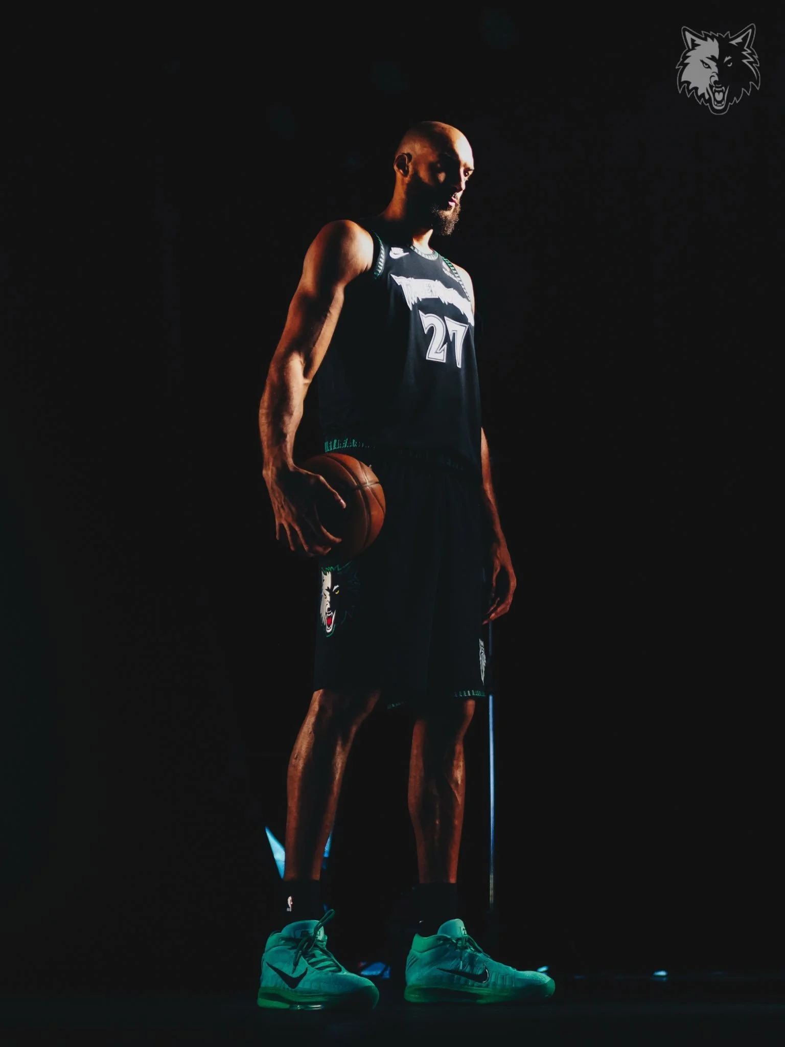
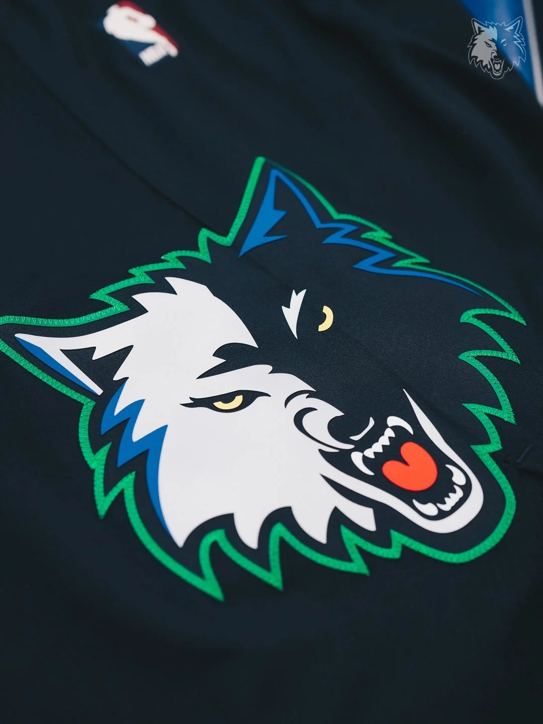
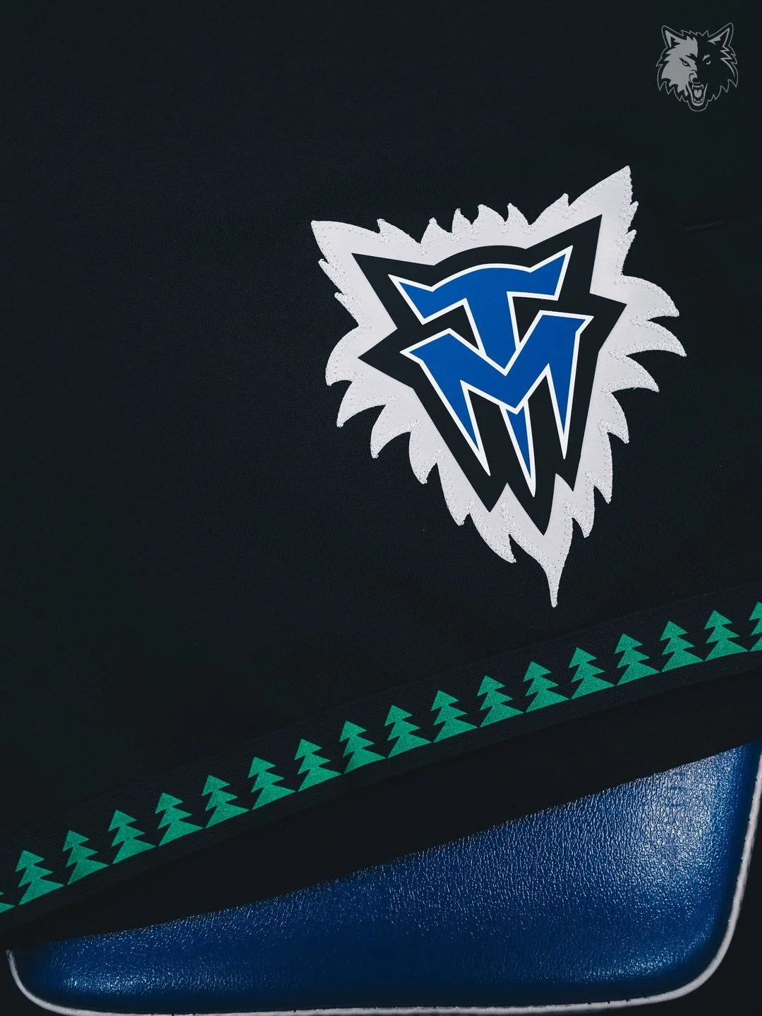
The Minnesota Timberwolves have officially brought back one of the most iconic looks in franchise history. The team unveiled their 2025-26 Classic Edition uniform and matching court design, reintroducing the legendary “Black Trees” set that has long been the most requested uniform among Timberwolves fans.
The Classic Edition uniform and court will make their season debut on October 26 when Minnesota hosts the Indiana Pacers at Target Center.
The “Black Trees” uniforms, originally worn during the 1990s and early 2000s, remain one of the most celebrated eras in Timberwolves history. With their bold black base and tree-patterned trim, the jerseys captured the culture, energy, and style of that era.
“These iconic uniforms hold a special place in our community, and bringing them back reflects our commitment to listening to fans and celebrating the moments they value most,” said Timberwolves and Lynx CEO Matt Caldwell. “Our Black Trees uniforms pay tribute to one of the most defining eras in team and league history, while introducing a new generation of fans to the Timberwolves’ legacy.”
The Wolves will wear the Classic Edition uniform for 28 games total this season, 21 at home and seven on the road.
To complete the throwback, the team also revealed a Classic Edition court, designed as a replica of the 1990s parquet hardwood floor from the original “Black Trees” era. The Wolves will play on this retro court for all 21 home games in which the uniform is worn.
With the return of the Black Trees, the Timberwolves aren’t just honoring their past, they’re giving fans a nostalgic reminder of one of the league’s most unique looks, while creating new memories for the next generation.
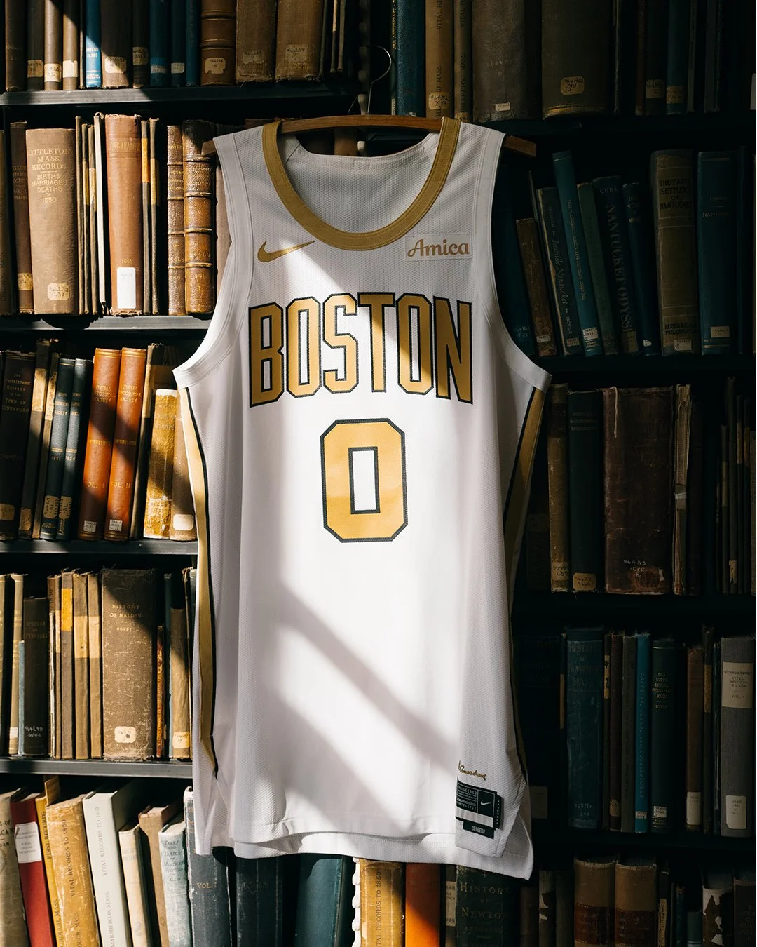
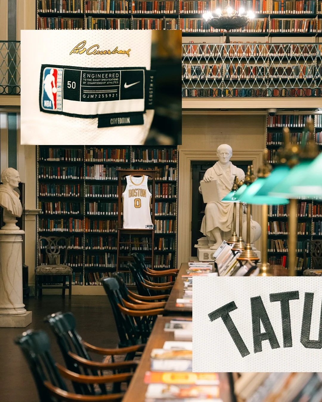
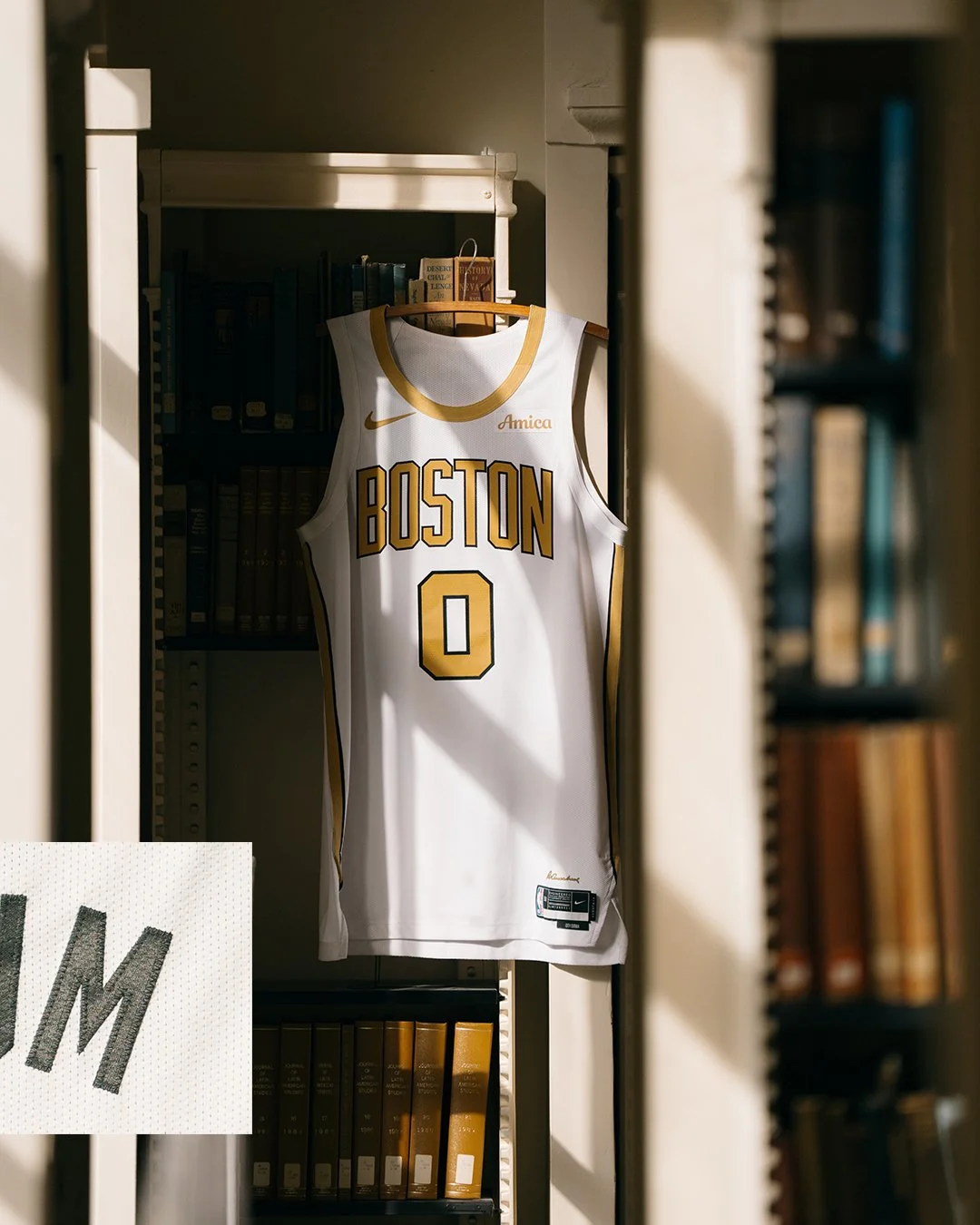
The Boston Celtics have officially revealed their 2025-26 Nike NBA City Edition uniforms, giving fans a fresh take on tradition while honoring the team’s championship-rich history.
This year’s design steps away from the franchise’s signature green, opting instead for a crisp white-and-gold look that symbolizes Boston’s unparalleled 18 NBA championships, the most in league history. The black trim outlining the names and numbers adds sharp contrast, while a special touch sits at the bottom of the jersey: the signature of legendary coach Red Auerbach, a fitting tribute to the architect of Boston’s winning culture.
The Celtics’ City Edition uniforms have long leaned into the franchise’s storied past. Fans may recall the 2020-21 alternates, inspired by the championship banners hanging in the rafters of TD Garden. This year’s set continues that tradition, blending history with a clean, modern design meant to shine under the bright lights of Boston’s next title chase.
— West Virginia Football (@WVUfootball) May 5, 2025
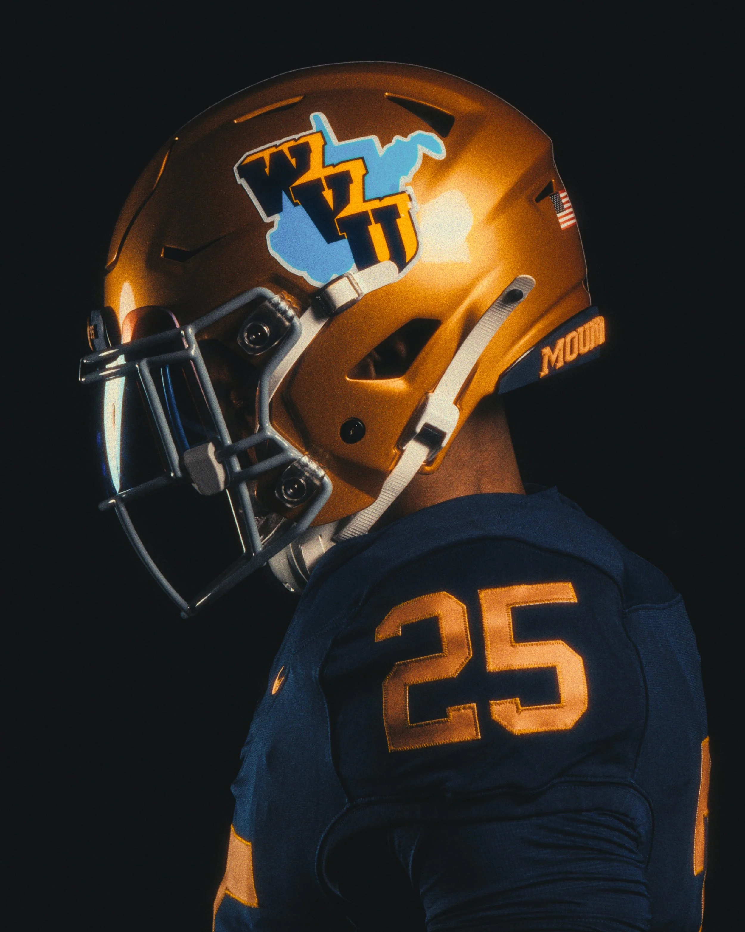
Cue the nostalgia — and the old gold. West Virginia University is throwing it all the way back to 1965 with a special edition uniform that’s more than just a retro look. It's a tribute to one of the most storied seasons in Mountaineer football history — and a design that has never truly been replicated... until now.
the 1965 throwback uniform marks a first-of-its-kind effort from WVU: a true historical replica that brings to life the textures, tones, and traditions of a team that not only dominated the Southern Conference but lit up the scoreboard in a record-setting Backyard Brawl.
“It was an opportunity to do a true throwback, which we haven’t done,” said WVU deputy director of athletics Matt Wells. “We thought with the unique nature of that helmet, and the helmet logo with the baby blue, it was probably the most unique element of any of the past uniforms that we could potentially replicate.”
It’s what turned heads then, and it’s what turns heads now: a three-dimensional navy blue WVU logo, outlined in gold, laid atop a light-blue silhouette of the state of West Virginia. Set against an old gold shell, it looked ahead of its time back in ’65 — like technicolor in a black-and-white world.
The helmet design was so iconic that WVU athletic director Wren Baker made it a personal mission to revisit the look as soon as he spotted it in the Hall of Traditions.
“The inspiration really came shortly after Wren got here,” Wells said. “He was familiarizing himself with the history of Mountaineer football, and he saw the 1965 helmet on display… that started a conversation of, ‘Hey, what can we do with that?’”
Some versions of the original helmet had a single blue stripe, while others didn’t. Split end Bob Dunlevy recalled, with a laugh, that the inconsistency probably came down to the infamous resourcefulness of longtime equipment manager Carl Roberts.
“I kept my helmet because I needed it to play in the North-South game after the season,” Dunlevy said. “I’m sure Carl was probably after me to return it, but I kept it, and I still have it.”
The throwback uniform does more than just replicate an old look — it marks 60 years since WVU’s 1965 conference championship season, a year highlighted by the highest-scoring Backyard Brawl in history, a 63-48 win over Pitt.
While the look came from the past, the design process was very much rooted in the present. Kristin Coldsnow, the creative force behind WVU’s recent themed uniforms, was brought back to lead the design — ensuring everything from the shade of blue to the state outline was authentic. She worked closely with Nike to match every detail.
Equipment staffer Austin Blake helped perfect the helmet’s bumper colors and logo placement, while WVU’s internal uniform brain trust — including Michael Fragale and Joe Swan — all contributed during the design phase.
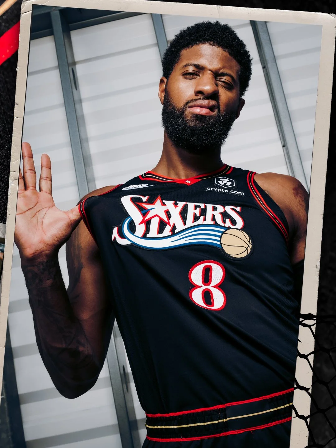
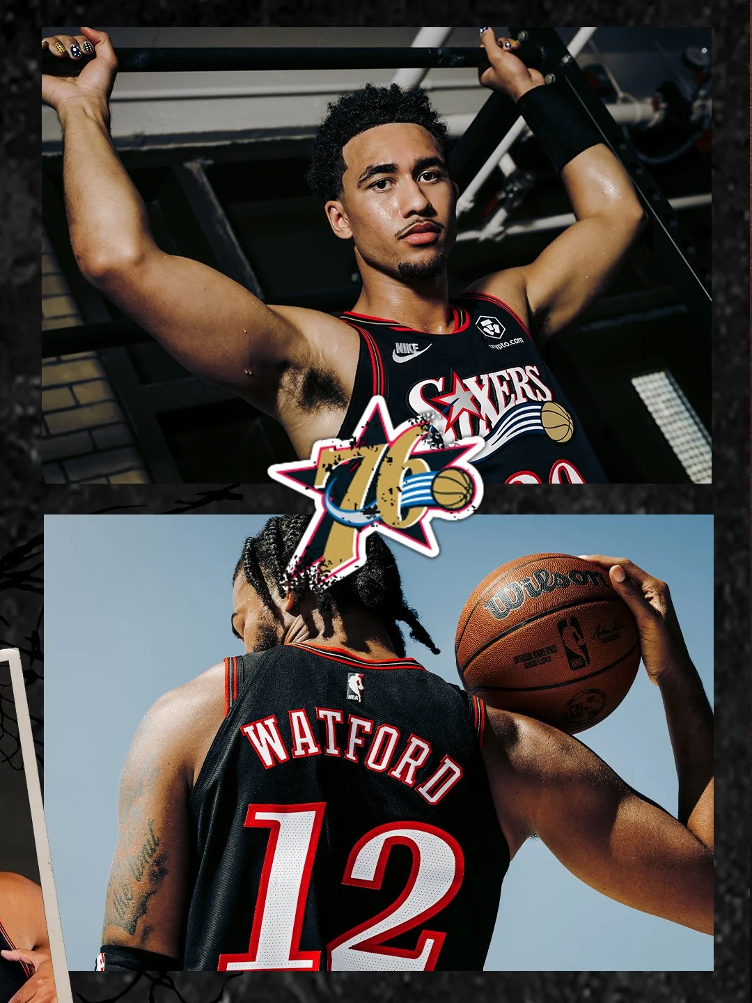
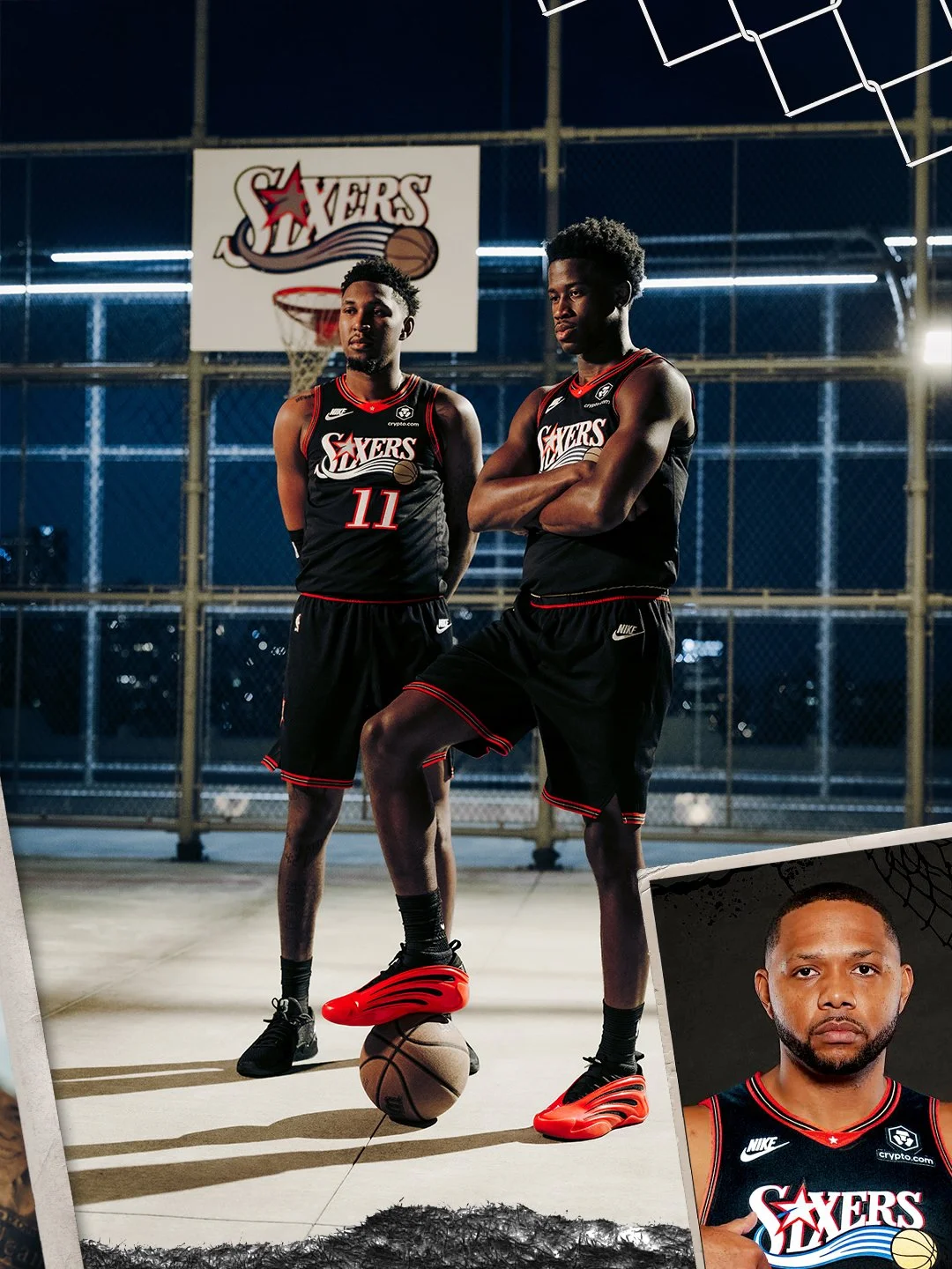
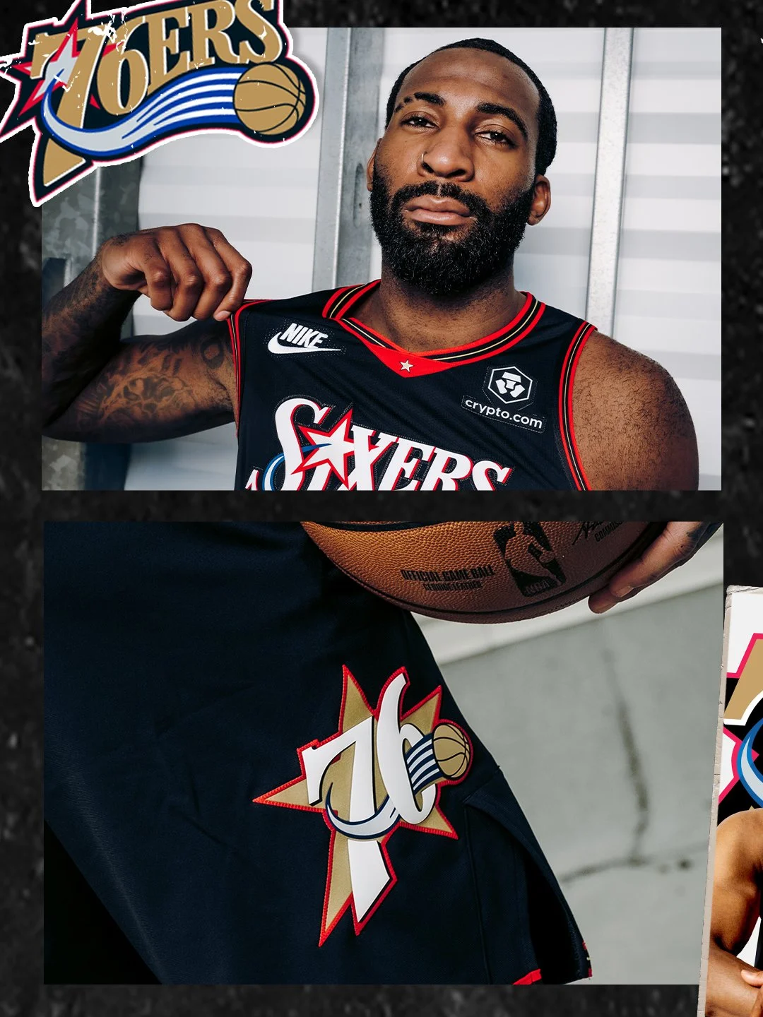
The Philadelphia 76ers are turning back the clock in a big way for the 2025-26 season. The team officially unveiled its Nike NBA Hardwood Classic Edition uniform. The all-black look is a faithful throwback to the uniforms worn during the unforgettable 2000-01 season, a year that saw Allen Iverson lead the Sixers to the Eastern Conference title and an NBA Finals appearance.
That team, coached by Larry Brown and anchored by stars like Iverson, Dikembe Mutombo, Eric Snow, and Aaron McKie, left an indelible mark on the franchise and the city of Philadelphia. Former Sixer Eric Snow reflected on what the uniform means to him:
“Some of my favorite memories came when I was wearing this uniform. I enjoyed every moment of playing for my childhood team. This uniform represented the connection of players with the city and 76ers fans. Although we didn't accomplish our ultimate goal, I'm still thankful for the time I played in the 76ers uniform. Even now, I still meet people wherever I go who speak about the passion they had for our team and that run.”
The 2025-26 Hardwood Classic Edition uniform mirrors the 2000-01 design while being built on Nike’s updated performance chassis, engineered for today’s NBA athletes. From the bold black base to the retro typography and signature detailing, the kit brings back all the nostalgia while keeping performance front and center.
Lara Price, COO of the 76ers, spoke about the uniform’s meaning: “This uniform is more than just a piece of fabric; it represents an era of franchise history that embraced a distinct identity and captured the attention of the entire city. To see these uniforms back out on that court will bring back a lot of nostalgia, and we are excited to share that in many different ways with our fans this season.”
The Sixers will debut the Hardwood Classic Edition uniform and themed court on Saturday, Nov. 8, when they host the Toronto Raptors at Xfinity Mobile Arena. In total, the team will celebrate with 14 “25th Anniversary Celebration” nights presented by Crypto.com, featuring the throwback uniforms, custom merchandise, and special tributes to members of the 2000-01 squad.
The uniform will also make appearances on the road, with six additional games against playoff contenders from that storied season.
With the return of one of the most iconic looks in franchise history, the 2025-26 Sixers season promises to be a nostalgic celebration for fans in Philly and beyond.
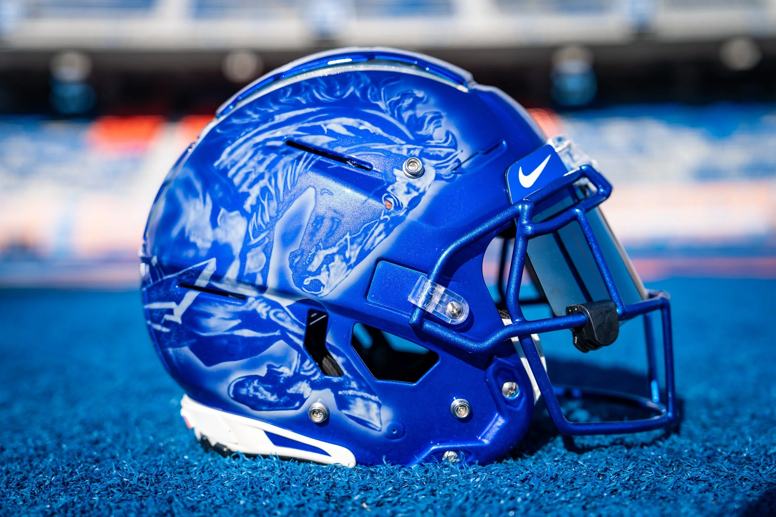
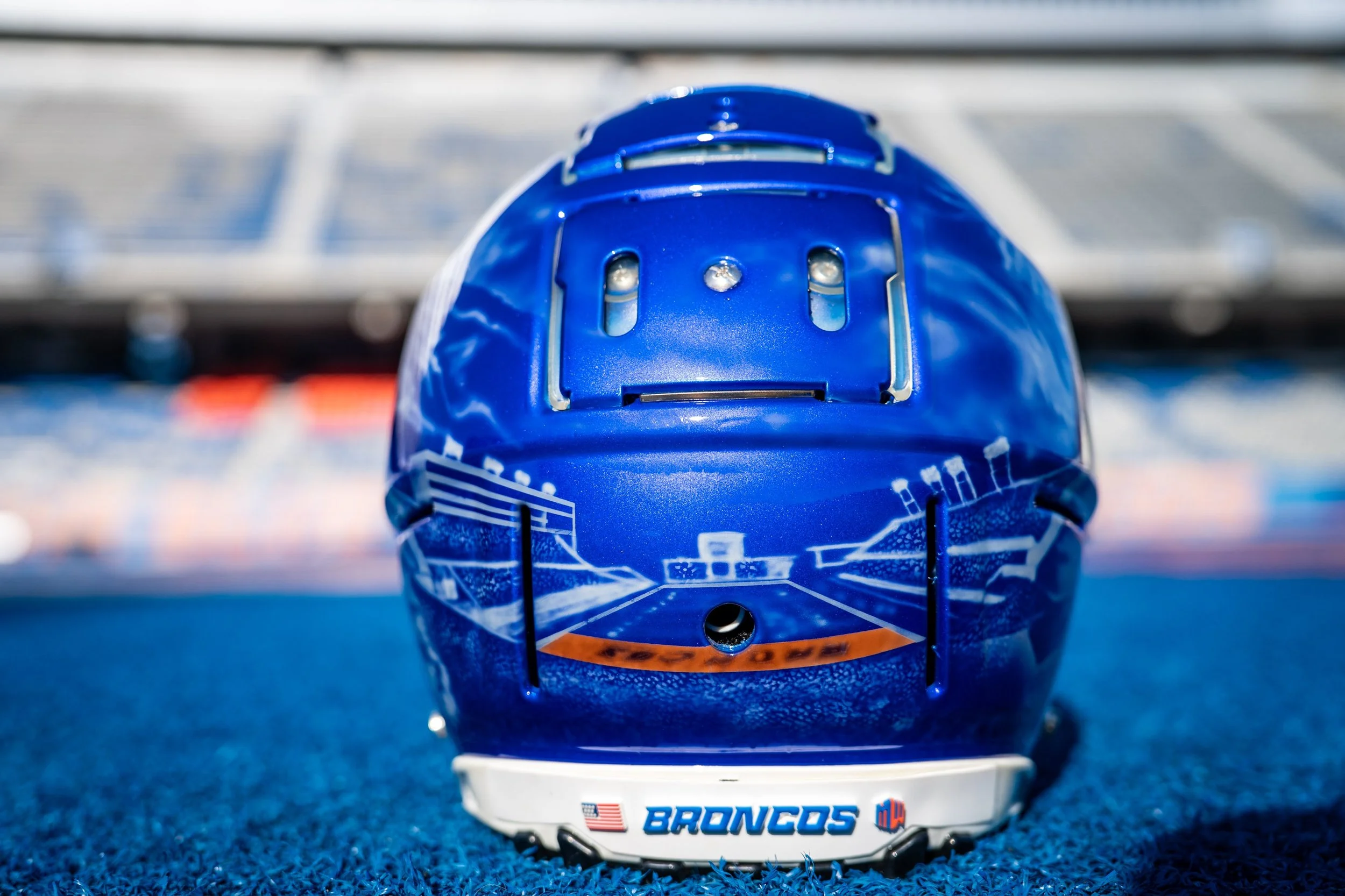
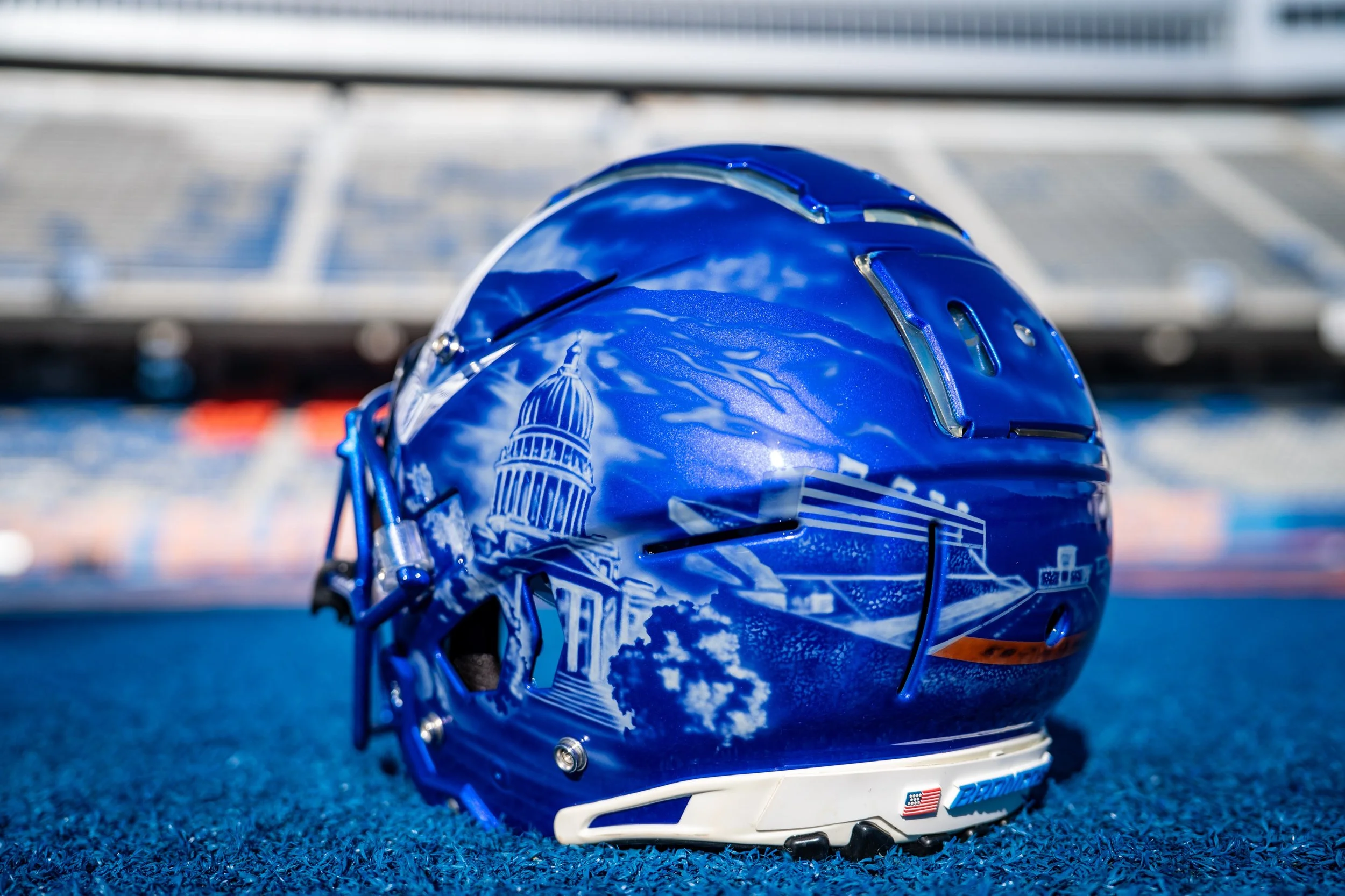
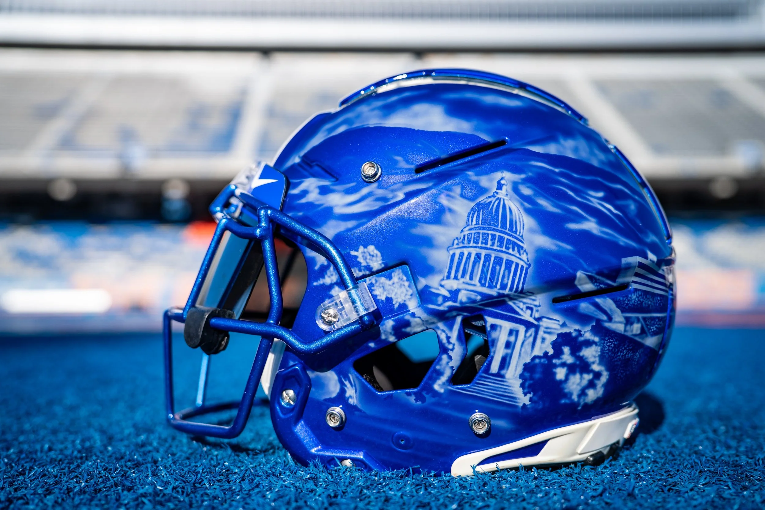
Boise State is bringing art to the gridiron. For its Sept. 27 showdown against App State, the Broncos will debut the “Front Porch of Idaho” hand-painted helmet, a one-of-a-kind design that pays tribute to the beauty of Boise, The Blue, and the state of Idaho.
The helmet, crafted by artist Armando Villarreal, wraps around Boise State’s iconic blue shell with intricate white airbrushing accented in the Broncos’ signature orange. Every detail tells a piece of Idaho’s story:
Right Side: A galloping Bronco charging forward, symbolizing strength and tradition.
Left Side: The Idaho State Capitol framed by the scenic Boise foothills and the “City of Trees.”
Back: Albertsons Stadium and its world-famous blue turf above the Boise River, complete with tree-lined landscapes.
Finishing Touches: A bold orange flash in the Bronco’s eye and the end zones, plus a front bumper etched with “208,” representing both Idaho’s area code and the height of the Capitol dome.