Louisville is bringing a piece of the city's boxing history to the football field.
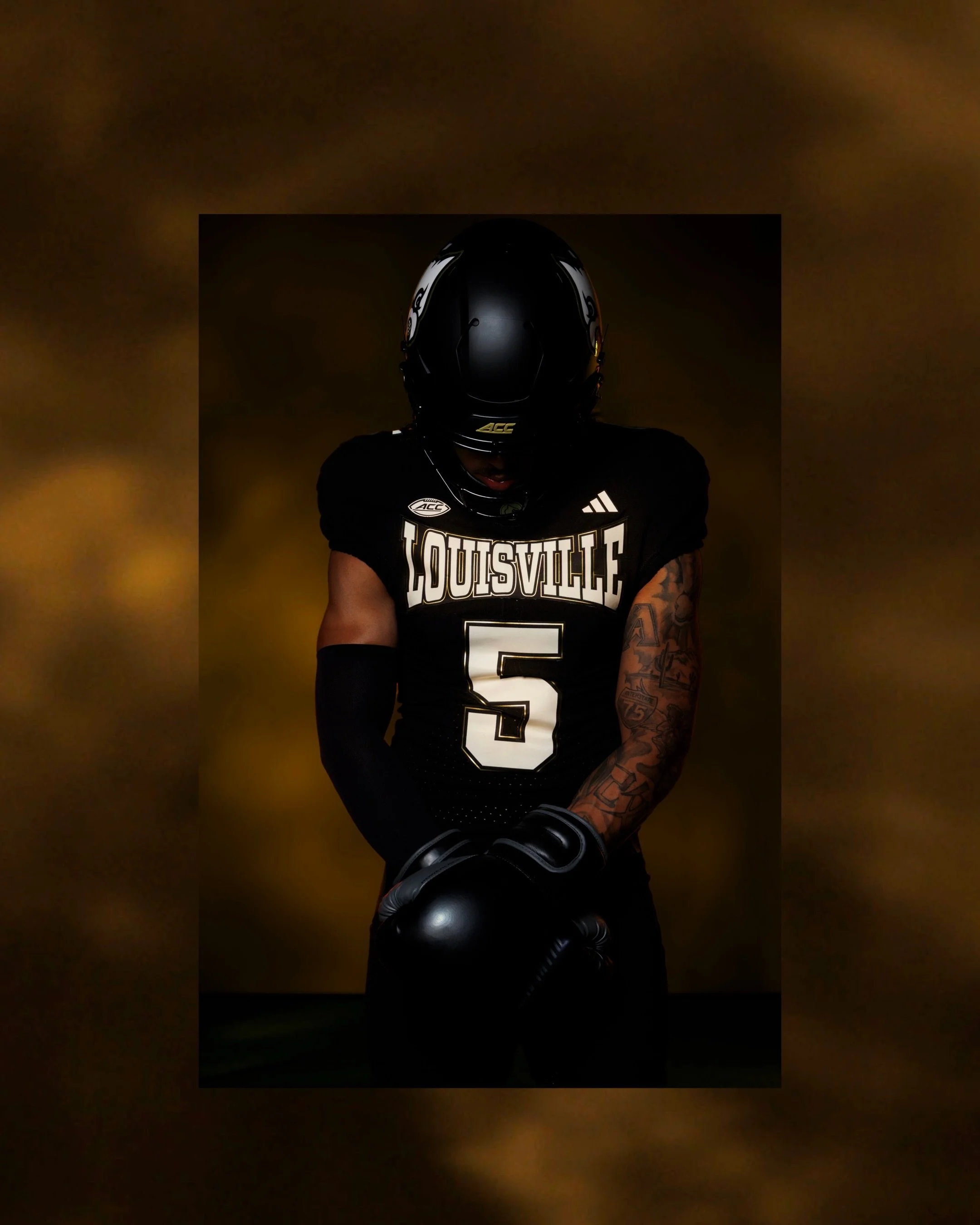
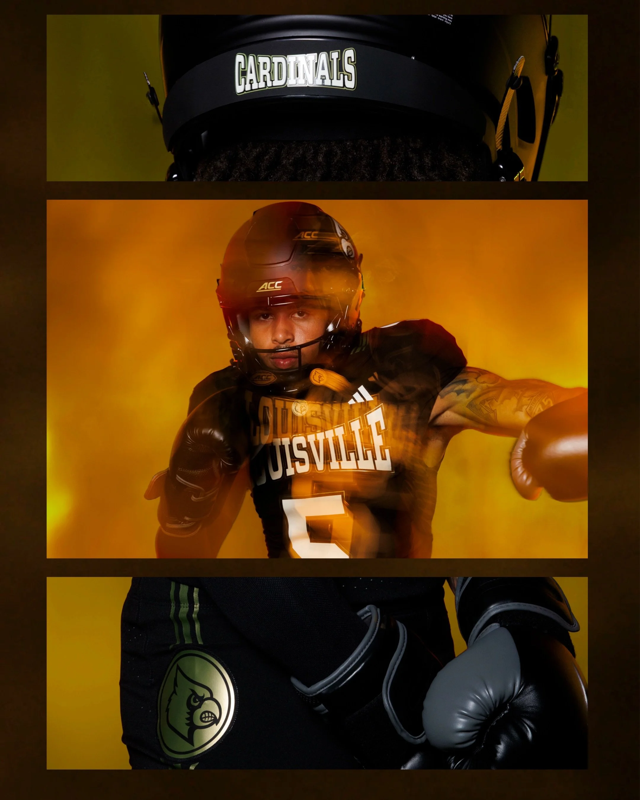
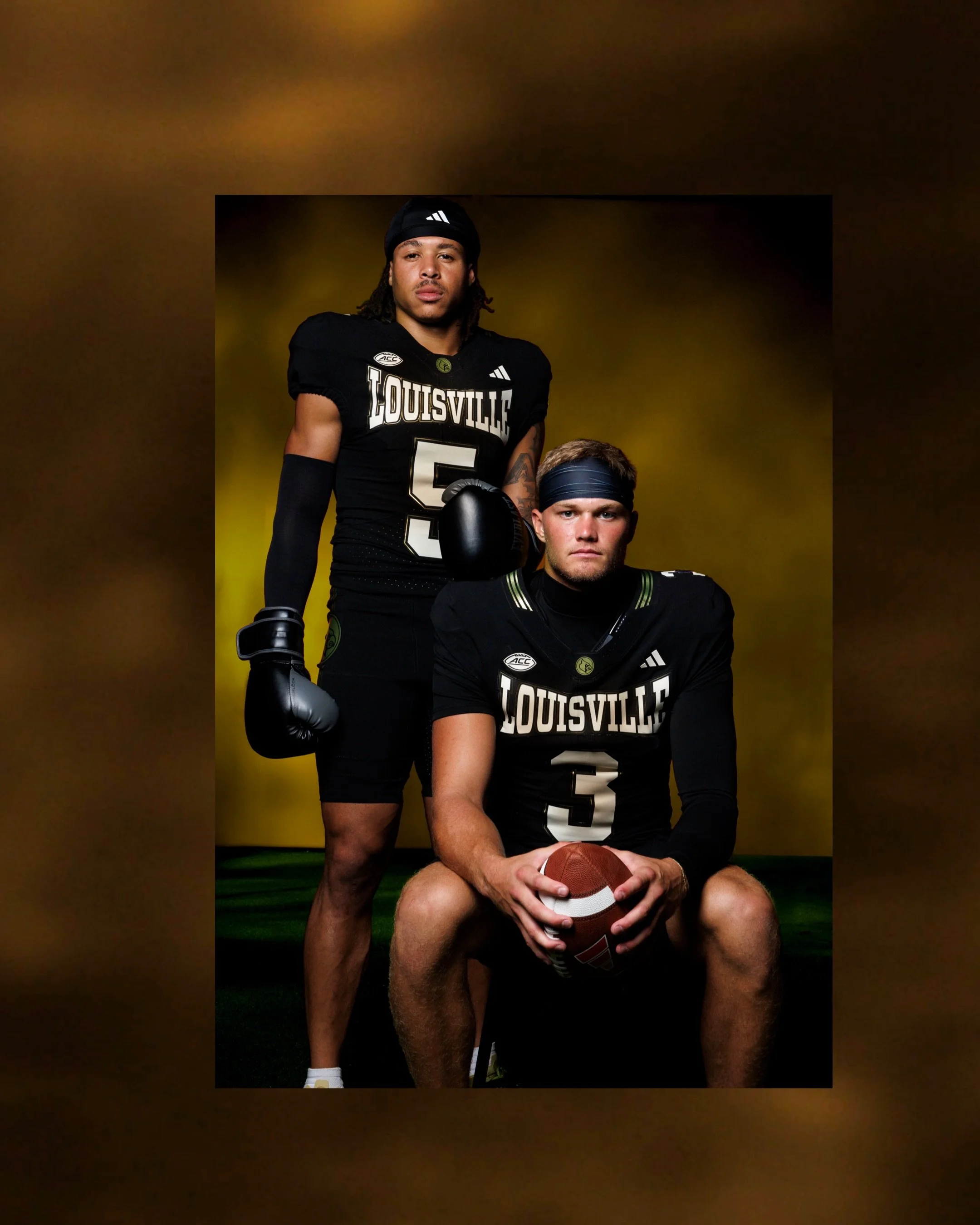
The Cardinals have unveiled their new “For The Ville” uniform, a 2026 alternate inspired by Louisville legend Muhammad Ali. The design draws heavily from the look of Ali's iconic boxing gear, giving Louisville one of its most unique football uniforms in recent years.
Ali's connection to Louisville runs deep, making him a natural source of inspiration for the Cardinals' latest alternate.
The new jerseys feature a black base with “Louisville” across the chest in white, using a typeface that closely resembles the branding associated with Everlast, the boxing brand famously connected to Ali and the sport.
The stripped-down black-and-white design gives the uniform the appearance of a classic boxing kit while translating Ali's legendary aesthetic to the football field.
The result is a look that feels distinctly different from Louisville's traditional red-and-black uniforms.
Louisville has previously honored Ali with alternate uniforms, including an all-white design during the 2019 season and a uniform inspired by Ali's famous “Rumble in the Jungle” bout against George Foreman in 2024.
The 2026 version takes a different approach, using Ali's boxing aesthetic as the foundation rather than simply recreating one of his famous fight uniforms.
The Cardinals will debut the “For The Ville” uniforms on October 31, when Louisville hosts Stanford.
SHOP Louisville gear HERE
See What Else Is New
Featured

Related Articles
Featured
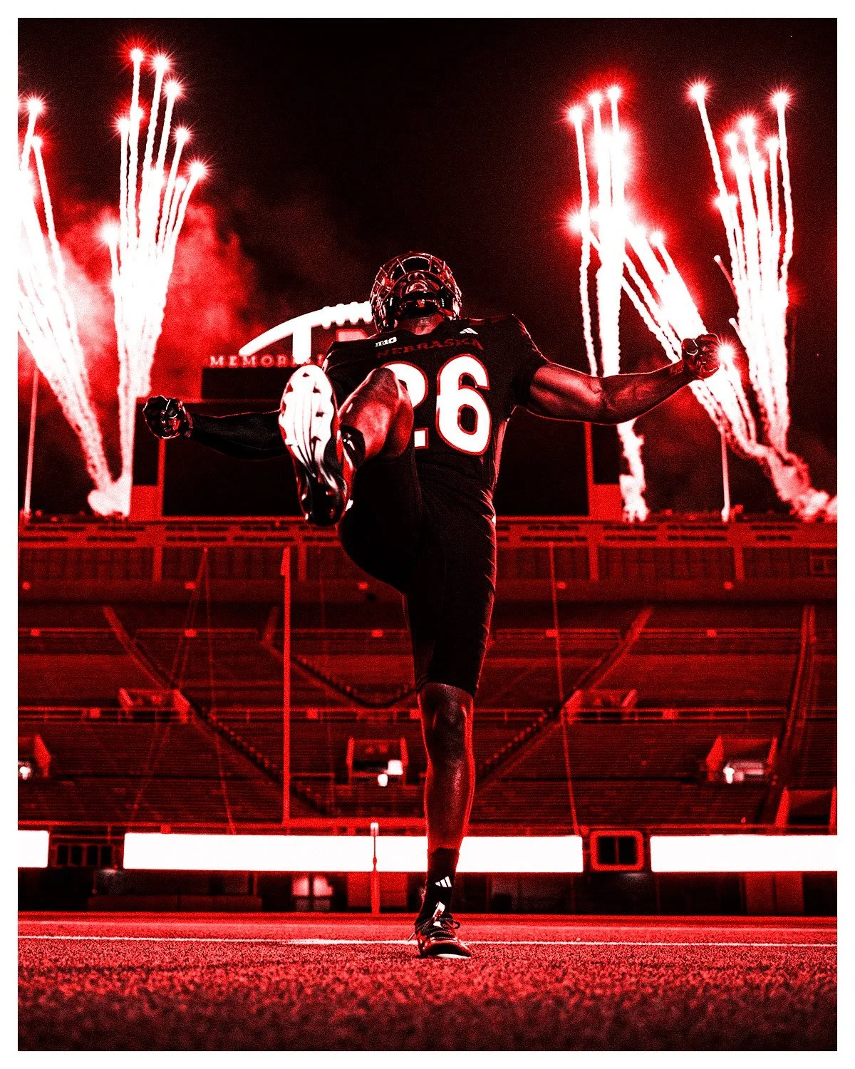
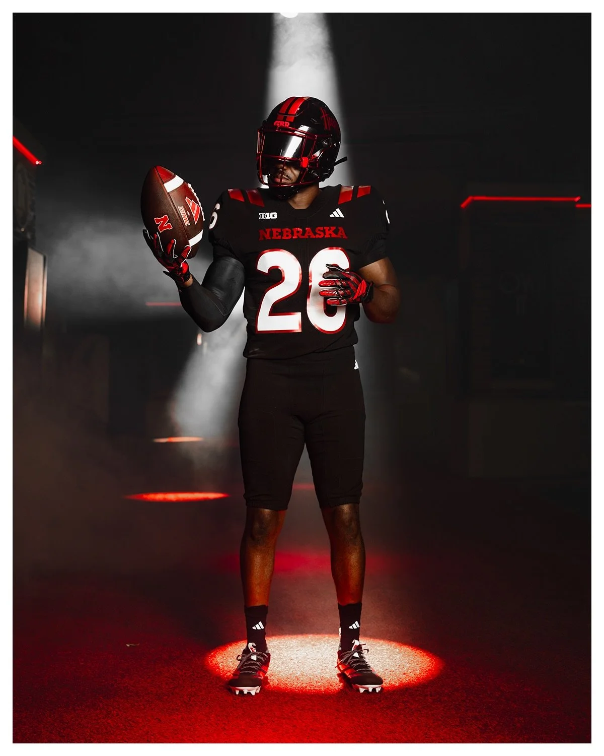
Nebraska is embracing the darkness.
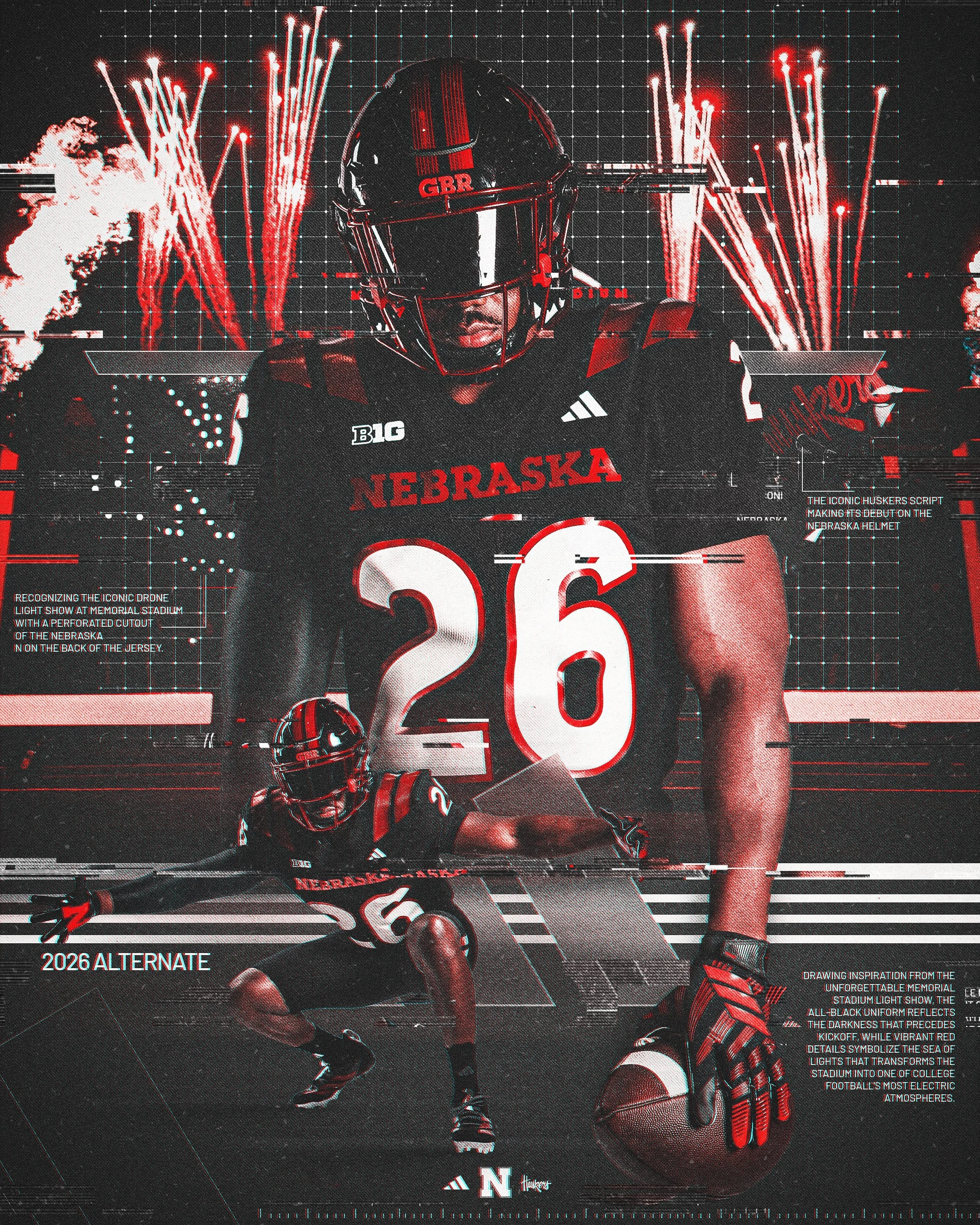
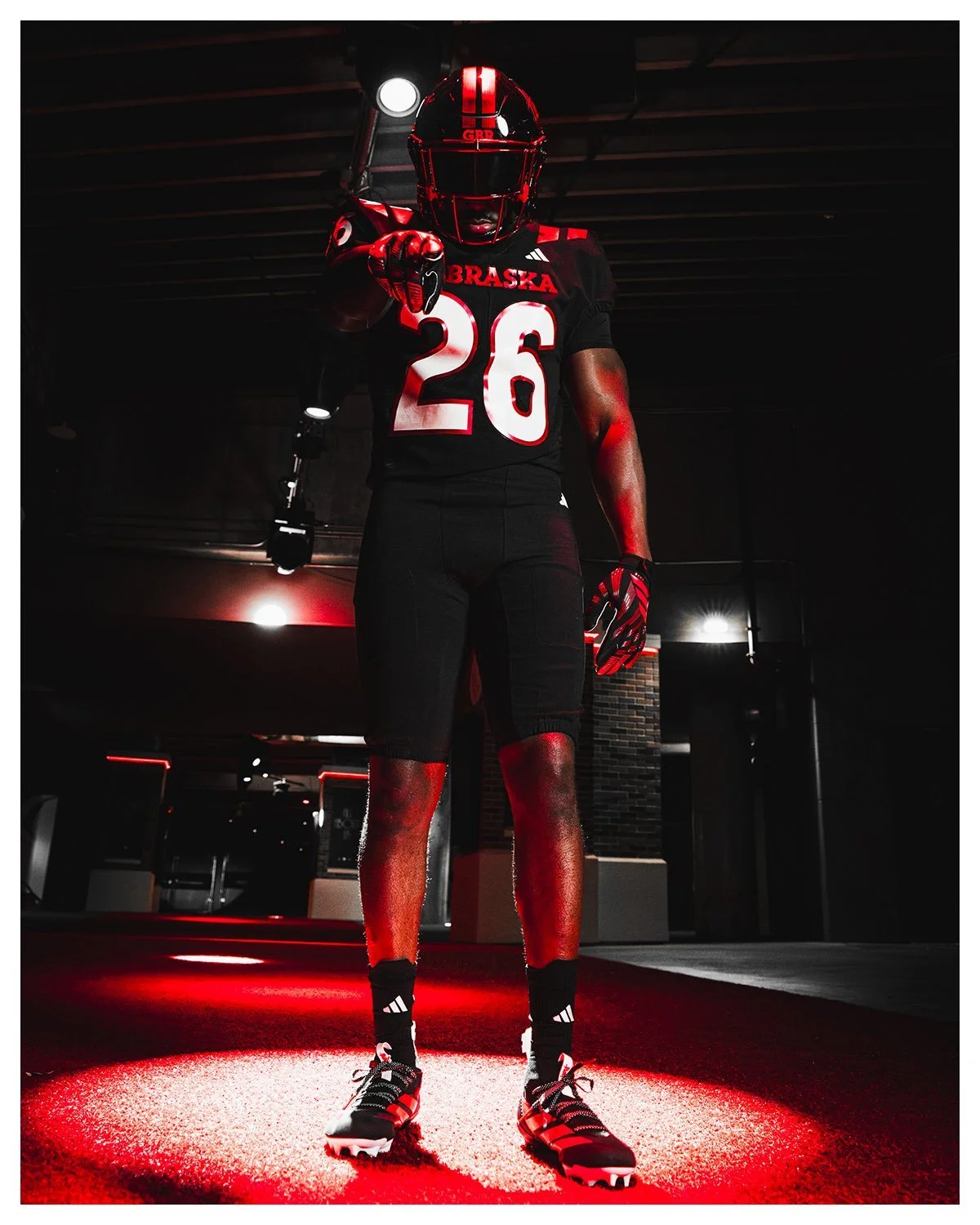
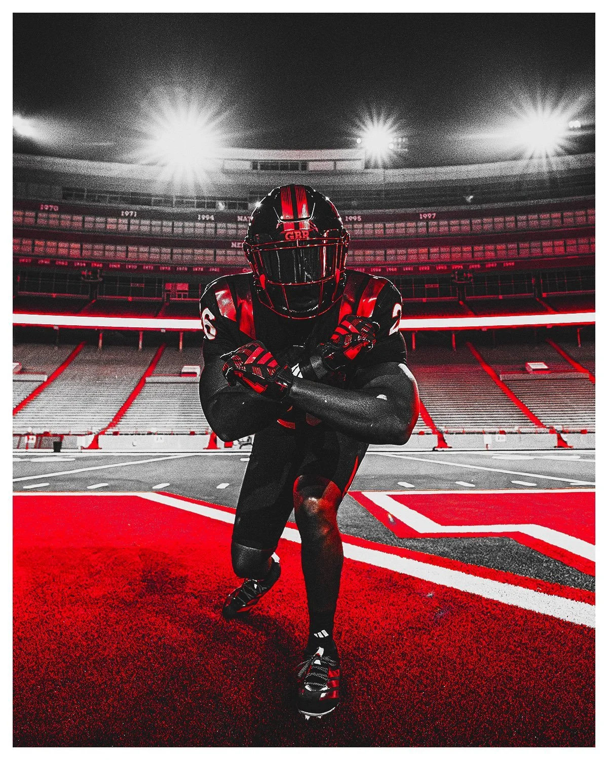
The Huskers unveiled their 2026 alternate football uniform, a bold black look inspired by the unforgettable atmosphere of a Nebraska night game inside Memorial Stadium.
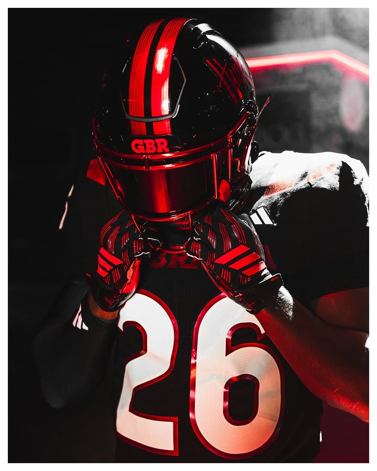
Built around the theme “Our Red Burns Brighter,” the new uniform combines Nebraska’s iconic red with a black base and metallic red details designed to capture the energy, lights and traditions that make a night in Lincoln unlike anything else in college football. The uniform starts with a black base, providing a dramatic backdrop for metallic red accents throughout the set.
The metallic red details are inspired by the glow that takes over Memorial Stadium during night games, including flames, fireworks and the sea of red in the stands.
The design also draws inspiration from some of Nebraska’s newest game-day traditions, including the synchronized light shows, the fire tower flames in the end zone and the red fireworks that light up the sky above the North Stadium scoreboard.
The result is a uniform that transforms the familiar Nebraska color palette into something much darker and more aggressive.
Nebraska packed several meaningful details into the design.
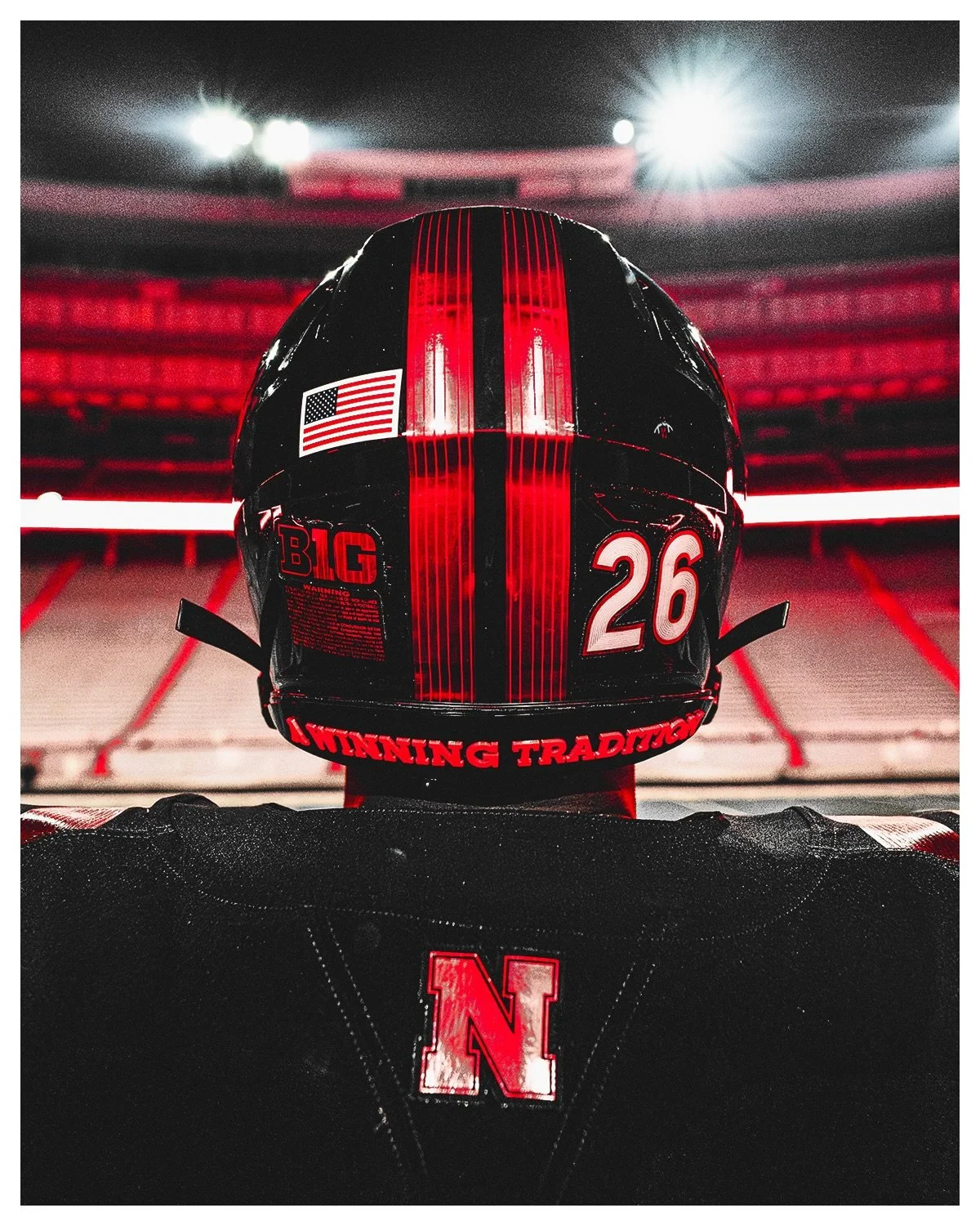
At the bottom of the jersey's back panel is a custom perforated Block “N,” inspired by the drone shows that have quickly become a signature part of Husker game days heading into the fourth quarter.
Inside the collar, “A Winning Tradition” serves as a tribute to Nebraska's remarkable history under the lights. The Huskers have won more than 81 percent of their night games at Memorial Stadium, adding another layer of meaning to the phrase.
The traditional Block “N” also appears on the back collar.
The uniform is completed by a brand-new black helmet, highlighted by the debut of the iconic Huskers script in metallic red.
The back of the helmet features an “A Winning Tradition” emblem, matching the message found inside the jersey collar.
Perhaps the most unique helmet detail can be found on top. The metallic red helmet stripe features a crop row pattern, serving as a tribute to Nebraska's agricultural heritage. It's a subtle detail that connects the modern Blackout look back to the state itself.
Nebraska will debut the new alternate uniform on Halloween, when the Huskers host Washington at Memorial Stadium for the second annual Blackout game.
With an all-black base, metallic red accents, a new helmet script and details inspired by the sights and sounds of a Nebraska night game, the Huskers have created a look that is unlike anything they've worn before.
SHOP Nebraska gear HERE
See What Else Is New
Featured
Related Articles
Featured
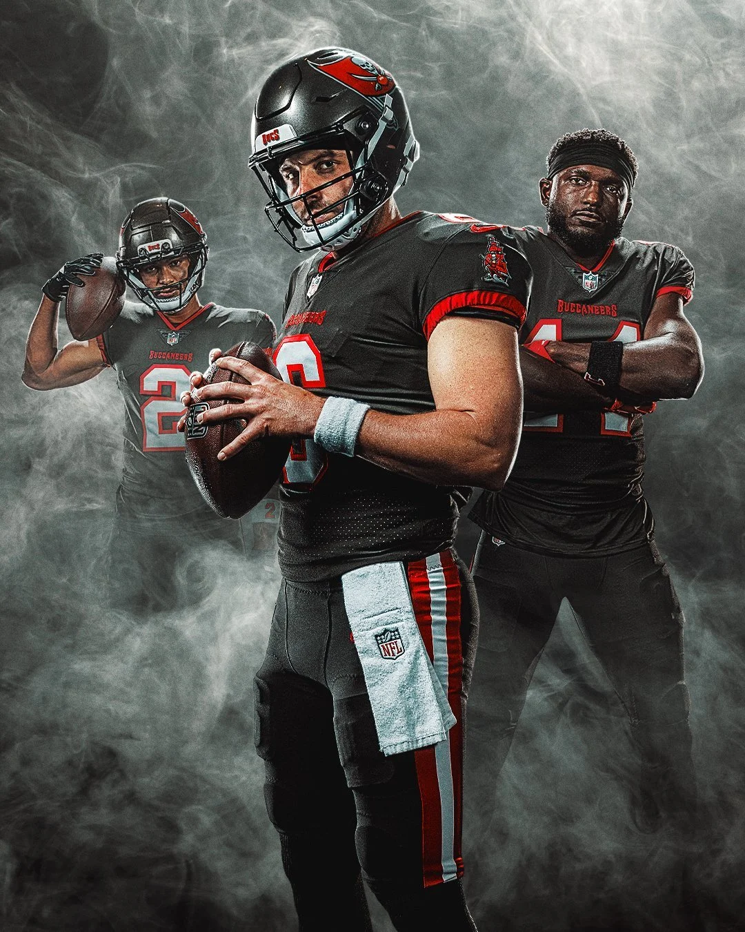
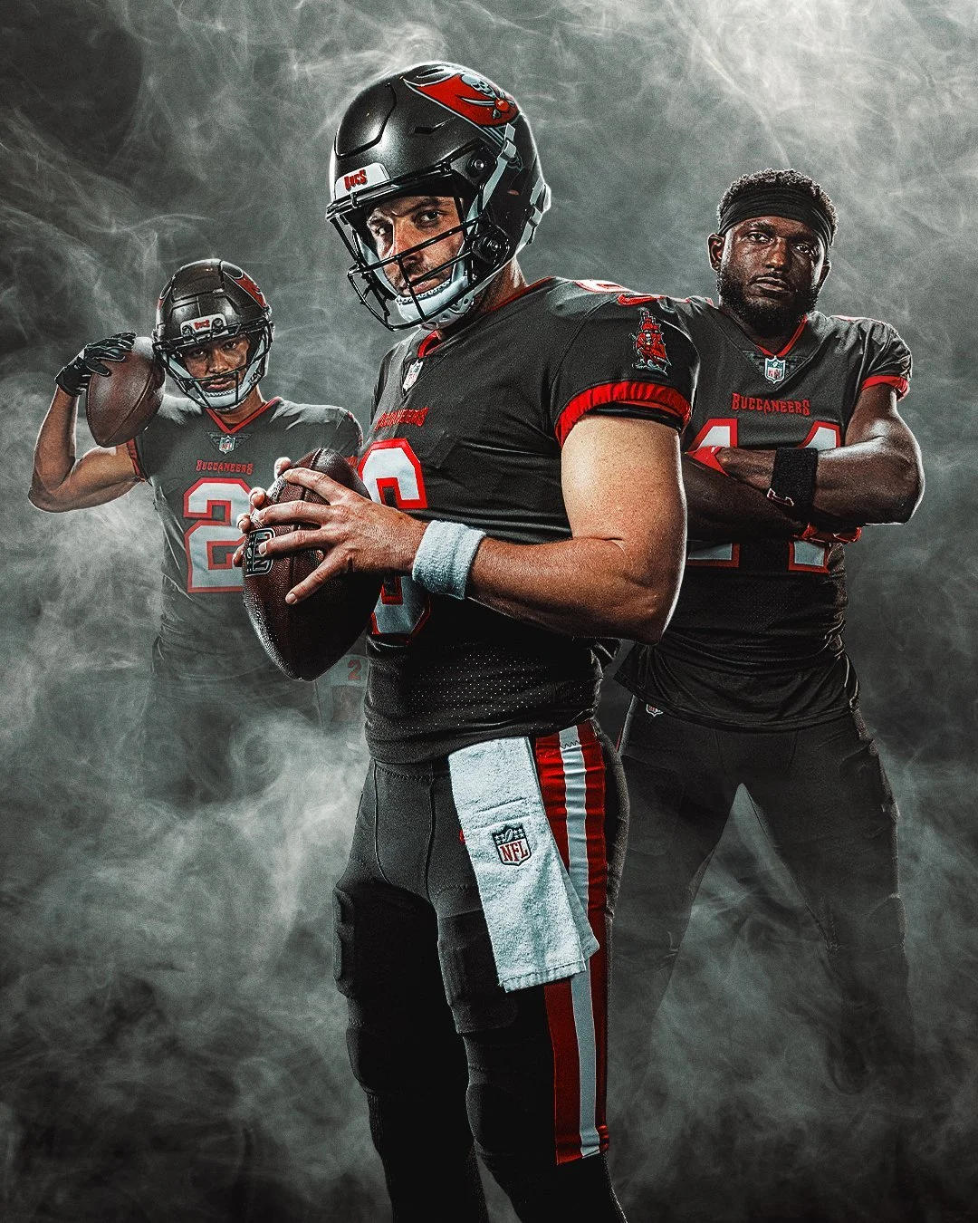
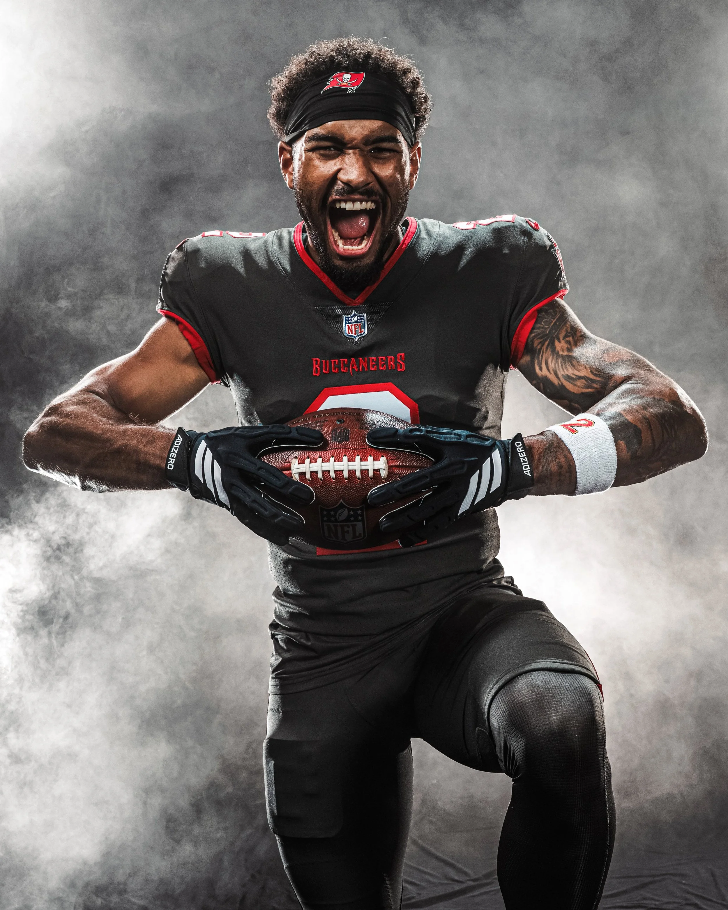
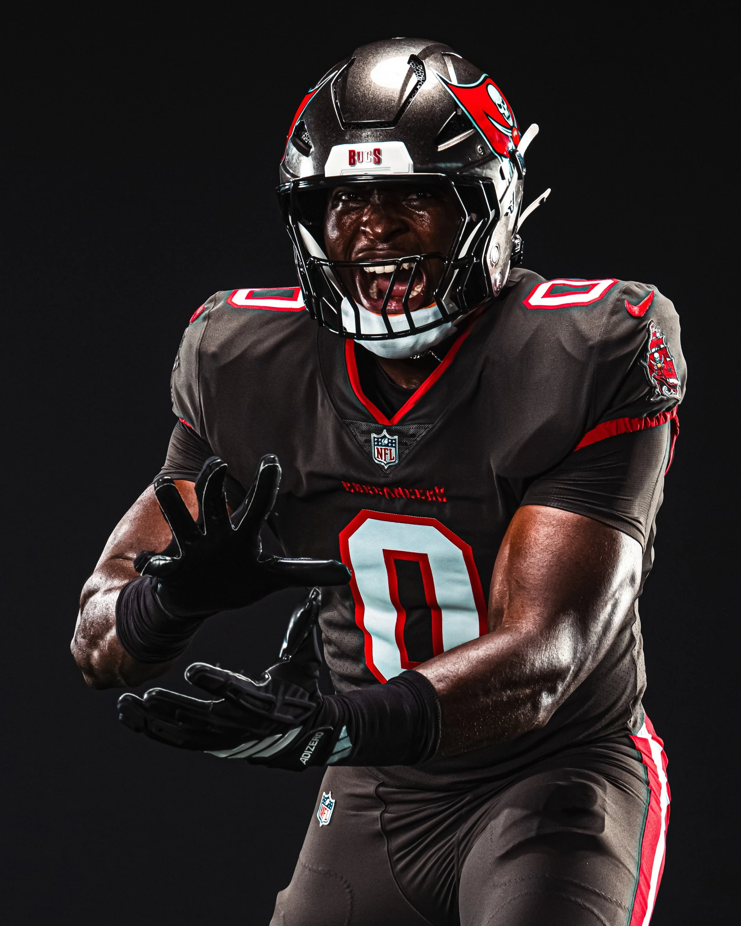
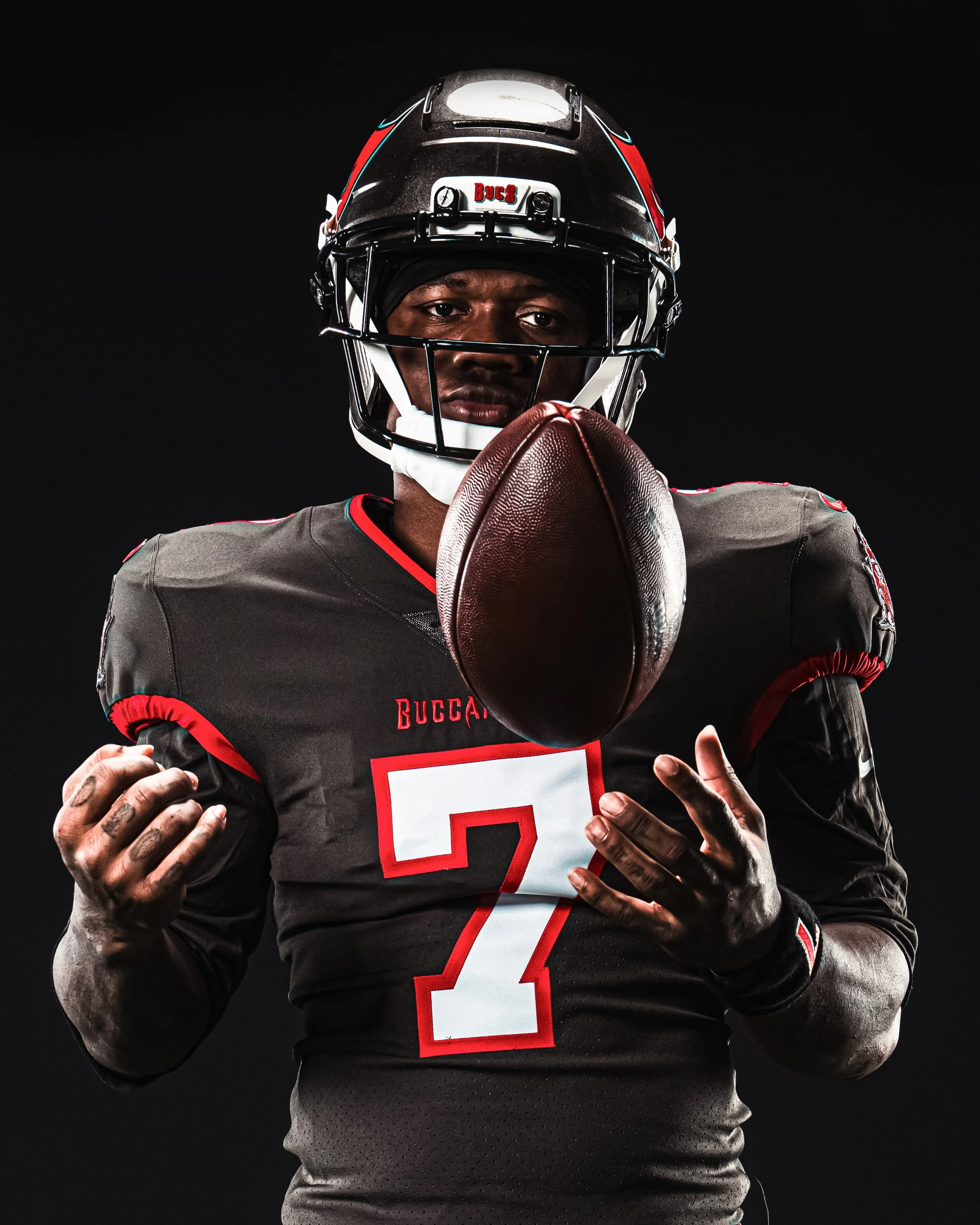
The Tampa Bay Buccaneers are bringing back one of their most distinctive looks in 2026.
Tampa Bay will don its Pewter Color Rush uniforms on Sunday, December 20, when the Buccaneers host the New Orleans Saints in an NFC South matchup at Raymond James Stadium. The game is scheduled for a 1:00 p.m. ET kickoffand will mark the first meeting between the two division rivals in 2026. The teams will meet again just two weeks later in the regular-season finale at Caesars Superdome.
The Buccaneers will wear a pewter jersey with matching pewter pants as part of their Color Rush uniform ensemble in 2026.
The head-to-toe look is finished with solid pewter socks, creating one of Tampa Bay's most monochromatic uniform combinations. Red and white striping runs along the sides of the pants, while red pirate ship logos on each shoulder and a red "Buccaneers" wordmark across the chest provide the primary contrast.
The Buccaneers will be permitted to wear the pewter uniforms three times during the 2026 regular season, making the December 20 matchup the first officially announced opportunity to see the full Color Rush combination.
The Pewter is back.
SHOP Bucs gear HERE
See What Else Is New
Featured
Related Articles
Featured
back by popular demand ⬜️🟧 pic.twitter.com/SU7ChHK1vn
— Tennessee Soccer (@Vol_Soccer) August 10, 2026
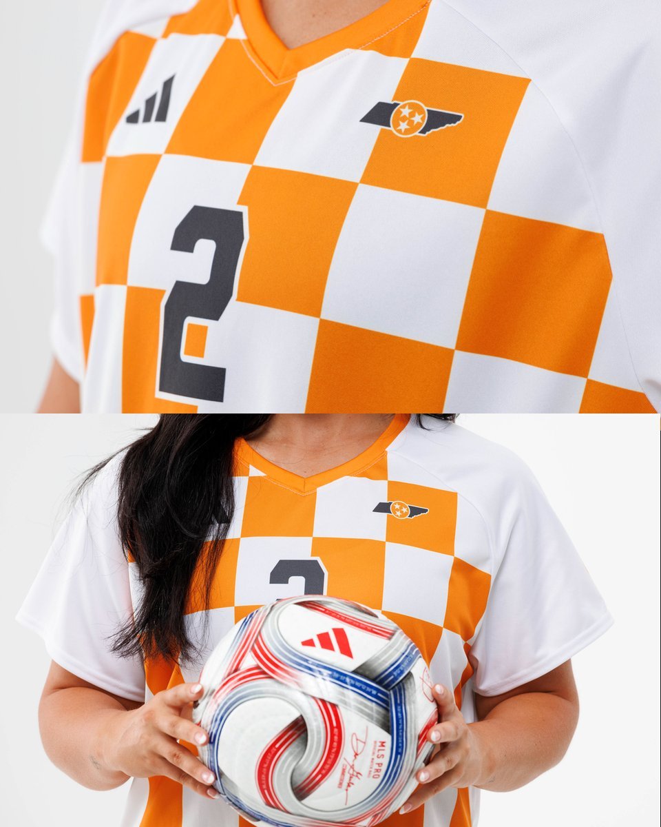
Tennessee Soccer is bringing one of the Volunteers’ most recognizable visual traditions onto the pitch in a big way.
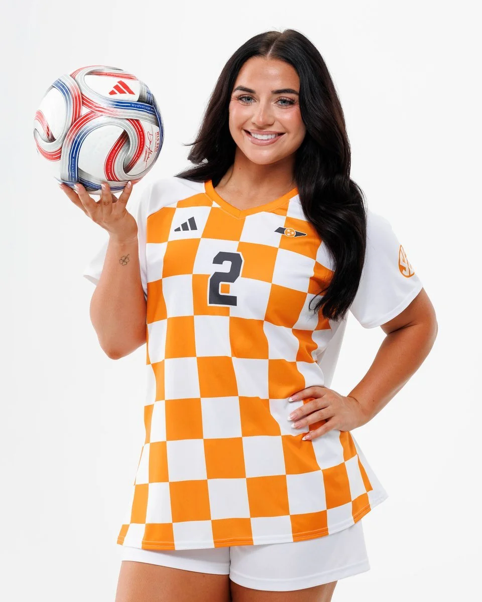
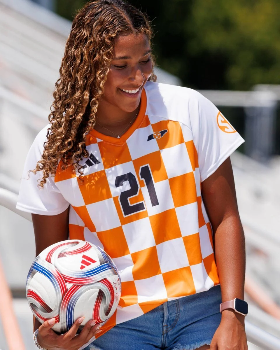
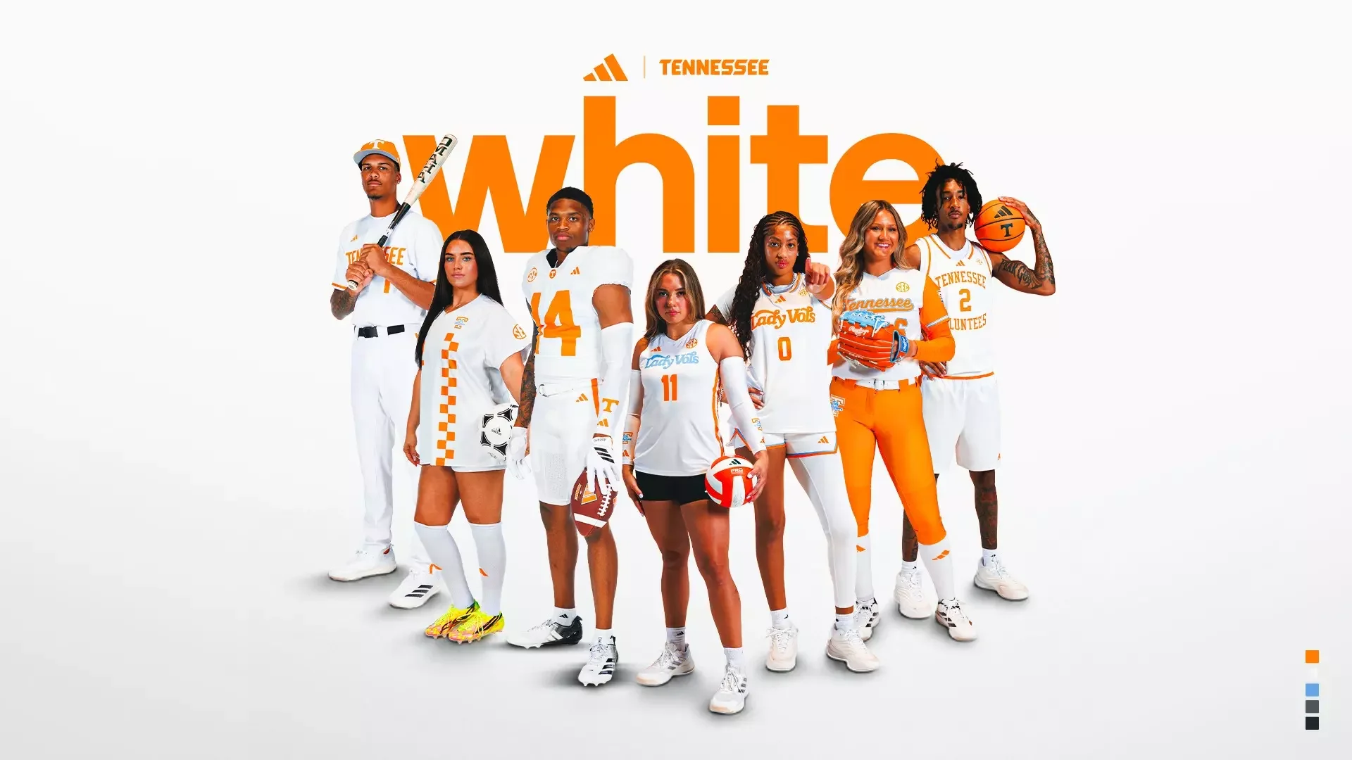
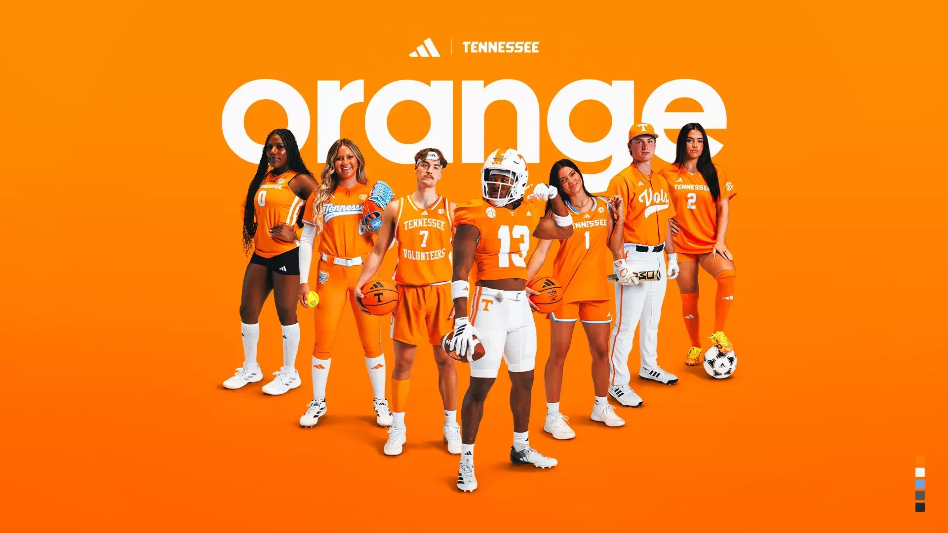
As part of Tennessee Athletics’ new partnership with adidas, the Lady Vols have unveiled a bold new checkered soccer kit that puts the iconic Tennessee Orange front and center. The new look is one of the more distinctive designs in Tennessee’s new uniform collection, combining the school’s traditional colors with a full checkerboard pattern across the jersey.
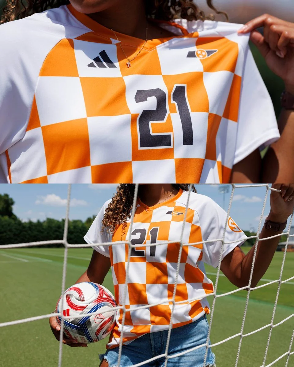
The jersey features a white base covered with an oversized Tennessee Orange checkerboard pattern, creating a look that immediately stands out on the field.
Rather than using the checkerboard as a small accent, Tennessee makes it the centerpiece of the design. The pattern covers the front of the jersey while the sleeves remain primarily white, giving the kit some balance and keeping the design from becoming too overwhelming.
The orange V-neck collar ties the look together, while adidas' three-stripe logo sits on the upper chest opposite Tennessee's soccer crest.
The player number is finished in a bold dark gray, creating strong contrast against the orange-and-white pattern.
The checkerboard isn't new to Tennessee Athletics. It has long been associated with the Volunteers and has appeared throughout the university's visual identity, particularly in football and other Tennessee programs.
For soccer, however, the new adidas design takes that familiar pattern and makes it the defining element of the kit. Tennessee's previous soccer uniforms have incorporated checkerboard elements, but the new design pushes the concept much further.
Tennessee has already introduced a number of new adidas uniforms during its transition to the brand, but the women's soccer kit might be one of the most visually interesting.
The checkerboard gives the Lady Vols a strong identity on the field, while the restrained use of the pattern on the sleeves and shorts keeps the jersey from feeling too busy.
It's bold, it's unmistakably Tennessee, and it's exactly the kind of uniform that gets noticed.
SHOP Tennessee GEAR HERE
See What Else Is New
Featured
Related Articles
Featured
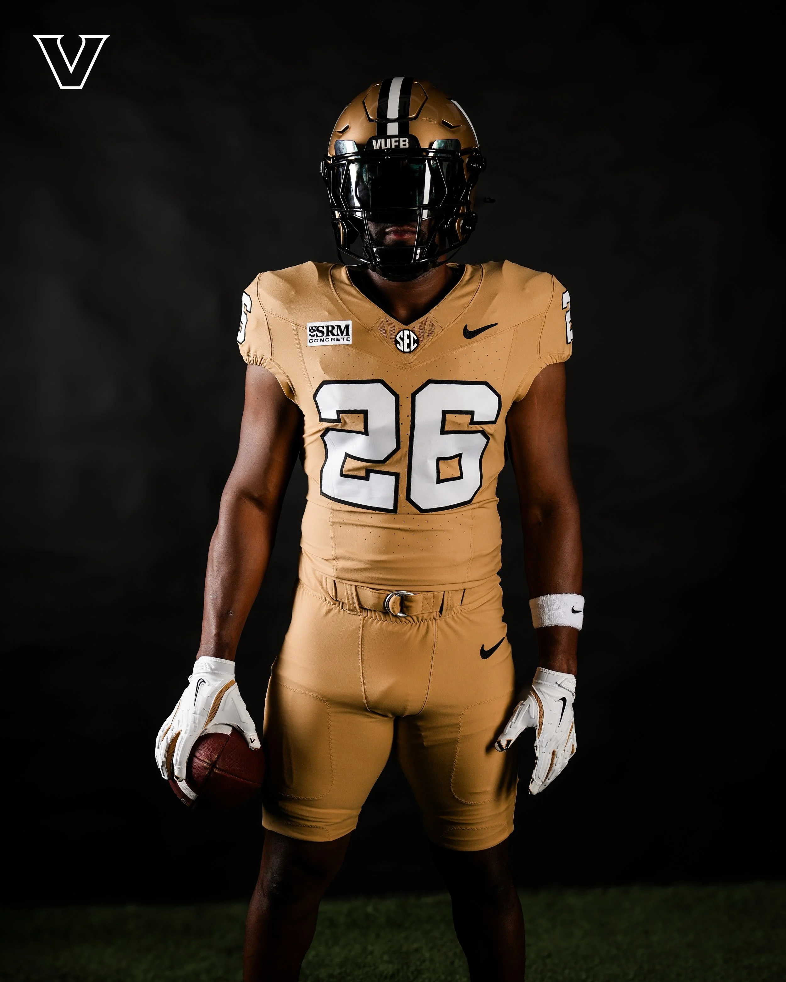
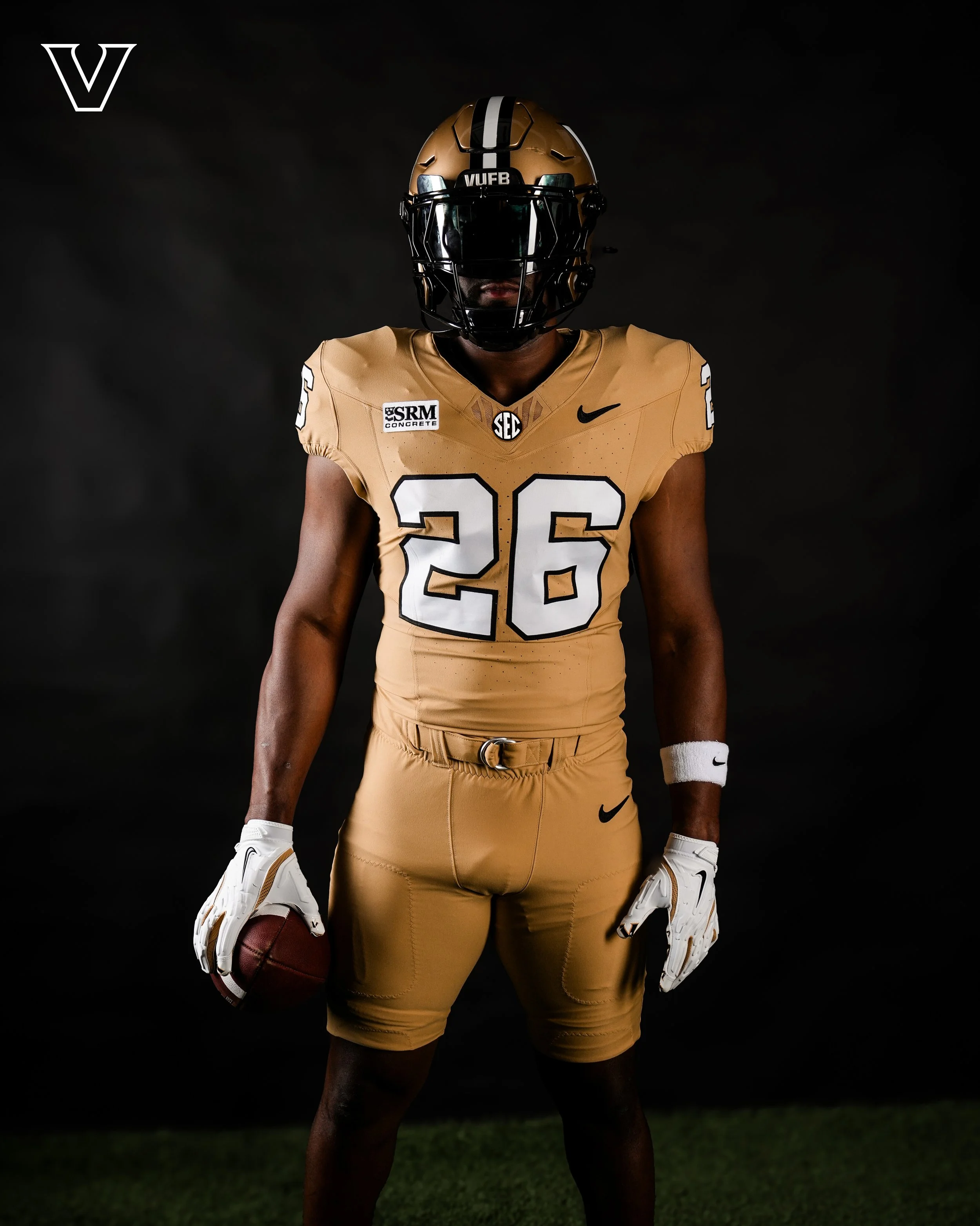
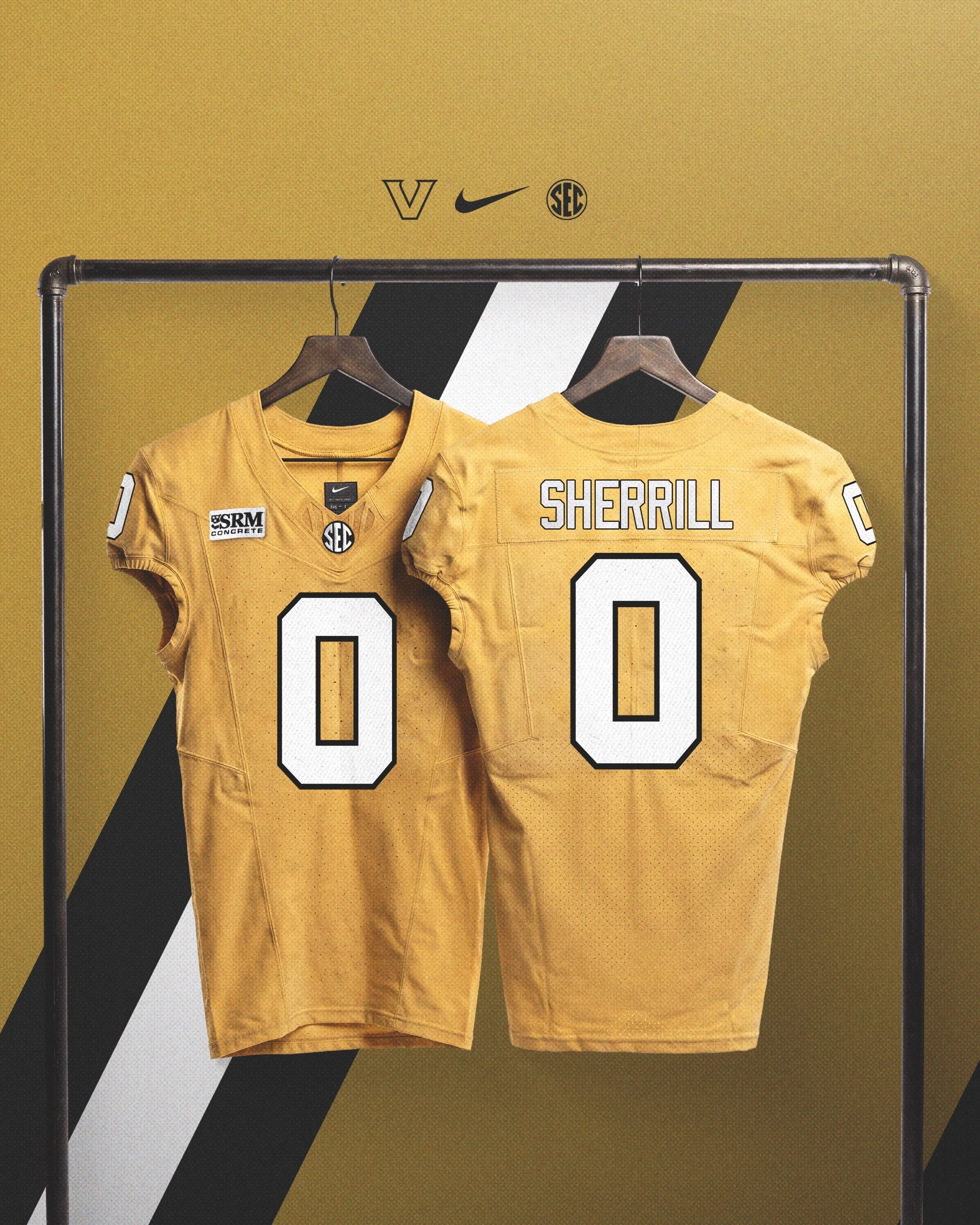
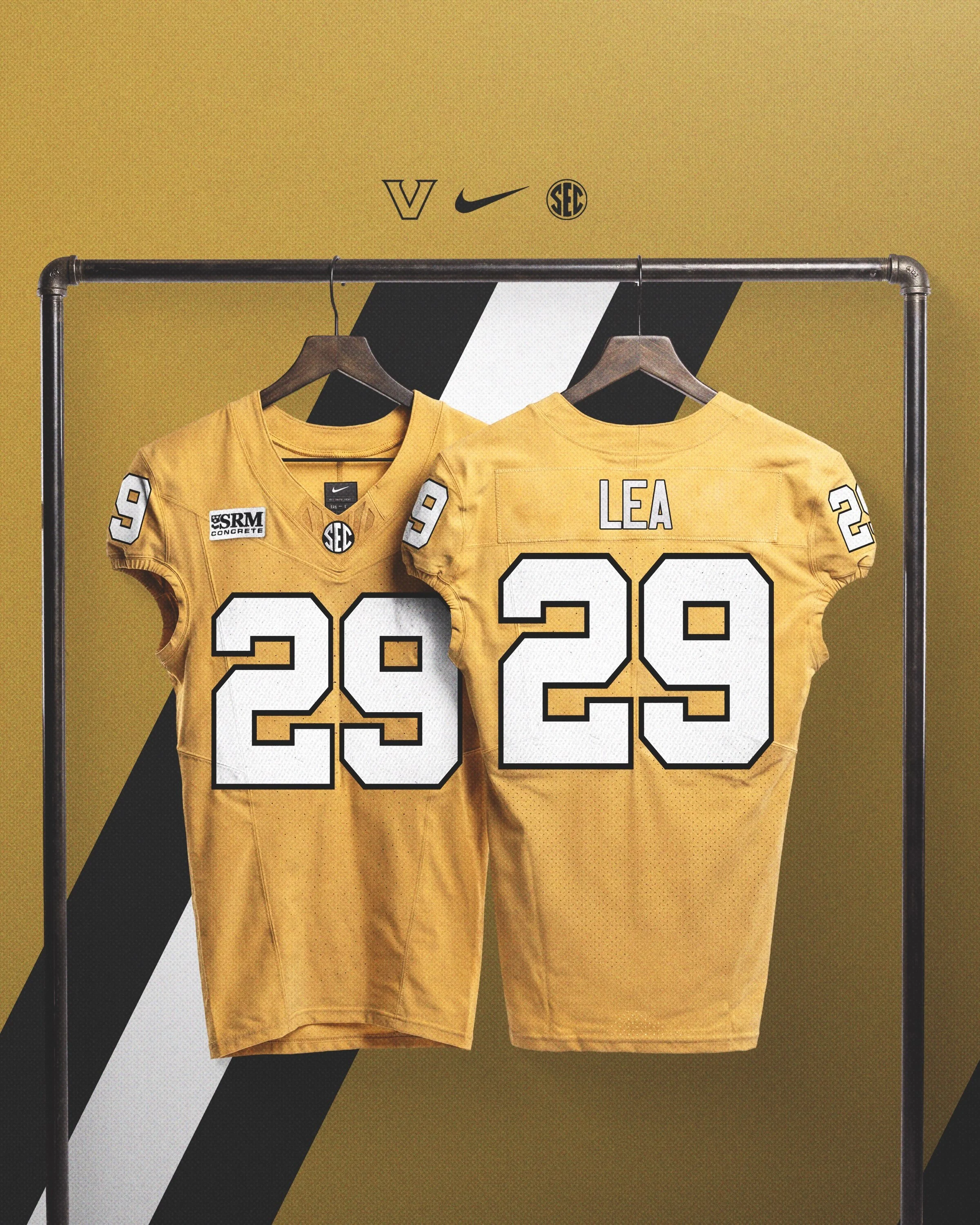
The Commodores are bringing back a fan-favorite look. Following the first day of preseason practice, Vanderbilt Football unveiled new gold jerseys that will be worn during the 2026 season, giving fans their first look at the return of one of the program's most recognizable uniform combinations.
The new jerseys feature a gold base with white numbers outlined in black, paired with matching gold pants and Vanderbilt's traditional gold helmet. The look creates a true all-gold uniform combination while maintaining the clean, classic aesthetic the Commodores have leaned into under head coach Clark Lea.
Although Vanderbilt has experimented with all-black and all-white uniforms in recent seasons, gold jerseys have become a rarity in the program's modern uniform rotation. the Commodores last took the field in gold jerseys during the 2020 season, making this the first return of the look in six years.
The gold jersey also reconnects Vanderbilt with one of its most traditional football identities. Throughout much of the program's history, the Commodores regularly mixed gold jerseys into their uniform rotation before shifting primarily to black at home and white on the road. The return adds another option to a wardrobe that has expanded in recent years while still staying true to Vanderbilt's black-and-gold color palette.
What do you think of the return of Vanderbilt's gold jerseys? Let us know where they rank among the SEC's best uniform combinations.
SHOP Vanderbilt gear HERE
See What Else Is New
Featured
Related Articles
Featured
THE VOTES ARE IN.
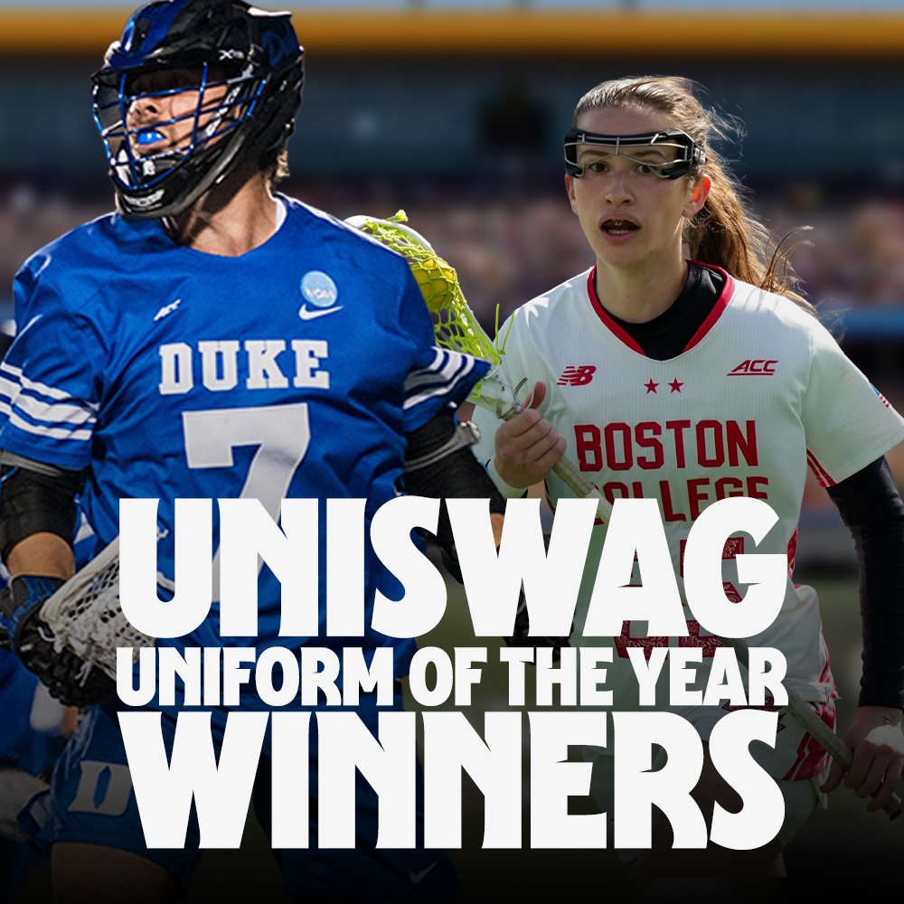
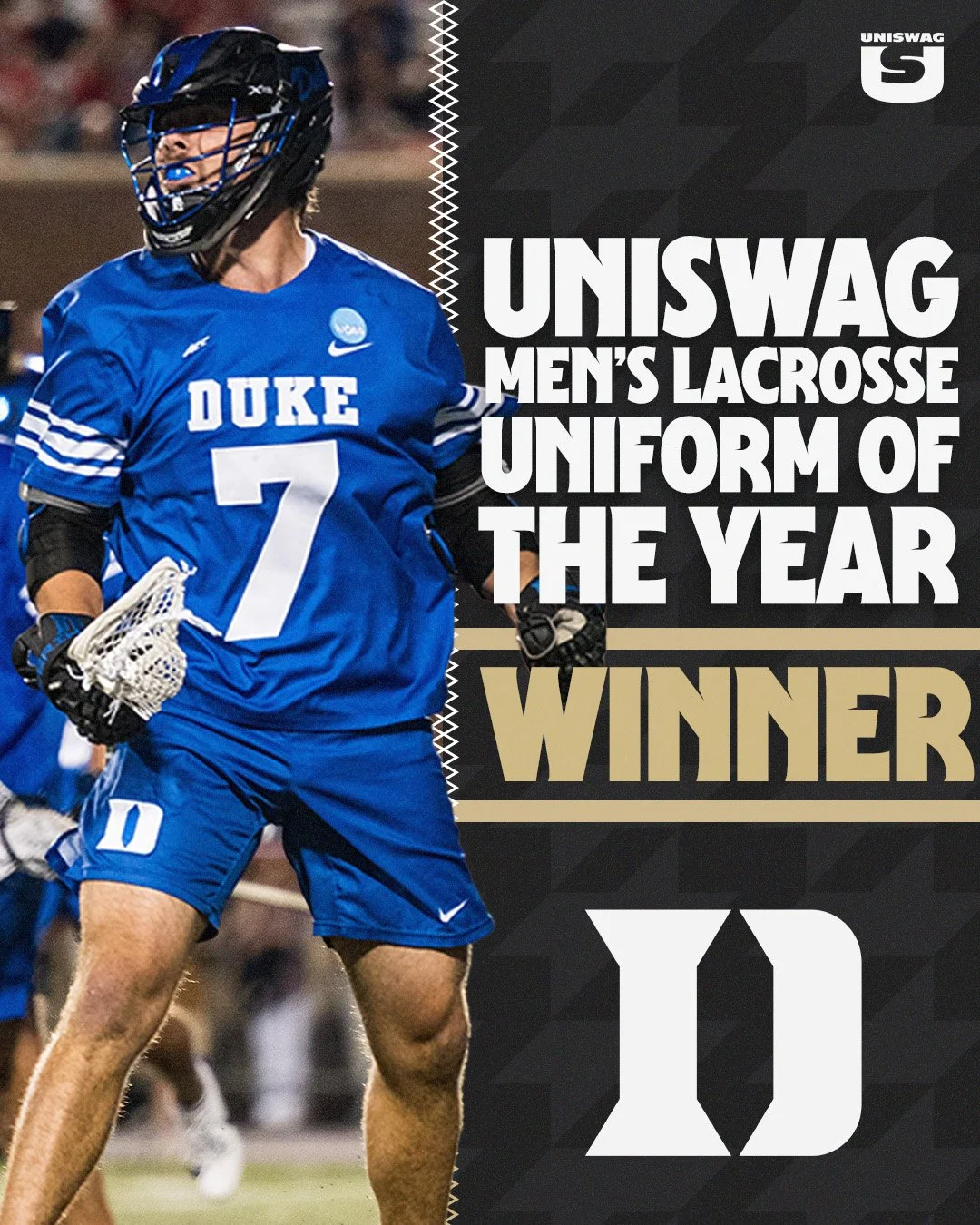
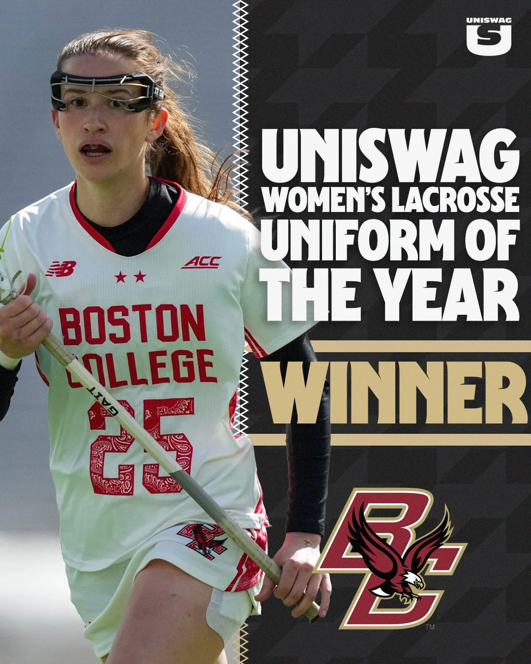
After thousands of fan votes, Duke Men's Lacrosse and Boston College Women's Lacrosse have officially been crowned the winners of the 2026 UNISWAG Lacrosse Uniform of the Year Awards.
Both programs emerged from a talented field of contenders, showcasing two of the most iconic looks in college lacrosse. From timeless tradition to modern execution, these uniforms captured the attention of fans throughout the season.
Boston College Eagles – Women's Lacrosse Uniform of the Year
Boston College captures the 2026 UNISWAG Women's Lacrosse Uniform of the Year award with its powerful Red Bandana uniform. Inspired by the legacy of alumnus Welles Crowther, the special edition design honors courage, sacrifice, and service while incorporating striking red bandana graphics throughout the numerals and uniform details. More than just a uniform, it serves as one of the most meaningful tributes in college athletics and resonated with fans across the country.
Duke Blue Devils – Men's Lacrosse Uniform of the Year
On the men's side, Duke claims the 2026 UNISWAG Men's Lacrosse Uniform of the Year award. The Blue Devils' royal blue look stood out with its timeless design, bold "DUKE" wordmark, and top with a black helmet, proving that tradition never goes out of style.
The UNISWAG Uniform of the Year Awards are decided entirely by the fans, making these honors a true reflection of the uniforms that resonated most across the college lacrosse landscape during the 2026 season.
Congratulations to the Boston College Women's Lacrosse program and the Duke Men's Lacrosse program on earning the title of 2026 UNISWAG Lacrosse Uniform of the Year.
SHOP LACROSSE GEAR HERE
See What Else Is New
Featured
Related Articles
Featured
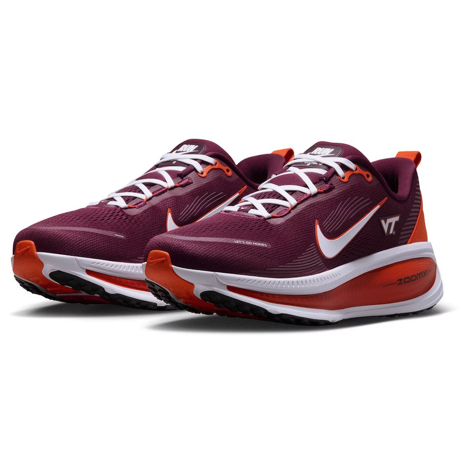
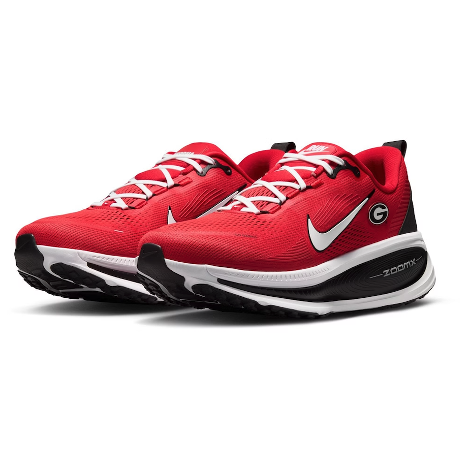
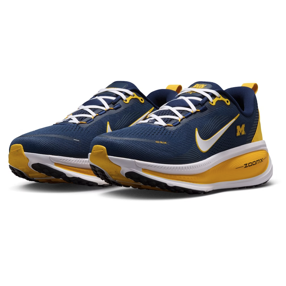
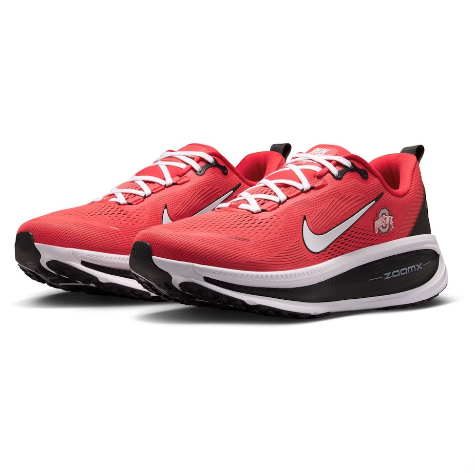
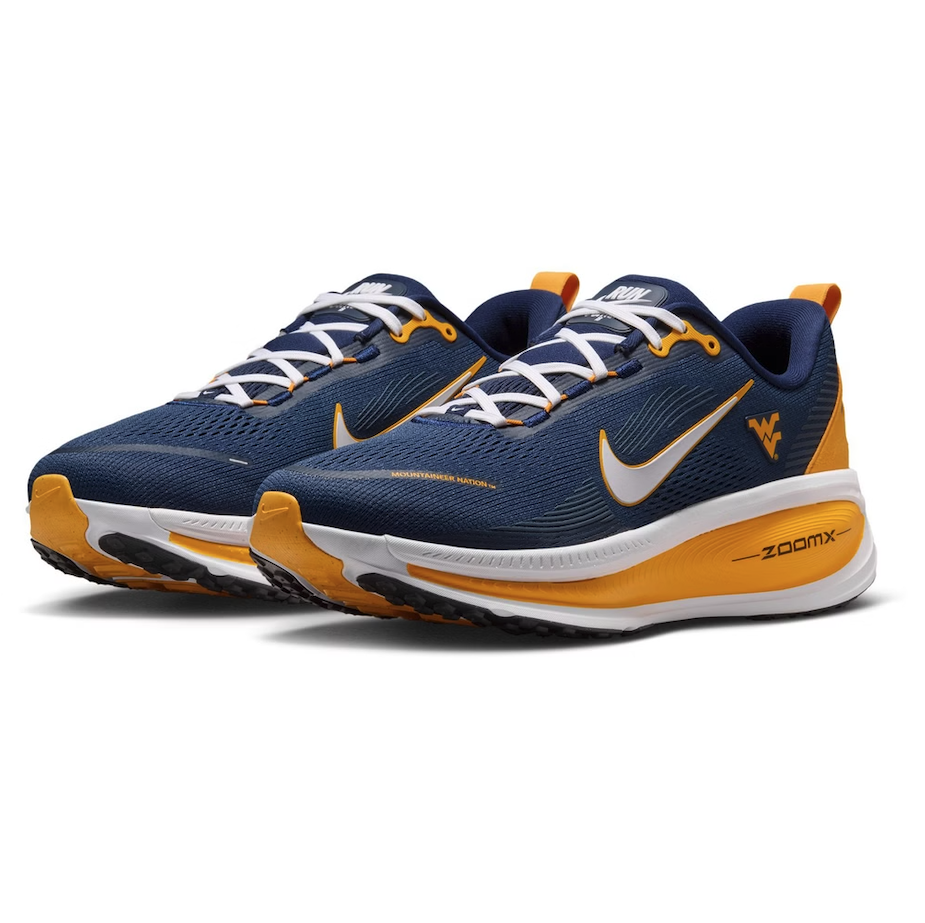
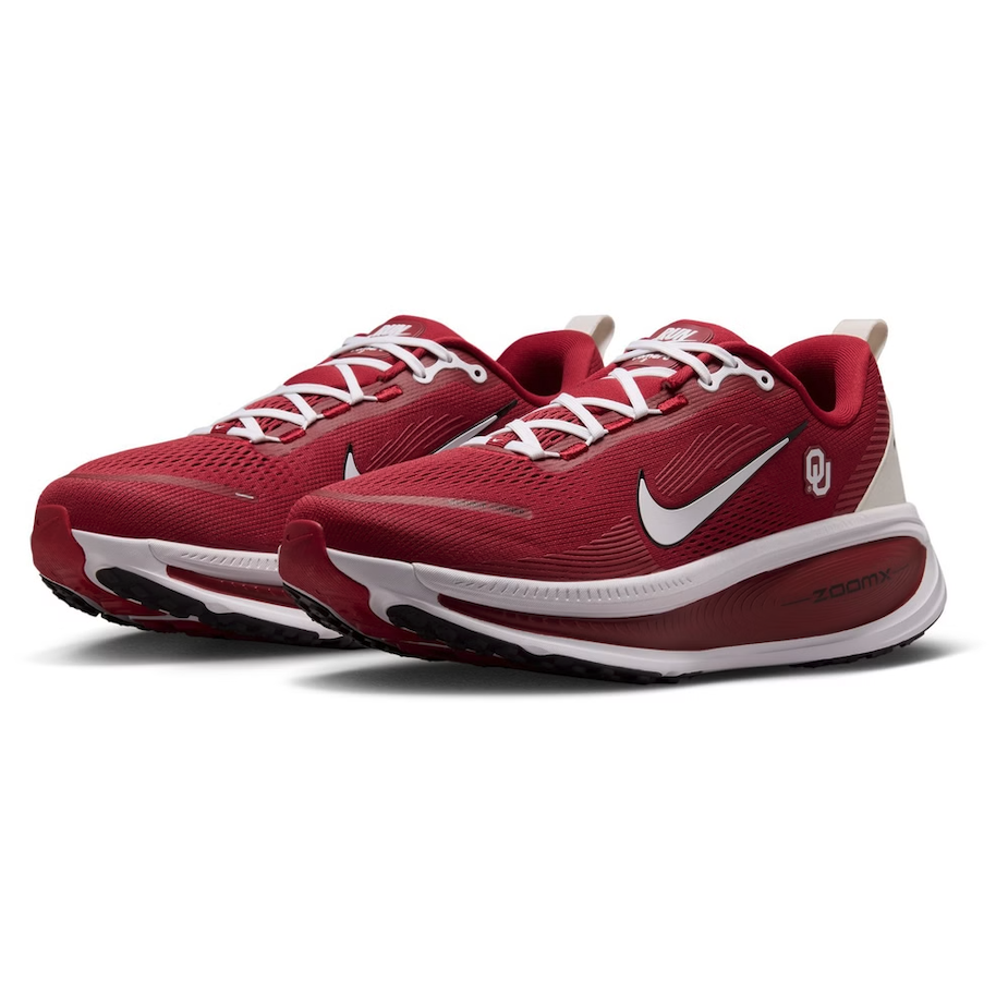
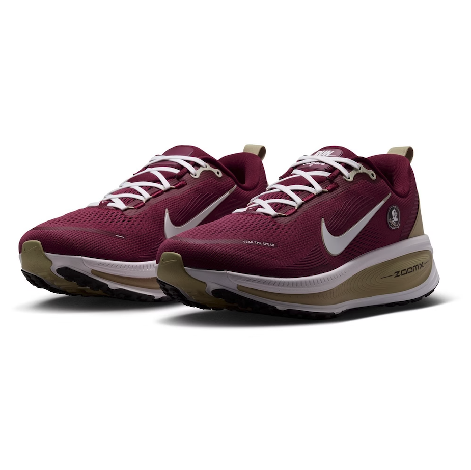
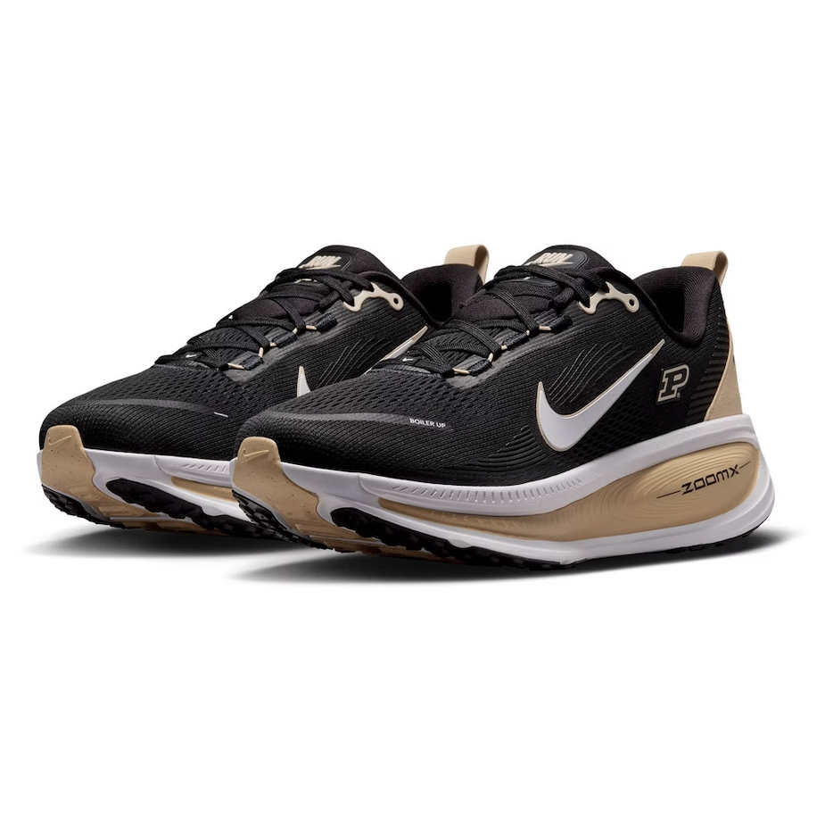
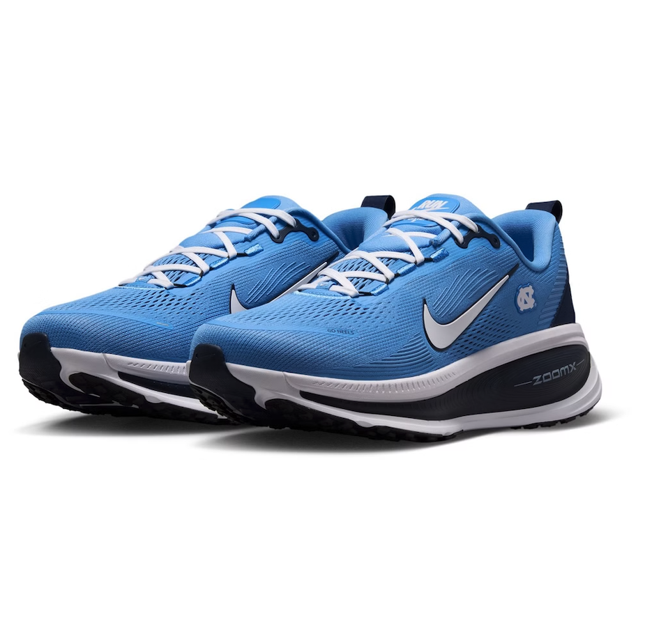
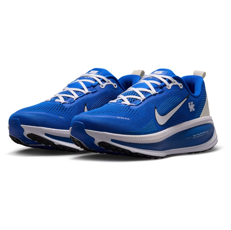
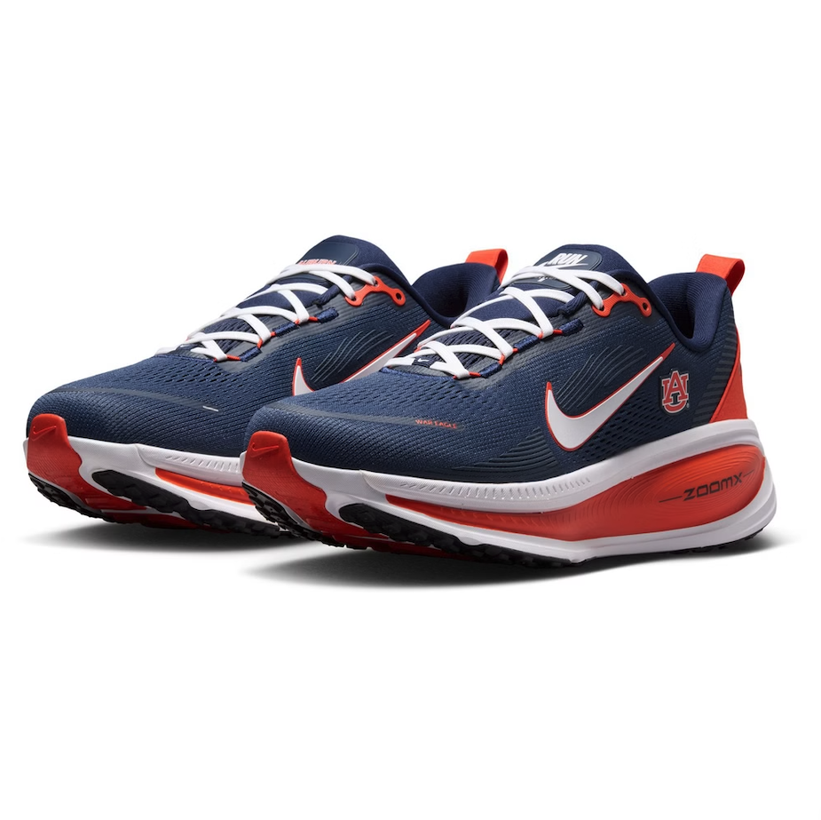
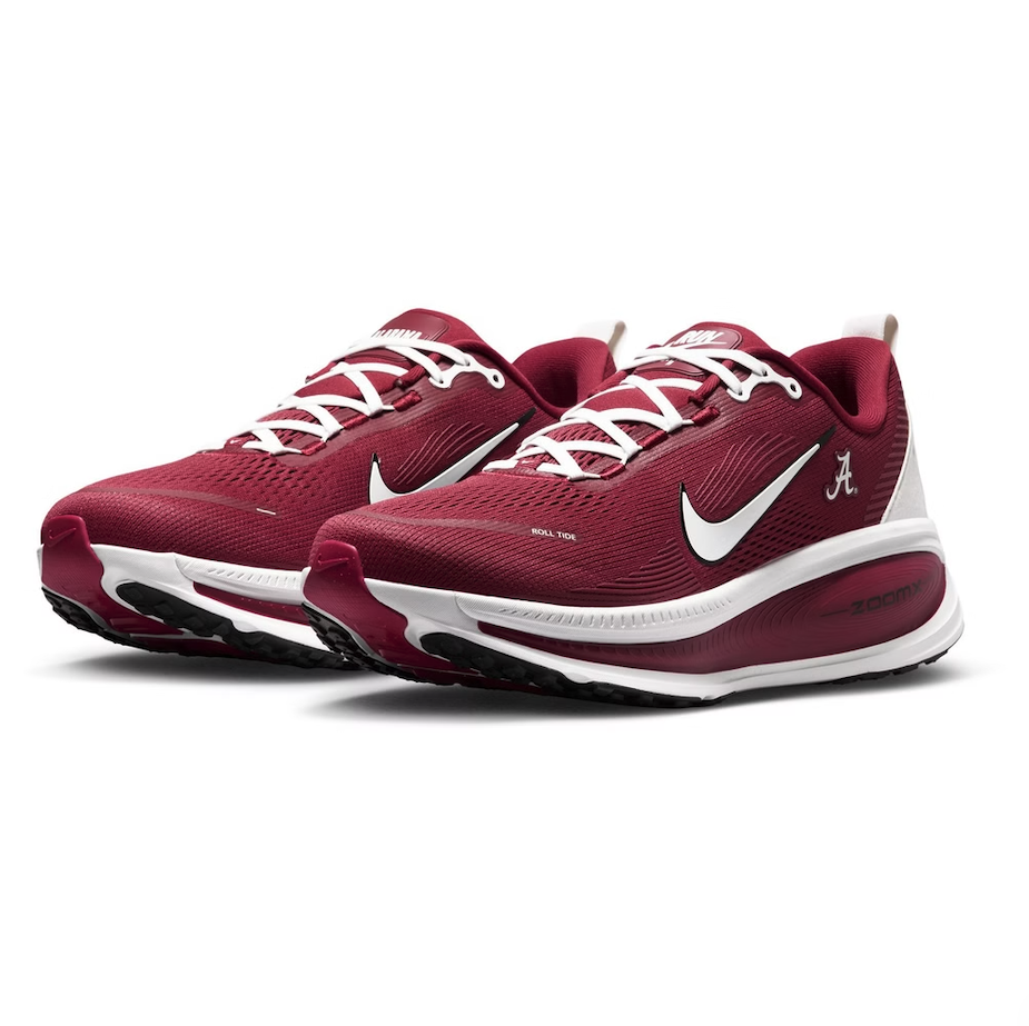
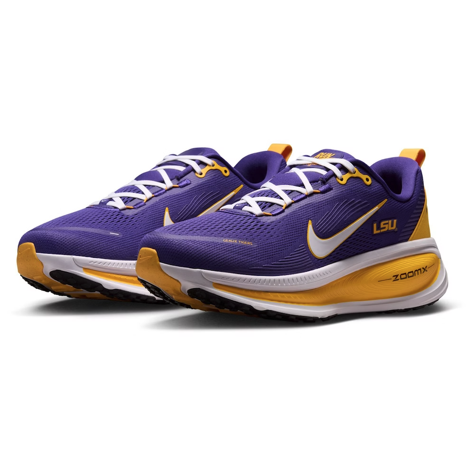
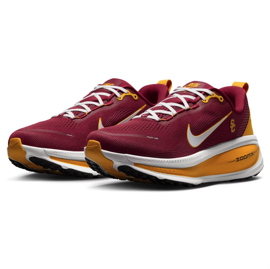
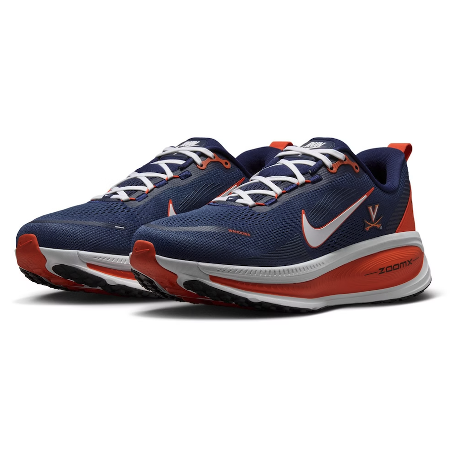
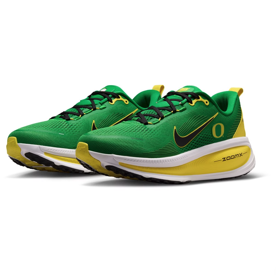
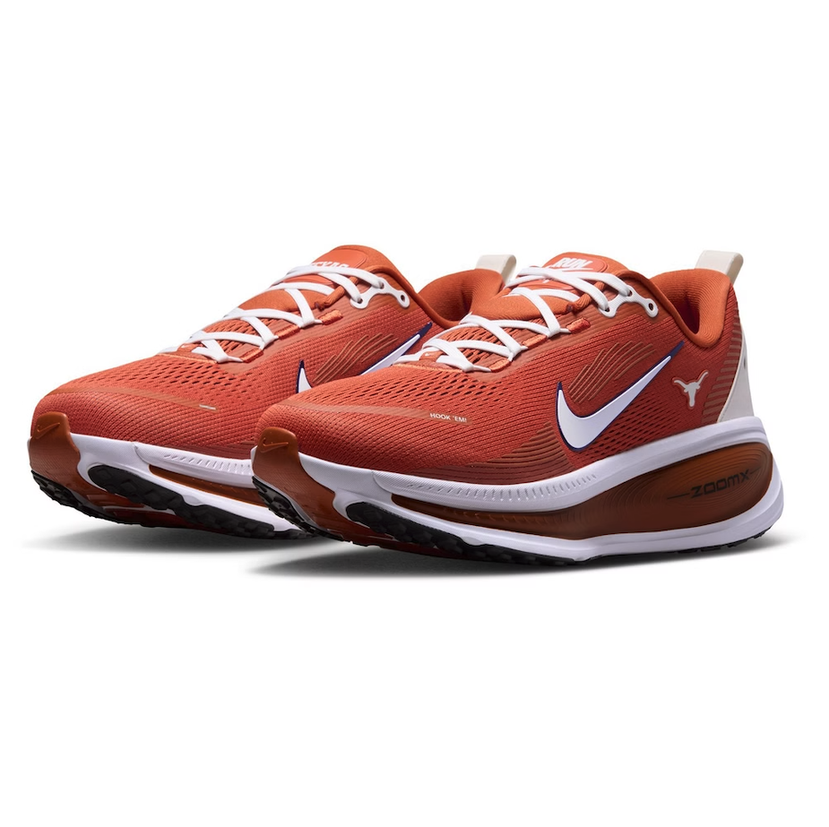
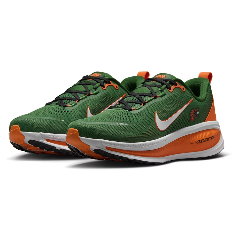
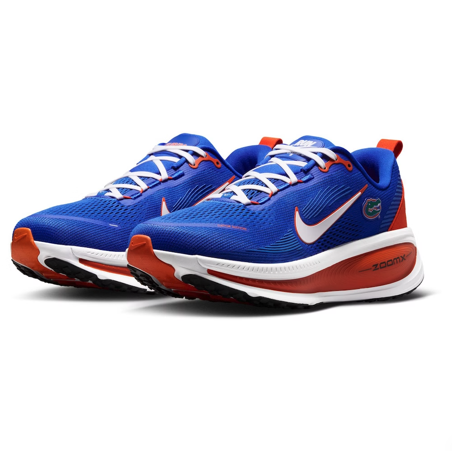
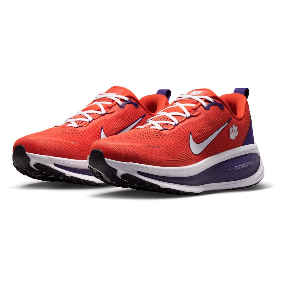
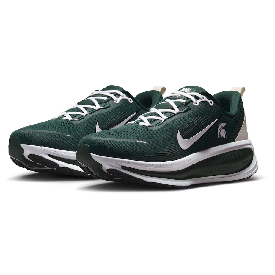
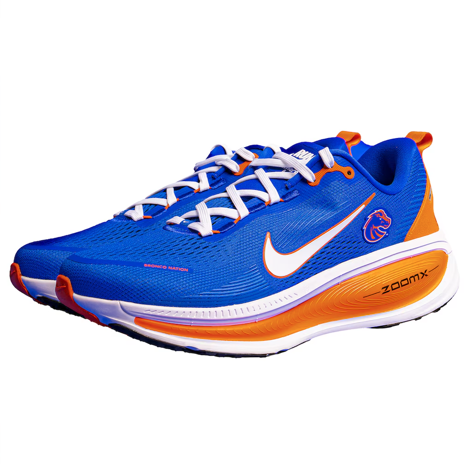
The Nike Vomero 18 collection brings together premium running performance and collegiate pride, giving fans the opportunity to represent their favorite Nike school both on the run and throughout everyday life.
Designed for runners of all levels, the Vomero 18 features Nike's most advanced cushioning system yet. A dual-density midsole combines ultra-lightweight ZoomX foam with highly responsive ReactX foam, delivering an exceptionally soft, energized ride whether you're tackling long training runs, daily miles, or simply staying active.
Comfort is at the forefront of the design. Built on Nike's trusted MR-10 Last, the engineered mesh upper provides outstanding breathability while a plush tongue and interior lining create a secure, comfortable fit from the first step to the last. Strategically placed outsole pods improve traction, agility, and smooth heel-to-toe transitions, helping runners maintain confidence across a variety of surfaces.
What makes this collection especially unique is the ability to combine elite performance with school spirit. Available in designs representing a wide range of Nike collegiate programs, the Vomero 18 allows fans and alumni to support their favorite university while wearing one of Nike's premier running shoes. Whether you're training for your next race, walking across campus, or showing off your school colors around town, the collection offers the perfect blend of comfort, innovation, and collegiate pride.
For fans looking to elevate both their running experience and their game-day style, the Nike Vomero 18 collegiate collection delivers the best of both worlds.
SHOP NCAA SHoes HERE
See What Else Is New
Featured
Related Articles
Featured
A home made real. And now, a vision worn with pride. Say hello to our 2026 Third Kit, CÉNIT 🤍🩵🩷@RoyalCaribbean pic.twitter.com/RdrFTWSH16
— Inter Miami CF (@InterMiamiCF) July 30, 2026
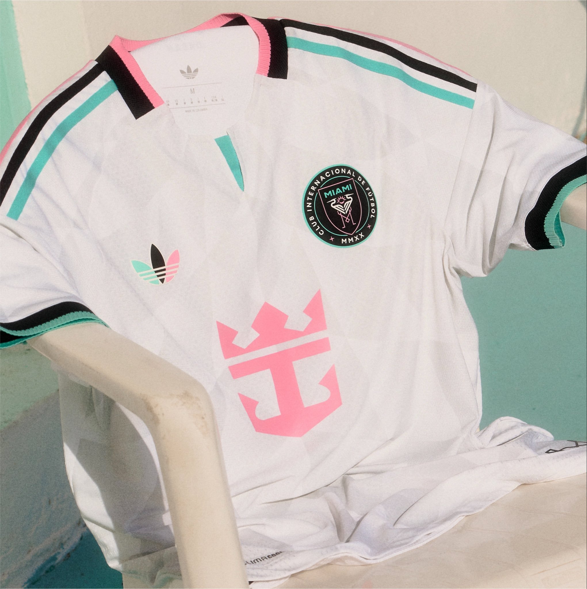
Inter Miami CF is celebrating a major milestone in club history with a new third kit that pays tribute to the future of the franchise.
Created for the 2026 season, the Cénit kit represents the club’s next chapter as Inter Miami prepares to open the doors to its new home, Nu Stadium. The name “Cénit” translates to “zenith” in Spanish, a fitting theme for a club continuing to push toward new heights both on and off the pitch.
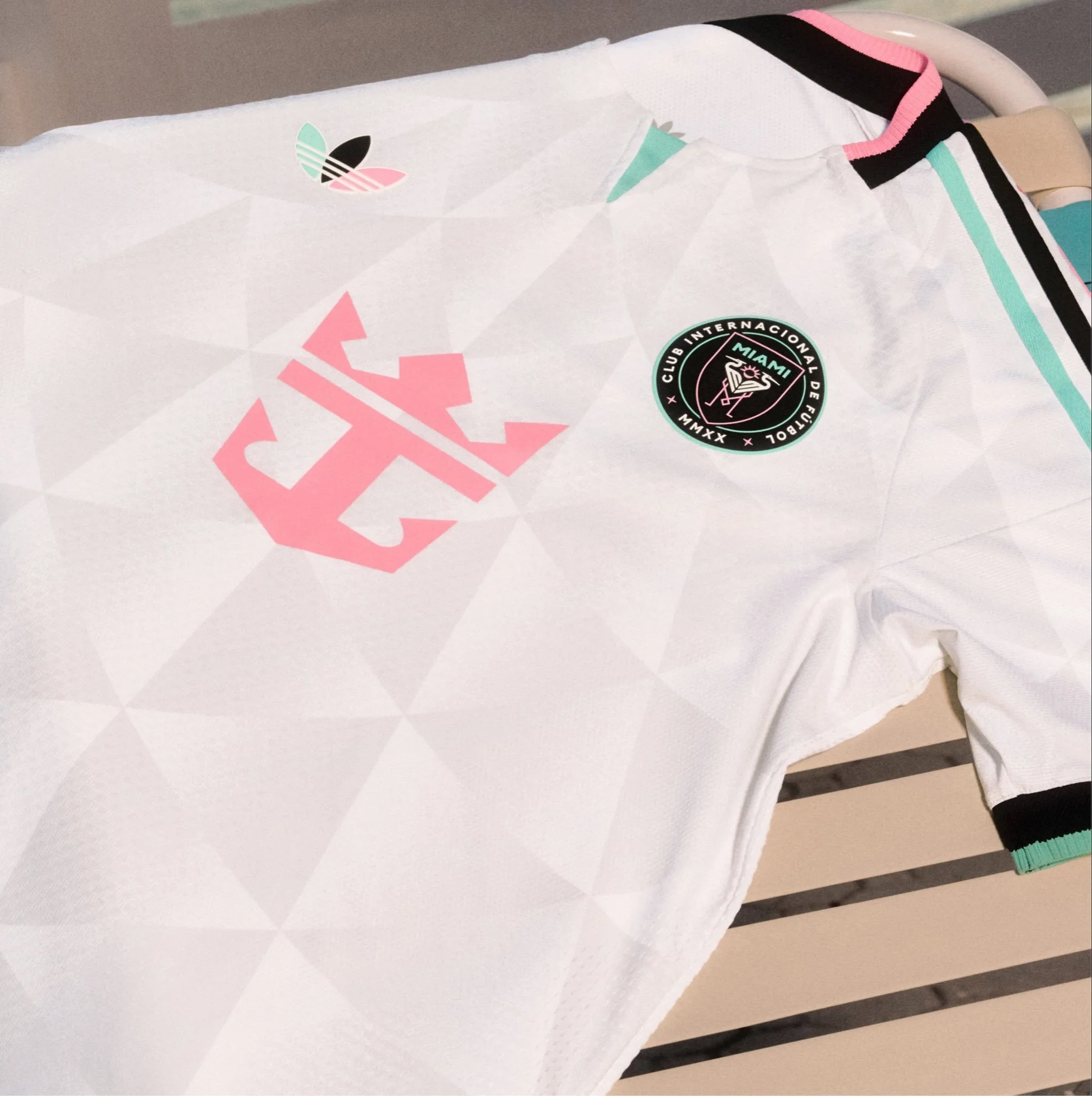
The centerpiece of the Cénit design is a crisp white foundation featuring a subtle tonal triangle pattern throughout the jersey. The geometric elements are inspired by the architectural structure of Nu Stadium’s signature canopy, connecting the team’s newest chapter with the place where players and supporters will come together.
Rather than relying on bold graphics, adidas created a refined look that blends modern design with the elegance of Miami’s evolving soccer identity.
The jersey incorporates Inter Miami’s recognizable color palette with accents of Bliss Pink, Easy Mint, and black. Those colors appear across the adidas shoulder stripes, collar, sleeve cuffs, sponsor marks, and the retro adidas trefoil logo placed on the chest.
The Cénit kit continues Inter Miami’s tradition of adding meaning through small details.
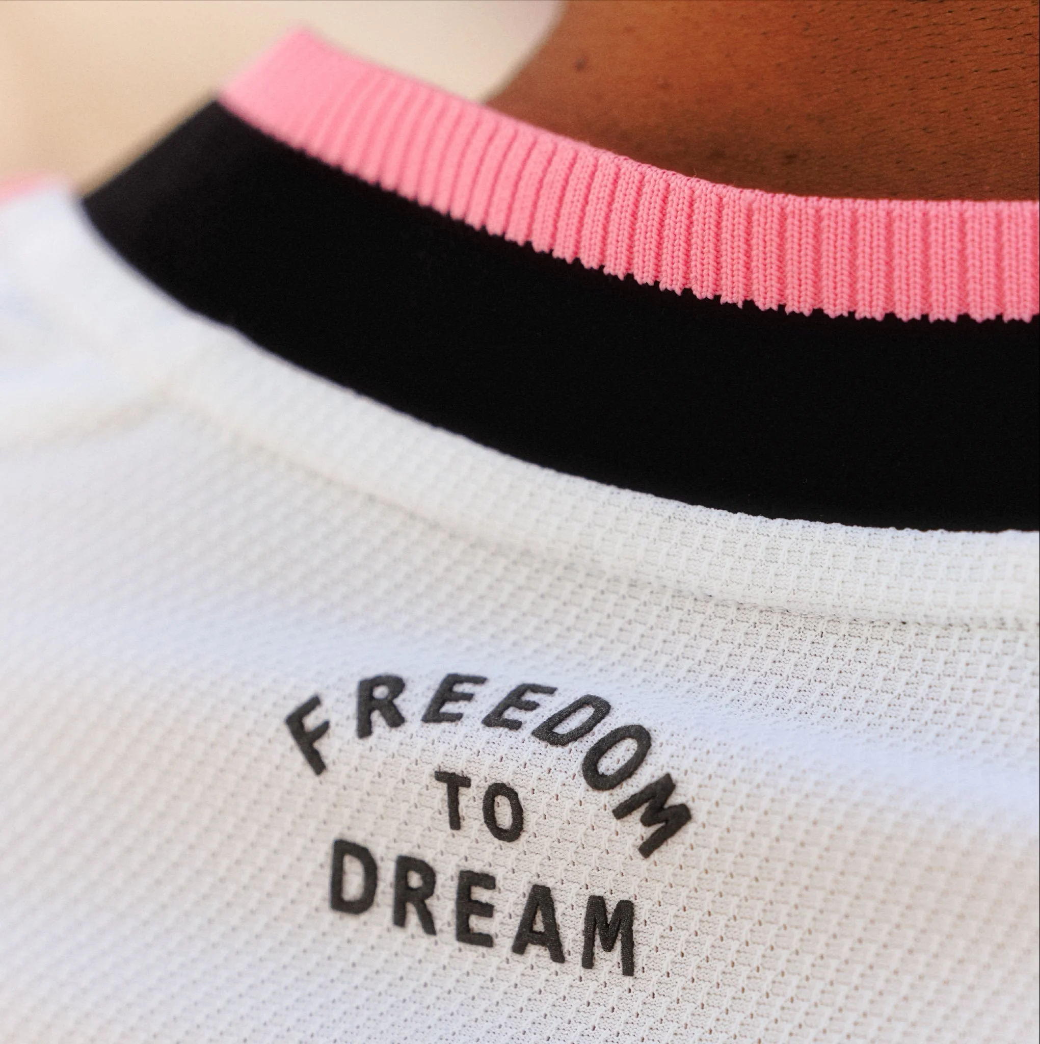
Easy Mint appears throughout the back lettering and numbering, while the Inter Miami crest features the color as part of the updated design. The club’s famous phrase “Freedom to Dream” is also included on the back collar, reinforcing the ambition that has driven the club’s rapid rise.
The matching shorts continue the clean white aesthetic with multicolored adidas striping along the sides, creating a complete look designed for both performance and lifestyle.
The release continues a trend across soccer where clubs are creating kits that represent more than just competition. The Cénit jersey reflects a moment in time: a club growing, a new stadium opening, and a city embracing the next stage of Inter Miami’s story.
SHOP Inter Miami GEAR HERE
See What Else Is New
Featured
Related Articles
Featured
Pinstripes are back 🔥
— Indiana Pacers (@Pacers) July 30, 2026
(Re)introducing our new statement edition uniform.https://t.co/jUGCVevY2f pic.twitter.com/hQpMVI8ddU
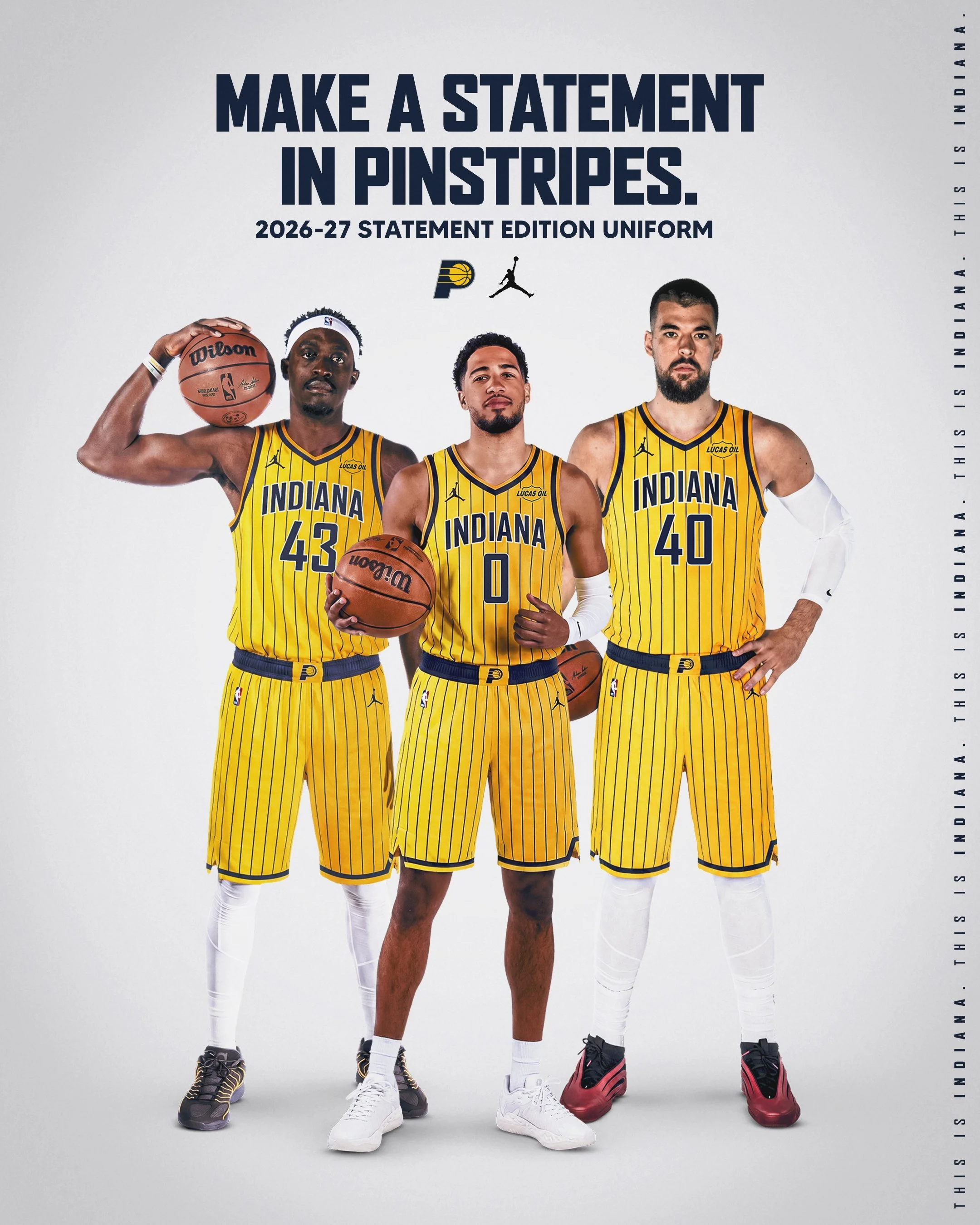
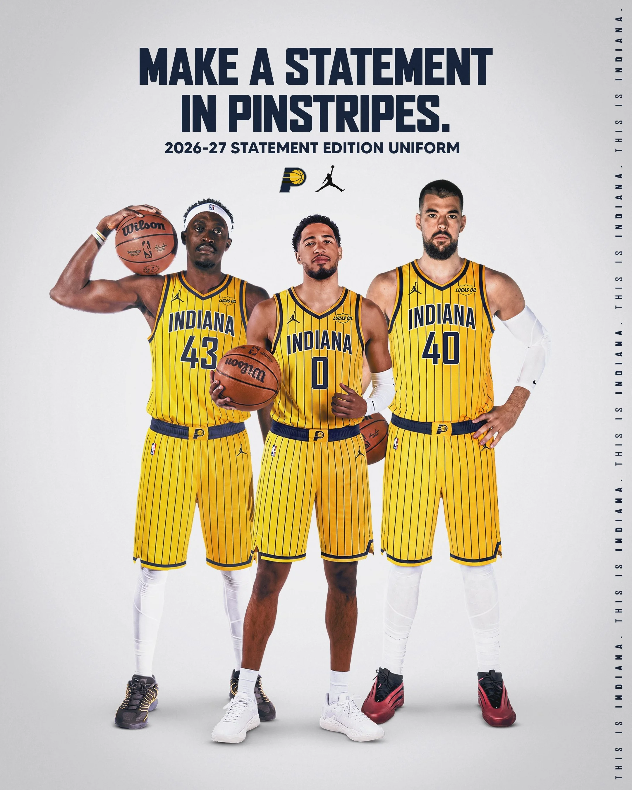
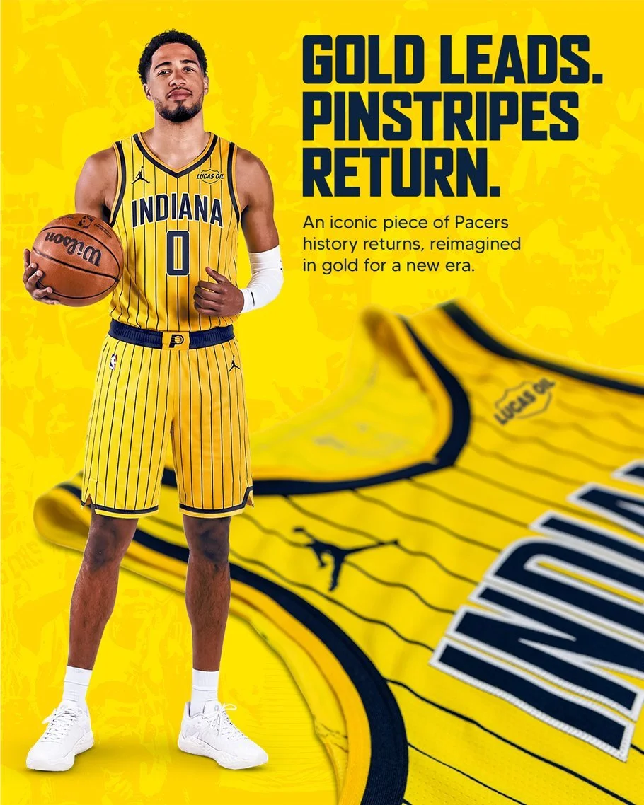
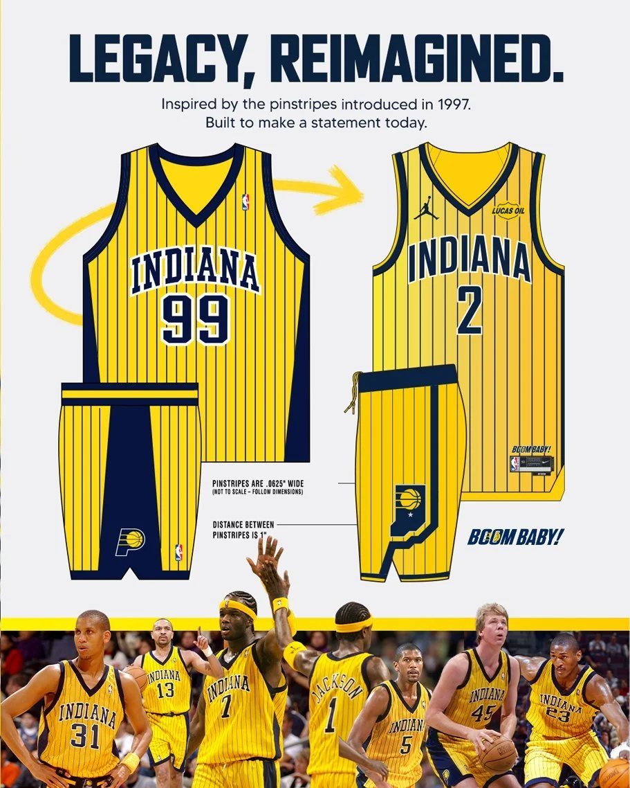
The Indiana Pacers are turning back the clock. The franchise officially unveiled its new 2026 Statement Edition uniform, reviving one of the most beloved looks in team history by bringing back the iconic pinstripes that defined the Pacers' late-1990s and early-2000s era.
Inspired by the uniforms first introduced in 1997, the refreshed design combines nostalgia with modern details while celebrating both the franchise and the state of Indiana.
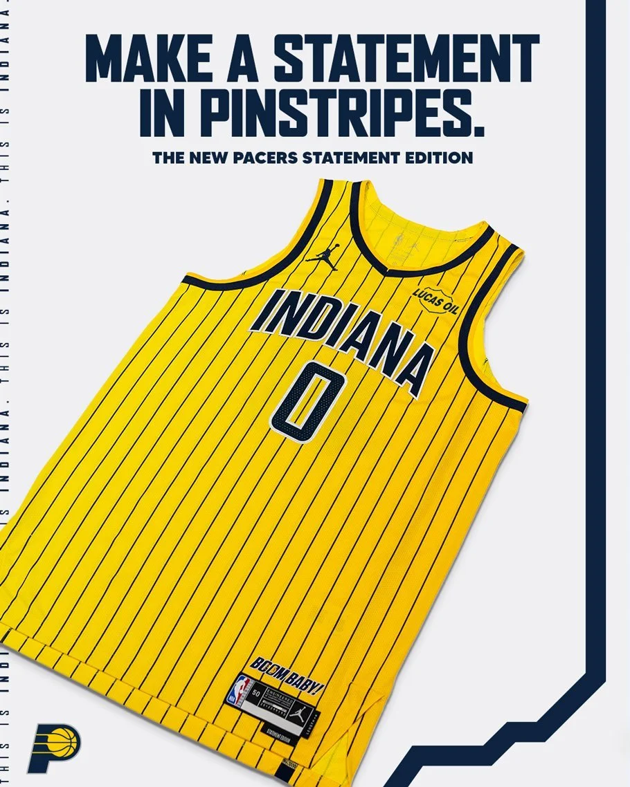
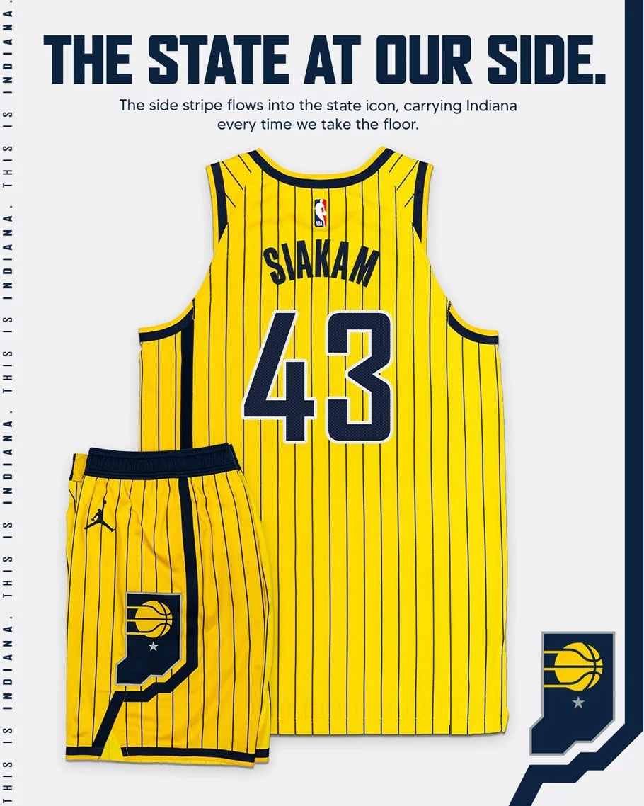
The new Statement Edition jersey features a bold gold base accented by black pinstripes and navy blue lettering, instantly evoking memories of one of the most successful stretches in Pacers history.
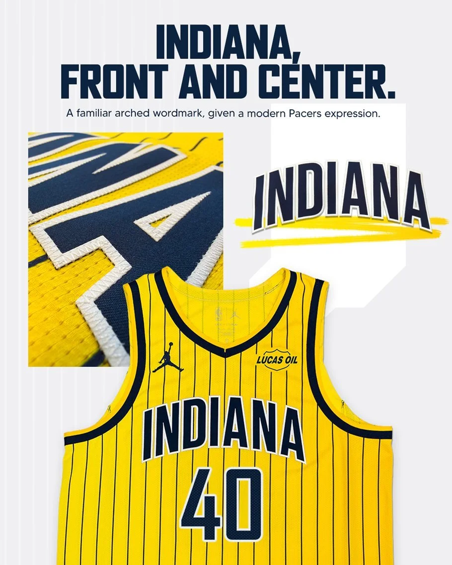
Rather than displaying "Pacers" across the chest, the jersey proudly features "Indiana," putting the entire state at the center of the design. It's a subtle but meaningful touch that reinforces the franchise's connection to basketball fans across Indiana.
The shorts continue the storytelling. An asymmetrical stripe runs down one side, outlining the shape of the state of Indiana, while the Pacers' basketball logo sits inside the graphic in gold. A single star marks the location of Indianapolis, giving the uniform another unique design element that ties directly to the franchise's home.
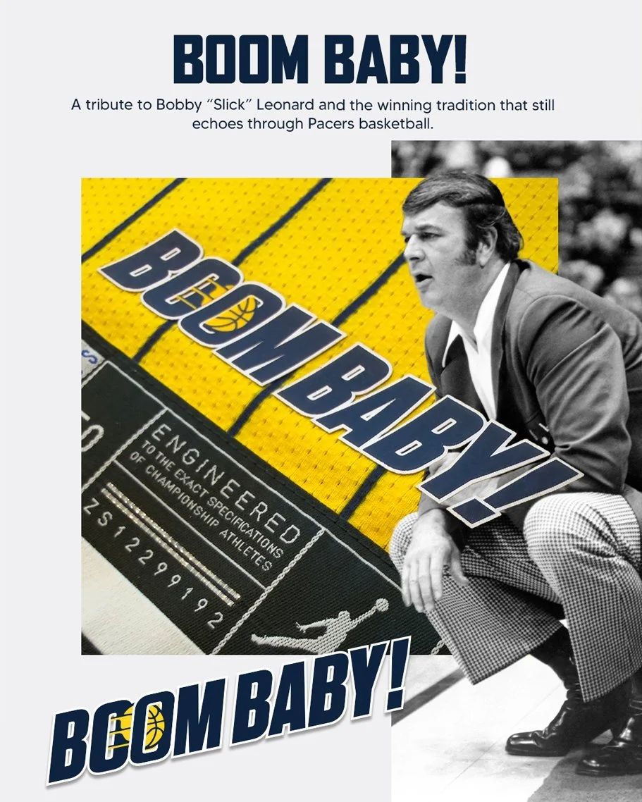
Hidden near the jersey tag is another tribute that longtime Pacers fans will appreciate. The phrase "Boom, Baby!" is stitched into the uniform in honor of legendary Pacers coach and broadcaster Bobby "Slick" Leonard, whose signature call became synonymous with Indiana basketball and remains one of the most recognizable phrases in franchise history.
The return of pinstripes isn't just about style. When the Pacers originally introduced the look in 1997, it marked the beginning of one of the franchise's most successful periods. Indiana reached the NBA Playoffs in nine consecutive seasons, highlighted by an appearance in the 2000 NBA Finals against the Los Angeles Lakers.
For many fans, the pinstripes are synonymous with Pacers basketball at its peak.
Shop Pacers Gear Here
See What Else Is New
Featured
Related Articles

Featured