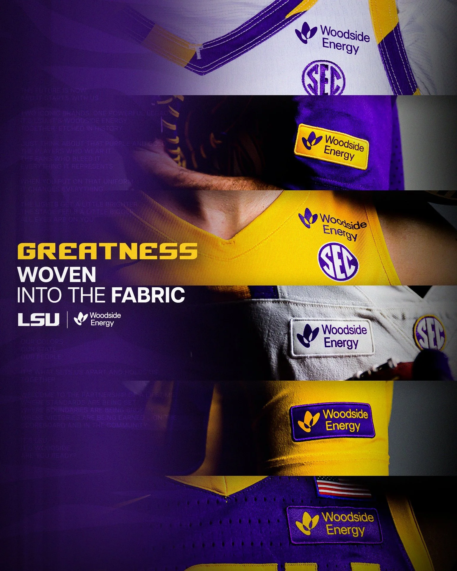
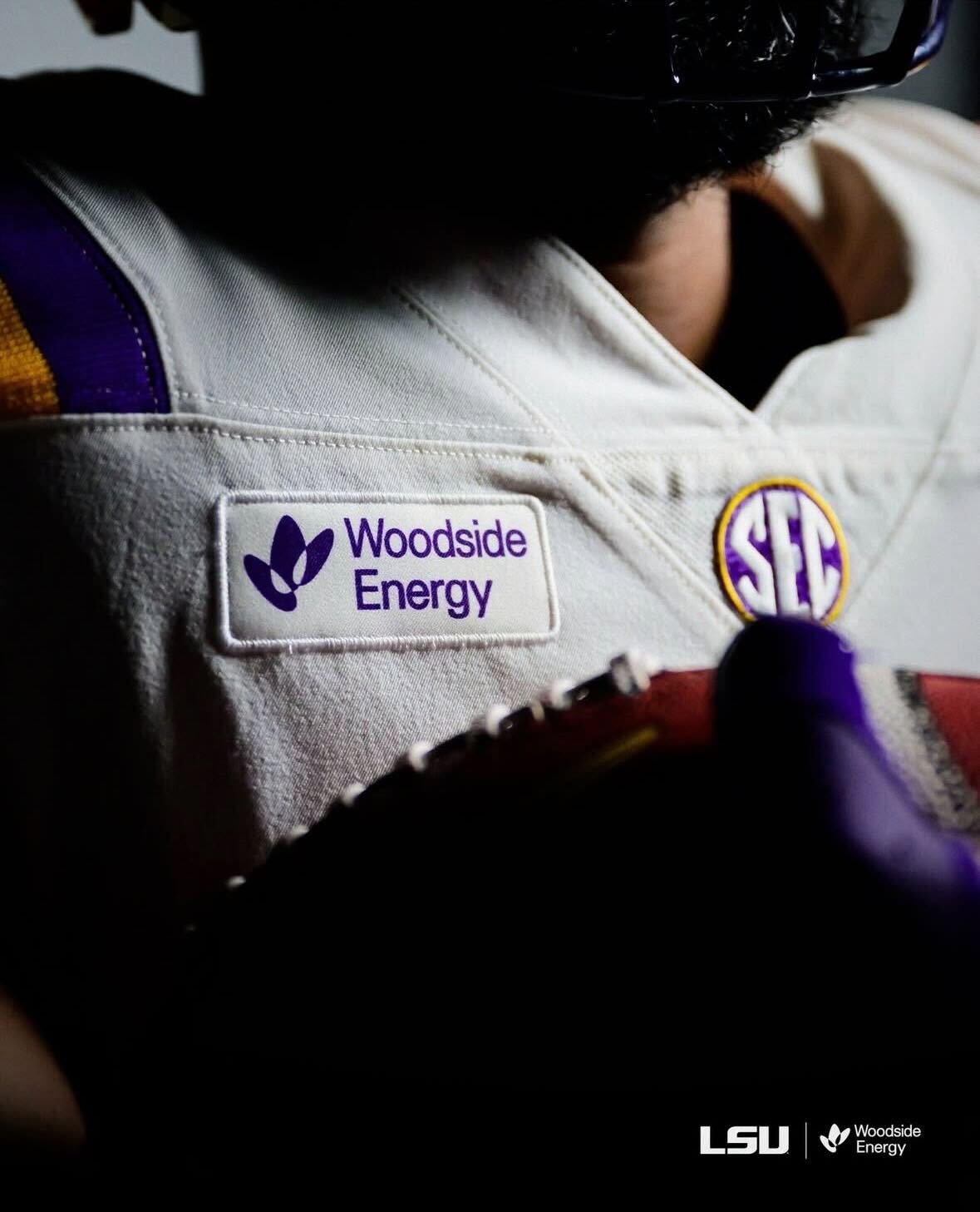
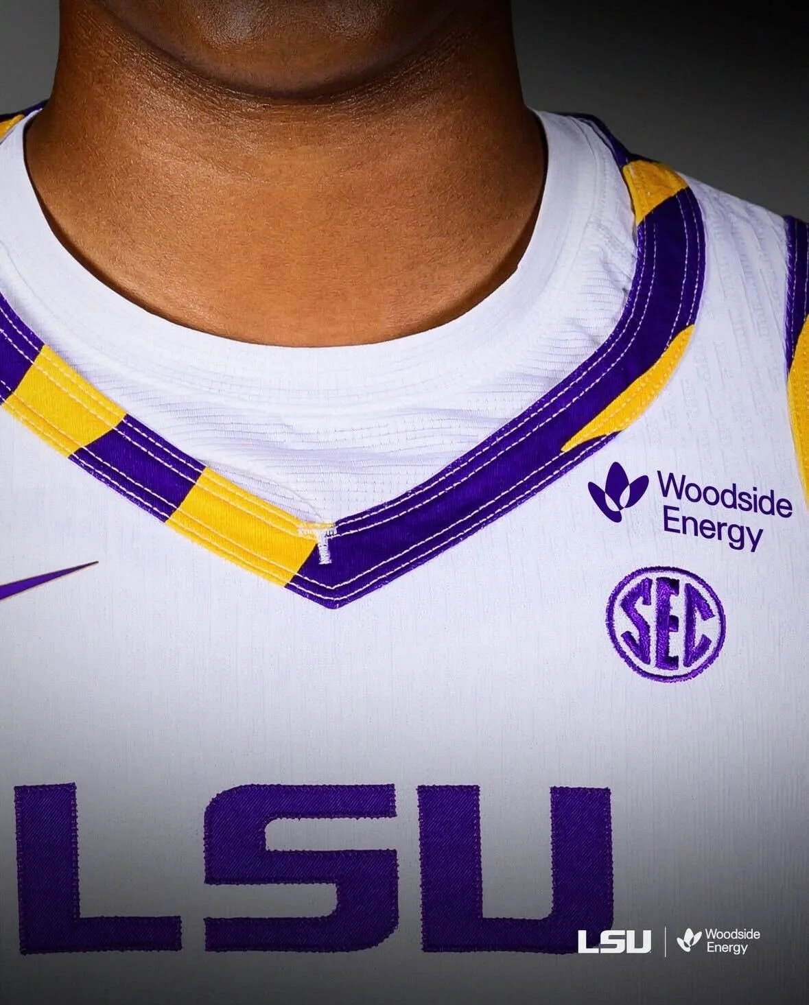
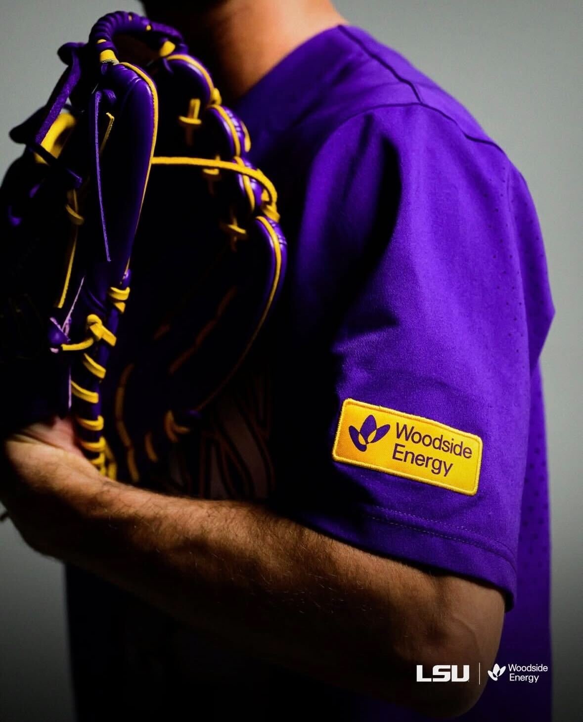
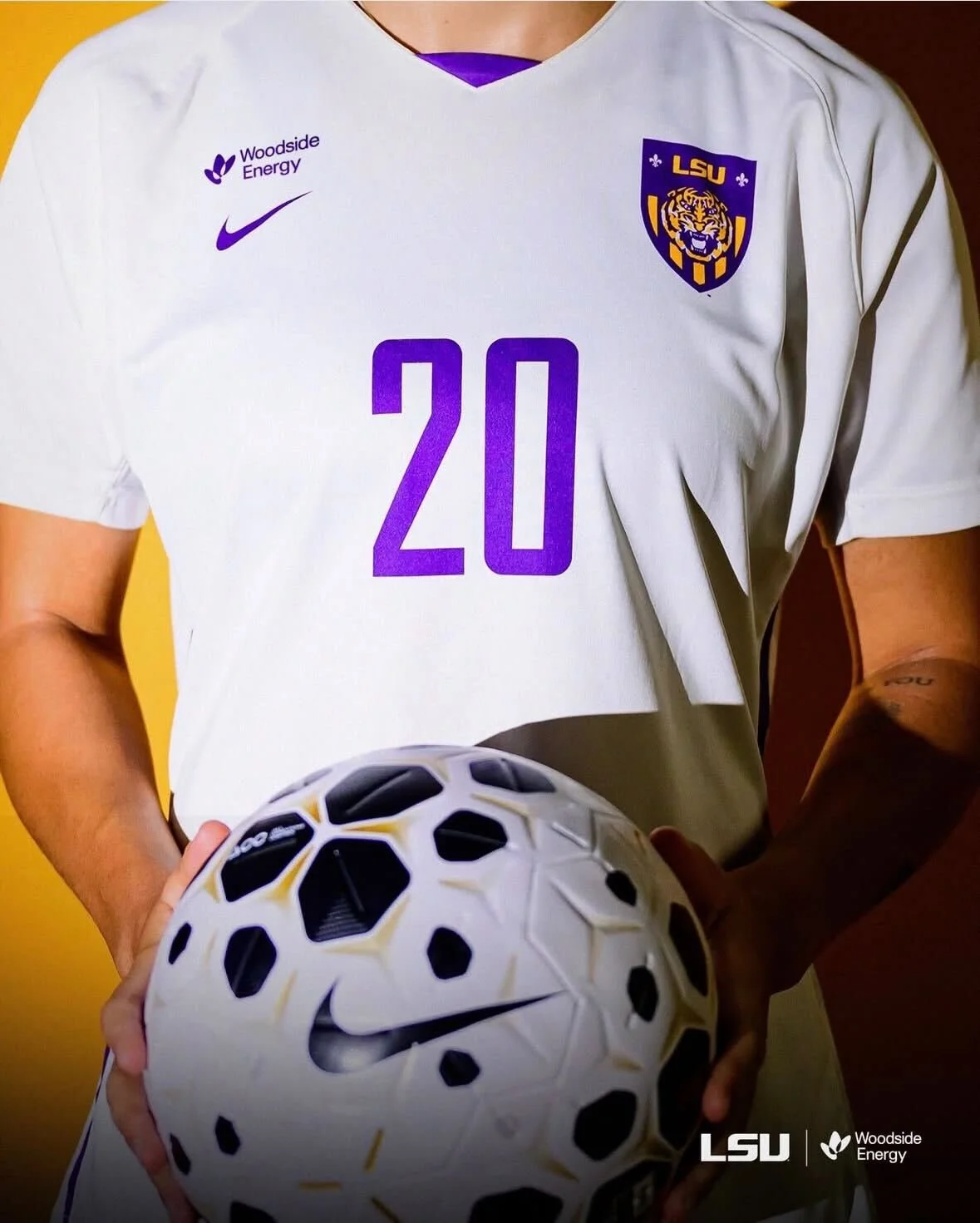
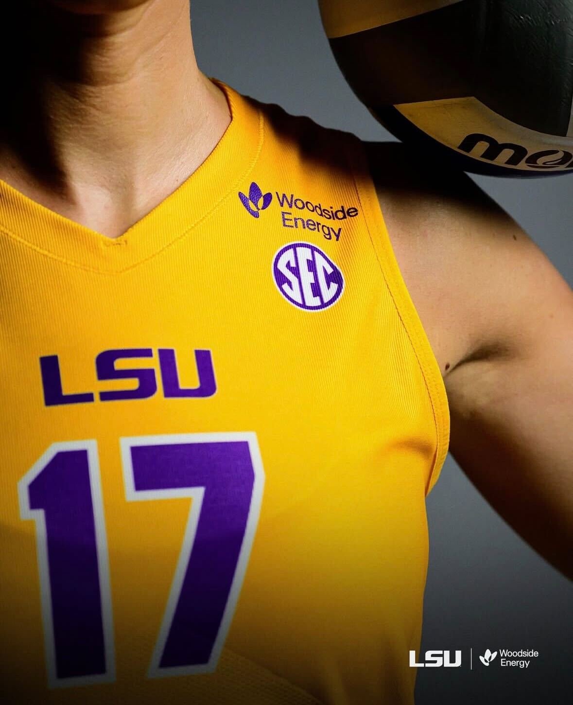
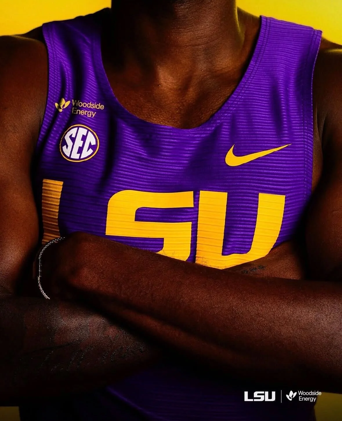
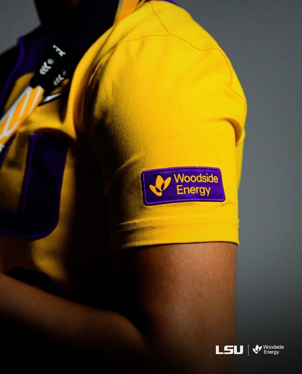
Another MLS season is around the corner, which means one thing for uniform fans. New kits across the league. All 30 clubs are rolling out fresh Adidas designs, and this year feels noticeably different. The template heavy era that once made half the league look the same has taken a step back, replaced by more bespoke builds that give each team its own identity. The result is one of the most visually diverse kit slates MLS has produced in years.
Instead of copy and paste collars and striping, clubs are leaning into personality. Some designs pull from deep local history, incorporating city symbols, architecture, and cultural references. Others keep it simple and just focus on looking clean. Not every jersey needs a complicated backstory. Sometimes a good kit is just a good kit.
Across the board, the variety stands out. There are bold statement pieces, minimalist classics, modern throwbacks, and a few risky swings that will definitely spark debate. That mix is what makes kit season fun. When every team looks distinct, matchups feel sharper and fans actually have reasons to add something new to the closet.
SHOP MLS GEAR HERE
See What Else Is New
Related Articles
Featured
The Marlins officially unveiled new throwback uniforms that will be worn on home Sundays throughout the 2026 season, bringing the franchise’s original signature shade back to the field in a big way. for the first time in team history, a teal Marlins jersey will be worn during a regular season game.
It is a move that instantly taps into nostalgia while still feeling fresh, reconnecting today’s roster with the era that first put baseball in South Florida on the map.
Teal is not just a design choice here. It is the foundation of the Marlins’ identity.
The base of the uniform pays tribute to the original Florida Marlins look introduced in 1993, the same era that produced the club’s early fanbase and two unforgettable championship runs. For a lot of fans, teal is the Marlins. It is the shade people picture when they think about the Fightin’ Fish.
Bringing it back full time on Sundays feels less like a throwback and more like a homecoming.
As Marlins Chief Brand Officer Alex Parker put it, teal represents the moment fans first fell in love with Marlins baseball. This set is meant to connect that legacy with today’s team and today’s fan.
The throwback look keeps things clean and intentional. Across the chest, an “Always Marlins” wordmark reinforces the idea that while colors and eras change, the name stays constant. It is a subtle but smart storytelling touch that bridges past and present without feeling forced. On the sleeve, players will wear a Florida Marlins legacy patch that honors the franchise’s beginnings. It is the kind of detail uniform nerds appreciate, giving the jersey a little extra authenticity and pride.
The overall construction blends modern tailoring and performance materials with a timeless aesthetic. So while it looks straight out of the 90s, it is built like a 2026 uniform should be.
Shop Marlins Gear Here
See What Else Is New
Related Articles
Featured
The Minnesota Twins are not overhauling their look for 2026, but they are making the kind of change uniform fans always notice. It is small. It is subtle. And it completely shifts the feel of the jersey.
Ahead of the new MLB season, the Twins are updating their navy blue road alternate set, replacing the arched “MINNESOTA” wordmark across the chest with a white scripted “Twins” logo. Same base color. Same cap. Same overall structure. But that one swap gives the uniform a much more classic, throwback personality. Sometimes the tiniest tweaks hit the hardest.
The new script sits front and center in white, paired with the familiar red player number below. Sleeve striping stays intact in blue, white, and red, keeping that clean, traditional Twins palette that has defined the club for decades. It feels less like a redesign and more like a refinement.
The sleeve patch also gets a meaningful update. Out goes the standard “TC” logo. In comes a state map of Minnesota, highlighted with the club’s red North Star planted directly over the Twin Cities. It is a small detail, but one that leans heavily into state pride and geography, giving the uniform a stronger sense of place. It is the kind of patch that feels tailor made for an alternate set.
On the back, the Twins flip the color balance for better contrast. Player names move from white to red, while numbers switch from red to white. The result pops more cleanly against the navy base and should read sharper from the stands and on TV.
This navy look officially replaces the previous navy alternate the team has worn since 2023. The rest of Minnesota’s uniform lineup remains untouched, including their City Connect set.
Flexibility is part of the plan here, too. The jersey can be paired with white pants at home or grey pinstriped pants on the road. No matter where it shows up, it will always be worn with the “M” cap, keeping the identity consistent. It is a modern alternate with some old school versatility.
There is also a cool historical wrinkle baked into the update. This marks the first time the Twins will wear “Twins” across the front of a regular road uniform since the powder blue road jerseys back in 1986. For decades after that, “MINNESOTA” became the road standard, especially following the late 80s rebrand that coincided with their 1987 World Series run. It is a throwback without actually being a throwback. And that balance is what makes this one work.
Not flashy. Not loud. Just a smart, heritage driven upgrade that feels right at home in the Twins’ closet.
Shop Twins Gear Here
See What Else Is New
Related Articles
Featured
The 2026 Formula 1 season is fast approaching, and with it comes one of the most anticipated parts of the build-up: new liveries and car designs. With sweeping technical regulation changes and major power unit partnerships set to reshape the grid, teams are entering a true new era of Formula 1. As a result, the liveries being introduced for 2026 do more than just refresh a look, they signal identity, innovation, and a clear direction for what’s next, blending modern design with each team’s heritage.
Shop f1 Gear Here
Red Bull
Racing Bulls
Haas
Audi
Mercedes
Ferrari
Alpine
Willaims
Cadillac
McClaren
Aston Martin
See What Else Is New
Related Articles
Featured
For the first time in league history, both teams will take the field in full monochrome looks. The Seattle Seahawks are going head-to-toe college navy, while the New England Patriots will counter with an all-white uniform from jersey to pants.
It might sound subtle, but visually it’s a first-of-its-kind moment for the Super Bowl, and it instantly gives this matchup a unique place in uniform history.
The Seahawks will wear their all-navy combination, a look that has quietly become the franchise’s standard since the current uniform set debuted in 2012. The deep navy jersey paired with matching pants and socks gives the team a clean, aggressive silhouette that feels modern without trying too hard. It’s one of those combinations that simply looks right every time they step on the field.
It’s also familiar territory in the Super Bowl. Seattle has worn all-navy in two of its three previous appearances on the big stage, including their last meeting with New England in Super Bowl XLIX.
On the other side, New England made a more surprising decision. Despite being designated as the “home team,” the Patriots elected to wear white jerseys, continuing a recent trend that has seen them favor road whites in championship games. Since their loss to the Giants in Super Bowl XLVI, the Patriots have worn white in each of their next five Super Bowl appearances, clearly buying into the long-standing superstition that white jerseys equal wins.
For the first time, the Patriots are pairing those white jerseys with white pants, creating a true whiteout look that they’ve never worn on this stage before. The result is sharp, minimal, and modern — a clean aesthetic that should really pop against the darker tones of the field and Seattle’s navy set.
Historically, the numbers back up the choice. Dating back to Super Bowl XXXIV, teams wearing white jerseys have won 18 of the past 26 championships. That’s the kind of stat that makes equipment managers and coaches feel a little more comfortable sticking with tradition.
Both teams will also carry an additional detail that ties the game to something bigger than football.
Each uniform will feature a commemorative patch honoring the 250th anniversary of the United States, positioned directly below the Super Bowl LX logo on the right shoulder. It’s a rare league-wide addition that connects the moment to national history, and it echoes a similar touch from Super Bowl X, when the Cowboys and Steelers wore patches celebrating America’s Bicentennial.
SHOP NFL gear HERE
See What Else Is New
Related Articles
Featured
For the 75th NBA All-Star Game, the league made sure the jerseys carry real meaning. The NBA officially unveiled the 2026 NBA All-Star uniforms ahead of the February 15 matchup at Intuit Dome in Inglewood, California, the new home of the LA Clippers and this year’s looks lean fully into the league’s new USA vs. World format while pulling inspiration from Los Angeles’ deep basketball culture. For the ninth straight season, Jordan Brand is outfitting the stars, continuing its run of turning All-Star kits into some of the most collectible pieces of the year.
Every jersey features a Los Angeles-inspired script “All-Stars” wordmark across the chest, giving the collection a smooth, West Coast feel right away. It’s clean, slightly retro, and feels authentic to the city rather than overly “event-branded.”
Seven stars surround the wordmark as a nod to the seven previous All-Star Games hosted in L.A., adding a subtle historical touch that ties this year’s game to the city’s long relationship with the sport. It’s a small detail, but it grounds the entire set in place something the best All-Star designs always do well.
Team USA gets two separate uniforms, both built directly from American flag iconography.
The USA STRIPES uniform features a blue base with bold red-and-white striped inserts running down the right side of the jersey and shorts. The striping creates a fast, directional look that feels made for motion — perfect for an All-Star game built on pace and highlights.
The USA STARS uniform flips the palette with a red base and a large star silhouette filled with blue and white stars along the side panels. Where the stripes look feels sleek and linear, this one feels punchier and more graphic-heavy.
Together, the two designs feel connected without being repetitive. Same theme, different execution which keeps things visually interesting when both teams share the floor.
The World team takes a different approach.
Instead of flags or loud graphics, the international squad will wear a white uniform with blue and green paneling along the right side, representing the vastness of land and sea across the globe. It’s a more symbolic design, and honestly, it might be the cleanest look of the bunch.
The lighter base gives the jersey a modern, minimalist feel and lets the colors pop without overwhelming the design. Next to the bold red and blue USA sets, this one should really stand out on the floor.
NBA star graphics appear on the front and shorts, customized to each team’s theme stripes, stars, or a globe/compass motif. Each player’s country flag sits on the back above the number, reinforcing the international identity of the matchup and adding a personal touch for every athlete on the floor.
The jock tag also commemorates the 75th annual All-Star Game, a small but meaningful detail that instantly makes these feel like keepsakes from a milestone year.
The league also unveiled a custom court for the weekend at Intuit Dome, designed with the Clippers’ navy, red, and pacific blue palette, layered wood stains, and angular patterns inspired by the arena’s architecture. The darker tones should make the uniforms pop on broadcast and give the entire game a cohesive, LA-specific vibe rather than a generic event setup.
Shop NBA Gear Here
See What Else Is New
Related Articles
Featured
When you stage a hockey game inside one of college football’s most iconic stadiums, you don’t just show up in your regular set. You dress for the moment. Penn State Men’s Hockey understood that assignment perfectly.
Ahead of their outdoor showdown against No. 2 Michigan State at Westshore Home Field at Beaver Stadium, the fifth-ranked Nittany Lions unveiled a one-game-only sweater that blends football heritage, hockey history, and stadium-scale design into one of the most thoughtful specialty uniforms we’ve seen this season.
The main crest features stitched twill “Penn State” lettering across the chest in Helvetica Neue Bold the same typeface used in Beaver Stadium’s end zones. It’s one of those hyper-specific typography decisions that design nerds appreciate and casual fans subconsciously recognize as “right.” But the nods don’t stop at football. The sweater also pulls heavily from the program’s first varsity hockey era from 1941–1947.
A white shoulder yoke gives the jersey a vintage, throwback silhouette, while matching white pants complete the old-school feel. Down the sides of those pants runs a solid blue stripe, a callback to the football program’s famed Generations of Greatness uniforms. The result is a perfect blend of eras: part archival, part modern, entirely Penn State.
Where this uniform really shines is in the small stuff. The front collar features the Nittany Lion Shrine, tying the look back to campus tradition and one of the university’s most recognizable landmarks. Inside the collar, though, the designers got creative. The lining mimics the look of brown leather with white laces, a direct homage to the texture of a classic football. It’s what’s known as a “hanger effect” detail: something players see and feel every time they put the jersey on, even if fans never notice it during the game. It’s subtle. It’s clever. And it’s exactly the kind of storytelling element that separates a good uniform from a great one. Built for Visibility and for Beaver Stadium.
Outdoor hockey games aren’t designed like arena games. Sightlines are longer. Fans are farther away. Numbers need to pop from the upper deck. Penn State responded with enlarged sleeve and back numbers specifically optimized for stadium viewing. But they didn’t just make them bigger, they made them meaningful. Each number features a sublimated blueprint pattern of Beaver Stadium itself. Even cooler? Every numeral is cut from a different section of that blueprint, meaning no two jerseys are exactly alike.
It’s a subtle way to bake the stadium’s architecture directly into the uniform, a detail that turns every game-worn sweater into a one-of-one collector’s piece.
Striping continues the storytelling. The sleeves and socks feature a thin-thick-thin stripe pattern inspired by the first-generation Generations of Greatness football socks, reinforcing the football DNA running through the entire kit.
In a move that feels straight out of the football playbook, Penn State will skip traditional nameplates on the back of the jerseys. Instead, they’re embracing a simple message: “No Names, All Game.” The back remains clean, finished only with the classic lion head logo on the nape.
The rest of the uniform keeps things timeless. A white helmet with a navy center stripe anchors the look. Standard blue gloves with white cuffs keep the color story tight and traditional. Inside each jersey, players will find a custom game-worn tag featuring Beaver Stadium’s iconic gate, another small but meaningful touch that locks this design to a specific place and moment in time.
The sweaters will be worn just once as part of Penn State Athletics’ Winter Weekend before heading to auction. A portion of the proceeds will benefit the State College Coyotes Sled Hockey program, adding a community impact element to an already memorable release.
SHOP penn state GEAR HERE
See What Else Is New
Featured
Related Articles
Featured
A new season is right around the corner in Honolulu and the University of Hawaiʻi baseball program is entering 2026 with a fresh look.
The Rainbow Warriors debuted one of their new Nike uniform sets during last weekend’s alumni game. The spotlight was firmly on a cream-colored uniform featuring a vintage Rainbow Warriors colorway, instantly standing out as a throwback-inspired nod to the program’s past. the team has also introduced Kelly green home uniforms, Classic road grays, and Pinstriped designs paying homage to Hawaiʻi baseball history
The collection blends modern performance with visual cues that longtime fans will instantly recognize.
For senior infielder/outfielder Ben Zeigler-Namoa, the uniforms represent more than just game-day gear they’re part of the program’s identity.
“Coach Rich talks about wanting his guys to fill out their uniforms and look good in them,” Zeigler-Namoa said. “Our uniforms always look clean, and they do a really good job with them. I’m just excited.”
Head COach Rich Hill also noted that the uniforms were designed with the future in mind, particularly the next wave of Hawaiʻi athletes watching from the stands.
“The keiki are really looking up to us,” he said. “I want their jaws to drop when they see the names on the back, the pinstripes, the Kelly green and the grays — paying homage to what Coach Les started. I love it.”
With vintage elements, bold colorways, and a clear respect for the program’s roots, Hawaiʻi’s 2026 uniforms strike the perfect balance between past and present. As the Rainbow Warriors prepare to take the field, they’ll do so wearing a look that reflects not just a team, but an entire state.
Shop Hawaii Gear Here
See What Else Is New
Related Articles
Featured
The West Virginia Mountaineers men’s basketball program revealed a new throwback uniform, which the team will debut Saturday at home against the Colorado Buffaloes. The reveal is another example of a growing shift across college sports: simpler, cleaner, and more familiar designs replacing experimental looks of the past decade.
From the early 2010s through just a few years ago, many programs leaned heavily into bold redesigns unique fonts, aggressive striping, unconventional numbers, and modernized elements meant to stand out. While those looks grabbed attention, they often drifted far from what fans traditionally associate with their programs.
Now, the trend is swinging in the opposite direction.
The simplified design brings back a look that feels authentic to WVU, tapping into the program’s visual roots and leaning on a more classic approach that longtime fans immediately recognize.
This isn’t the first step toward a return to form.
Last season’s Jerry West throwback uniforms sparked optimism among Mountaineer fans that a broader shift back to classic design might be coming. That reveal suggested WVU was open to embracing its past and this new home throwback set reinforces that idea.
With navy and gold variations still on the table, the Mountaineers now feel closer than ever to fully committing to a classic, simplified uniform identity across the program.
The Mountaineers will debut the new throwbacks Saturday night against Colorado.
This uniform reveal is about more than just one game. It’s a sign that West Virginia is embracing what made its identity strong in the first place clean design, bold colors, and a look that doesn’t need explanation.
Shop West Virginia Gear Here
See What Else Is New
Related Articles
Featured